Category Archives: Graphic Arts

This Category should be selected if you are a Graphics Arts student.

Final Summary

Throughout the writing and research of the blog posts and their topics, I’ve broadened my knowledge in the world of design about areas that I wouldn’t usually look in to, and discovered that I actually find many of them fascinating. I discovered new artists that I am fond of and can learn form that goes outside of my usual style, allowing me to experiment more, such as Gilles Beloeil who uses traditional medium and painting styles for his conceptual illustrations. Before discovering this artist, I’ve always separated fine art and digital concept art, especially for such a commercial instance like video games, as two separate things, but now I see how they could be overlapped and combined to create something beautiful and meaningful.

Learning about famous art movements such as Avant Garde and Postmodernism has given me the ability to criticise art from a new perspective beyond aesthetics, and to be able to add deeper meanings into my own pieces of work instead of deciding based on visual appeal and cleverness in the design. It has also given me a deeper appreciation to art and design, knowing that it has the potential and capability to alter the course of social establishment; to create and destroy, which is absolutely astonishing. I’ve never been one to appreciate art that is on the abstract side, due to they’re presumed “pretentiousness” and lack of traditional use of skills and methods, but caring to look beyond the superficial (which is something that I learned from the Modernism movement), I’ve learned the importance of art that ventures outside the convention and mainstream appeal, which is key to the evolution of the art industry as a whole. Prejudice in perception of art is hard to overcome, but I see this as a start to pulling down the inhibitions one naturally has when approaching something unfamiliar.

Exploring new topics in depth also inspire new ideas which has aided my practises to becoming more experimental and wide ranged. It also allows more possible combination of methods and style instead of sticking to traditional formulas. I have also been able to improve some of my transferable research and critical skills, which will be very helpful to my future projects, regardless of the topic. When I needed to find references, image sources and just generally more information about the thing I’ve chose to analyse, I had to make use of every method, especially for works that are obscure with engines such as google reverse searches and google scholar and the library’s resources to obtain the bit of facts that I needed. I realised that on the way I am also exposed to new inspirations that aren’t actually relevant at this time but could be in the future, such as new artists, and blogs like Widewalls that I could go back to in the future.

In conclusion, this project not only exposed me to new ideas, it has also expanded my way of thinking and understanding of the world of art and design, and I can’t wait to see how my works in the future will change and the new directions it can take.



Counter Culture

Counterculture was born into a time of austerity due to the cold war.Rebellion was a crucial key to the counterculture movement, “summarised in (embracing) an alternative lifestyle characterized by…, brightly colored clothes, communal living, free sex, and rampant drug use”. The art created represented this hedonistic yet antipathy towards politics of the time.
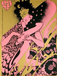
Hapshash and the Coloured Coat consisted of two graphic designers, Michael English and Nigel Waymouth.

I find it interesting how in the left-hand corner, the same male figure thats in the centre, is posed differently,slightly distorted and in this gold ink. I feel this alongside the repetitive patterns of the flowers and elongated shapes emphasise the psychedelia that strongly influenced the work of this time period.

The collaboration described their work as “a precursor to a sort of graffiti.” which I feel is shown in the colour scheme which solely consists of three colours.

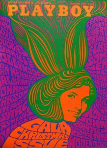
Wes Wilson is seen to be the ‘godfather’ of psychedelic art that emerged
within the 1960s. His most well-known work would be the typeface he created which was heavily used within the 1970s in the psychedelic and counter culture movements. The piece of work which interested me the most that Wilson created was for a playboy magazine cover. I find the way in which the type frames and creates a sense of movement to the central image, but also makes up the body of the girl, i think the use of movement was pivotal to the whole psychedelic movement.

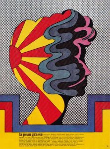
Milton Glaser’s work, though still in the vain and strong within the counter culture movement, this particular piece of work has rather colour palette compared to the work of other artists within the movement, this piece of work compared to Wilson’s playboy cover shows how the colour schemes within the movement, though still bright, did not necessarily have to have that bright fluorescent or metallic look to them. I found this particular piece interesting because of the way in which the movement created by the abstract-esque shapes are all contained within a silhouette of a face.


(1)http://visualarts.britishcouncil.org/collection/artists/hapshash-the-coloured-coat

(1)quoted in Summer of Love Art of Psychedelic Era, Tate 2005, p. 107

Hapshash and the coloured coat-Luv Me Promotional Film Poster,1967: https://paddle8.com/work/hapshash-and-the-coloured-coat/102695-luv-me-films-promotional-poster


Johnson,K Summer of Love:

http://www.coldwar.org/articles/60s/summeroflove.asp


Postmodern Images


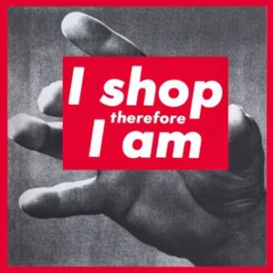
The first image I chose is a creation by Barbara Kruger, whose work mainly includes things related to consumerism and feminism. All of her work has a true meaning hidden in them. The phrases in her works often include pronouns such as “you”, “your”, “I”, “we”, and “they”, addressing cultural constructions of power, identity, and sexuality. In this case, it directs to consumption. Her works are mainly ethical, social, political, economical and humanistic based. In this particular poster, I like how she has used red, black and white colours. Red is a dominant colour and to promote a message to a large audience, red is a colour that can be very useful. I love how she has combined few images and has created a poster out of it. This particular poster of Barbara Kruger was and is still very famous and popular among audience.


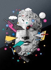
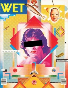
This is the second postmodern image I chose, this has a lot of techniques related to photo manipulation which is one of my favorite areas of design to work with. I like how the creator has used multiple images to create a poster. The background seems to be plain and simple which is totally matching with the objects placed on the foreground. This poster has a variety of colors used in it. The combination of different images used to form a poster in this is totally balanced, which gives the poster a refined look.


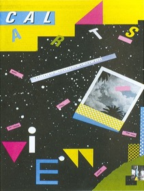
This is the third postmodern image I chose, it has a combination of designing techniques like addition of typography, photographs and objects in it. The placement of all the objects seems to be refined. The colors used in this poster give the poster a very bright, colorful and artistic look. In terms of visual mapping, the poster seems to follow the correct visual mapping pattern as the visual mapping starts from the upper right corner and ends smoothly towards the bottom left corner.

This poster could be an example when I create my projects as it has a balanced combination of typography, photographs, colors and other designs.

http://www.theartstory.org/artist-kruger-barbara.htm

http://ucresearch.tumblr.com/image/47883063847

500 word summary

During the research and communication project I have learnt how to research and analyse other artists and art movements, and not just the art work, but also the political climate and other events that influenced the artwork and artists at the time. This understanding of art history is crucial and has helped me to see where artists got their inspiration from, and I understand how art movements have developed. For example during task 3, I researched how technology and the invention of the camera has impacted the art word, and pushed the development of art movements such as impressionism, as they captured something that a camera can’t. I also wasn’t able to distinguish the features of art movements, such as the different between modernism and post modernism, and how different they were. Now I feel confident in recognising art movements. 

After seeing a wide range of mediums and work, it will help in my developing practice, giving me a wide range of inspiration and artists which to reference my future work from. I found task 7 about published images very useful, as I want to do illustration, and it pushed me to see the links between the article and the work, and how the artist chose the imagery to communicate the message. I mostly focused on illustrative work for all the research tasks, which now I realise was a bit limiting, and I should have includes some photography or graphic design as well, to broaden my horizons. Taking inspiration from a range of mediums would be beneficial, I think.  

Regarding theory and practice, an understanding of art theory is crucial for creating successful pieces of art. I think that understanding previous art helps us improve our own, as we see what is successful and what is not. We have to have a certain understanding of the rules so we can break them and create something new and original. This can be seen in Post Modernism, and the whole point is trying to build off of previous movements and morphing it into something that hasn’t been done before.

I found the third lecture quite thought provoking, discussing if technology is the mortal enemy to art. At first I agreed with the statement, as traditional and portraiture art is now being pushed aside for modern art and abstraction, but then I realised that without technology I wouldn’t be able to create my own art. I also discovered that without the invention of the camera we wouldn’t have the art movements that we have now, and that technology has actually helped to push art forward, and create new mediums such as graphic design, motion and other computer based media. The task on authenticity was also thought provoking, and critical thinking is a skill that is essential for critiquing and evaluating others work, and your own.

In conclusion  I have found the lectures and tasks very helpful to develop my thinking and research skills, which will eventually have a positive impact on my practical work.

Task 7


This book was made by Irma Boom which was commissioned by Chanel. The 300-page book has no ink—each of the crisp white pages is embossed with a drawing or quotation, because this special printed way concentrate on a sense of touch. It’s clean, understated and ephemeral, and somehow still totally engrossing. The book allows us to see the new meaning of the book in the digital times, the active role of the designer in the publication process as well as the need for a new kind of printed book. Irma Boom reinvents the traditional book. It is hard to imagine any other individual following her footsteps, since the digital revolution entirely changed the world we are living in, but it would be interesting to observe where the journey of the printed book will continue next.

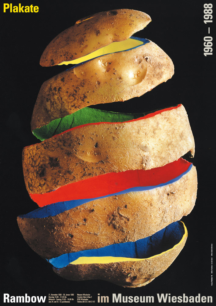
In Gunter Rambow potato series poster, each picture is to show the theme of potato, different is the treatment of potatoes. He peeled, twined, cut, colored, and piled up… There are some similarities between the different forms of composition, which is the combination of the potato profile and the color of the block in the composition. Contours and colors are the most expressive elements in a painting

Gunter Rambow said that Poetry, art and literature are what people can feel every day. It’s everywhere. People can find it as long as they look at it.His works fully reflect the fancy imagination of lanburger, and no one will think that potatoes can split up and show the effect of space on the plane.


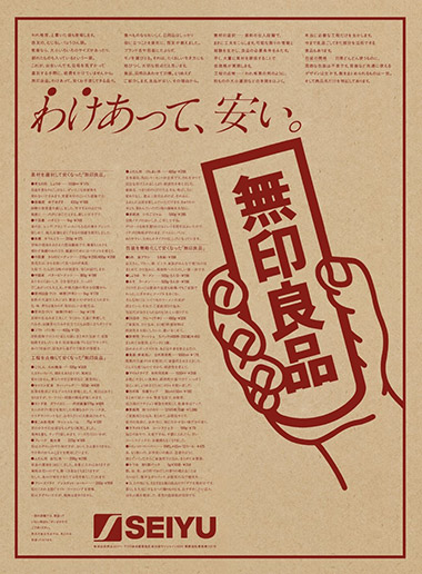
Ikko Tanaka designed the first advertisement for Muji, a poster printed on a kraft paper, and the branded hue of Muji. The first impression of customers is important to a brand. He used a typical picture in Japanese historical dramas, which emphasized the “right conclusion”. It was illustrated holding a brand sign with emphasis on Muji. He held the idea of simplicity and neat created a new aesthetic form. Moreover, He protruded a specific thing in the advertising picture to introduce the idea and guide people to read more information on the poster.


References

http://milkbottle.today/wp-content/uploads/2016/04/chanel-2013.05.07_Paris_No_5_Culture_Chanel_0674_HI-RES-1.jpg


http://www.gunter-rambow.com/Poster/80er/1988_06_Wiesbaden1.jpg


http://www.muji.com/img/flagship/huaihai755/archive/koike_img02.jpg


Week 7: Publish or perish

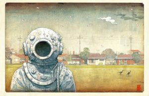
Image Source: [The Visitor by Shaun Tan – Tales from Outer Suburbia ]

This Illustration is for his award winning of-the-walls story book, and I think this shows exactly why. The unusual combination of familiar elements, ie an astronaut and a suburban environment creates a sense of heightened reality to suggest that this is a metaphor as opposed to literal. He uses almost a childlike and storybook style to tell more mature tales, in which I interpret as a sense of solitude and not belonging. He uses a range of colours in a ashy discoloured way that suggests a passing of time, which resembles a 1950’s futurism poster, or perhaps an old children’s novel with the former child owner now grown up, with their former creative mind tarnished?

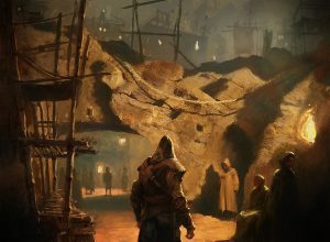
Image Source: Gilles Beloeil [Assassin’s Creed II artbook]

This is a concept art for the game franchise Assassin’s Creed, however unlike other concept art, this is painted in a traditional medium: oil, and the composition resembles that of a Romantic Era painting of an occurring scene. The artist create a sense of realism by choosing to go with a realistic style, but at the same time creating a sense of mystery and wonder by using a singular ashy colour scheme and the play with light and dark. The painting style is reflective of the time setting of the actual scene which allows the viewer to be drawn in to the alternate reality. The plotting of character’s location and position creates a narrative and serves it’s purpose of potential story telling.


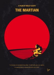
Image Source: Re-imagination of The Martian movie poster by ChungKong Art

I like this poster design because it is a minimalist depiction of The Martian poster. It doesn’t require much graphics to reveal the main plot of the movie. The use of the bright circle both represent the colour and shape of Mars and the lens of a telescope, also the emotional struggle the protagonist is going through. The abundance of space in the frame and the character’s position suggests a sense of solitude and sadness, which is a perfect depiction of the theme of the movie. I really like how the artist use one aspect of the poster to convey multiple ideas and messages instead of making a complex image. This method also adds focus and to the main subject of the film, at the same time still being aesthetically pleasing; this required intricate planning of the poster’s layout.

publish or perish

Starting off strong with one of my first and favourite ever graphic novels Batman: Hush. It was published Image result for batman hushissue by issue from December 2002 to November 2003. The award winning story was written by Jeph Loeb and brought to life by the amazing pencil work of Jim Lee which was then inked by Scott Williams and finally coloured by Alex Sinclair. Jim Lee alone is one of my favourite comic book artists with his amazing renditions of the characters. Besides the beautiful artwork the story and narrative is gripping throughout the entire novel with intense action sequences and compelling backstories to lesser known characters. Also the way the Williams has introduced so many characters into  the plot with out it seaming like to much each having just the right amount to make them relevant to the continuation of the story. To prove my point further here is one of the first lines in IGN’s review  “there are books that offer significant changes in the status quo, good or bad. In either case, fans are certain to go absolutely f—— nuts. That’s what happened when fan-fave writer Jeph Loeb teamed with Jim Lee for the year-long “Hush” storyline. It didn’t just alter the status quo, it destroyed it.”


Image result for avengers infinity war magazine cover


next on my publication list is the more recent Avengers Infinity war covers to well know magazine Vanity Fair. these covers were published in late November of this year in order to further hype the already massively anticipated 2018 release of the movie. Vanity Fair writes about how marvels decade long story is coming into its final chapters with Infinity war. they interview many of the actors from the MCU one being The Hulk played by Mark Ruffalo who said to Vanity Fair “All good things must come to an end.”


Image result for posters 2017


And finally moving away from the comic theme slightly and into the realm of popular television show we have the second season of the smash hit Netflix original Stranger Things. This latest addition to the Duffer brothers show was another hit and a great addition. Both seasons are jam packed full of pop culture references to the era that its set in. That era being the 80’s. The second season scored an impressive 94% on rotten tomatoes                         ” Stranger Things‘ slow-building sophomore season balances moments of humor and a nostalgic sweetness against a growing horror that’s all the more effective thanks to the show’s full-bodied characters and evocative tone.”


Article title: Batman: Hush Review – IGN
Website title: IGN
URL: http://uk.ign.com/articles/2005/06/16/batman-hush-review
Author Joanna Robinson
Article title: Avengers, Assembled: Feast Your Eyes on All Four of Vanity Fair’s Marvel Covers
Website title: HWD
URL: https://www.vanityfair.com/hollywood/2017/11/all-four-vanity-fair-marvel-covers
Website title: Rottentomatoes.com
URL: https://www.rottentomatoes.com/tv/stranger_things/s02/

postmodernism condition


Postmodernism was a movement that was born as a response to modernism. Modernism was a movement that was born as a response to industrialisation. Modernism let to great achievements but world war one happened as well as the invention of the nuclear bomb and all of this led to realisation that those same institutions we trusted would progress us into the future are lust as likely to destroy us.Postmodernism is direct response to modernism, its does not replace modernism but it does question everything from the concepts of truth, logic, and were adopted the enlightenment era.


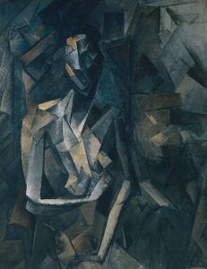
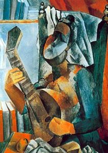
Modernism had failed or at least that’s what the postmodernists believed. Modernists had spent much of the 20th century trying to forge a better world inspirited by the science and universal truths. To them less was more. The postmodernists less were a bore. They believed we needed as many references as possible to demine our own individual subjective conclusion. Picasso created one off masterpieces based upon predetermined principals of art. His creation rocked the art world, but postmodernist wasn’t impressed. They believed in more than one method or style. Collage, chance, anarchy, repetition. These were infinitely more interesting. Postmodernists wanted to challenge audiences and force them to ask questions. Postmodern buildings rallied against the blandness that had gone before.

postmodernism had its critics, objecting to unnecessary ornamentation. An obsessive tendency to recycle the past to make something new and often just plain silliness. The rise of mass media really helped postmodernism take off. The world was interconnected like never before. For many postmodernism was liberating giving creative expression a dynamic, often unsettling vice. Postmodernist cinema still confuses, surprise and delights us. Postmodernist performers still bemuse us and we just can’t seem to get enough quirky postmodern art. Politically, philosophically, creatively- the postmodern movement has proven itself a force to be reckoned with. Like a giant social cattle prod compelling society to question why things are the way the are, and why they aren’t.

Reference

https://en.wikipedia.org/wiki/Postmodernism

postmodernism collage


Counter Culture


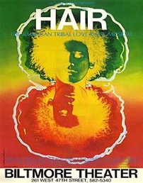
The first counter culture image I chose is the original Broadway poster of the Biltmore theater for The American Tribal Love-Rock Musical- Hair, it is a product of the hippie counterculture and sexual revolution of the late 1960s, several of its songs became anthems of the anti-Vietnam War peace movement. Visually this poster, looks very creative and appealing. The combination of colors totally brings out the spirit of the theme behind the poster which is to promote the musical.


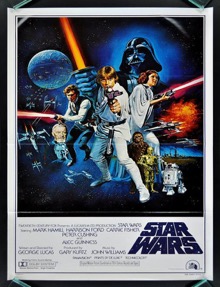
The second poster I chose is the official poster of Star Wars, we can call the posters of Star Wars “a visual history” because there were around eight posters created for the movie in the 1970’s itself, but this is the one which was admired by most of the people. From the placement of the Star Wars logo to the visually appealing background, everything in this poster seems to be perfect. Even in terms of visual mapping, it follows the correct pattern as the visual mapping starts from the upper left corner and ends smoothly to the bottom right. In terms of the colors used in the poster, they totally balance with the theme of the movie and the character placement is also done properly. My field of study being Graphic Design, I am inspired by this design and the fact that this was created in 1970’s as the design approach used in this poster is still used by a lot of designers.


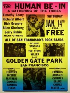
The third image I chose has more of a typographic approach of design, and that is one of my favorite type of design. This poster has different types of fonts and text sizes. The placement of the text is also done in different ways. The main heading that has the text- “The Human Be-In” doesn’t really seem to be placed properly, because visually “the” doesn’t look like a part of the heading. The use of leading in the upper half of the poster seems to be more appealing in terms of designing than the lower half. The background color selection gives the poster a refined look.


https://pin.it/scikxgbn6pr4ic

https://pin.it/5whlu3fprjeach

http://www.vintag.es/2013/01/star-wars-theatrical-posters-around.html

https://en.wikipedia.org/wiki/Hair_(musical)


Task 5

The artworks of the counter culture developed more from the 1960s to the 1970s. Sometimes they are called underground publications because those comics and magazines can get in the psychedelic stores which sale goods such as marbles, cigarettes, tie dyed fabric and books.


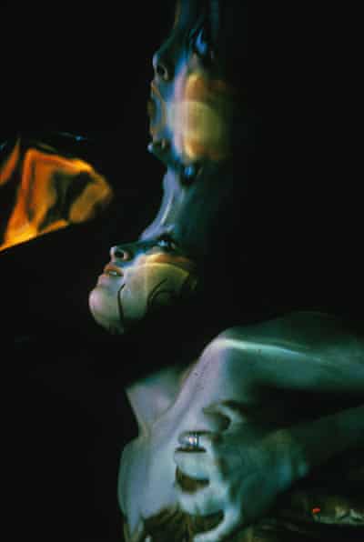
Mylar Chamber image used by Life magazine, 26 December 1969, in its special issue to mark the end of the 1960s. The image illustrated a section on drugs which stated that ‘few came as close to explaining the euphoric distortions of hallucinogenics’ as Cohen. I am interests in the light and shadow in this photo, and combining the color, it really looks like a hallucination. It seemed to express the freedom, the self-indulgences and relevant to one of the core spirit of  the counter culture. Similarly to Dickens, it could be said that counterculture of the 1960s marks for some the best and the worst of times at the same time.


The second image is the cover of an album called Cheap Thrills which is one of the famous work related to the counter culture. It published in 1968. The cover was drawn by underground cartoonist Robert Crumb. Using comic form as a cover is clever, because the readable of characteristics is easy to pass message and information. In at least one early edition, the words “HARRY KRISHNA! (D. GETZ)” are faintly visible in the word balloon of the turbaned man, apparently referring to a track that was dropped from the final sequence. The words “ART: R. CRUMB” replace them. A variation of the title on the cover is used as the logo for the Cheap Thrills record label, owned by British DJ Hervé.


The third image I chose from Oz (No.3 May 1967) which is a successful underground magazine. It is 3 page Martin Sharp foldout What Beautiful Eyes She Has with Revlon Invents Wet Lipstick on the reverse. The color of the poster is the typical of that period, bright, vivid,making a sense of psychedelic.


According to Musgrove (1974), the counter culture expresses the dissatisfaction with the prevailing culture or social system, and influences the way of life through the impact of cultural shock, so as to make the system change. This is the meaning and value of that period.


References

Musgrove, F., 1974. Ecstasy and holiness: Counter culture and the open society (Vol. 530). Taylor & Francis.


Images


https://i.guim.co.uk/img/static/sys-images/Guardian/Pix/pictures/2011/5/12/1305210097754/Ira-Cohen-2-001.jpg?w=880&q=20&auto=format&usm=12&fit=max&dpr=2&s=6da


https://upload.wikimedia.org/wikipedia/en/9/9e/Cheapthrills.jpeg


http://ro.uow.edu.au/cgi/viewcontent.cgi?filename=0&article=1002&context=ozlondon&type=additional