Category Archives: Graphic Arts

This Category should be selected if you are a Graphics Arts student.

publish or perish

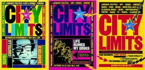
These poster was created by David King. He was a British designer, writer and historian of graphic design who. From this collection, he created a series of revelatory books unfolding the history of the Russian Revelatory, and its associated art and propaganda. He developed a special interest in Leaon Trostsky and the Subsequent doctoring of revolutionary photos and record.

for the past three decades David King has moved deftly between roles as designer, photographer, editor, researcher and author. His graphic style ā€“ an easily recognisable mix of explosive sans serif typography, solid planes of vivid colour and emphatic rules ā€“ reworked for the New Left in Britain the graphic language of the Russian Constructivists.

King was born in 1943, and studied at the London School of Printing and Graphic Arts (now London College of Printing) under Robin Fior, who describes Kingā€™s approach as ā€˜compare and contrast as a political stanceā€™.


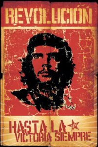
Cuber poster is the popular art form in Cuba following the Cuban Revolution, when the government sponsored some 10,000 public posters on a fascinating range of cultural, social, and political themes.

Alberto Korda was the official photographer of Fidel Castro. His photographs are known for their endurance. His most recognizable image of Che Guevara, titled ā€œGuerillero Heroicoā€, became a worldwide emblem of revolution and rebellion. After Cheā€™s death as martyr, this photograph was used in T-shirts and album covers and advertisers started using this image of Che to draw the attention of youth. But Alberto never made a penny from this renowned photograph. As a photographer, he always preferred to take photos in natural light. He, for the first time, used Cuban models to show off Cuban clothes. Earlier, he was more interested towards fashion photography. On account of the Cuban Revolution, the condition of the people living in poverty made him to change the subject of his photography. His photo ā€œLa Ninaā€ represents the stories of the poor. Kordaā€™s photographs served as the documentary of the entire Cuban revolution under the reign of Fidel Castro.

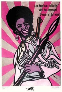
Emory Douglas was an integral part of the Black Panther Party, joining as minister of culture in 1967 and designing artwork that became potent symbols of the movement. Although the party ceased to function from 1980, its legacy goes on, as does Douglas’s work in an exhibition at Urbis, Manchester.

ReferenceĀ 

https://en.wikipedia.org/wiki/David_King_(graphic_designer)


http://www.eyemagazine.com/feature/article/repuations-david-king


http://gilburtandpaul.co.uk/index.php/2016/05/12/spoilt-for-choice-londons-listings-mags-in-the-early-1980s/


Task 6- Post Modernism


Postmoderism was born as a reaction against moderism. While moderism focused on technique, form, and realism, post modern art focuses on the subjects and the message it’s trying to tell. It introduced a era of freedom within art. One of the post modern art movements that stands out to me is surrealism, for these reasons. In my own interests surrealism seems to be a reoccurring theme so that’s what I focused my research on.

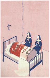
The first image is an illustration by Emiliano Ponzi, titled “The Death of Postmodernism”. I think the title speaks for itself- the literal death of a Campbells Soup can, one of the most famous pieces of postmodern art. I think the imagery of the two nuns praying over it is effective, and the style in which the illustration was drawn is very similar to pop art, so the whole image is consistent and the soup can doesn’t feel out of place. I also like how Ponzi kept the rest of the colours very simple and pale, so the red and white of the can stands out in the illustration. What stands out to me from this illustration is that its self aware.

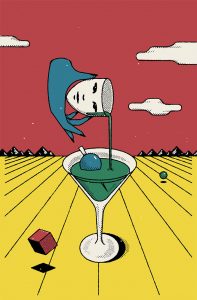
The second image also fits in with the pop art style. The illustration was used to advertise a new bar, and feature dreamlike scenarios together- reminiscent of the surrealism movement. Because of my interest in surrealism this image appeals to me, and I especially like the imagery and colour scheme; the colours contrast against each other really well and I like the whole hyperreality aspect.

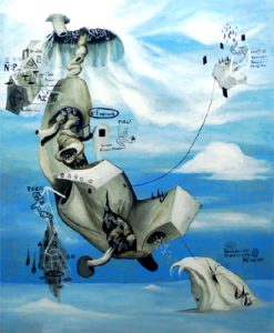
The third artist is Ian Quirante, who also works in surrealism. He shows different forms and shapes in his paintings, and cartoon figures that reflect his psychological state. Each of his paintings tell a story; you need to look for all the little hidden details to fully understand what he’s trying to communicate. His work reminds me of Picasso and cubism because of the shapes and simplified forms. Like Haddad, his work also features a hypereality aspect, however Quirante’s style is a lot more realistic than the other two images, since he works in oil paint, and not screenprinting.

Ponzi. E, 2011, The Death Of Postmoderism, [image] Available at <https://www.emilianoponzi.com/portfolio/death-of-postmodernism/>

Haddad. M,2017, Unnamed, [image] Available atĀ  <https://www.itsnicethat.com/articles/michael-haddad-illustration-240817>

Quirante. I, 2009, Unnamed, [image] Available at <http://www.artesdelasfilipinas.com/archives/75/ian-quirante-a-postmodern-artist>

Week 7 – Reviewing

Over the last six blogs I have been testing out different methods of researching and seeing what works for me. I feel that the best method I can use for researching is finding a source, reading it, then recording my findings. I am not sure that it is helpful to me to watch really long videos in a lecture room about something I am not interested in, however as I am entering the graphic design world I do know I need to get used to doing this. I feel that I need to be better at watching a video and taking facts from that and recording as I get too distracted by what is going on, on the screens rather than in the video and finding facts.

I have learnt how to summarise a method and research piece at the end rather than leaving it on a whim and not explaining myself fully so that I do not need to go back to it and try to catch up. Using references was new to me but I found this part a little helpful as I could go back to my sources and double check my information I had retrieved was correct.

Overall, I found the past 7 weeks interesting and helpful with my skills in researching and communicating information and feel it would be interesting to take it further and push myself so that I was able to improve these skills.

Task 7- Publish or Perish

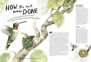
The first illustration by made by Byron Eggenschwiler, and published in a magazine called Cottage Life. The message is an educational one- the illustration accompanies an article about birds and how they made their nests.Ā  The illustration, I think painted in watercolour, really draws the viewers eyes in, and the double page spread catches your eye when you’re reading it. I think the colour scheme is effective; the range of pale greens and browns is cohesive and is pleasant to look at, as bright colours would just be overwhelming.

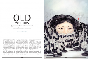
The second illustration was published in fine art magazine calledĀ Maisonneuve, and by an artist called Selena Wong. Her piece “OId Wounds” won gold in the lllustration category. I’m not sure what style her illustration would fall into- it has aspects of surrealism and pop surrealism, but I think her imagery is very effective. The story behind the piece is to show the struggles of aboriginal woman with domestic abuse, and the woman’s hair being twisted around the trees shows the message of being trapped, with only half of her face showing like she’s hiding. At first I didn’t understand what the illustration was trying to show, but when I read the article I suddenly understood all the details in the painting. I think it’s a very powerful image.

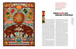
The third and final illustration is by Christian Northeast, published in Global Brief,Ā an affairs magazine. The piece is titled “India does go grand strategy” and is screenprinted. What stands out to me about this illustration is the aesthetic and the overall look of it, it reminds me of an old circus poster. I can see how this links in with the content of the article- elephants and tigers are animals found in India, however I think if he included some mandala patterns the link would be more obvious. To be honest I think the illustration doesn’t go well with the message- the colours look dirty and muted, whereas Indian culture is very colourful and vibrant. However I didn’t really understand the article, so maybe that’s why I can’t appreciate the little details in the illustration.

Eggenschwiler. B, 2015, How The Nest Was Done, Published in Cottage Life Magazine, Available < atĀ  <https://blog.magazine-awards.com/2014/05/15/top-10-canadian-magazine-illustrations/>

Wong. S, 2016, Old Wounds, Published in Maisonneuve Magazine, Available at <Ā https://blog.magazine-awards.com/2014/05/15/top-10-canadian-magazine-illustrations/>

Northeast. C, 2016, India does go grand strategy, Published in Global Brief.Ā  Available at <https://blog.magazine-awards.com/2014/05/15/top-10-canadian-magazine-illustrations/>


Week 6 – Postmodern Images

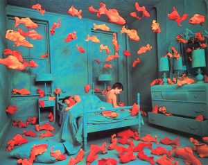
This postmodern photograph shows a surreal image of goldfish in a room with a boy. This is showing an image which is clearly not real. By deconstructing different elements from different walks of life and merging them together you are able to revealĀ a new image. The gold fish are in a way in their own environment because the blue tones in the photograph have connotations and are revealing a presence of water in there. However there is a boy in the photograph too. He is also feeling like he is in his own environment because in the blue tones there is the first bedroom which obviously belongs to him. This shows that together both focuses of the photograph are showing they are in their own environments but its made to be surreal and merged together.

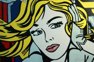
This postmodern image is an illustration in the style of a pop art image. This is a contemporary image and shows it is living in the present. The colours are not so vibrant in this image, theĀ only part of the image is the yellow that is standing out and drawing your eyes in. The background is quite boring and not revealing much about the image.

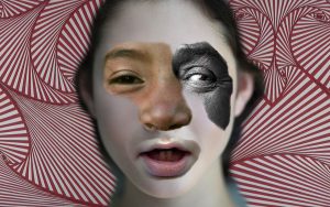
This postmodern image is a mismatch of photography, collage, and editing. I think this image is quite a conversation starter, rather an odd piece if I am honest but a complete contrast to my previous images. This image is very contemporary and modern in society these days as mismatch art is quite on trend. I think the colours in this image do not show it in its best light because they do not complement each other. The picture has quite an ugly outlook to be honest.

To summarise I do not feel a connection with these images and I do not feel that they tell an amazing story. I feel if you are trying to make a contemporary image they are a little odd and out there. The feelings and messages these images send me are a little muddled, the only image I feel tells a story and connects with me isĀ the first one.

References: https://www.bing.com/images/search?view=detailV2&ccid=zPSscIUm&id=F53F5700EB269ECFABF9DE8D06603E929661FAD6&thid=OIP.zPSscIUmpVgaEsNHWZRuKgEsDt&q=postmodern+photography&simid=608008117942749220&selectedIndex=0&ajaxhist=0

https://www.bing.com/images/search?view=detailV2&ccid=5Zpwrzgz&id=5EABA75DDC2ECAB564154E59880DC845DCF25643&thid=OIP.5ZpwrzgzuvuxGPqsSsRtowEsDH&q=Postmodern+Art&simid=608054967434742708&selectedIndex=0&ajaxhist=0

https://www.bing.com/images/search?view=detailV2&ccid=8xeIsr7h&id=2A1AB1389231A11C7A3DA3A88CA39C73238B72DF&thid=OIP.8xeIsr7hlQPeUU-ACqq-tAEsC7&q=postmodern+photography&simid=607996697641878044&selectedIndex=2&ajaxhist=0z

Publish or Perish


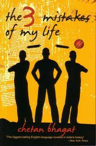
The first image I chose is one of the best-selling novel in India called- The three mistakes of my life, the story revolves around three friends whose characters are young, ambitious and passionate and have the same moral, social and religious dilemmas as many of the young Indians today. The poster of this novel totally resembles the plot of the novel as itā€™s cover shows the silhouette image of the three main characters in the novel. In this poster, I like how snippets of the text from the story has been used in a poster, which is giving the poster a very refined look. The placement of text in the bottom is also very balanced with the entire poster. The incorporation of the ball in the poster however seems to be unnecessary. The background is very bright and soothing. Due to the balanced combination of typography in the background, colour selection and character placement the poster of this novel looks very balanced and appealing.


The second poster I chose is a billboard advertisement of Tim Hortonā€™s, which is the most famous coffee brand in Canada, and after brands like Google, Apple, Microsoft, Facebook, YouTube, Visa and Walmart, Tim Hortonā€™s is the eighth most influential brand in Canada. This advertisement clearly shows the reasons why it is the one of the most loved brands in Canada. This poster is a good example of promoting the brand over the audience, as it shows the actual reasons along with a percentage, which proves how influential this brand is. I love the colours used in this advertisement, these are similar to the coffee cup, bags and even the stores of Tim Hortons which use ā€œredā€ as their main theme colour.


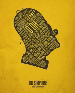
The third image is a minimalist poster of the main character of The Simpsons show- Homer Simpson, this poster uses typography to display the phrases that Homer Simpsons uses the most. I like how the creator was able to use all the famous phrases of Homer and combined them inside the minimalistic portrait of him. The poster has a very appealing look.


http://www.livemint.com/Consumer/jMIN1mn63tv6qMnzzR0ASJ/Book-review–The-3-mistakes-of-my-life.html

http://marketingmag.ca/brands/the-10-most-influential-brands-in-canada-ipsos-165968/

http://www.brainerddispatch.com/sites/default/files/styles/16x9_860/public/fieldimages/42/0929/0b7rw7divrmlxam14a2pusersvwm.jpg?itok=mggT_DpN

https://pin.it/sm4wixvwlextwr

https://pin.it/wvmkyflxvf55hi

summary of rcs

To be completely honest I can say I didn’t enjoy this at the beginning I found the researching tedious and in some cases irrelevant. I have never been the biggest writer so it was quite difficult to get into as well. Some weeks were definitely easier than others as I found the topics more interesting therefore it was easier to express my views and opinionsĀ and I feel this will be evident in my previous posts.

One of my least favourite is most likely evident as the Authenticity post. I did not enjoy this one at all it dragged out and was extremely boring to research. And as admittedly I don’t have the longest attention span this one was hard to complete.

On a more positive noteĀ one of my favourite posts would have to be the Publish or Perish. I enjoyed this one I’m not 100% sure I done it right but nether theĀ less it was interesting to me to look at and express my opinions on some very interesting pieces of published media especially when I spoke about the comic ‘Batman: Hush’. I was able to speak about this with fondness as I very much enjoy the book.

Image result for martin luther kingThe Publish or Perish lecture was also one of my favourites for another reason. I found the section on Dr. Martin Luther King and Malcom X extremely interesting as I have looked into this a little myself and it was very insightful into the black history in America. This is a topic I find engaging as a young black man myself this relates to my history also.

Overall I did like the way we explored into each of the pathways throughout the course of the lectures. They are not all going to apply to me but I did get the much needed insight in order to help me make a decision for which I am going to choose. I do feel like the lectures were a bit too long on some days though. I feel as though there wasn’t enough information given to justify two hours of lecture. Especially withĀ the Netflix show ‘Abstract: the art of Design’ don’t get me wrong I enjoyed watching the show but on occasion it wasn’t completely relevant andĀ sections could of easily been skipped.

My personal take aways from the research and communication lectures are the ability to reference. I have never used this form of referencing before so it was a change but I see its importance to see where the information has been sourced from. Also the ability to find these sources that give valid information that I need. I will definitely be using these skills to improve my research in future projects making sure to use correct referencing.

Website title: Upload.wikimedia.org
URL: https://upload.wikimedia.org/wikipedia/commons/8/84/Martin_Luther_King_Jr_NYWTS.jpg

Summary

Research and Communications has shown me a variety of different aspects of all four pathways, whilst incorporating interesting and pivotal aspects of modern design and art history. Not only this, but to delve into the aspects of different art movements, and to see how artists of the time used art to respond to propaganda from war or to express their political views was eye-opening.
Because of the research and knowledge that has accumulated over the last few months, it has allowed me to further stretch my interests of different designers,illustrators and art movements within the design industry world, and how they have also influenced those working in the present day.

I previously already had an interest in illustration, being particularly interested and drawn to designers such as John M Mackay, who I further researched and analysed within week 2. This project was wholly in my comfort zone, because I was faithfully writing about artists who I had previously touched upon during my a levels.
Within week 5, when looking at counter culture, I became very interested in the prints of Hapshash and the Coloured Coat. The colour schemes in which the collaboration used to create psychedelic pieces was intriguing. I found how they used metallic inks within their work to add a sense of depth and beauty to their work an interesting concept. I thought this could be quite interesting within my already 70s themed zine. I felt that the incorporated or even inspiration of Hapshashā€™s colour schemes and use of repetitive patterns would really emphasise how my illustrations were meant to have a 70s look and feel to them. I thought adding touching of metallic gold to the front cover of the zine could look interesting, as well as using loose movement in shapes to fill my backgrounds, adding a slightly peculiar look to the whole product.

Not only did Hapshash influence my illustration rotation, but I began to edit my photography in a particular way that uses a limited colour scheme and shapes to reconstruct a portrait using two colours and black. I chose carefully what colours I wanted to use because one portrait in particular, a key element to the piece of work was a bleeding nose, which I did not want to be lost within the block black. When looking at how colour and particular shapes can represent and communicate to the viewer a particular emotion or viewpoint within post-modernism, I remembered how Basquiat and Haring used colours and basic shapes to connote to the audience a message. Within Basquiatā€™s work he used limited primary colours to draw the viewer into the central part of his King Alphonso piece. I did the same by using red to represent the blood.

Overall, research and communications has helped me develop furthermore as a designer because I have been opened up to new movements within the art world, and how they have influenced design in the present day to connote and communicate messages in simplistic ways.

Publish or Perish!

For Lazy Oafā€™sā€™14 summer and magazine launch party, this image was created for the front cover, as well as to be used as a poster to advertise the event.
The aesthetic created for the magazine was deliberately in the same vain as their clothing which has very strong illustrative look to them; for example the shirt the model wears has the same shapes on it that the brandā€™s logo which is being used as a masthead. The sleek and muted colour scheme which consists of a strong pink and blue to it runs throughout the photograph, from the background, to the shirt and even the washed-out muted colour of the modelsā€™ skin, this appeals to their target audience, meaning if you connected with the ad, youā€™d want to buy their product.

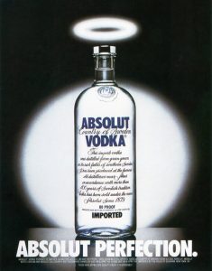
Absolut vodka ran a series of interesting adverts from 1980 till the early 2000s depicting their drink in different scenes.

The ads were created by the New York City Agency, and used no photoshop through the campaign.
The campaign incorporated the brandā€™s name into each of the different ads. What I liked about the ā€˜PERFECTIONā€™ ad,was the lighting was used to create angelic lighting to create a halo which also really ties into the colourscheme, because theres its quite monotone, meaning you’re drawn more into the brandā€™s name on the bottle and the anchoring text.

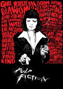
Illustrator Peter Strain creates original artworks that- in a sense- advertise films. I found his Pulp Fiction piece interesting because he used one illustration of Uma Thurman in black and white, whilst flooding the background. This helps Strain tell a story ā€œthrough a single image (which)is important (to me) and mixing in typography allows (him) to do thatā€

I also found it quite interesting how heā€™s used the reference to Thurmanā€™s misuse of drugs within the film.


Your eye is drawn to what she is doing,because sheā€™s looking down at the table, and as you follow her hands down you can see she’s cutting out the letters of the film in cocaine- this was a clever way to communicate to the audience the film title.


Lazy Oaf Launch and Magazine Cover,

https://www.lazyoaf.com/blogs/story/lazy-oaf-ss14-magazine-launch

Absolut Advertisement:

https://www.buzzfeed.com/copyranter/the-best-of-the-great-absolut-ads?utm_term=.hv1Qg2rpr#.iyomwgKMK

Peter Strain, Pulp Fiction:

http://www.peterstrain.co.uk/ADMIT-ONE-FILM-POSTER-EXHIBITION

Coles, M (2014), Interview: Peter Strain

QUOTE STRAIN: http://www.peopleofprint.com/general/interview-peter-strain/

Postmodernism

Postmodernism essentially contradicts and challenges all aspects of modernism. The artwork created by postmodern artists opposes the ā€œmodernismā€™s utopian visions, which had been based on clarity and simplicity.ā€


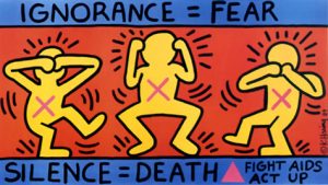
Keith Haringā€™s ignorance=fear was created to promote awareness of AIDS,


for the activist group, AIDS Coalition to Unleash Power. The three figures represent ā€œsee,hear and speak no evilā€ to show how people refused to acknowledge those who suffered with AIDS.

The use of bold shapes and primary colours creates a visually interesting style of pop art that is prominent to Haringā€™s work that makes everything very simple, due to the fact you’re not distracted by anything within the piece. The bodies created by simple shapes,clearly show what the figures are doing. This makes you question what the campaign is about because you assume due to its simplicity its aimed at children, when the actual reason promotes a very serious topic, that was coming out as a near epidemic for the time period.

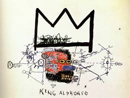
Basquiatā€™s ā€œKing Alphonsoā€ really interested me, once again, because of itā€™s limited colourscheme. The use of purely primary colours mixed with child-like fluidity to the drawings really drew me in. I found it interesting how Basquiat used colour only in the centre of the piece of work, which your eye is after you see the huge signature crown in which has become essentially a signature for Basquiat, which is seen as a sign for greatness, ā€˜Even if no one else sees it, heā€™s a king in his own right.ā€™
I like how the disorderly scribbles in which produce a mind map that sit underneath the crown, they sort of connote how Basquiat knows post-modernism is going to be a
crucial movement within art.

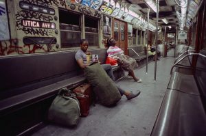
Jamal Shabazzā€™s Back to the World beautifully documents the subway in quite a contradictory way. Though what is being photographed isn’t seen to be beautiful, the way in which Shabazz captures those going about their daily life in an rough area, ā€œItā€™s an interesting mashup of the elegance of humanity in spite of the decay of the city and those photographs had a warm, yellowy, upbeat quality to them.ā€


Jamel Shabazz,back to the world,1980
http://www.jamelshabazz.com Ā -Young, B

http://www.vam.ac.uk/content/articles/p/postmodernism/


Keith Haring, Ignorance=Fear, 1989

Ignorance = Fear


Basquiat King Alphonso,1983

http://aloversanthology.com/king-alphonso/