Category Archives: Fine Art

This Category should be selected if you are a Fine Art student.

summary

Through these modules I found all of the lectures and tasks basically are very interesting and useful and although one of them I did not enjoy, they were beneficial in the end.

Through task 1/2 Online Resources I know many different ways to search online resources, a variety of different sites, as well as contact a lot of different areas of the website, also expanded my aspect of knowledge.

Through task 3/4 Academic integrity, I understand academic integrity deeply and further how important are these rules, because these laws can protect academic copyright for people.

Through task5/6 Visual research, I have deepened the understanding of the visual and aesthetic feeling, has boosted its taste.

Through task7/8 Reflective writing, I read the fashion media chapter, know the origin of the magazine and why is it important to magazine, also know about the history and development of clothing, the relationship between art and fashion, the relationship between fashion and clothing.

Through task 9/10 Ethics, I know, the importance of ethics, equality between men and women.Big brands and small gap is how to control the balance between the ethics.Some brands use sex to promote their own brands or clothing, has violated the ethics.

. I looked at a number of different sources, but I found I was looking in the wrong places.

In the end, I think that the module in the aspect of learning or in the arts are of great help to me, and help us to understand art, also can help me learn English, through the way of writing an article helps me greatly improved my English level, I enjoy it very much

Task 12

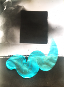
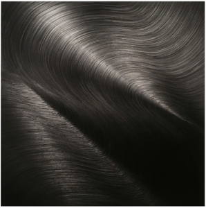
Tempest Tossed (2017) is a 48×48 inch painting by James Austin Murray. By using just Ivory black oil paint on canvas and a large, handmade, squeegee-like brush tool, he creates huge swirling marks. Echoing the practice of Gerhard Richter and James Nares, his work is an exploration in process, light and material. He also makes prints with this surface, changing movements on the canvas and recording the relief onto linen. In terms of making this in a smaller scale, I would choose a 4×4 inch or smaller piece of MDF/wood/canvas and use a small amount of oil paint. Black definitely works the best as it absorbs and reflects the most amount of light. I could either make myself my own paintbrush/tool with tiny bits of twig tied together (or use a toothbrush) to create marks in the paint. I would then take a piece of canvas linen to create the same relief prints. An advantage of this descaling would be that the item being painted is a lot more tangible and portable, so more repetitions can be made on that linen surface or any other surface for that matter. More choices. On the other hand, the issue with it being so small is the fact that it lacks the grandeur that Murray’s pieces exude. There is far less material used, therefore cheap to execute. A smaller scale also comes with a more experimental action than that of Murray’s huge, laborious movements/process.

task 9&10

I chosen the second image, American Apparel, when I first saw this image, I think it is not a good sample of advertisement. Firstly, I do not know what is this image want to present and the action of this girl was a little bit over. Secondly, ethical standard is a very important issue in the world, even some photographer could use this point to get much more attention from some people for sure. However, that is the reason why they could not be successful, there are many famous artists who are doing the same job in the world, because they knew what ethical standard is, so they can be called the artist.

  • For example, in this picture, he put a brand name in this women’s private parts, I think this is not art, contrary to morality, even is a kind of discrimination against women, maybe he was just a sock advertising, but in this world there are many different ways to promote the brand, this way propaganda I feel a bit too over. This image is full of sexual connotation, you can see that a girl is lying on the bed and her legs are very suggestive of sex. This kind of background also can make the person to extrapolate

Sex sells is not all bad, for example, we can use this to get a lot of attention to the traffic, even if you can make good use of this point can also help people understand what is sex. like a lot of luxury brands in advertising, their choice of models is often very good stature, because they are professional, so they can not only attract the attention of people can also tell people the importance of having a good body figure.

But some brands use a lot of sex suggestive pictures and actions, and even let some children put out some unhealthy movements, which is very incorrect.


  • Art is freedom, everything is freedom. I don’t deny it, but everything should be rational. This type of advertising is seriously against ethics and is unacceptable. As one of the largest North American clothing manufacturers and marketers, this is a very wrong method, even can be called an unsuccessful advertisement.

Task 11

My blog posts have been a useful exploration and introduction into some art theories, movements, artists and essays that I wouldn’t of otherwise thought about looking at before to support my work. This has been a weekly enriching task for me, exercising my research and organisation skills.
A task that I found useful in particular was task 5, writing about a piece of artwork I had seen in person. It was enjoyable writing about my favourite piece of artwork and arguing about the importance of seeing a piece of artwork ‘in the flesh’. I always find that writing about artists and issues is always good practice, which I enjoy. One thing that I struggled with in these blog tasks was the fact I was getting distracted while researching some elements, especially in task 7 comparing texts. I ended up looking at different concepts and artists that came to rise in the 70s. Getting distracted is a blessing and a curse, as on the one hand it’s fun to lose myself in something I’m interested in for a minute, but everything ends up taking a lot longer than planned.

task 7&8

<Taste, fashion and the French fashion magazine> is the article I chosen to read.

In the first paragraph, I knew that the fashion magazine was originated in France in seventeenth Century, the role of the magazine is not only to record the process of fashion and the development of art, but also to promote the development of fashion.

In the next paragraph, I knew how does the fashion magazine appear (1627) and what form it appears. And then, in the years of 1768, fashion magazine got the official publication and the “taste” of fashion come out.


How to prove this thing is art or fashion, the problem began to be discussed, after a lot of experiments, that everyone has their own views on art, their taste, this is a very inspired me, everyone looks at each work has its own thoughts and opinions, because of this, the world is colorful, fashion is also various, in my opinion, different fashion together can be considered a real fashion.


Fashion magazines may not completely change the way people appreciate their beauty, but they can tell people how to dress, how to entertain, how to change some interior decorations, and tell people about their interests and customs. It also improves people’s fashion taste


Even in some art or paintings, there are also differences between fashion and clothing, such as Claude-Louis Desrais, Pierreomas LeClerc and Antoine Watteau “s grandnephew, Fran ois-Louis-Joseph Watteau (Morini 2006: C 32.), we can see in the illustration to the different class system of clothing is not the same, can tell the clothing tell the difference between people and history in the fashion clothing at the same time.

I really like this sentence, “Le Brun Tossa intended the concepts of fashion and taste to be regarded as fulïŹlling the same function: if fashion could be aligned with taste, it could also—very conveniently—be regarded as a form of art, and if fashion could indeed be regarded as a form of art, then it would also legitimately become the proper remit of the faculty of taste”.

Different types of clothes can present different culture and life style, people have the right to choose, fashion magazine could be one of the most influential way to spread.

Art and fashion are not conflict, fashion comes from art, and art comes from fashion.

So the transformation process of fashion magazine recorded the clothing style, also marks the transition to modern history, not only in fashion, of which there are many potential such as history, society, history, so I think the fashion magazine is a very meaningful product.

Task 10

Repetition
Reproduce
Swirl
Chance
Intention
Colour
Control
Aesthetic
Discussion
Abstract

My practice involves exploration of the physically/materiality of paint and the act of painting, which is why I used the words chance and intention, abstract. I also like the idea of collecting, and repeating, working with materials and results at hand, which is why I used the word repetition and reproduce. Colour, aesthetic and swirl describes my style of painting however intentional or unintentional I try, my work always takes on a playful, pretty aesthetic. I used the word discussion because I like to hear the discussion around one of my abstract pieces, I like reaction bad or good. I like to hear what thoughts and questions it brings up.

task 8

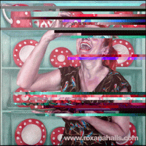
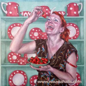
After being inspired by a lecture by Roxana Halls I decided to use her work for my appropriation task. The painting I chose to appropriate is called ‘Laughing While Eating Strawberries’ and was made in 2015 Oil on Linen. This portrait is of a women eating strawberries maniacally looking up at the food laughing. The painting has an obvious colour scheme of blue and red tones. Halls made this in disagreement to women who give up identity and people who think a women can only indulge in food once they look really pretty. She says that she envisions her paintings and what she wants them to look like before starting a piece. I find this to be an interesting concept as working from a mental image relates a lot to memory. As a play on this idea of memory. The method in which I chose to distort the image was to glitch it. This affected the colouring of the image in interesting ways I hadn’t preconceived, for example, exaggerating the blues into turquoise’s and reds into pinks and purples. The glitch also created horizontal lines of colour across the work contrasting against the naturalistic style of the painting and also making it impossible to see some of the painting. This is also symbolic of memory as sometimes we remember parts of a memory but not the full memory e.g. some things in memory are clearer than others.

Task 12


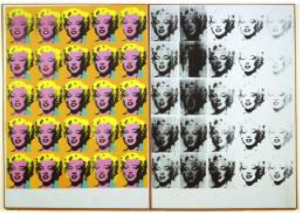
Andy Warhol

‘Marylin Diptych’

1962

Acrylic paint on canvas

2054 x 1448 x 20 mm each panel

Andy Warhols ‘Marylin Monroe’ works are incredibly well known, and it could be argued that they are the face of Pop Art. However, what some people do not know is the sheer scale of the work. More often than not, they are displayed with other very similar works (depicting Monroe), which only adds to the overall size. Warhol created the prints in the years following Monroes death, due to s a substance overdose, throughout Warhol’s work we can see two strong themes; death and the celebrity sect. Here we have an interesting union of the two, the repetition enhances the idea of over publicized and fame while the black fading signifies death. The strong colours and vibrant face on the left contrasts heavily with the distorted monochrome features on the right. If we take the space between the two as ‘death’ (and read from left to right) then the fading of the face could be suggesting that the world is going to forget Monroe. The scale of the work puts the themes right in the viewers face, to the extent of unavoidability. This again hints at the idea of fame, it is a large inescapable object that draws you in with its clean vibrant colours, and could almost be seen as advertising. So if we were to shrink the image down to a quarter of the size, 513.5 x 362 x 5 mm, we have a very different piece. We would still have the same themes of course, but we would look at them in a completely different light, firstly, and most obviously, it would be altogether subtler. The themes wouldn’t be screaming and shouting for attention. For me this is a large part of the work, so to take its size would in effect be taking its message.


Bibliography:

http://www.tate.org.uk/art/artworks/warhol-marilyn-diptych-t03093

Task 11: Summarise your blog and reflect on what you have learned from the process.

Writing this blog has played an essential role in my understanding of the wider context of art. It has stretched me and encouraged me to do extra research which does not directly link to my studio practice. I have found the tasks interesting and varied. The blog is a great opportunity to push myself to think more about what goes on in the world of art and in the past related to areas that I wouldn’t normally think to investigate. I have broadened my understanding of the history of art, of contemporary artists, of different art movements and institutions and of critical discussions surrounding art. I’ve been encouraged to consider different ways of making art outside of my usual practice and I think it has been a valuable addition to my art education.

Task 7

The Yale Lecture was developed by Richard Serra from notes after an abandoned sculpture project back in the mid-1980s, Slight Point. This lecture was given in the wake of a similar issue involving his work Tilted Arc. It was removed from the Federal Plaza in New York by a government agency and destroyed after it was deemed to be lacking in ‘aesthetic appeal’. It was debated widely after speculation of it being an ‘act of censorship’ and ‘suppression of speech’. Serra discusses his practice, inspired by the steel mines he worked in at the age of 17 to fund his studies. His site-specific work and its materiality/physicality speaks for itself, it is also heavily dependent on the social and political context in which the work will be/is placed. He believes that the works scale, size and location of the sculpture should be determined by the topography of the site. Compared to that of modernist sculpture, transportable and lacking context. Calling them ‘follies’, he humorously finds similarity in an iron deer on a front lawn, explaining that modernist sculpture is too commonly autonomous with its surroundings. Merely functioning ‘critically in relation to the language of its own medium’.

In an excerpt from Leo Steinberg’s Other Criteria, published in 1972, he discusses the subject of what he calls ‘The Flatbed Picture Plane’. The 70s is the decade that signified a huge shift within the art world. There was a strong sense of rebellion, and need for change. Contemporary Art is said to have started around this time. It was the decade of body art (Gutai), installation art, the conceptual, minimalism, performance art and the rise of feminist art after Linda Nochlin’s article Why have there been no Great Women Artists?, published in Art News in 1971. In one of the best essays on Robert Rauschenberg, Steinberg refers to the artist’s ‘Flat-bed picture plane’, borrowing the term from the flatbed printing press. He describes how Rauschenberg tacks pictures and material on a flat surface as one would with a bulletin board, and how people tack maps or horseshoes on the wall. He describes the flat bed picture plane as a ‘receptor surface’ in which objects are scattered. Steinberg also discusses how the picture plane is an upright, vertical surface that over a huge amount of time has survived even the biggest changes of art style (Willem DeKooning, Rothko etc.), still confronting the human posture, head at the top, foot at the bottom.

In terms of comparison of these two pieces, both explore the idea of change within their field. For instance, from what was said in Serra’s lecture, it is clear that his work embodies the change in which contemporary sculpture had created. It became much more conceptual, well within the context of the sculpture’s location whilst still celebrating its materiality. Steinberg also mentions Duchamp and his paintings in which flat, vertical picture plane becomes horizontal, a whole new viewing experience after the tradition of upright vertical surface lasted so long.
Harrison, C. and Wood, P. (2001) Art in theory, 1900-1990. Oxford, UK: Blackwell, pp. 948-953, 1124-1127