Category Archives: Fine Art

This Category should be selected if you are a Fine Art student.

Task 4.

Wade Guyton – Das New Yorker Atelier, Abridged. – Serpentine Gallery:

Das New Yorker Atelier, Abridged is a fascinating contemporary exhibition showing the modern world of technology and communication. It deals with the boundaries between the digital realm and our physical reality, as well as the speed and frequency with which we access, register and document information. The exhibition reminded me of Cildo Meireles’ Babel, 2001, at the Tate Modern. Similar ideas on modern technology, the overwhelming amount of communication we receive and how overbearing it can be on the mind.

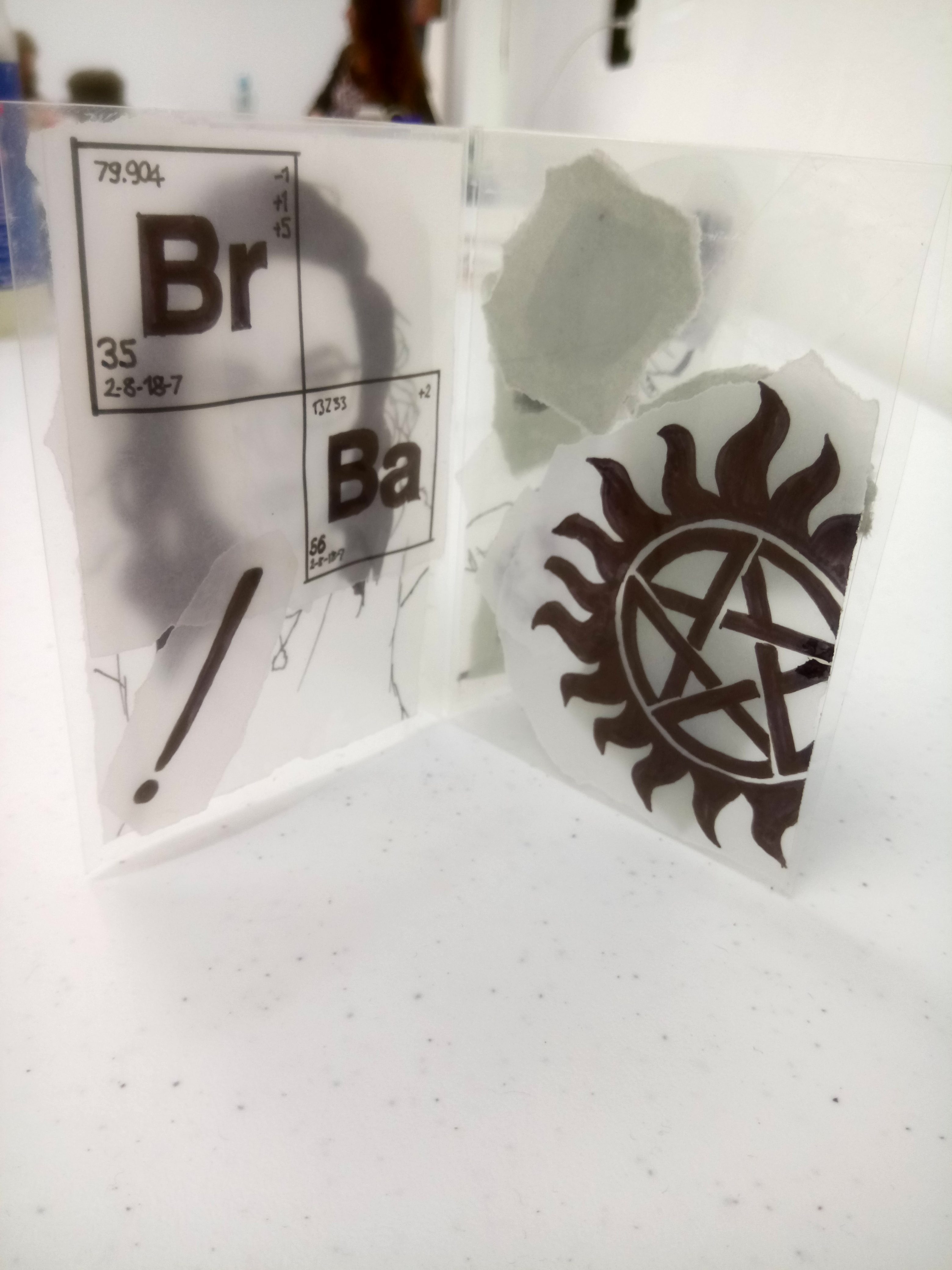
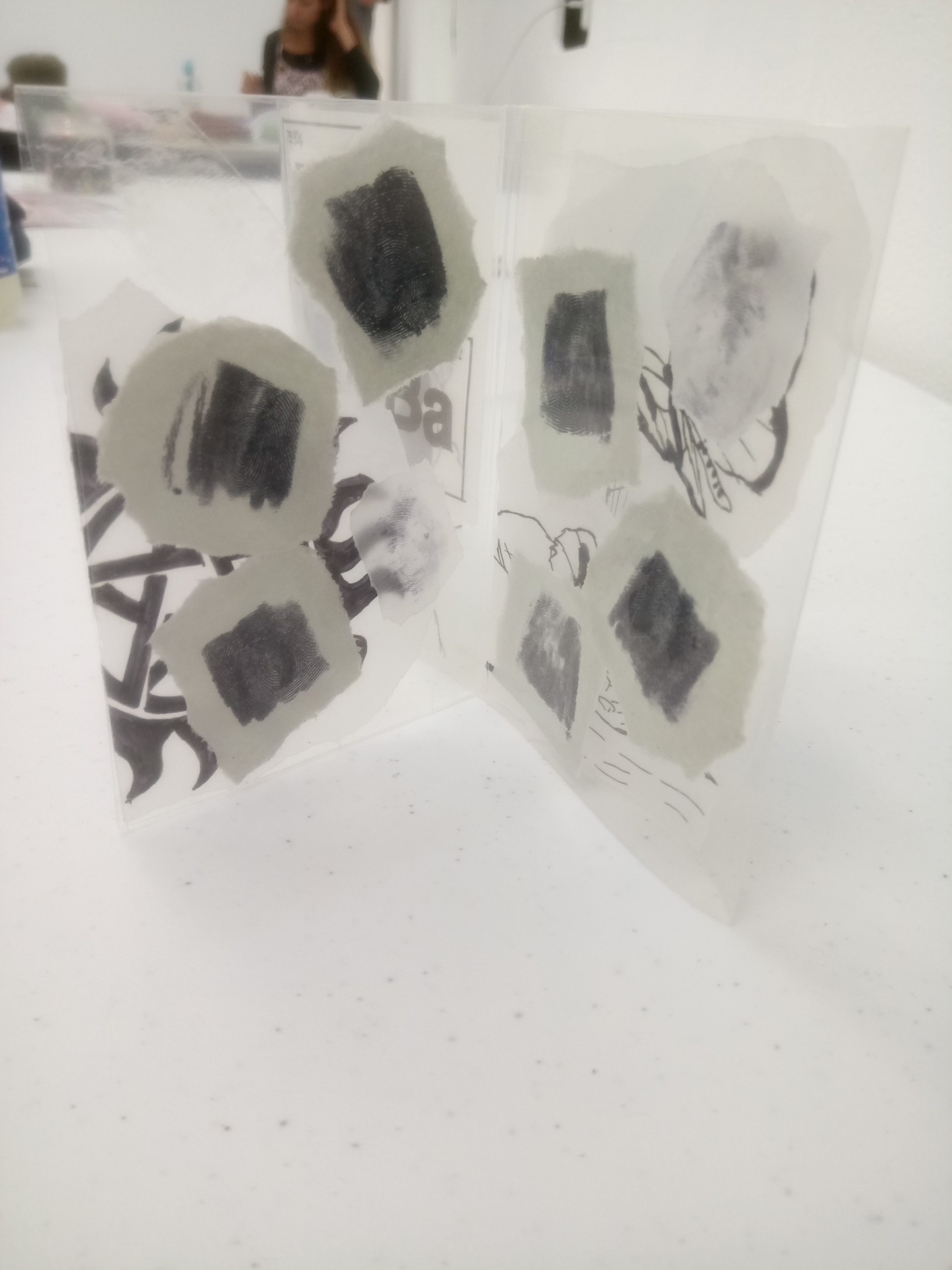
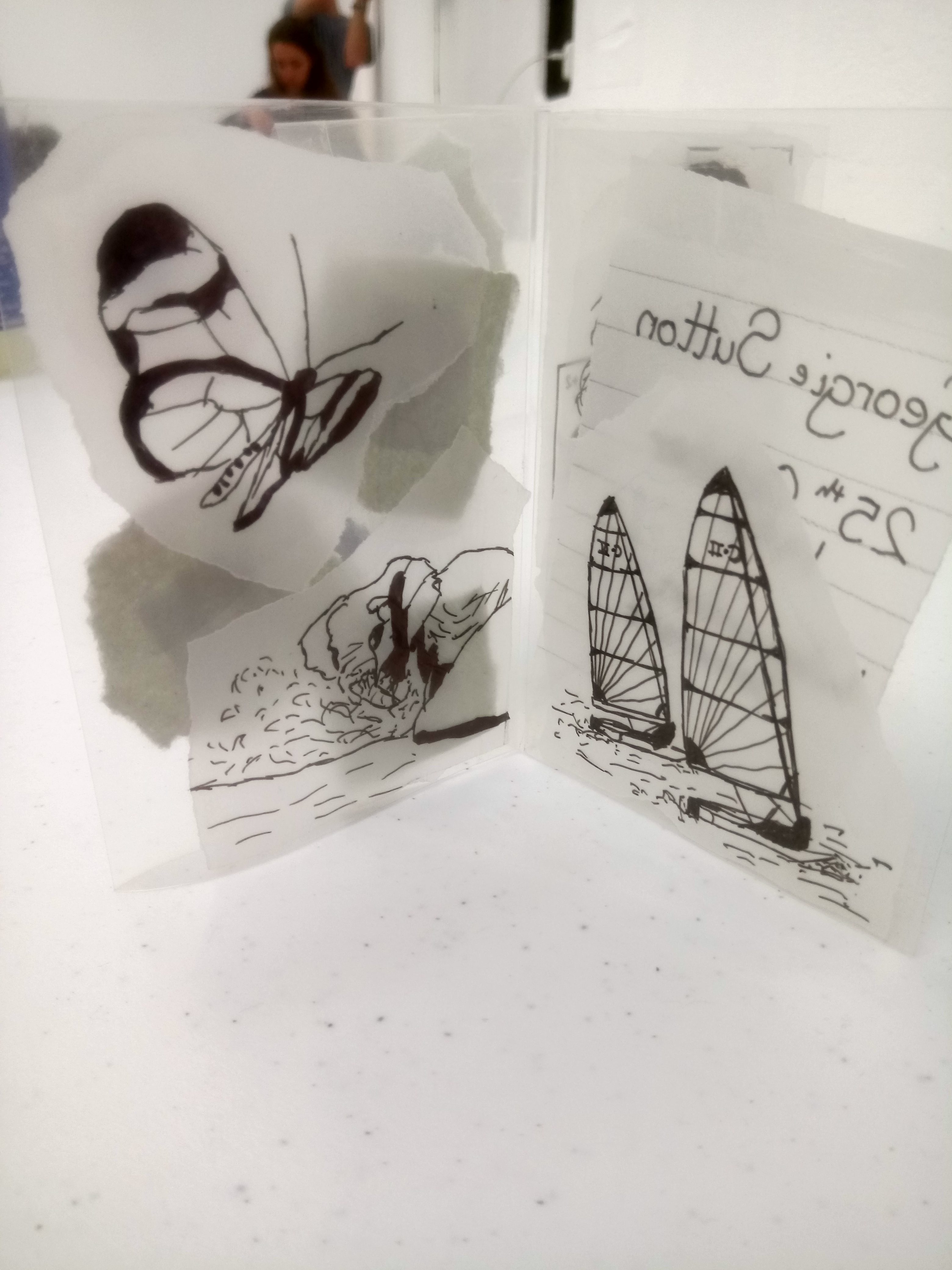
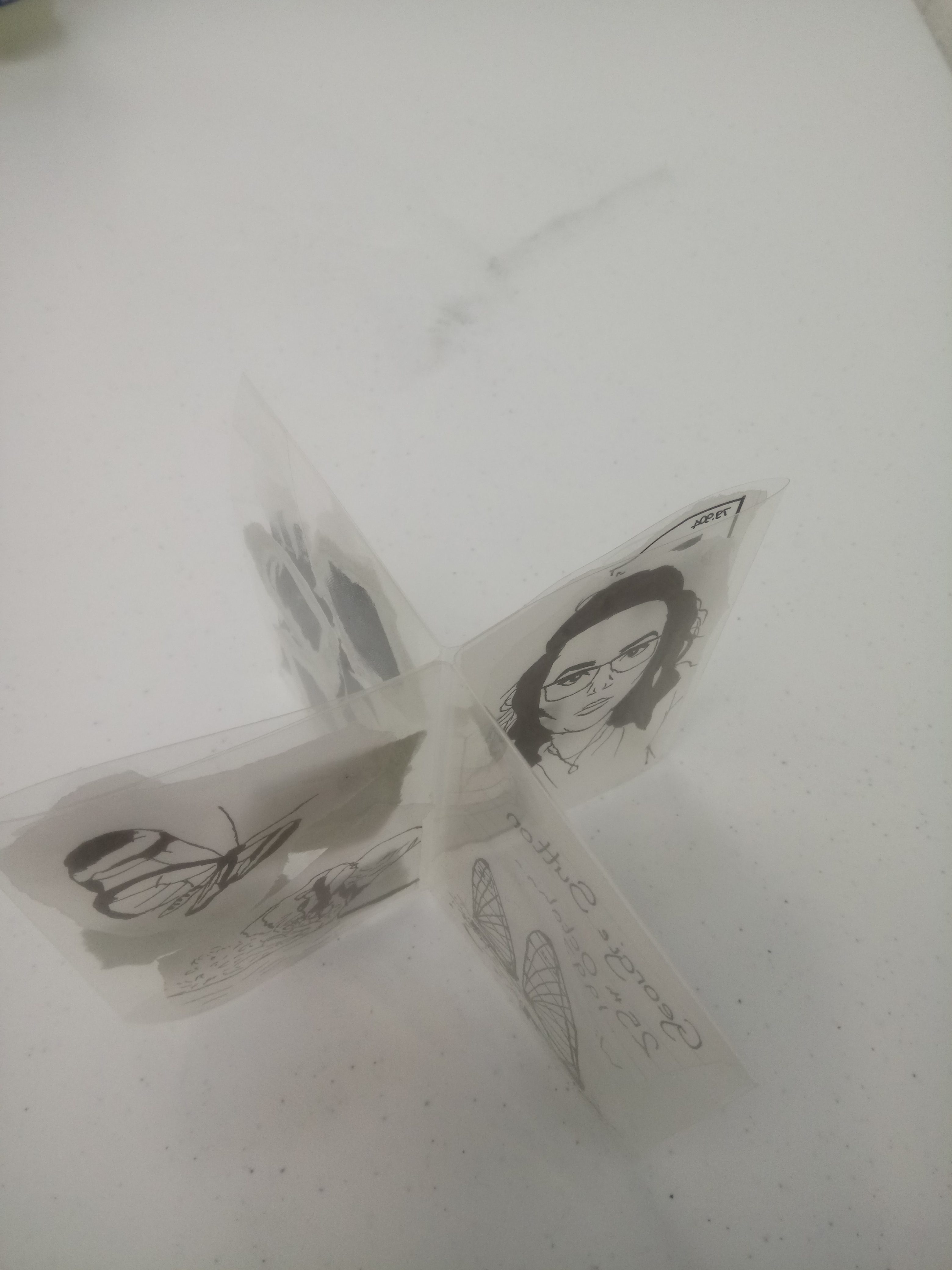
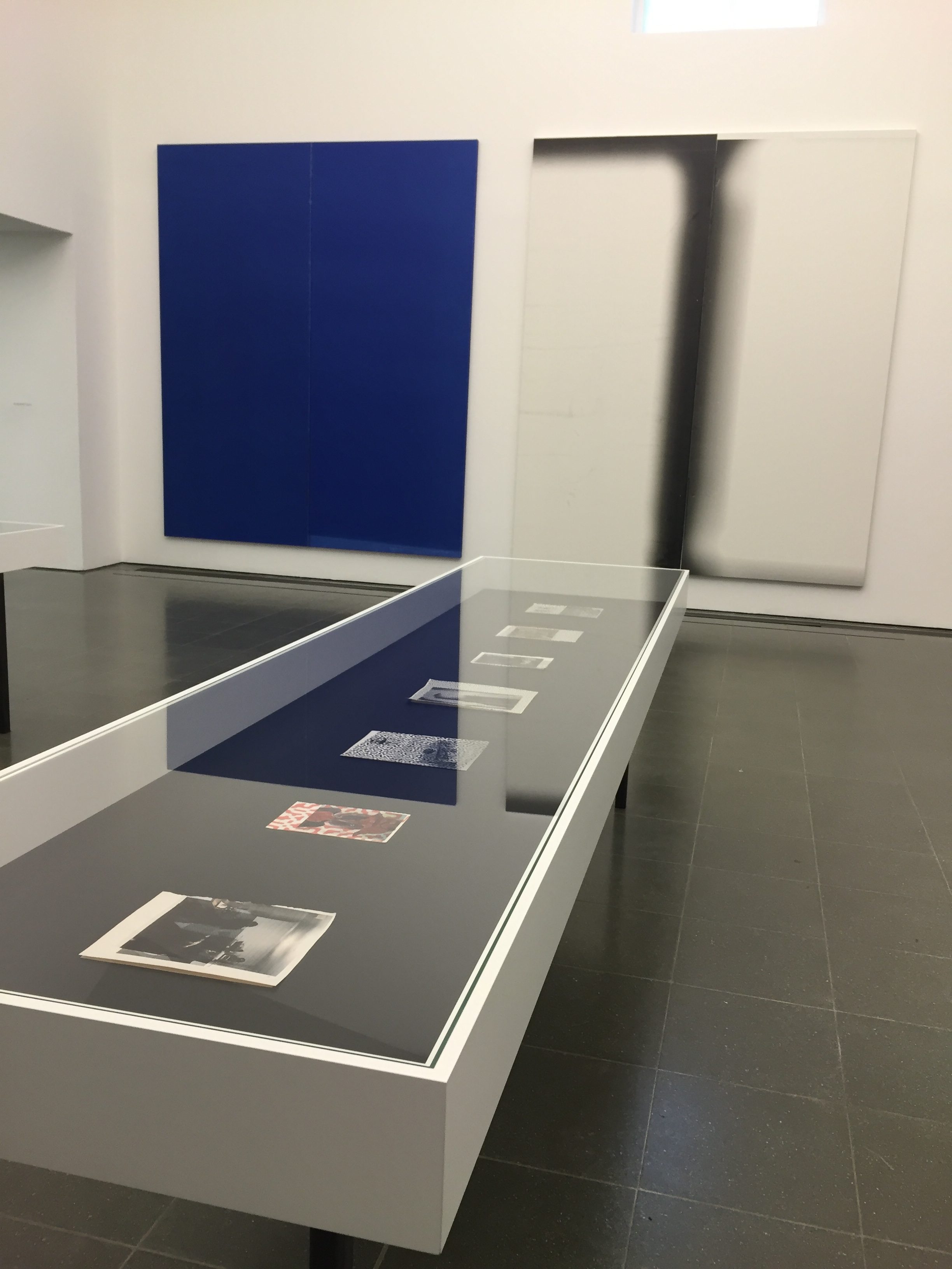
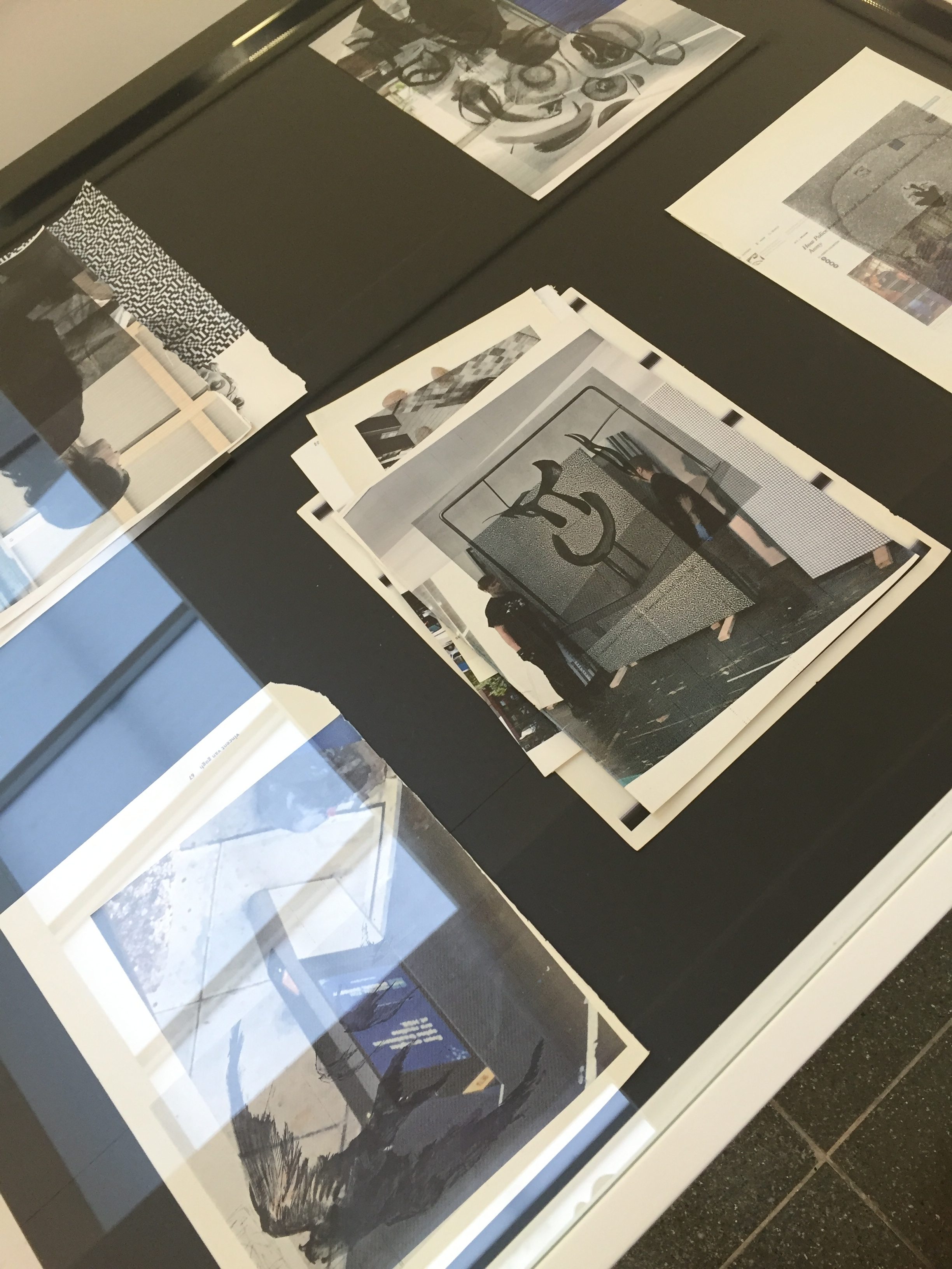
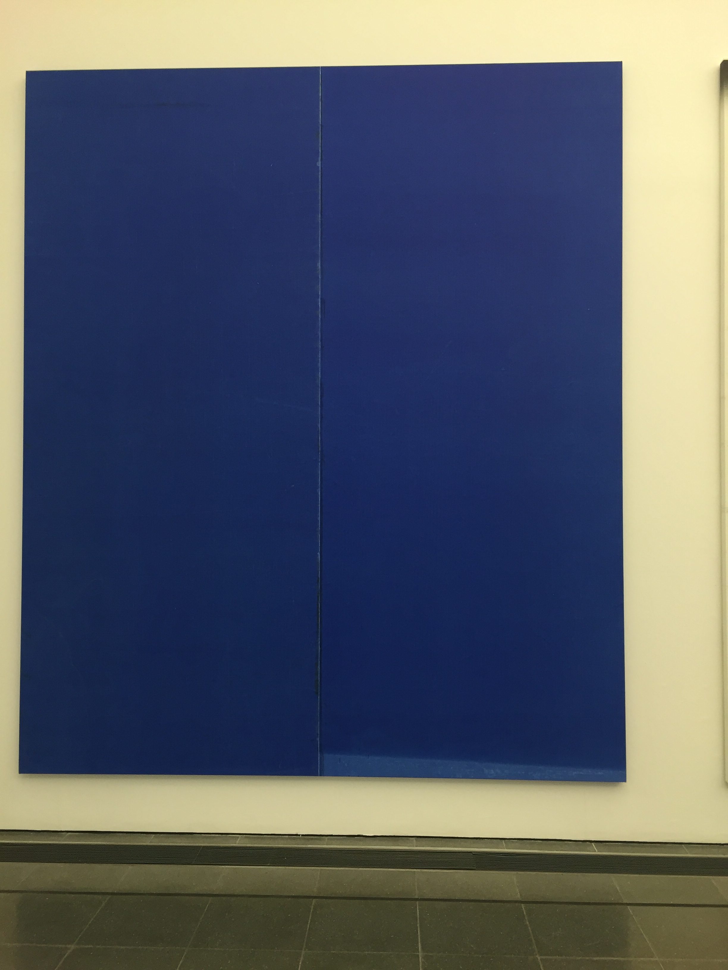
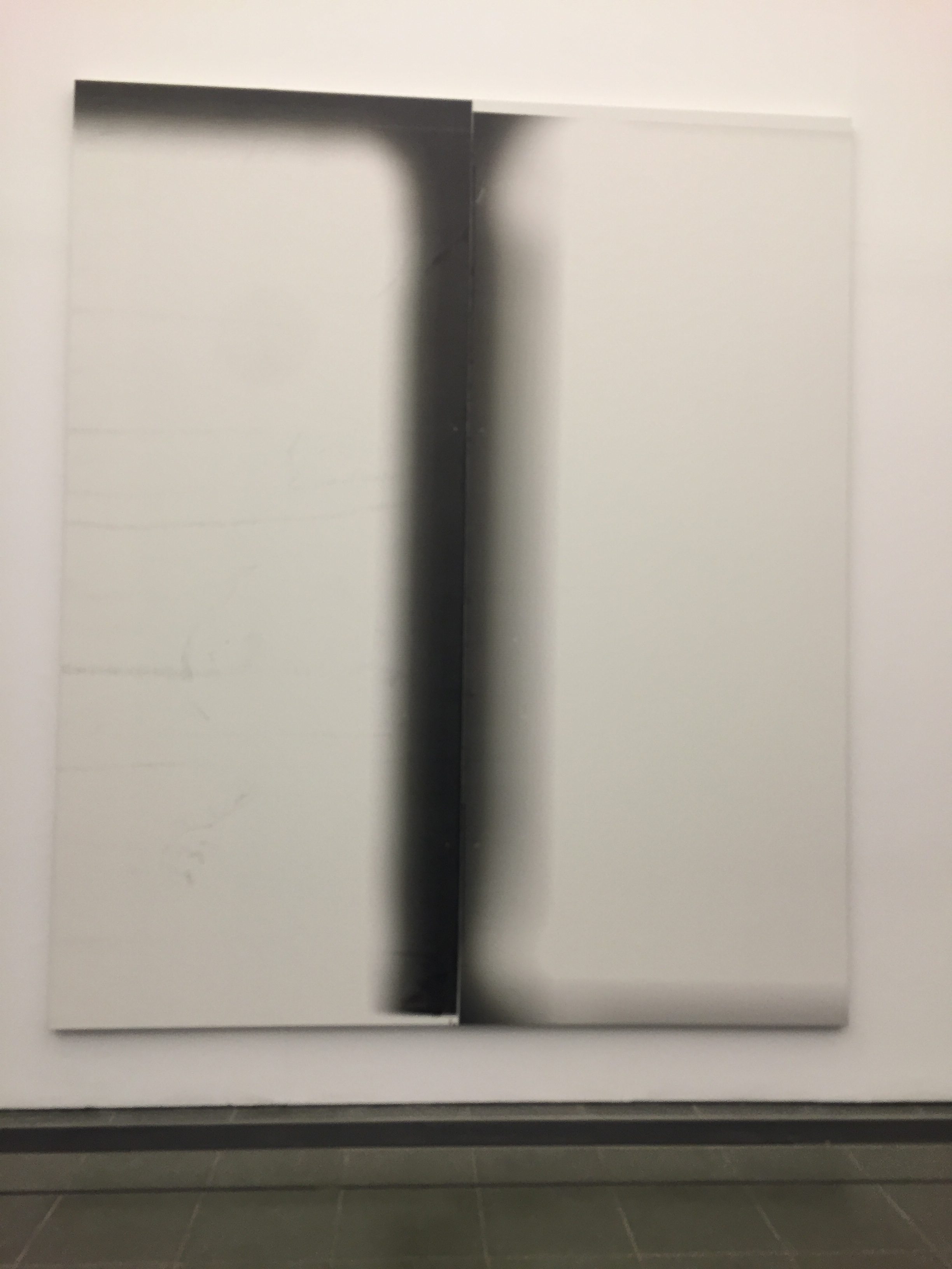
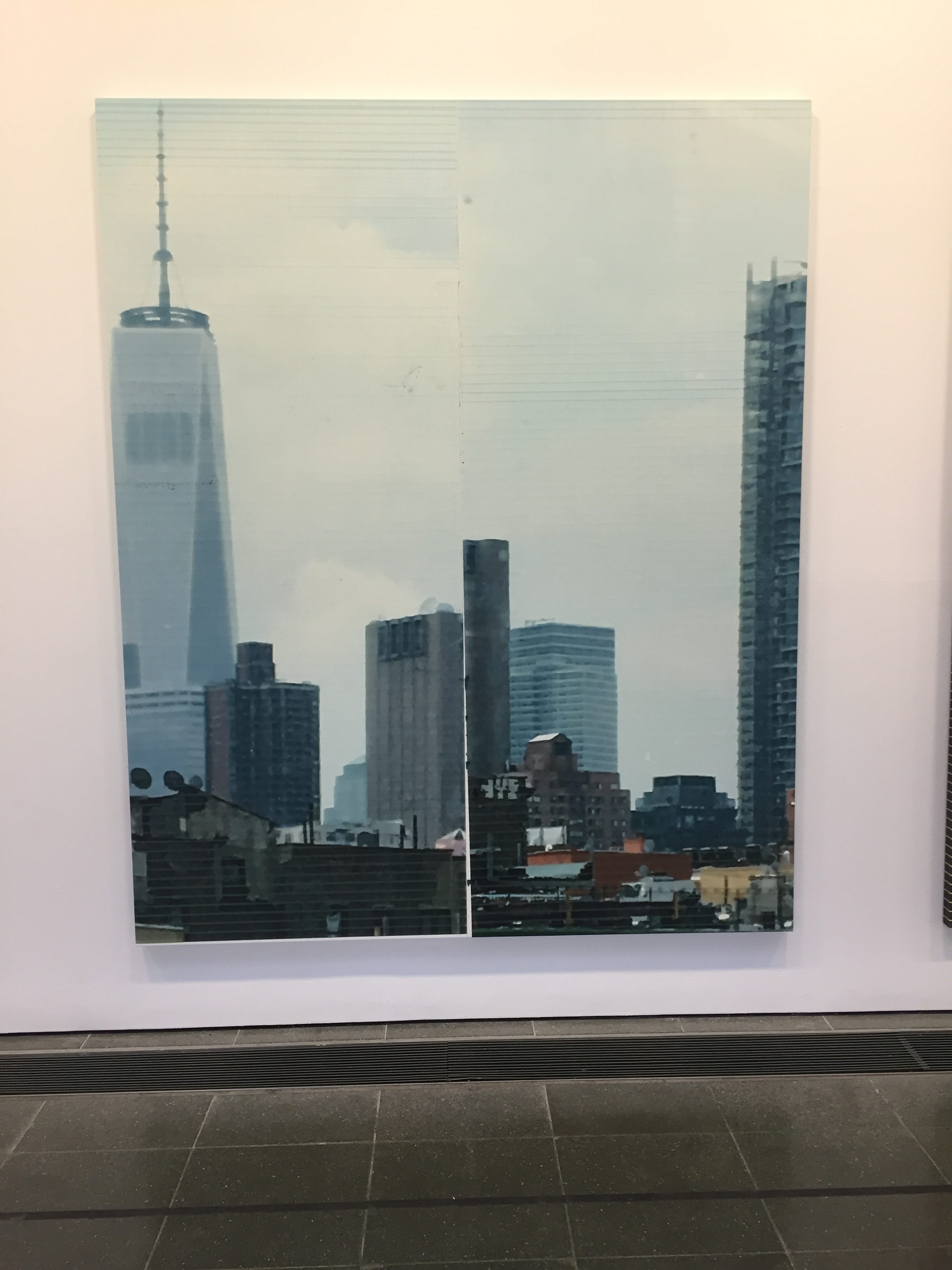
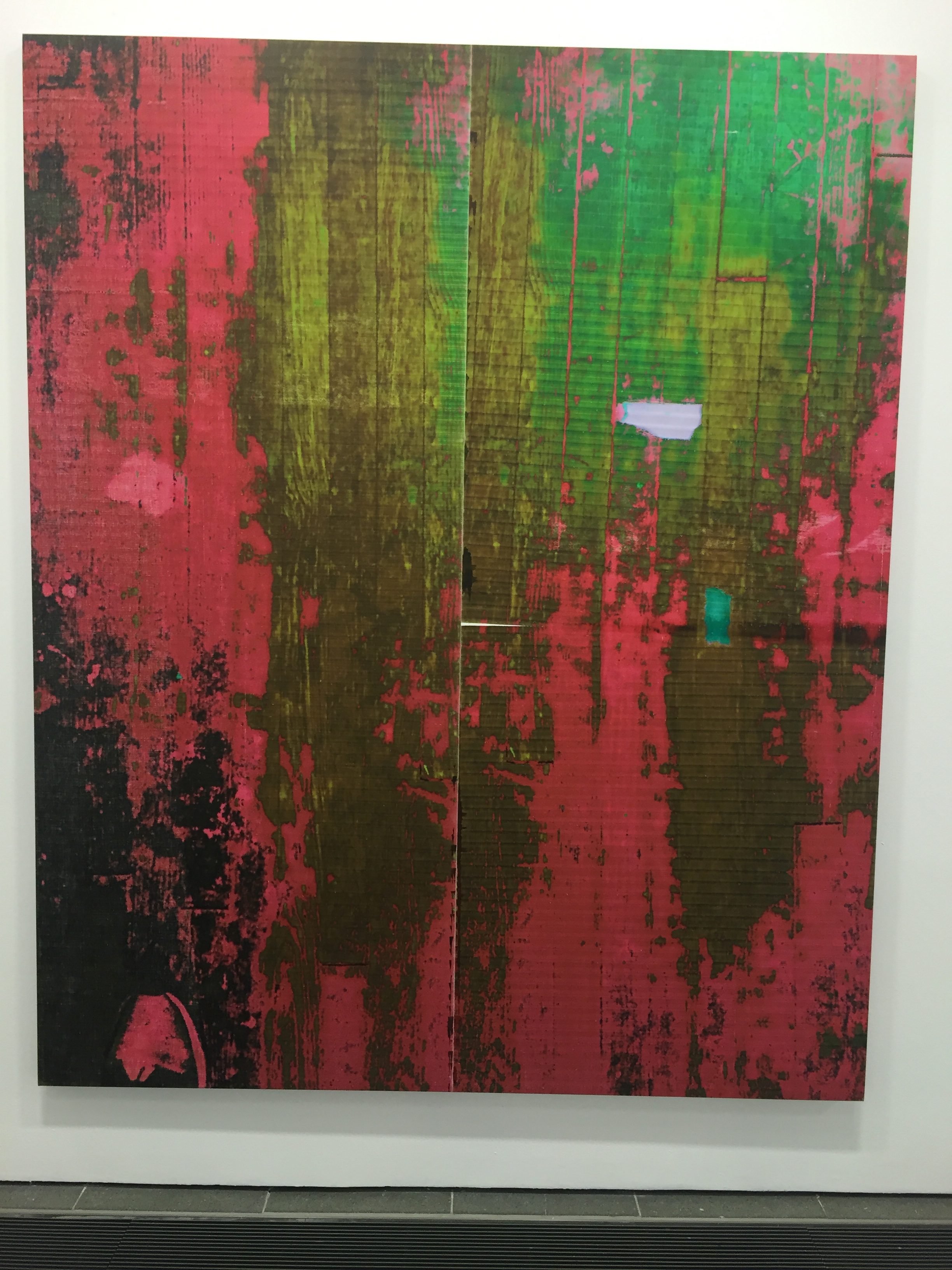
Guyton’s work is a series of large-scale paintings as well as smaller works on paper that are made using computers, inkjet printers, scanners and iPhone cameras. The exhibition is curated beautifully to make all the pieces seem like one single body of work. That body of work being the production of mass produced media in an almost fabricated way, the canvas’ are pixelated and abstract as if we are reading the digital images wrong or at a slow speed. The smaller works are pixelated images and pages of news articles and magazines that have been run back through the printer with messy ink spills and disorientated drawings.

As you walk around the exhibition space taking in the information around you, you get an overwhelming sense of the technology we encounter in our daily lives and the impact that media has on our thoughts and feelings. The long tables with images of pixels and media outlets and the huge abstract and pixelated canvas’ suddenly bare a weight in your brain about the scarily overwhelming sense of media in our life. It’s almost like entering a room in your brain where it is trying to process this information.

Overall the exhibition is a wonderful experience that shines a light on the sight to mind process of taking in media with the ever-changing world of technology. Not only pointing out the fascinating way we all take in this information and how technology is constantly growing but also showing us the negative, scary aspect of communication overload and the impact on us mentally and physically.

Task 3.

RenĂ©e Cox – Hot-en-tot Venus, 1994 [photograph]  

In the image Hot-en-tot Venus you see the subject is Renee Cox herself completely naked apart from oversized prosthetic versions of breasts and a butt that are tied around her with string. Cox is posed in a way that is showing her body off with these fake implants that she is wearing, her gaze is striking almost worrisome as if she is daring you to look at her but almost like she doesn’t want you to at the same time. A very powerful image with positive and negative connotations. 

Positive connotations in that the image itself is very powerful and striking, she is showing body confidence to be able to show off 90% of her body, even though the 90s were more accepting of women doing these things in a non-sexual way like 10 years prior, women are still sexualised to this day, so for this image to hold a deeper powerful message without being sexualised is amazing. Which brings me to the negative connotations of what I think the image stands for, the boob and butt add-ons are clearly much larger than Cox’s own, held up in a perky manner a light on what society considers a man’s ‘ideal’ body based off of many modern day magazines and bias blog posts, which sheds a light on why her face seems so tense yet sullen and her pose is almost an intimidation of a pose made to show of her body as if just by her glance she is saying ‘am I perfect now?’ 

When you look in to the context behind this image it becomes an even more powerful photograph about the extraordinarily shocking histories of human exhibition. The photograph is a reference to Saartje Baartman, a Khoisan woman who was objectified as an interesting curiosity and exhibited in Europe in the 19th century, as the ‘Hottentot Venus’. To me, Renee shows us the power of humiliation and inequality this woman endured as well as shedding a light on the horrific slavery of black men and women and even more contemporary issues such as the way women are sexualized by their bodies still to this day. 

Task 1

For the passport project I felt I wanted to do a scaled down version of my last project which was about the female identity. I felt as a passport is an individual’s national identity I could do a version of a passport which showed identity in the basic sense of femininity. Within the passport I did small sketches of body parts progressively getting to more intimate areas of the body as I felt it was a “journey” of discovery of the female form, keeping within the idea of travel associated with a passport but also a journey of self discovery in one’s self. I also added some initial detail to the sketches by doing simple textured backgrounds to draw over, I wanted to add texture to the sketches as I felt I wanted to do a visual representation of the layers of someone’s personality and also the layers of intimacy you can have with yourself or another. I felt these pieces developed from my love and curiosity for the female form and the concept of gender.

If I was to develop these pieces further I would do the sketches in a more refined manor and also on a larger scale, however, I did feel there was something quite intimate about the passport and the drawings within being small and personal. I would also like to experiment with different mediums to show more variety and depth within my work but as I was on a small time frame I stuck to pencil and Biro. Furthermore, I would develop the theme behind it all and make it more personal and make the pieces from my own perspective on what my identity is as a female, this may leave myself open to criticism but it would be my own opinion which I would defend.

IMG-6760 IMG-6761

Nathan Pine – Task 2

The book I chose to read was Harry Thubron by Arts Council. The book was simply talking about Thubrons work from a viewer’s perspective. I found this more informative as I could compare my own personal opinions of an image with the authors perspective; giving me new ways of viewing some of his work.

Some of Thurbons work could be interpreted as an organised mess, “To him there is no contradiction between order and disorder”, this quote from the book reinforces my point and after reading the quote his artwork made a lot more sense to me. At first glance at Thurbons work it all looks like a jumbled pile of materials, some of them I do feel just look like piles of trash, such as the work named “Camino Real, 1974”. However some of them have an almost accidental structure, which I find quite beautiful. One piece in particular strongly captured my attention and that was “Rose, 1966”. The image is still messy but in a more attractive way than some of the others. The colours are similar shades of yellows and browns, which match the golden-yellow tones of the roses; it has a symmetry that makes it seem more organised and presentable compared to some of his other works.

I personally like Thurbons approach to art, however sometimes I feel he takes it too far and it begins to lose its meaning, but perhaps this is his intention.

Task 2 / To consume a book

September A History Painting by Gerhard Richter

By Robert Storr

In the book, Storr explores the meaning and controversy behind the painting September 11 by Gerhard Richter. The painting is based around the terror attack on the world trade center on 9/11/01. As a man who witnessed this attack from a distance and new friends and neighbors who had been in the buildings and nearby the buildings on the day of this horrific event he starts by telling his own story, his own feelings, and thoughts from this day. Storr suggests the meaning of Richter’s painting “to render the simple, absolute but always elusive reality of human suffering”.

The American critic and curator Robert Storr has a working relationship with Richter. Storr shows how Richter struggled to express this event in his work, starting with a blank canvas working from photographic images and videos, painting the event quite literally he soon became unhappy with the way that his painting was portraying the event. Contemplating destroying the painting all together he decided to deface it by using his usual abstract technique of dragging the paint across the canvas in different ways, leaving only two visible layers of the painting. After reading this I thought that maybe the layers on the painting could suggest the different effects that this event had on the world, the chaos of the event and then the smoky calm silence following. Or as Storr puts it “a ghost of a ghost”.

This book investigates the true meaning behind the painting and what drove Ritcher to pick such a heated topic. This meaning which does not become clear until after learning the title. I am fascinated with how you can create a piece of work which comes across so calm and muted, to then give it a title and change it to such a highly emotional and impactful piece.

Bibliography:

Storr, R. (2010) September A History Painting by Gerhard Richter. Millbank London. Tate Publishing.

Kerry Mercer – Research and communication skills / Task 2

Upon being given the task to ‘consume a book’, I decided to relate this to my Contemporary Project and read into one artist I’m looking at currently. Here I decided to go for an artist I knew little about, which in my case was Anselm Kiefer.

Whilst scanning the library for any related material, I came across the book ‘Anselm Kiefer’ which was produced in London by the Royal Academy of Arts (2014). This book was made alongside an exhibition titled ‘Anselm Kiefer’ which was in honour of his work to the present day.

Throughout Kiefer is mentioned as a ‘most important’ contemporary artist of the late 20th century. He transcends an array of mediums ranging from sculpture, photography as well painting and installation to convey the taboo subject of Nazism. He reflects upon Germany’s dark past, referring to the holocaust, and unearths the raw emotion that still lies within the subject today. It’s stated that “he allows us to discover a whole that is greater than its visible sum” (pg 149), meaning that he allows for more to be seen, and opens our eyes to a time that can often be over looked. This book looks upon his oeuvre and highlights the deep-rooted connections the German painter has towards such topics, being so closely born to the era in 1945. This not only creates a complex relationship with his art, but also introduces a spiritual influence into his work as well.


Bibliography:

SORIANO, K. LEA, S. KIEFER A. (2014) Royal Academy of Arts. London.

Task1

Idol A

The body of my Idol A sculpture is clay which was formed by clenching the clay then putting it into a microwave to dry and keep the structure. I removed clay where I wanted to put a strip of lead in, I melted the lead and poured it into the cavity. During this process a flame caught the grass and the smoke had stained part of the sculpture a light brown like a cigarette stained ceiling which I thought was such a beautiful colour so I piled grass under the sculpture and lit it turning the sculpture light brown from the smoke then I sanded the surface to make the stains less dominant which finished it to look old and worn.
I added bits of emulsion paint in various places because I liked the clean white blended on the off-white surface. I painted an orange square in oil paint then polished it and the rest of the surface.
The latex was added after I finished my foundation show because I was sceptical about adding it but to me, it’s everything, before it had latex on it was my least favourite thing but I think it brings the whole thing together.
I researched into Venus figurines, Louise Bourgeois, Marcel Duchamp, and Kanye West’s Yeezus album and art for inspiration. The shape is similar to Jean Arp’s sculptures and the colours remind me of Andy Warhol’s soup prints.

Image result for Louise Bourgeois latexImage result for Marcel Duchamp erotic objectsRelated imageImage result for Andy Warhol’s soup printsImage result for Venus figurines

I liked my sculpture so much I wanted to make more by forming a silicone mould of it. I made sculptures in different materials like pulp, papier mache, cement, plastic, jesmonite, clay, but they weren’t as good as the original they were all off because the silicone moved too much and it took away the spontaneity of the original but I liked that they were like a parody of my own motif. The most curious cast I attempted to construct was formed of gelatine and titanium dioxide which is two of three parts of the ingredients for pill capsules. I wanted to make a cast that would be a hollow shell of this material that would slowly degrade but the mixtures weren’t successful.

Task 2: Consume a Book

Nicola Hicks, Sculpture and Drawings, 14 January – 13 February 1994

This book is about the artist, Nicola Hicks. Hicks is a contemporary sculptor who also has a passion for drawing. The book describes her series of animal sculptures and drawings, her move to human figures and then an interview with the artist.

Several questions are put to the artist, one being about how sculpture could be a drawing. Hicks (1994, pg. 71) states that:

‘The excitement is in the form and the only thing you have to work with when you make a sculpture is light. You draw with light.’

She is saying that with sculpture you always have to think about how line is affected by light, and using the light to draw the line. When you look back at some of her sculptures that are created using plaster and straw, you can see how she has used the light to shape her piece. She thinks that sculpture is the closest to drawing out of all the fine arts because of this.


Bibliography

HELLER, R. HUBBARD, S. (1994) Nicola Hicks Sculpture and Drawings. London: Flowers East.

Task 1: Passport

The first task we did on the course was making a passport, we were asked to show our feelings through our work.

I chose to fold acetate to gave me 8 pages for the passport, then stick tracing paper onto it. I wanted to use acetate because it acts as a metaphor that I am quite an open person, but the use of tracing paper symbolises that there are some things that I am not as open about.

I started with a self-portrait as this is the traditional way of describing yourself. I used my phone to trace a picture of myself so I had an almost perfect representation. The photo I used was a passport style image. I decided to keep it simple and monochrome with block areas of black colour, this is because I see things quite straightforward and in ‘black and white’. On the next page I wrote a few pieces of information like; my name, date of birth and hometown.I then traced images of; TV shows, bands, hobbies and animals that I have interests in. I used the same style as the  throughout this passport to keep it unison.

The last thing I added was fingerprints. I drew on a few fingers with a black marker pen and pressed down onto some cartridge paper (I couldn’t use tracing paper as the pen didn’t absorb into it).

I stuck the images inside the acetate so they were framed by it. This made it appear like it was behind glass which is quite fragile, linking back to the feelings and emotions part of the task.

I am happy with how it turned out, but if I were to develop it further I would think about how I could write words on the back of the tracing paper. They would be hidden to the viewer’s eyes so only I would know what was written down.
DSC_3755[1]
Georgie Sutton Passport 2Georgie Sutton Passport 3Georgie Sutton Passport 4Georgie Sutton Passport 5


Morgan Watson, Fine Art, Task 2

When requested to ‘consume a book,’ I was drawn to the work of Artemisia Gentileschi due to her conquests in the art world as a female painter. I chose to study the book ‘Artemisia Gentileschi Around 1622, The Shaping and Reshaping of an Artistic Identity’ by Mary D. Garrard, an American Art Historian, considered to be ‘one of the founders of feminist art theory.’ This book provides a deep insight into the artist, rather than placing focus on her disturbing past of which consumed her career.

In a male dominated art world, Gentileschi was considered to be incapable of any artistic originality as she was a woman. She was known as the ‘famous rape victim’ due to her subjection of sexual exploitation from a male superior- of which provided a twisted fascination with her artwork under male speculation. Garrard claims that, “for the male viewer, it was the painter more than the painting that titillated. And the story of her rape would only have added spice” (pg 109). Her art was considered to be a thing of beauty and sexuality as her audience would project her experiences and her beauty onto her work.

Despite Gentileschi’s many hardships in the art world, it is overlooked how she resisted gender classification throughout her life, working entirely alone; with very little help to gain a place in the masculine art market.

Bibliography:

‘Artemisia Gentileschi Around 1622, The Shaping and Reshaping of an Artistic Identity’, Mary D. Garrard, University of California Press, 2001