Category Archives: Fine Art

This Category should be selected if you are a Fine Art student.

Nathan Pine – Task 5

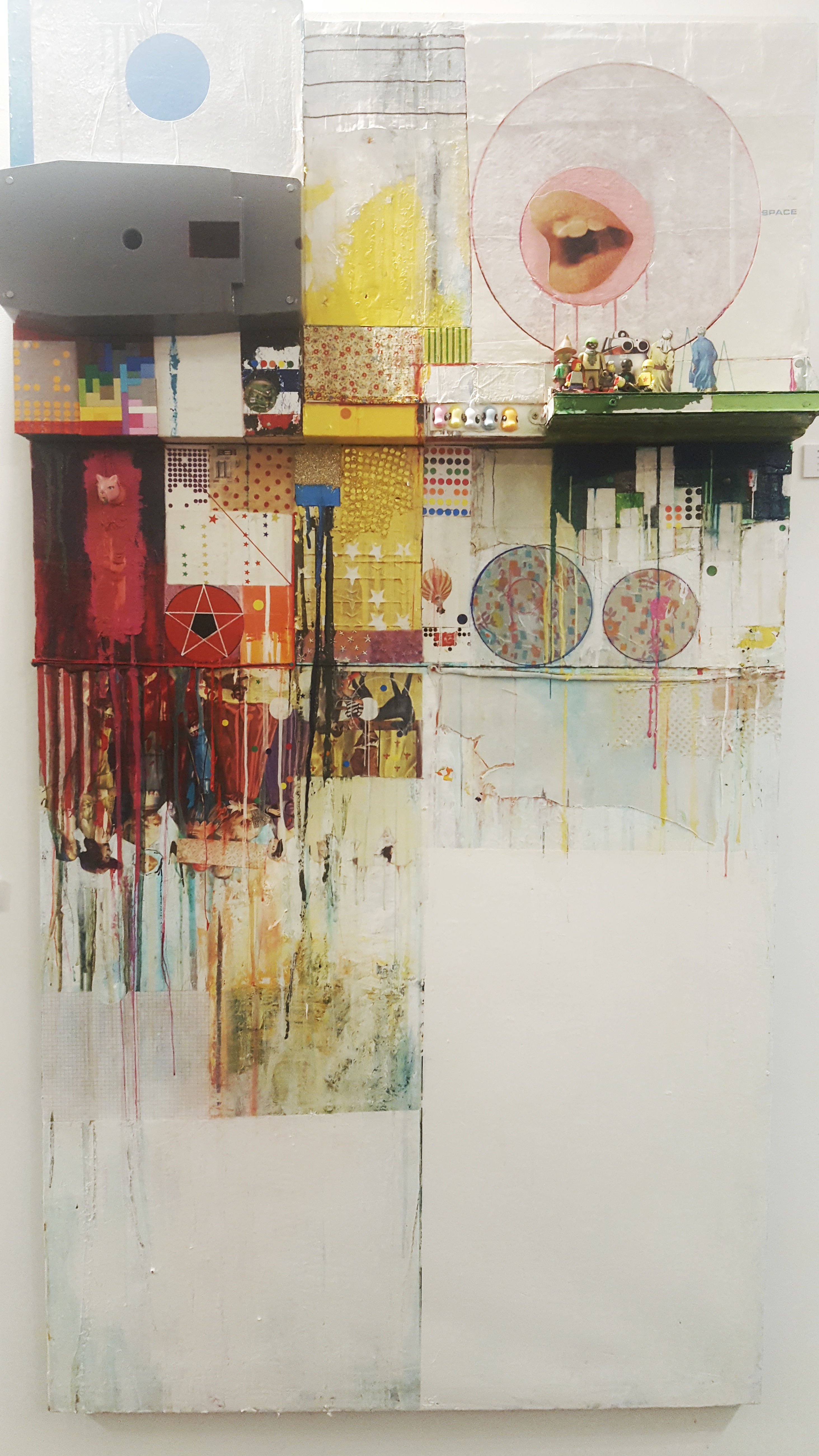
The piece of artwork I will be speaking about is “Violetta Alone, 2015” created by Tom hammick, which I witnessed at the “Towards Night” exhibition at the Towner Art Gallery in Eastbourne.

What I found most striking about seeing this image upfront was the size of the piece. It is larger in size than I anticipated (193 x 152 cm in size to be precise), this made the image have a far greater presence than when glancing at it on the internet. The image captivated your gaze with its size and by its moody, mysterious atmosphere that was not as strongly present when looking at it through a screen.

I also noticed that marks and colours appeared more vivid in the piece compared to when browsing the piece online, certain red lines silhouetted the figure making the character seem somewhat more sinister. I did not notice this online compared to when I saw the artwork upfront, making the image far more interesting to me.

The way the artwork was positioned in the exhibition made it have more of an impact on the viewer. The image had its own wall in the corner all by itself so it was seen as an almost monumental piece by the artist. This would only have been noticed by seeing the work upfront and perhaps at this particular exhibition.

Nathan Pine – Task 4

I recently visited the Towner Art Gallery in Eastbourne to attend the “Towards Night” exhibition curated by Tom Hammick. Tom had curated the show around the theme of night, painting the walls a dark blue to give the entire space an atmosphere of night, giving the exhibition a more immersive experience than if the walls did not go with the theme of the exhibition.

I was first attracted to the exhibition due to my previous research into Tom hammick and liking his artwork and his use of day and night themes within his work, so I wanted to go and see his work upfront as he was also showing his own artwork at the exhibition. A lot of his work was focusing on night and had dark colours and dark blues which merged into the wall being of the same blue colour, this made certain pieces of his work seem even larger and more captivating than without the use of the wall colour matching the works background. A piece where this really worked by Tom was the “Violetta Alone, 2015”. The image is already large in size and with the added illusion of it merging into the walls due to its dark blue background, it certainly became a memorable piece of the exhibition.

Nathan Pine – Task 3

I chose to look at “Nikki S. Lee, Part (14), 2002 [photograph]” more closely. It appears Nicki is acting as a women sitting in a car with an arm wrapped around her shoulders, which looks to be a males arm and the face of the man is not seen. The women is starring off into the distance, her facial expression sad and longing to perhaps be somewhere else.
I feel that perhaps the image is about an unloving relationship, or at least a relationship that is bad enough she does no longer want to be in it anymore. However the male is still committed shown by the affectionate gesture of him placing his arm around her shoulder. I feel either she doesn’t know how to get out of the relationship or it could be more darker and it’s an abusive relationship that she is feeling trapped in. This is shown by her sad and longing facial expression and by her body language; she is facing the opposite direction of whoever is wrapping their arm around her as she does not want to be reminded of the pain of her situation.
I feel Nicki is trying to convey in a subtle way how isolating and lonely bad relationships can feel to the viewer. Perhaps she has gone through this personally and is an aspect she struggled with the most whilst being in a bad relationship, so she felt the need to express it through her work. Perhaps this was simply her own expression and she did not consider the viewers perspective on this piece that much and it was simply an outlet of the trauma she faced.
I decided to choose this image out of the four to analyse as I was intrigued by the images potential dark subtext, the other images failed to interest me in the same way.

Task 2

Ilya Kabakov (Contemporary Artists)

The book “Ilya Kabakov” gives an overview of his range of works. Kabakov is a Russian artist who was born in the 1933, where he has experienced life under the regime of the Soviet Union. The tone of the book is subtly critical of the regime and the art which was produced at the time.

I found the pieces of ‘working with garbage’ the most fascinating in the book. Works such as “the man who never through anything away” was a key focal point in his ideology to do with garbage. This work started with Kabakov realising he never really cleared out his studio that he had worked for more than 20 years. He decided to collect paper scraps and started to file them. This process created importance and value to Kabakov. Archiving these papers was like Kabakov’s treasuring memories. Memories over time are “reconciliations tied to one another” which made it difficult to throw the papers away. But these papers only have significance to him and no one else because to others it is only rubbish.

The reason why he was so obsessed with working with rubbish was because “the work of art and the piece of garbage is equally as useless, non-functional, superfluous things, peripheral to the universal traffic in commodities ”. The main difference between art and rubbish is that art is kept safe in a studio or museum, where rubbish outside or thrown away. However, art not recognised can be seen adding to the ‘garbage heap of history’, depending on the perceptions of the viewer.

Bibliography

Chekhov, Anton, ‎Groys, Boris, ‎Kabakov, Ilya, (1988). Ilya Kabakov (Contemporary Artists). Phaidon Press (20 Oct. 1998)


Task 1

For the project of creating a passport I used the technique of origami to create a booklet first. I did this because of my Japanese background and this would help show my identity better. Additionally I drew a passport with both the Japanese and British logos and myself and my parents. I put the British logo on the front and the Japanese logo on the back of the passport, which is the front from the Japanese view. In Japanese you read right to left and back to front the opposite of English.

However, the passport I made originally did not feel like it represented me completely. But when I did the additional soft pastel drawings of places which have significance to me, they connected to me much better. I drew my house where I live with my parents, my grandma’s house, my new home at the university and the seaside where I went on holiday. Drawing these places was very enjoyable and better illustrated me as a person. Also using colour helped this further because it gave the essence of place better. To extend this further I would draw more places which have significance to me. Additionally, it may be more effective to incorporate objects which have sentimental value. Working larger scale and using different mediums may be better to move the piece forward.

P1120207P1120206 P112020822686788_1613473622049524_1954151286_n


Task 5, Single Exhibit

Seeing James Oliver’s piece, ‘B.E.D (BigEpicDiorama)’ at the Matthew’s Yard Gallery space in Croydon was really interesting and has inspired me to want to create works of a similar scale using mixed media. Having seen images of it online, the piece was so much more powerful in person and I spent a while looking at it closely and examining the different media used by the artist. The immense amount of detail and variations in patterns, colours, textures and mark-making make the piece much more exciting when viewed in the flesh. The varied layers are also far more effective when being viewed in person, as in this piece some areas stick out further than others. The process of creation is clearer than when viewing it online, as the varied layers, paint splatters and use of collage can be seen, as well as how far different components stick out from the wall.

I also like how the title and appearance of the artwork references Robert Rauschenberg’s ‘Bed’, adding the artist’s own style to the piece but referencing the layout and mixed media, paint and collage style adopted by Rauschenberg. The large scale of it and use of ‘combines’ (found objects) are similar to those in Rauschenberg’s work, as his piece ‘Bed’ includes a well-worn pillow, sheet, and quilt as the basis for his painting. However, in Oliver’s piece many of the objects are far less natural in appearance, using brightly coloured plastic instead of the muted tones and fibres of fabrics (e.g. through inclusion of My Little Pony heads and Lego blocks and people.) Like Rauschenberg’s piece, Oliver’s ‘B.E.D’ is hung on the wall like a traditional painting, although where Rauschenberg’s piece can be seen to act as an intimate self-portrait, Oliver’s is instead somewhat less personal, as it uses widely available machine manufactured objects. This obviously relates to his style through distinct brightly coloured shapes, rigid geometric forms and an exploration of collage and mixed media.

Although the room in which ‘B.E.D’ was placed was not greatly lit, seeing it in the flesh allowed me to better appreciate the process of creation and experience the 3D nature of the work and the application of paints and colours.

James Oliver, ‘B.E.D’ close-up

Task 4

On a visit to The Tate in Liverpool I came across the exhibition of Aleksandra Mir’s work, this was an artist that I hadn’t identified previously. The size of her work was overwhelming and something I couldn’t have appreciated if I was viewing the work in a book or on a screen. My first impressions were, Mir had used black marker pen creating a contrast with the crisp white background of the paper and I questioned how she had managed to create such large scale pieces of work on her own. This was a question that would be answered with further research of the artist, I discovered that she works collaboratively with young artists and students making each pen stroke unique to the individual and each separate piece of work exclusive.

Texture was visible on each of the works, some being clouds and others being planets that came to life on paper. Marker pen is such an uncertain medium  to use as a mistake could so easily be made and be quite noticeable if looking carefully. Stood in the gallery space looking up at all the work I had this overpowering feeling of insignificance, everything seemed so much larger than I was especially with the references to outer space.

Emily-Jayne Ponting: Fine Art – Research and Communication Skills (Task 5)

Barkley L.Hendricks Icon For My Man Superman, 1969, 151.1 x 121.9 (Superman Never Saved any Black People-Bobby Seale) Oil Paint, Acrylic Paint and Aluminium Leaf on Canvas

Barkley L.Hendricks
Icon For My Man Superman, 1969, 151.1 x 121.9
(Superman Never Saved any Black People-Bobby Seale)
Oil Paint, Acrylic Paint and Aluminium Leaf on Canvas

When I visited the exhibition ‘Soul of a Nation-Art in the Age of Black Power’ at TATE Modern, I was drawn to pure confidence behind the above painting by artist Barkley L.Hendricks. The show of work was about tackling equal rights of Black artists over the two decades in America after 1963 and representing their freedom.

‘A nation where they will not be judged by the colour of their skin but by the content of their character’

For me as soon as I saw the self-portrait I was drawn to its bright colours that hung within the three-stripe border invoking the American flag and the novelty T-shirt worn boldly by the black character. I was aware of the piece appearing in the exhibition as it was presented on the covers of the leaflets given. However there was something about witnessing such a meaningful empowering piece of artwork that made my skin crawl. As an individual artist I am always eager to present art that contains a strong in depth meaning of some sort and could intentionally change my audience’s opinions. With this piece I felt exactly that and seeing the work ‘in the flesh’ I was able to consume the artist’s emotions from a stronger source. The materials used were also perfect and complimented the whole aspect behind the composition.

‘The black artist as a superhero, painting himself into history rather than waiting for someone else to confer the honour upon him’

Bibliography:

Soul of a Nation-Art in the Age of Black Power, Edited by Mark Godfrey and Zoe Whitley

TATE Modern handout programme 12th July-22nd October 2017

Task 1

The task in which these works are based on was to create passport of yourself which could be presented in any way you feel. I stuck to the traditional form of a passport which is a booklet form and my first design had an overall darker theme. Each page is decorated by ripped up paper to give a rough scrappy look to it. The dark colour scheme is meant to fit in with my interest of German expressionist printmaking which is stated on the third page. The Biro drawing of the tree is to show my interest in decaying environments.

After near completion of my first passport I decided to explore with bright colour. I then started to create ideas for another passport that primarily had the colours red, yellow, blue and green. I created different patterns for each page using layers of neatly cut out paper as opposed to ripped sheets. This passport is intentionally much smaller to reflect on my lesser inclination to used bright colours and results in a fun way of showing my basic  identity.

To Develop my passports further, I would try to make it make it more personal in a way that it encompasses a wider aspect of my life rather than just myself. To do this I would have included sketches of my family in each page and perhaps use an A3 page to completely expose my life in front of people rather than being a closed book in which you have to make the effort of opening it up to know about me.

22662638_1666943943325867_761289385_o 22664220_1666943926659202_64208404_o22689866_1666943919992536_1081022305_o22662693_1666944003325861_1386038206_o 22662608_1666943989992529_2131475894_o22690360_1666943979992530_381423443_o

Morgan Watson, Fine Art, Task 5

‘Anna in Venice’, Lucian Freud, 1960, ‘Unseen’ exhibition, The National Portrait Gallery

While visiting The National Portrait Gallery to see the ‘Unseen’ Lucian Freud exhibition, I was captivated by his piece ‘Anna of Venice,’ a small-scale painting of a woman in one of the artist’s sketch books.

What I noticed about the piece is how it is different from the famous textured oil techniques of which Freud is renowned for, hinting at its unpolished nature. Furthermore, the fact that the piece remains tucked away in a sketch book lowers the status of the work to me. Rather than being hung proudly, the piece was in a sketch book; within a glass cabinet in the centre of the exhibition. Its lower status grabbed me as I came to the realisation that this particular painting is an insight to the real process of the artist, becoming almost intrusive due to the private nature of a sketch book.

The neutral tones of the painting imply an element of female passivity. Reinforcing this is the averted gaze of the subject. Her eyes remain closed, shielded by a veil of lashes, while her face points downwards to the ground- conveying a modest woman refraining from vanity. She remains closed; not revealing much about herself to the audience viewing her. Therefore, we almost feel a sense of guilt and shame looking upon her.

IMG_0198[1]