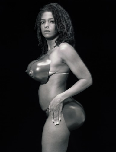
Category Archives: Fine Art

This Category should be selected if you are a Fine Art student.

task 3

RenĂ©e Cox is a Jamaican born artist who makes straightforward statements about gender and race through the use of her body in her work. I believe Cox is using her physique to redefine her individuality as a black female and likewise demonstrating further women similar to herself. For example, this black and white photograph entitled ‘Hot-en-tot Venus’ is based on a woman called Sarah Baartman. She was born in 1789 and was exhibited along with others as ‘freak show’ attraction in 19th century Europe under the name Hottentot Venus or “Hottentot” due to her large buttocks.

RenĂ©e Cox deliberately depicts female nudity and appears to be revelling in self-love for her body whilst trying to raise awareness of Sarah Baartman’s life. I find this piece very controversial as there are many ways in which a person can interpret the image. In my opinion, the image is symbolic of female expression but also keeping the body confined. In the photograph, the artist is posing herself with oversized sexual features of the female body, in this case wearing only a prosthetic buttocks and breasts making her body way out of proportion.

The composition is placed so Cox is standing sideways with her head turned to the camera. Cox’s stance show freedom and appreciation for her body, depicting it however she likes, but it is also easy to see how the image can be seen to reflect on racial stereotypes. Cox highlights how mass media frequently sexualises and negatively represents females. The photograph also is against society’s disrespected dealing of Sarah Baartman’s sexual organs which were on display in a Paris museum until 1974. She wasn’t buried until 2002.

Overall this image is a strong objection to how black women have been depicted sexually in media. The image, therefore, is still important in today’s society as a reference to the history of black women’s lives and the constant fight against racism and sexism.


Bibliography

https://en.wikipedia.org/wiki/Sarah_Baartman

https://www.onthisday.com/events/date/1994?p=4

https://www.artspace.com/renee_cox

http://topics.nytimes.com/top/reference/timestopics/people/c/renee_cox/index.html

https://theculturetrip.com/caribbean/jamaica/articles/renee-cox-challenging-stereotypes-and-empowering-minorities-through-art/

http://www.artnews.com/2001/04/01/thank-you-mr-mayor/

http://www.reneecox.org/

task 2

I chose to read KRAPP, P. (2011) Noise Channels: Glitch and Error in Digital Culture. Minneapolis: University of Minnesota Press. This book is an analysis and study of creative expression in digital culture with the particular support of malfunction and glitch. Peter Krapp explains “there is arguably no art without any constraints at all” meaning all matter of subject has limitations. Chapter 1 rejects the view that hypertext may cause the end of creative writing. For example, he references historical writers and their collections of research references (index cards) as a similarity to hypertext, for example, he talks about Gerhart Hauptmann writing thoughts and notes on his bedroom wall. The book determines new media as not narrative based and that digital culture lacks predetermined order. Krapp stands up for hypertext and computer-based research pointing out memory as an unreliable source. He references art critics and curators e.g. Jasia Reichardt and discusses throughout the book Claude Shannon, who’s best known for information theory. Chapter 2 presents digital culture as a fuel of human rights movements. Krapp talks about hackers using systems as a means of freedom of speech. Krapp stands up for hacktivism saying “sit-ins and virtual blockades, e-mail flooders and computer worms declare themselves interactive digital art projects” showing it as a non-violent means of creating change in the same way artists hope they will change others. He mentions artists such as George Legrady who is particularly interested in the use of data processing as a mode of practice which is of particular interest to me and may inspire my practice.

Jordan Warwick – Task 5: Mona Lisa

Mona Lisa – The Louvre, Paris

Last year, I visited the Louvre in which I managed to see the Mona Lisa by Leonardo Da Vinci.
As we were walking through the building, I noticed how magnificent it was in size and that there were so many rooms filled with different exhibits from a variety of eras, and so we knew we definitely could not do the entire museum in one day. Therefore, we decided to pick the exhibits we really wanted to see; the Mona Lisa being one of them.

The design of the room that the Mona Lisa rested in was quite comical. The piece itself is as big as an A4 piece of paper – surprising me as the piece is so well known yet so small. On the opposing side of the room there was an enormous piece of work titled; Wedding at Cana by Paolo Veronese. The piece was massive and probably the largest painting inside the Louvre, and the fact that this magnificent piece, unknown to most, was opposite one of the most famous paintings in the world that was so much smaller, was very amusing.

 Mona Lisa, Leonardo da Vinci

 Wedding at Cana, Paolo Veronese


Task 8.

‘Protect me from what I want.’ A beautiful conceptual piece by Jenny Holzer. A piece I came to because of a song of the same title by one of my favourite artist’s; Placebo. A reason I chose this piece of art to appropriate is because I’m using it in my manifesto project currently, but also because the art, the words, they’ve followed me throughout my teenage years and mean a lot to my identity.

The words ‘protect me from what I want’ have always made me think of certain things I want that I know are not good for me, that I shouldn’t delve in to. Corrupt fantasies we all have, temptations we tease but know will end up being our downfall and then even our epitaph.

Which was my mindset whilst creating my appropriated piece, a piece that incorporates how I feel about this text in representation to myself. I layered images of myself in Photoshop to create an almost double exposure image of myself that comes across ghostly as if I’m not fully there, as if my mind is not fully there which is how I feel most of the time, thinking about things that I shouldn’t. I used the colour red as a powerful symbol of danger, as if you should stay away, I should stay away from these corrupting thoughts. The contrast of cyan was a happy mistake whilst messing around with layering effects but I thought it worked aesthetically and compositionally.

Overall, I think it’s a very interesting art piece that conceptually says a lot about myself.

task 1

The passport exercise was about conveying my identity to others. Initially, I made a self-portrait, but it became problematic when it didn’t resemble me. I found problematic issues; How to pose in the artwork? Would wearing make-up be dishonest? In reflection, I established a new idea: A self-portraiture photograph with make-up exaggerating features on top. This is relevant as it represents coming to university feeling unready to show myself to everyone and depicts the use of make-up as a mask. Repeating the self-portrait without looking at the paper felt more genuine as I wasn’t making corrective changes based on what I thought it should look like. The Motivation for my idea came from seeing online complaints from transgender people about passport photo regulations, making them look very different to how they look every day. Inspired by classmates including fingerprints on their passports, I generated lipstick prints – changing the idea to work around my theme. A criticism of the piece was: “Would it be more appropriate if I wasn’t smiling, as passports don’t include emotion?”. My group suggested looking into Claire Tabouret’s portraits. I might develop the work making portraits with focal points centered on core features of make-up. Starting with a lipstick print and drawing a face around it. As well as look into the culture behind make-up.

Task Four + Five

Recently I visited an exhibition titled ‘HOLD’ in Petersfield Museum, put together by 6plus2 Art Collective. The six artists share an interest in responding to their surroundings. Contextually, Petersfield Museum is situated in an old police station, containing authentic police cells. Because of this, Brayshaw, Tett, Boardley, Buchanan, Pollen and Jacobs decided to base their work around notions of incarceration, each having their own space to explore what this means to them individually. Brayshaw explored the depths of emotion regarding incarceration:

      ‘I was struck by feelings of anger and desire for escape and I have tried to portray that transition through those emotions’ (6plus2 Art Collective, 2017).

Pollen allowed her surroundings to influence her work in a different way, looking at DNA and the process of gathering evidence:

     ‘This body of work focuses on the minute details of fingerprints, their intricate form and unique characteristics’ (6plus2 Art Collective, 2017).

Reading the artist statements was very insightful to me as the audience, but I think looking at the work of one artist in relation to another spoke for itself. It was clear that the artists were responding to the site due to the way in which the environment complemented the work, and talking to some of the artists made me realise that the audience wouldn’t get the same impression if the same work had been exhibited in a gallery space. Intentions were communicated clearly due to the location, and the experience was immersive as a result. The shift of perspective through each artist made me realise how diverse exploration of a singular word/location can be, and by coming to realise that the environment can play a huge role in how work is communicated will influence my artistic choices in the future regarding how my own work is installed.

Robyn Jacobs work was valuable to see ‘in the flesh’ as it contained elements of immersive participation. Forensic gloves were provided, and Jacobs invited you to leaf through her work as though it was potential evidence for a case. The dimly lit cell with work displayed in folders and scattered around the walls gave an investigative impression that wouldn’t have been picked up at all if you were to simply observe Jacobs’ work through photographs. However, it’s imperative that all the work exhibited at ‘HOLD’ was seen ‘in the flesh’, due to the fundamental influence of the environment: in a gallery situation, the work wouldn’t have had the same effect due to the context of the work.

6plus2 Art Collective (2017). ARTIST STATEMENT. HOLD.


Task Three

With the focal point of Nikki S. Lee’s photograph Part (14), 2002 being the face, the woman initially appears to have a blank expression: she appears unfazed.

It seems the woman is in the company of a man. The masculine gesture of placing an arm around the shoulder of the woman suggests gender: it’s a dominant gesture that could be described as caring, or perhaps synonymous of ownership: personal space is something that appears non-existent. Regardless, this gesture speaks volumes about the relationship the pair share: they may be romantically involved. If the pair are not in any kind of compassionate relationship, perhaps there are economic or sexual ties. The man may be using his higher status as a male in a patriarchal society by claiming this woman through this forward gesture.

On closer inspection, the woman appears to be tense. Perhaps it’s the invasion of personal space; the gesture may be unsolicited; she may feel powerless. Should we assume that the pair are romantically involved, perhaps there are unresolved issues within the relationship. The woman’s positioning indicates this, suggesting deliberate detachment. The gesture suggests that the man is unaware of any issues, or overlooks them. Either way, it’s important to note that Nikki S. Lee has made the decision to only include the woman’s profile in the photograph. Nikki S. Lee may want to expose how women can be affected by the actions of men, which may explain why the man’s expression is not important.


Task 7 – Histories of Art // Text Comparison

Leo Steinberg, ‘Excerpt from Other Criteria: The Flatbed Picture Plane’, 1972

Steinberg explores the radical shift from verticality of the pictorial plane towards horizontality. He explains this in literal terms, describing a physical shift of the painting from an ‘uprighted state
 correspond[ing] to human posture’ and the way in which Rauschenberg ‘seized’ and ‘uprighted’ his bed against the wall. He uses this literal description to explain the ‘transposition from nature to culture through a shift of ninety degrees’. This move from ‘nature to culture’ is a rejection of the

Rauschenberg symbolises this shift, his work surface ‘tabulates’ information – linked with Pop Art and emblematic early work of Jasper Johns, in this shift in art towards culture.

He described how Rauschenberg’s work of the early 1950s became a metaphor and ‘dump’ for the mind itself, through his

Richard Serra, ‘The Yale Lecture’, 1990

Richard Serra, in his 1990 Yale University Lecture discusses his practice and his attitudes towards site-specificity. He considers the way in which the decision making process is made evident in his work

In their respective texts, Richard Serra and Leo Steinberg present their attitudes towards art and question the general societal perceptions of it. Both artists consider the changing way in which artists produce work, while Serra discusses his own practice of creating steel sculptures; Steinberg’s focus is on Rauschenberg and his radical method of ‘flattening’ the pictorial plane, even with his use of collage and assemblage, as well as the way in which he drew his ideas and imagery from everyday life.

Both texts explore non-traditional attitudes and dismiss commonly held views. Steinberg’s rejection of the vertical picture plane, as a mirror of our own human form, parallels Serra’s rejection of ideas of the traditional studio, in favour of site-specificity and more industrial production methods.

Task 6

My mode of practice combines two of the most commonly used processes within art, these are painting and drawing. Although it sounds incredibly simple to fuse them together there is skill involved behind it and it can be challenging to create balance that is pleasing to the eye for both the audience and artist. This is something I tried last year but mainly stuck to drawing with paint rather than painting and I want to take this a step further at university this year.

20161129_165639

I hope that these processes can be used within my contemporary project as I feel that with the experience I already have with this idea, I could create a successful piece of artwork and include more paint than I previously did. The end result would be a hybrid art piece with influences from Fiona Rae, I hope to apply paint in a similar way to her but remove the abstract nature and instead focus on layers and how she creates mood within her work. I feel as though Aleksandra Mir is an influence to the drawing side of this practice as she uses marker pen to create large-scale textured drawings that I believe would complement the use of paint. With the combination of Fiona Rae and Aleksandra Mir I would be able to make an interesting contemporary piece.

Task 5

I went to the David Zwirner gallery in London and saw a group of paintings by Josef Albers. At the time I had just discovered a love for abstract art and so seeing these paintings really inspired me. I found the compositions of his works especially interesting as he experimented with using all the same rectangular shapes, placing them slightly to the bottom of the canvas but each piece had a different lay out. He combined this with using a varied colour palette for each, exploring the visual results. This meant that the paintings were all very clearly linked yet quite different.
I originally came across Albers’ work through the Tate online and so when I saw them in person I was expecting to see flat paintings with print-like qualities but I was wrong. Instead I was able to see all the tiny, insignificant brush marks and the variations of thick paint and thin paint in different areas of the canvas, whether they were deliberate or not. His paintings were all very sharp and sleek which gave this kind of mechanical essence to them, as it doesn’t really look like a person could have painted such tight straight lines. There’s something about seeing an artist’s work as a collection, in person, it makes you realize the time and effort gone into the paintings, how incredible they are and the skill and mindset used to create them which isn’t something you understand through seeing them online.

https://www.davidzwirner.com/artists/josef-albers
https://www.davidzwirner.com/exhibitions/sunny-side