Category Archives: Fine Art

This Category should be selected if you are a Fine Art student.

Morgan Watson, Fine Art, Task 12

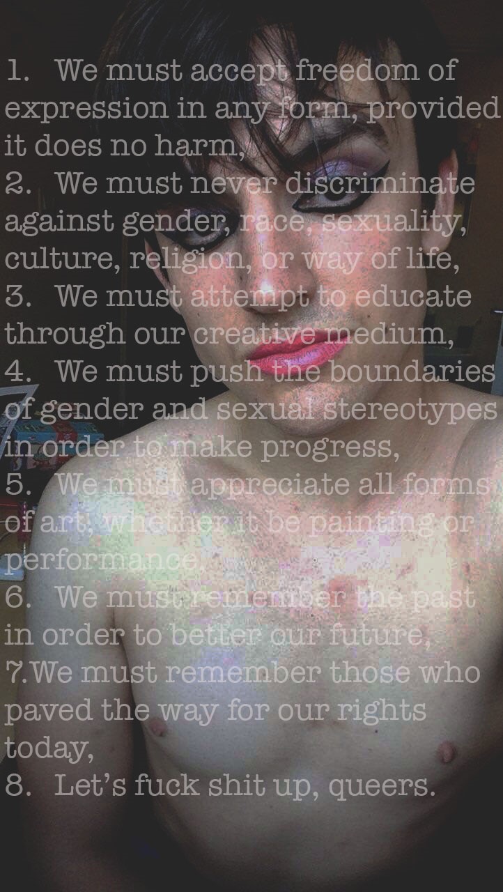
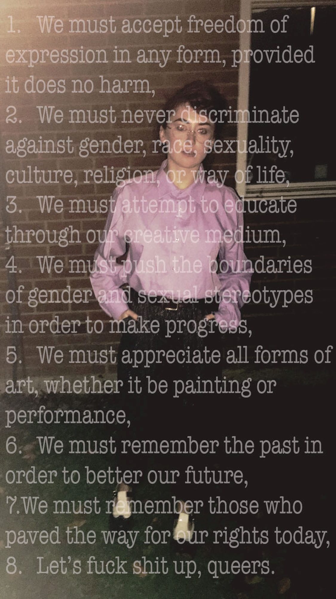
For my ‘Manifesto’ project, I produced two A3 posters. Ideally, these images should be on a much larger scale due to issues with legibility, as, to understand the imagery and the typography on a smaller scale, the audience has to come closer to the piece. Along with this, while being exhibited in a large space, the images run the risk of being swamped by the other imagery on display and drowning in the space.

I believe that a successful manifesto should demand attention from its audience; being large and bold so not a single person can ignore its presence and importance. Therefore, the manifesto pieces I produced remain too modest- especially for the subject matter I am dealing with. In order to fully encompass the spirit of gender fluidity, freedom of expression, and Queer Theory, the piece needed to be bigger and bolder.

Had I had more time to produce my ‘Manifesto’ pieces, I would have utilised professional print processes to create extremely large, glossy images- preferably 8ft X 4ft. The likely outcome of this would be more overwhelming, overpowering pieces that demand the full attention of the audience. Therefore, becoming a better representation of a triumphant manifesto and a dominant subject matter.

Task 6

Personally, my ideal studio would be a relatively large space consisting of four white walls. The blank walls create an empty space; a vacuum where I can think, focus and comprehend my ideas without distraction. Alone in my space, I am free to craft and create in various scales using a kaleidoscope of materials without limitation. Music is a major driving force in making my art hence I would colour the room with music. The music I listen to accompanies my thoughts and emotions; it immerses me into the world I create thus animating my paintings. This relaxed and therapeutic ambiance created is essential as it helps me slip into my subconscious where the minute problems of daily life no longer matter; instead I gravitate towards the wider subjects and emotions that I typically supress. This cubic white room is a space where I express myself without the worry of judgement.

Task 5

During the summer, I visited the exhibition ‘Beyond Caravaggio’ which was a collaboration between the National Gallery (London), the National Gallery of Ireland, and the National Galleries of Scotland. In this exhibition I found a multitude of enticing artworks, yet I was immediately engrossed in The Incredulity of Saint Thomas by Michelangelo Merisi da Caravaggio. His hyperrealist painting depicts Jesus proving his resurrection to Thomas the Apostle who previously disbelieved his miracle.

The experience of seeing this masterpiece in “the flesh” was startling; the lighting of the room was perfectly adjusted to illuminate the figures against the dark background. What I found particularly interesting was that Jesus (typically surrounded by a holy golden glow) is depicted to be a man of flesh and blood without the classic halo; the experience of seeing Jesus in this recognisable form makes the painting more immersive and real. The meticulous detail of the fabric, skin and hair renders me speechless, its astonishing how realistic it looks. There’s something oddly unsettling about the way Thomas’ finger penetrates Jesus’ flesh; the illusion of Jesus’ untouchable physicality is shattered.

Beyond Caravaggio (2016-2017) [Exhibition]. The National Gallery, London. 12 October 2016 to 15 January 2017.

Task 4

Saatchi Gallery and Huawei’s collaborative exhibition Selfie to self-expression (31st March – 28th May 2017) displayed a kaleidoscope of innovative and experimental photographs; it is also the first exhibition in the world to focus on the development of selfies throughout history. The works accumulated were taken from the competition #SaatchiSelfie which offered the opportunity for artists from all over the world to express themselves in the form of selfies. Most artists used this exhibition as a means of addressing our obsession with social media as selfies have quickly become a common tool of socialisation.

Artists explore our unhealthy idealization of perfection as well as the modern disillusionment with reality thus creating works that are beautiful yet perilous.  For instance, Ola Walków’s graphic and invasive collection „My only dream was about being beautiful, but it was hurting me
. I had to do it
..” illustrates the struggle of body acceptance; Walków’s selfie causes great unease as it forces the viewers to experience her sensations during the surgery. Other artists like Finnian Croy’s Duo transports us into the familiar setting of the bathroom. This mundane setting is interrupted by the double reflection of the subject, thus adding a layer of discomfort; like Walków’s piece, we are no longer a silent observer as the subject is aware of our presence. Most contemporary selfies tend to focus on existentialism and ultimately questions our way of thought, understanding and purpose.

Selfie to self-expression, (2017) [Exhibition]. Saatchi Gallery, London. 31st March – 28th May 2017.

Task 3: Hot-en-tot Venus


RenĂ©e Cox’s Hot-en-tot Venus illustrates the two common representations of female nudity in society: the sexualisation of female bodies in media which endorses the clichĂ© “sex sells”; and the celebration of the female body (suggested by Cox’s confident and poised expression). Cox, more specifically, addresses the misrepresentation of black females by directly alluding to the grotesque objectification of Saartjie Baartman (commonly referred to as Hottentot Venus). Baartman’s bulbous derriere (caused by steatopygia) was exploited by freak shows as she was paraded around Europe to entertain and astonish the public. She was depicted as an oddity, a monstrosity whilst also being fetishized to satiate men’s erotic fantasies. N. Gordon-Chipembere in her book Representation and Black Womanhood: The Legacy of Sarah Baartman (2011, p.1) wrote “She has become the landscape upon which multiple narratives of exploitation and suffering within black womanhood have been enacted”. Cox transforms this contaminated perception of black women by embracing her body with pride and great fondness. Her overpowering adoration for her own body creates a sense of impregnable freedom, she refuses to be silenced. Within the image, her body glows amid the solid black background; she radiates strength and power.

GORDON-CHIPEMBERE, N. (2011) Representation and Black Womanhood: The Legacy of Sarah Baartman, 1st ed. US: Palgrave Schol

Task 2

Susan May and Christopher Bedford comment on the of Mark Bradford’s exhibition Through Darkest America By Truck And Tank (16 October- 22 December 2013), White Cube Bermondsey. Susan May is an artist director at White Cube and Christopher Bedford writes for various art journals and exhibition catalogues. Typically, Mark Bradford specialises in collages and paintings to create unwonted and indubitably beautiful art. The material he uses are carefully chosen to fit the setting of his painting whether it be relics of everyday life such as scraps of posters and billboards. During the discussion with May of Bradford’s sculptural installation project Veni Vidi Vici (I come, I saw, I conquer), Bradford addresses his preoccupation with the concept of change. He is interested in the way changing social movements influence the course of history, particularly, the change in black culture during 1980. Due to the influence of American Hip-hop, most African-American men were perceived to be thuggish, virile, aggressive and overtly masculine; as Bradford declared “Black was a hard, male body”(pg.82). Yet, after the rise of HIV, this “manufactured knowing” of the black male stereotype is challenged; the disease physically debilitates and erodes the body. These two versions of perception manufacture an oxymoronic being; Bradford plans to create a sculpture to represent the shift in the depiction of the black male body.

Bradford, M. (2013) Mark Bradford Through darkest America by truck and tank. London: White Cube

Task 9

For this task I chose to look at Gerhard Richter’s 48 Portraits. He completed a series of 48 photographs, and 48 paintings (1972) to which were almost identical. In order to ‘limit the significance of the particular individuals portrayed’ including Albert Einstein and Oscar Wilde, he made the images all black and white, the subjects were all wearing smart attire and were all positioned on the page so that only the head and neck of the subject is included. The paintings created were deliberately soft-looking in order to resemble an un-focused camera and were completed for the German Pavilion at the 1972 Venice Biennale following the artist’s nomination as Germany’s representative. The series is often switched around and rearranged depending on where they are being installed.

Richter often softens and blurs the paintings in order to suggest that something (often the emotion) within the subject is missing or ‘lost in translation’, leaving a ghost-like, hallow figure. The process of blurring the images is a very natural practice and often creates an unexpected result each time. This links very closely to abstract expressionism, in which the paintings look very quick and involve fast, brash, brush marks. Richter however, uses a very particular technique to which he wets the canvas and uses a dry paint brush to apply the paint meaning that the brush marks are often invisible, looking more like a digitally altered photograph than a painting. Due to this, Richter is very difficult to pin down into one category as he works as both an abstract artist and a realistic artist, combining painting and photography.

48 Portraits 1971-98  http://www.tate.org.uk/art/work/AR00025

https://brooklynrail.org/2015/02/art/demystifying-gerhard-richters-gestural-abstraction-painting-in-the-gap-between-abstract-expressionism-and-pop-art
http://www.tate.org.uk/search?q=gerhard+richter+48+portraits
http://www.tandfonline.com/doi/abs/10.1080/17540763.2014.933399?journalCode=rpho20
https://www.gerhard-richter.com/en/art/paintings/photo-paintings/portraits-people-20/48-portraits-5860
https://www.gerhard-richter.com/en/exhibitions/la-biennale-di-venezia-36-esposizione-267
https://en.wikipedia.org/wiki/Venice_Biennale

Task 6

I have thought of two new modes of practice within printmaking specifically with etching and mono printing

The first mode of practice is on dry point etching. I would etch a drawing onto an acrylic plate an example being a face but instead of traditionally inking up the whole plate I would use a think ink card to selectively spread the ink into certain areas. I would then scrub away the ink only in the etched areas and leave the rest to be printed along with the picture. The result would give me a partially revealed print of the face corresponding to the movement of the ink card when I had spread it. I can see how this method can also be used to create more exciting back rounds in etching by inking up all of the etched areas as well as some of the area around it but not the whole plate and rub away the excess ink only in the etched areas again leaving the ink around it to be printed. This could solve problems to the tediousness of creating big blocks of darkness in etching and also dark back rounds would be easier to print.

My second mode of practice is on mono print. A much simpler concept of making marks on the surface you use to spread your ink. So the end piece is actually where the ink sits which has to be an acrylic plate. In other words the canvas is the acrylic plate and thus has to be photographed as you would need to wipe it away so other people can use it to print. It was a happy accident discovered when I had to create quick prints that combined two contemporary artists works together. Firs roll some mono print ink on a plate and start doing your mono prints but the only difference is that you don’t re-ink after prints. The goal is to create as many prints as you can from it before it dries out. Things to consider are that the individual mono prints you create aren’t the main artworks your creating any more and becomes more of the process of an artwork. The mark it creates on the acrylic is what it contributes to the end product. The factors surrounding a good mono print need not apply anymore as dabbing the ink so its not too wet isn’t essential. The fast prints that are made is not our main concern however the pressure needed when making these mono prints to actually mark the acrylic might need to be higher. It all depends on how much ink you have rolled. What we should get is white markings of different prints overlapped in one space. A chaotic composition that reflects truly on the relation between process and product.

Task 5

In my visit to Seth Price’s exhibition, his untitled video on the top floor had caught my interest the most. Isolated from the rest of the series, it was projected into a larger dark room into a centre screen. The video itself was a combination of his previous edited videos that resembled to somewhat of a conclusion of his series of works yet gave a strange feeling of being incomplete. It was practically an exhibition of his works but the whole idea of it was to make previously removed public works that were sold off to different individuals and basically made them public again essentially renewing its public access. These public works of old materials were used in he works downstairs but having them as a compilation in one video strengthens its availability. The dark atmosphere helped amplify the sounds as instead of headphones, the films audio is played on a loud speaker that filled the room. Its separation from the rest of the works into a specified room and its projection to the centre made it appear more important and is fitting as a last exhibit to see for its conclusive yet incomplete nature. Like an open-ended summary of the exhibition as a whole.

Task 4

Seth Price-Circa

I had visited the Seth Price Circa 1981 exhibition in the institution of contemporary arts in London which consisted of film art. I personally have never looked into film and video art exclusively and therefore my visit to Seth Price’s exhibition was both a fresh and baffling experience. The atmosphere of the rooms were naturally dark as opposed to the normal bright lit rooms in a normal museum which enables a full immersion of each films shown on separate screens. What I noticed from walking down the hall was the style of his film pieces which is commonly a combination of reused materials from a diverse range of media such as dated adverts or simply pictures from online to make a single idea.

One exhibit placed on the main hall was a piece called ‘Two for one piece’ I found amusing for its corny style of an Americans 60s/70s commercial break. I wore the headphones provided and fully immersed myself on this relic of an advert listening to the cheesy catch phrases and somewhat exaggerated acting. I could imagine anyone who had lived in that nuclear American lifestyle and had been old enough to remember to feel somewhat nostalgic. I felt it despite only being born years after that era.

Price’s work explore the concepts of recycling past material of media to create his art and use this to reflect on subject matters such as marketing and mass produced goods. But other aspects I found in his exhibition were that of a reflection of dated technology by using raw synth backing tracks. This is found in his piece called ‘industrial synth’ which uses a combination of footage of retro text based games of the 80s and strange abstract animations that all fit together to give a feeling of an 80s era arcade. Seth Price’s exhibition as a collection emphasises a great deal of how tenuous a static image can be on screen when subject to video production as he rarely focuses on a single scene or point in time. The exhibition as a whole was a refreshing look into an unfamiliar practice of fine arts but not something I feel I could be inspired to integrate into my own practice.