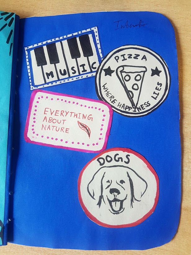
Original Untitled
Tomi Olumide
2017
Ink on photocopy
21 x 29.7cm
The work above is a darkened grey scanned photocopy holding markers (drawing tools). Initially made for a studio drawing workshop which I changed my mind towards using. It however worked very well in these adaptations, as I have appropriated elements of this piece into the following works.
I was inspired to create this style of work from the influence from a past drawing workshop which had involved photocopying art works we were interested in for our Contemporary Art project. I’m also very interested in incorporating text and motifs into my drawings and paintings, as it’s a very animated habit which mediates between childishness and passion of defining my points through verbal representation. I have found using motifs and figurative drawings or lines are a way to obscure my messages, be playful as well as distract my audience from the entire context of the work, while at times they could be guidelines to the context of the work.
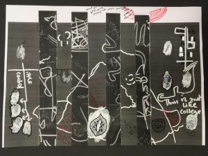
Blank Untitled
Tomi Olumide
2017
Ink on Collage
21 x 29.7cm
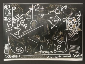
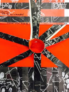
Red Untitled
Tomi Olumide
2017
Ink on Collage
21 x 29.7cm
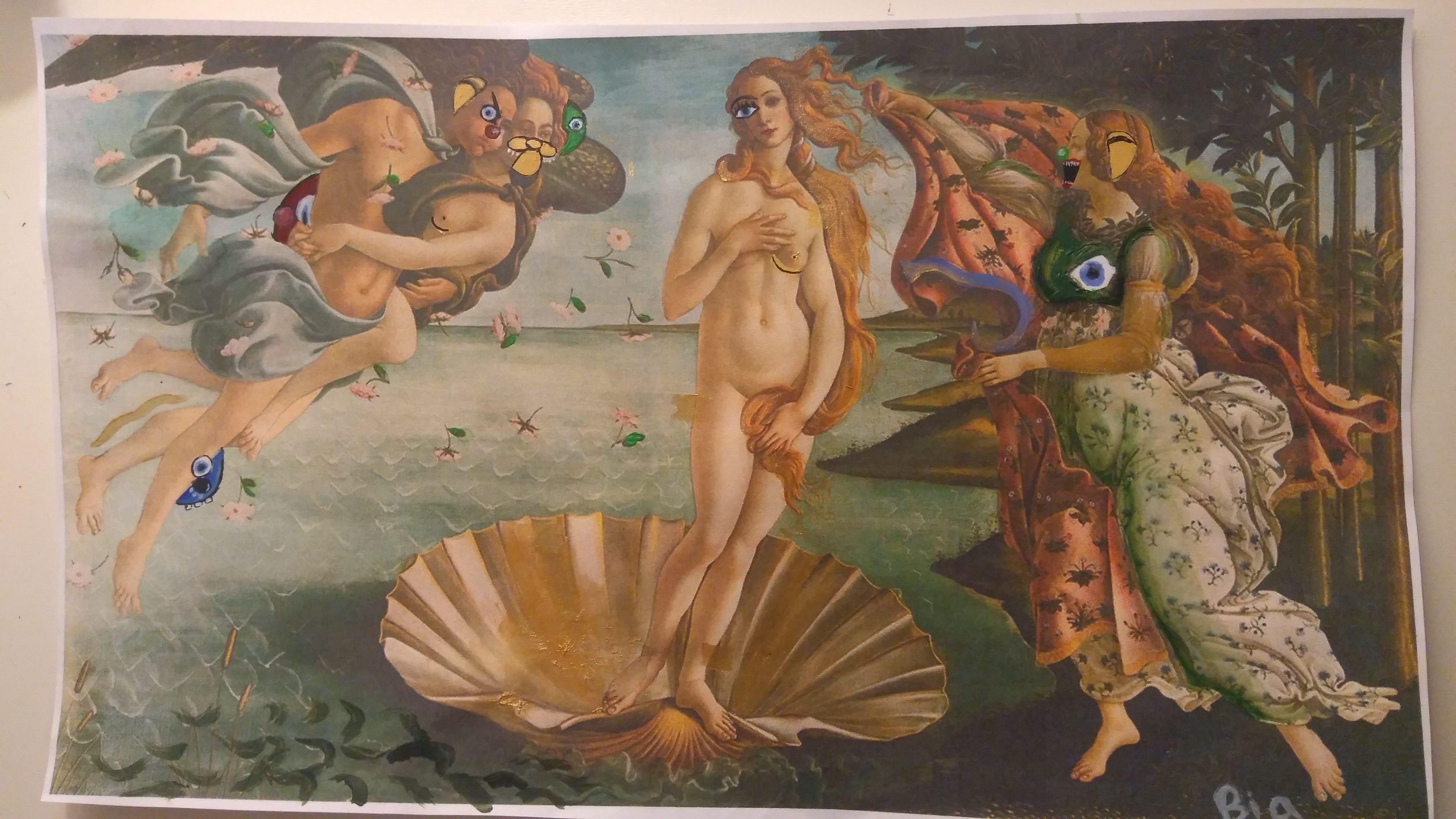
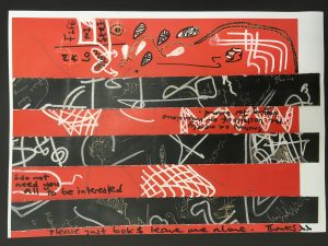
On the surface of the work are irrelevant lines and also text which do depict my personal frustration with my relationship at the time. Drawing on the scanned piece, was in fact a way to relieve myself of the tensions which resided within my mind at the time. Then unaware of the possibilities of carrying on the sequence of reproducing it into other forms, that still communicate emotional frustration, joy of transitioning into something more.
I used a photocopy of the work above and cut it in in a horizontal position, where a curtain looking omitted gap like bar graph was formed. This template became a flexible means to reproduce my ideas in various juxtapositions. The individual backgrounds becoming the supporting image laying against the back of the curtain strip, would in fusion with the strips form a collage of the two independent pieces merging them into one body, where the printed resulted would be further worked on with white and metallic ink drawings on its body. There forming the works ‘Red Untiled’ and ‘Black untiled,’ which illustrate the themes described in the ‘Original untiled’.
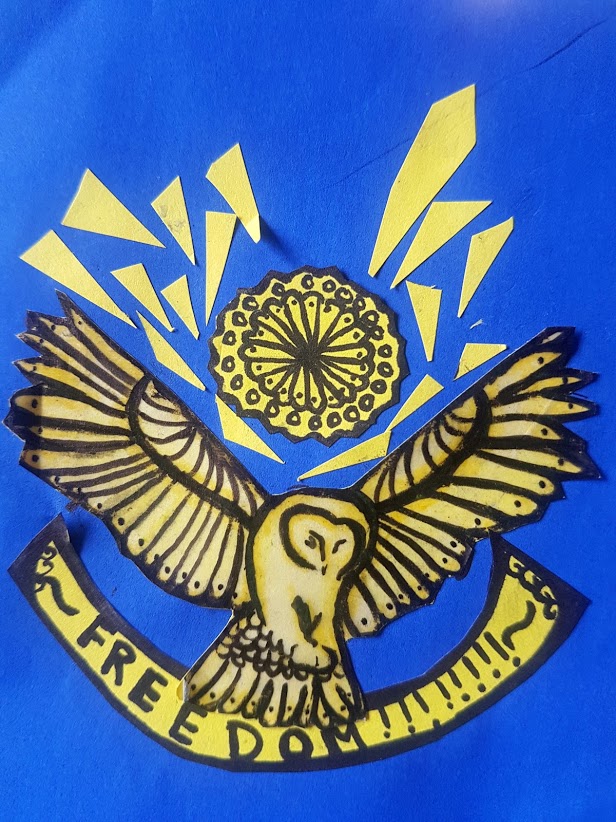
Chocker tentacles
Tomi Olumide
2017
Paper Sculpture
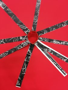
The curtain stripped piece was played with further by arranging it in positions of jewellery, like a choker necklace but with 9 black tentacles camouflaged in white and gold inscriptions.
Blood rose
Tomi Olumide
2017
Paper sculpture
Silent rose
Tomi Olumide
2017
Paper sculpture
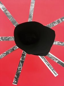
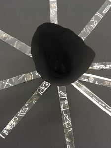
Whilst still in this position, I would take the choker necklace to be the anchor for a black paper rose, on the background of either Red or Black A3 paper, to engulf the full length of the tentacle strips. The miniature sculptures titled ‘Blood rose and Silent rose.’
After this the combination of the 4 works would then make my sarcastically titled end piece to conceal or Nah?. A collage of these pieces ‘Original untitled+ Chocker tentacles + Red Untitled + Black Untitled+ Red figurative drawing of male genitalia, then resulted in To Conceal or Nah?
To Conceal or Nah? Tomi Olumide 2017 Mixed media
21 x 29.7cm