Category Archives: Fine Art

This Category should be selected if you are a Fine Art student.

Task 10

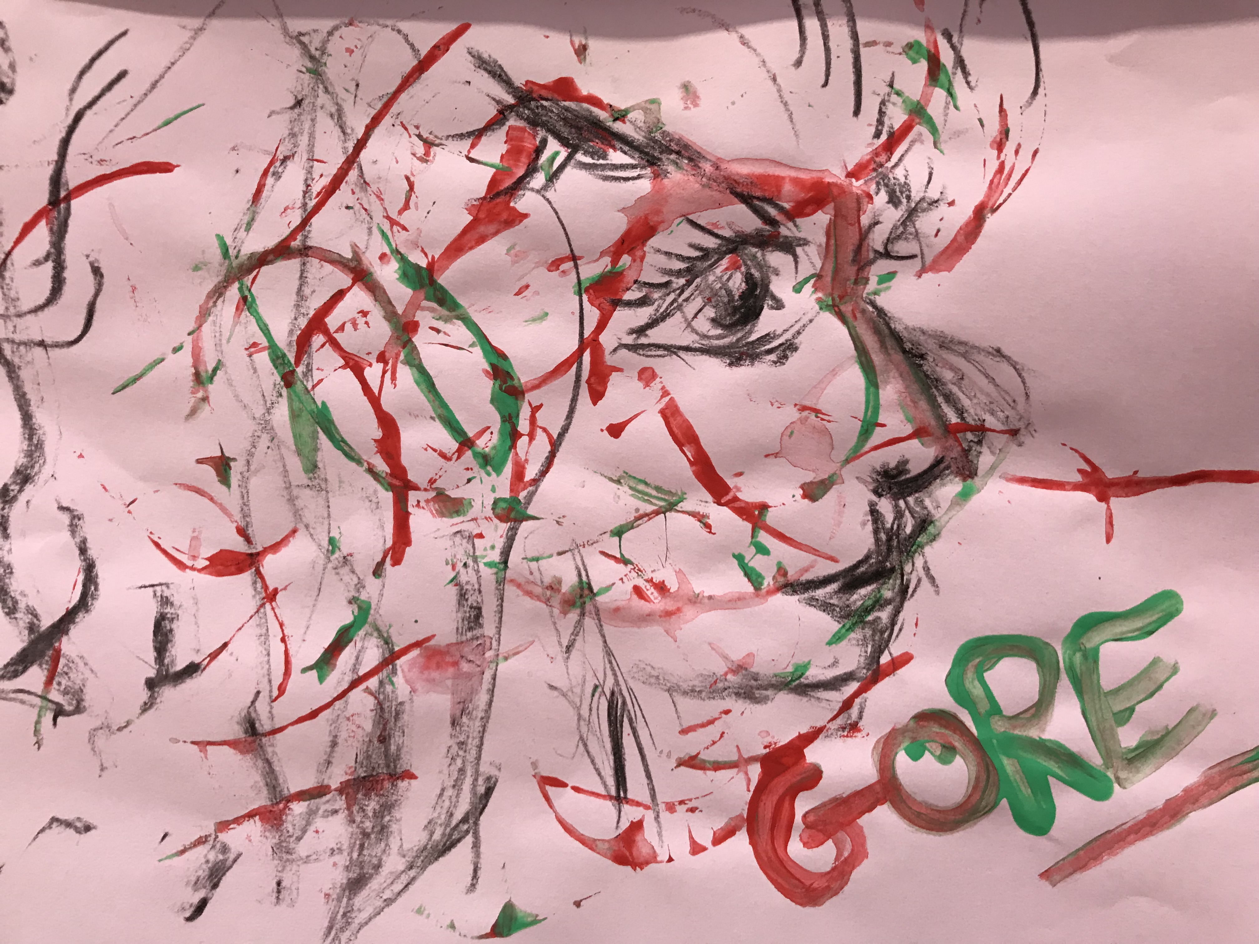
Recent shift in direction. complimentary colours slashed marked people words.

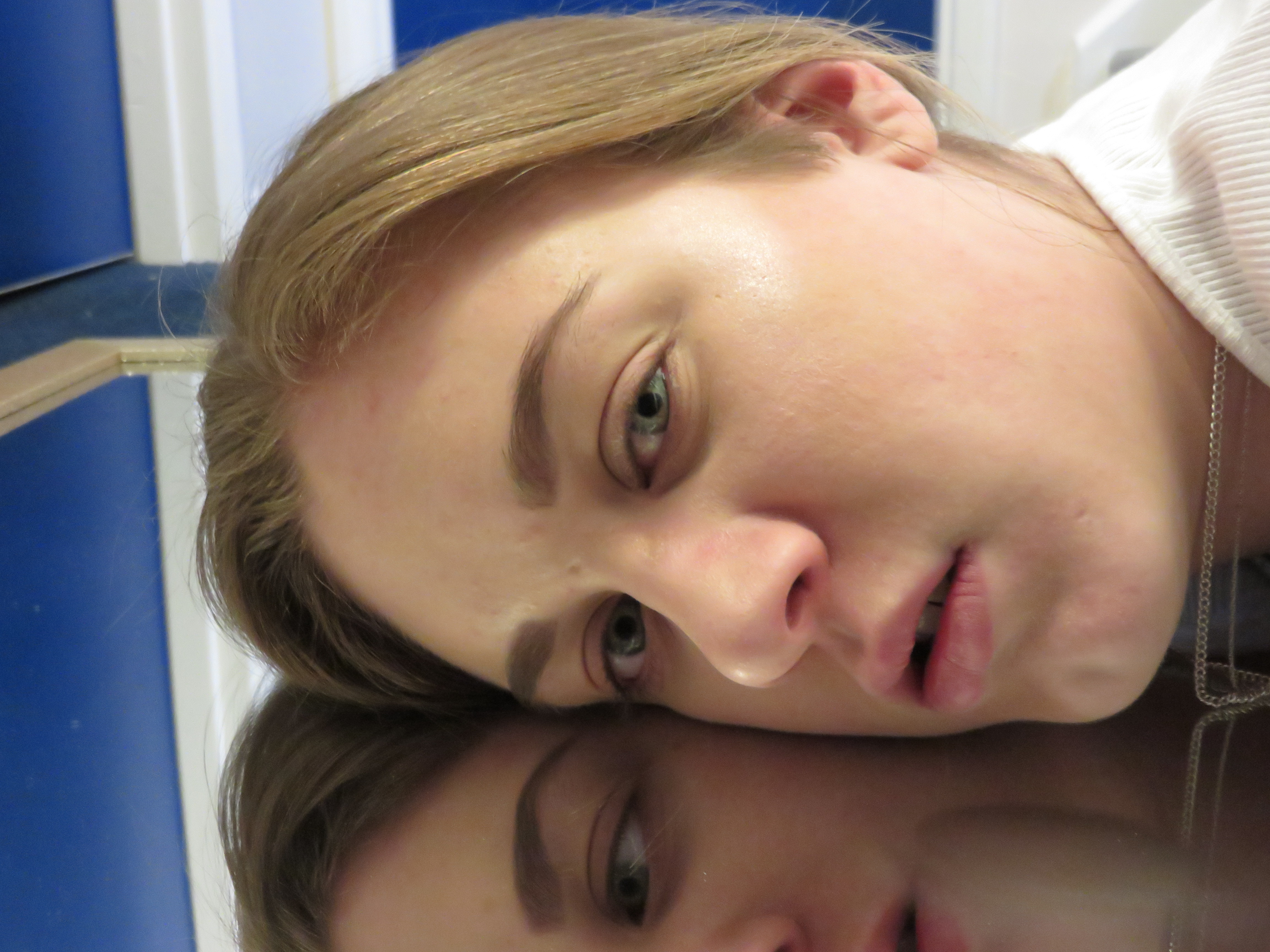
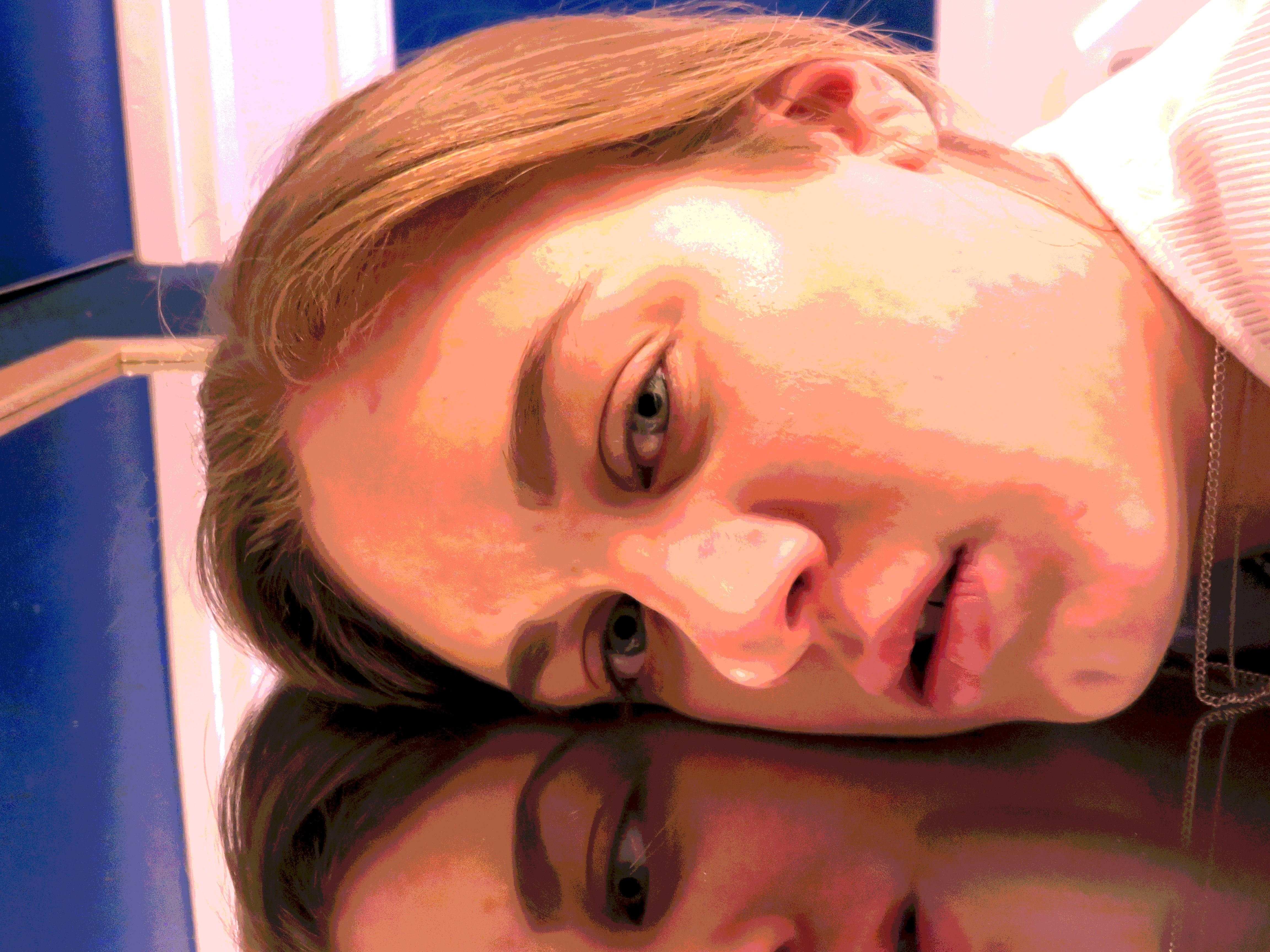
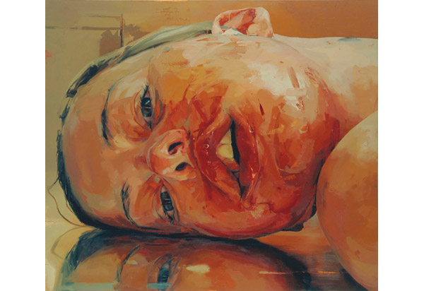
The first few words “recent shift in direction” were meant to reflect on my recent works of marking using multiple mediums.My most frequent practice came under print making especially in the style of German expressionist art and so my current mode of practice drifts away from that and delves into a more contemporary style of art. This art piece in particular was in the beginning an experimental piece of paper where i slashed marks on its not making any specific image. I then decided to play around with some acrylic colours and used green and red which are complimentary to each other. i had been influenced a lot by illustrator Rola Chang recently whom creates ink paintings often in a state of movement and dramatic poses and this is where my slashes come from. The word gore came into mind when i thought of Oscar Murillo’s works which had words, usually ironic to his subject matter, that gave his work more of a suburban look. In the end i a improvised and created a side profile of a face by emphasising the lines that resembled the shape of a nose and lips. My end product was something i didn’t originally think i would make but this has been happening to my recent works recently as i am trying to become more open minded with mixing different mediums together.

Jordan Warwick – Task 11: Reflection

To put it simply, my blog is honest.

At the beginning of this project, I never intended to create such an honest collection of analysation, anecdotes and opinions within every task; it just happened. Eventually as I got to task three or four I noticed how much I used storytelling as a pathway of writing about myself, and from then on would try and involve it somehow into everything I produced – as long as it was appropriate. Therefore, there is more often than not an introduction that provides a small personal flare, even if I’m writing about something that has nothing to do with myself.

Through this technique of writing, I have learned that sometimes writing comes more naturally to me than any other form of art. To me, writing is good for the soul, it expresses directly how the writer is feeling but can also be manipulated to sound very different. Furthermore, through this discovery I also found that a contradictory nature is a concept I find very exciting, and wrote about recognising it within the works of my own and of others within a few of the tasks that were set.

My blog is personal, it is not something that requires the reader to be in their ‘Sunday Best’, nor does it try to be overly pretentious and fancy. My blog is simply just honest, and a small fraction of what I intend to offer and produce within my own art and writing in the future.

Task 8

I chose the painting Reverse by Jenny Saville to appropriate into my own work, as Saville inspires lots of my work, despite her medium being something which I do not -as an artist- particularly use to finalise my work. To do this I photographed the model with her face pressed against a mirror in order to recreate the reflective surface from the original. This outcome was then edited this with Photoshop by posturizing the image to mimic the bold brush strokes typical of Saville’s work. Saville uses this technique to highlight the high and low points of her models, defining the tonal contrasts -much like the effect of posturizing does. I then saturated my interpretation to capture the raw emotion from Saville’s piece. Although Saville contrasts this with cooler toned yellows and blues I decided against copying this technique as with my blue background I found the resolved piece to be too dull through the choice of colour tones; I also chose against editing out the background to imitate Saville’s painting as it would have looked too unnatural for the composition I was attempting to appropriate.

Overall, I found that my process was well approached. Linking her painting style and manipulating this across mediums through posturizing was a great method and my outcome was successful in achieving what I intended to.

Megan Fragopulu – Fine Art // Task 12

For this task I decided to use my 3 images that I took for my final outcome in the contemporary project. I wanted to have texture and movement as the main themes in the images and from my group critique I found that that was successful. I printed them out size A5 but it would be interesting to see them a lot larger. I usually tend to work quite small because I like how the viewer has to pay close attention to my work.

The reason that I picked these 3 images was because I think it would be interesting to see the difference that the size can have on the overall outcome of how the viewer perceives the images. I would also like to play around with how the images are displayed. For example you could layer them on top of each other slightly off center so you can only see part of two of the images. I also think that if the images were bigger then they would be a lot more textured because of the pixels which would again give a different outcome because they would look more futuristic and unfocused. I also want to play around with the sequence of the images as well and get peoples opinion to see if that changes the way people interact with the images.

Jordan Warwick – Task 10: Ten words, One image


Discovery, experimentation, past, future, open-minded, growth, passion, communication, colour, fear.

Above are ten words and an image that describe my practice. ‘Discovering’, ‘experimentation’, ‘future’ and ‘growth’ relate to the idea of hope. This is something that is a strong trait within my practice. I have hope that I’m insanely proud of my next piece, and that my techniques will evolve and become a stronger version of what I already create.
This shows through the image. The photo of a work-in-progress self-portrait painted in Gouache onto sketchbook paper shows the many layers of skin tone as well as the still plain paper. This could be a metaphor; sometimes a concept entices me and I spend hours on it, but other times I have trouble – much like a writer’s block.

I see myself as someone who wants to learn new things and grow from them, thus why I describe my practice as being ‘open-minded’. However, there is a strong ‘fear’ of failure, anxiety and paranoia that sometimes knocks me back and convinces me to stay in my comfort zone and to not branch out and try new techniques. This is also apparent in the image as, I have created many a painting onto paper with Gouache paint, and I was too scared to try out oil painting at that moment in time.

‘Past’, ‘future’, ‘passion’, ‘communication’ and ‘colour’, are words that I picked to describe my practice because they are what I aspire to. I want to learn from my past so that my future is brighter and I want to create art that ignites a passion in both myself and the onlooker through my version of visual communication and colour.

Summary of Blog- Task 11

Through reflection of all my blog posts, I feel thoroughly pleased with each individual blog post. Each post encapsulates my thoughts delicately and the reader is able to capture a view of my work. The structure, form and quality of each one is acceptably written. Personally, I devoted many hours of time and effort to create them as well as enjoying each task and learning from them However, the main aspects I have really gained from making a blog is that it has increased my use of vocabulary. I now feel more confident when reviewing a piece of work or an image, or even just consuming a book or a section of text.

The highlights during the creation of my blog post was analysing images of artists work, as this is something I have always enjoyed. Making observations of a well-known artists piece of work and then reflecting on it, giving my opinion and thoughts about it and sharing this with other people. I thoroughly enjoy recreating pieces of work I have reflected on and I enjoyed reflecting on my own work as I find it helpful when I critique what I have created.

On this process of making my blog I did however come across some challenges from one or two tasks. These revolved around the subject of application than practicality. By this I mean within one of my tasks I was asked to write and then reflect and compare both texts. Even though I enjoyed reading them and gained much knowledge from them I did find comparing and writing about them difficult.

Encapsulation- Task 10


Performative, masking, expressionistic, chaotic, feminism , juxtaposing, rebellious, distortion, symbolic, beauty

Through my time at University, I have been looking at a specific theme of appearance and cosmetics and how they are used. This has been a common theme within each project. This then lead to the theme and ideas behind my film. I’ve always been intrigued with makeup and, so I wanted to really explore this idea of how it can be used to enhance, or even change one’s features, so when making my film I thought about this and wanted to explore this idea further. Therefore, I felt makeup was a great symbolic way to connect these two ideas together.

My film entails me, sitting in front of a camera applying and smearing makeup, mainly lipstick across my mouth and slightly onto my face. The pace of each clip in my film varies, some are fast, some slow and some are even in reverse. I did this by using an application that could change the speed of my video’s.

I feel the overall outcome of this film is very performative, which is something new to me as I haven’t created performative art before. I was inspired by the artist Pipilotti Rist, 1962.  Watching her video “Be nice to me” ,(2000). This video opened my mind to the possibility of making a film centred around the concept of make up and the symbolic power that it has. I really enjoyed creating my film through performance art. I definitely want to pursue this further in my practise as a medium.

Task 3 // Image Analysis


In this painting, the main subject is the naked man apart from wearing glasses and he is smoking a hash pipe. He is sitting very relaxed on a white rich couch, with a dark wooden frame. As the composition of this piece is cropped, the rest of the sofa is cut out of the frame including the shirt which is hung on the sofa, on the right-hand side beside the man. The shirt has repeated prints of a white woman looking towards the naked man. This makes the piece complicate its racial and sexual politics further also broaden by its intentionally provoking title. The background has vibrant colours of Moroccan tiles. The rug below which is shown a little, on where the  man stretches his left leg, has a repetitive pattern similar to the tiles above. This makes the piece more framed as a border with the Moroccan Tiles. His brush strokes remind me of Bhupen Khakhar’s style of painting, of how the texture is smooth and the strokes are blended in well. What mainly appealed to me to analyse this piece is the tiles in the background, the patterns are repetitive with minimal colours. They caught my attention as they contrast against the sofa.

The title of this piece is “No Naked Niggahs”, this statement could be a rule at the time and it shows how representations of African American nudes have received, feared and censored. However, the title juxtapositions the painting as the man’s expression shows that he isn’t bothered about breaking the rule, sort of rebel on and breaking stereotypes. He is looking into to the audience as he may know that they might have a discomfort of looking at this piece. This could be a way of expressing pride of his colour. Having researched the artist, Hendrick often paints Black Americans against monochrome interpretations of urban north-eastern American backdrops. He wanted to express the unheard voices of Black Americans in the 60’s and 70’s.

http://www.tate.org.uk/art/artworks/hendricks-family-jules-nnn-no-naked-niggahs-l02979

https://theartstack.com/artist/barkley-l-hendricks/family-jules-nnn

Philosophy and Theory and Politics- Task 9


Tracey Emin ( 3 July 1963) CBE is a well known Contemporary Artist born In Croydon, London UK. Her interests lie within Conceptual Art and confessional artwork.  This year she has an exhibition called The Memory of Your Touch, 8 September – 21 October 2017 displayed at the Xavier Huftkens in Brussels, Belgium.  

Her painting “Mother” is an acrylic painting which depicts a body, this is not clear or defined as she only has used minimal brush strokes to achieve it and the form of the body appears to be in line art. She has unquestionably left the viewer to come to terms themselves with this painting. It is set on a white background with underlying tones of pale pink with darker tones of crimson throughout the lower half. The outline of the body itself is created with black acrylic, which appears very fine. This really gives this piece of work a sense of freedom and imagination for the audience. I also find that the use of only two colour, which are very diverse to one other and aesthetically pleasing.

Emin allows you to question this painting. Is she remembering someone’s touch or is she mourning someone. The questions are endless. I believe though that it links nicely with the work of (Cy Twombly ,1928-2011). It is a fine example of abstract expressionism in the contemporary world of Art. His influence inspired the autobiographical and confessional medium of work that is still alive today in work by Emin.

Theory that underpins Emin’s work is conceptualism, feminism and abstract expressionism. I  focused on the sociological theory of Fouclaut (1926-1984). (Foucault, 1985).

Emin’s art reflects a notion of authenticity with feminism and political democracy through storytelling and truth telling. If you were to apply the theory of the French Philosopher, Michel Fouclault (1926-1984) you could see that his principles form part of her storytelling through emotion. His theory of power and the struggle with time known as “Foucauldian” displays his theory of abstract theoretical issues of power, knowledge, sexuality and selfhood. (Horrocks, 1997). Emin utilises this theory through her work of emotion, sexuality and exposure of problems and dysfunctional issues in society. This is a consistent theme throughout her work, which I feel is clearly shown time and time again in her work.( Harrison and Wood, 2003)

Bibliography

Foucault, Michel 1985 (1984) The use of Pleasure: The history of sexuality, Vol 2 translated from French by Robert Hurley, Pantheon, New York.

Harrison Charles and Wood Paul, (2003)  Art in Theory 1900-2000. Blackwell Publishing.

Horrocks, Chris and Jevtic, Zoran (1997) Foucault for Beginners, Icon Books, Cambridge.

Standard Evening (July 2014)


Task 1 // Module Introduction

These are quick paintings of these castle ruins in Hohentwiel, Germany.  During the summer,  I went on a hike with my cousin to the castle ruins, I painted a few primary observations as I was walking along the trail. Both these paintings were completed around in 20 minutes. I vaguely and quickly sketched the shapes with grey watercolour and I then started to build up the painting with darker tones. I then used colour pencils to make areas darker and to speed up the process. I used fine liner to go around areas to make it bolder. If I had to do this again, I would probably not use colour pencils as it looks messier and should have taken a bigger size brush to speed the process. I would use these paintings as references if I were to paint it in a different medium such as acrylic to develop this piece further. Also, I would scan these paintings and use photoshop and merge them together and use the opacity tool. This would make the painting look like an illusion. I am pleased with the painting of the castle and the blue sky however, I am not satisfied with the  one I’m in the castle as it looks messier because of the colour pencils.