Category Archives: Fine Art

This Category should be selected if you are a Fine Art student.

Emma Davies: Task 2

Pink: The Exposed Colour in Contemporary Art and Culture, written by Barbara Nemitz, discusses the individuality and exposé of the colour Pink in art. Considering aspects from its metaphorical and spiritual significance, to a number of colour-orientated artworks, the entirety of this book addresses Pink as a notably conceptual and visual element. For example, Nemitz (2006) regards the psychological potential of the colour:

“Pink is more closely associated with emotions than any other colour. It appears to be a colour that addresses us with such intensity that it poses a genuine challenge to our emotions… people seem to know exactly where pink belongs and where it doesn’t.”

Therefore, its effects on a viewer’s emotional interpretation is hugely relevant when connected with human behaviour. Whether associated with the flesh of the human body and its skin, the delicate cherry blossom tree, or an artificial material, the diversity of different shades of pink are both complex and fascinating. Thus, Nemitz transforms Pink from a mere colour to a hugely intriguing and connotational notion in art.

Bibliography:

  1. Nemitz, B. (2006) Pink: The Exposed Colour in Contemporary Art and Culture. Germany: Hatje Cantz Verlag

Emma Davies: Task 1

I find hands fascinating. They reveal a person’s life, disposition and personality far more than most other characteristic human features. Not only does this idea regard practices such as palmistry, or gestures and body language, but also the definitions and environmental damage scattered upon the surface of the hand. And, combined with my ongoing interest in psychopathology, my research led me to explore how people express their mentality and its repercussions through their bodies – in particular their hands. I studied mental illnesses such as bulimia, examining the ways in which people strive to be in control: by dominating their bodies those suffering with this illness often regain control of their emotions. Thus, the mind and body are merged in ways both physical and psychological, and the binge/purge practices associated with bulimia have hand/bodily connotations.

Inspired aesthetically by artists such as Ernesto Neto, I wanted to find something which can represent the metaphorically viscid emotional substance that is the constant need to be in control. I wished to symbolise the ways we as people can manipulate and strive to change situations physically, but their emotional effects are what firmly stick upon us. Using putty (a gummy, yet easily manipulated, stretched and altered material) I decided to present this concept visually.

In the arrangement of a series, the downwards transition embodies the potentially convoluted cycle of this mental illness: the perception of being in control, to its inevitable emotional effects. Control may be obtained in one moment, having a hold of the emotional instability and situation in hand (the putty), but in the next moment it elongates into something impossible to disperse, diminish and handle.

Task 7

Robert Rauschenberg began a shift in art by changing the way we use a “canvas” by changing the Renaissance way of working “vertical” which was so the art would be eye level to horizontal and other directions. Even the popular artists of the time such as Pablo Picasso employed this traditional technique – however Rauschenberg changed this. He also started to use “culture” instead of nature as his main focus which was something new at the time, using things such as printmaking, screen-printing, found materials and photographs. A motive of Rauschenberg’s was to ruin the illusion of depth by making everything pop out at once. As soon as placing any materials together that would create depth he would eliminate them. All this was a precursor to how we view art stimulus today.

Richard Serra also changed the way the art would be made by very adamantly sticking to what he called “site specific” works. He would employ the use of typical construction materials and techniques from the industrial revolution which was not used at the time in art since these methods were most likely not considered “proper” since they came from working class backgrounds. He believed that location was extremely important for context and that if you made a sculpture elsewhere that it would ruin its context. For example, with his “Tilted Arc” which was a large piece of steel was placed in a very neat and tidy area. This was very controversial and people at the time believed it was antisocial and would encourage things such as graffiti. He wanted to challenge daily norms and art institutions about the idea of modernist works which were autonomous to wherever they were placed. He decided to remove it in the end and it was not placed elsewhere since he believed there was no point since the sculpture was built for that area.

Rauschenberg and Serra are extremely similar since they both challenged the status quo of artists during their time employing new ways of working and new attitudes towards art which helped shaped the way artists create today.


Task 12

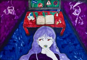
I did this piece on A3 paper with markers and pencil. I feel like it could be interesting if it was filmed. However, there would be many challenges which would come with it.

Props and background:

I would either have to green screen the background which I feel wouldn’t be effective. Or I would have to recreate the room it’s self so I would have to paint the walls, recreate/paint the furniture. As far as the small props go it would be fairly easy to get hold of but the book I would have to maybe spend a lot of money to get something similar. For the window, I would have to get hold of a real window since I don’t know how to construct one and then either paint the sky/signs or paint them onto paper and then stick them onto the window.

The girl:

I would either have to find a suitable model or use myself as the model. I’m fairly confident in my makeup skills to be able to create the look. However, I would have to buy a decent purple wig which would be costly or have a deliberately terrible one which I’m unsure about. I would have to get red contact lenses too.

Film/filters lighting etc.

I’m not entirely sure about lighting – I would have to ask someone to help me with that. In this piece, I did a deliberately odd perspective which might be hard to recreate on camera. I could maybe use a fisheye lens. I would be able to do a lot of enhancing with contrast after I had filmed.

I’ve really wanted to try and recreate my illustration images into film and this task was a good idea to think about that. But I feel I need to get more familiar and confident with film making to do something like this. Also I need more resources and space. If I actually did this project I feel like it would turn out slightly different to the original piece but it would be fine.

Task 11

When set these blog tasks I was initially fine with the ones being set but however a few weeks in I started feeling a bit overwhelmed with the adjustment to university life and other projects that required my attention. But despite the feeling of being overwhelmed I feel like this format has been very useful. If I were to do a similar format next time I would appreciate the bite-sized chunks of work set. I would have to be a bit better at time management. This work has also has gotten me to think in perhaps a more academic way when interpreting art. The work set and lectures have also given me valuable information about the history and politics of art.

I feel like generally my blog is a bit chaotic with some tasks better written than others.

Task 10

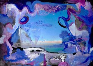
A reflection and interpretation of how I view the world.

I find it hard to sum up my art in so little worlds as I dabble in a few different things in this point of time. I am still trying to figure out what my art is all about but I know it’s from an emotional place.

With this particular art, I’ve chosen it’s the more illustration and painting side of things that I do. This piece was experimental using a photo I had taken near to where I was living.

I chose these words since the majority of my art is quite often interpretations of situations I’m in, facing or reflecting upon. I then give my work a narrative and quite often use the same ghostly figure give my work some life. I draw inspiration from music, anime and video games. I enjoy using various gritty surreal and abstract imagery and bold colours.

Task 8

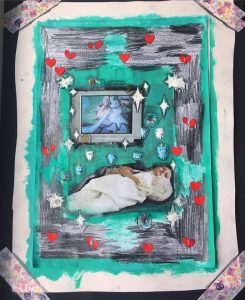
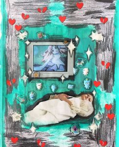
So I decided to choose a fashion editorial which I think about fairly often. There’s a girl in very regal clothing lying on the floor next to a 90’s-early 2000’s TV which has an anime girl on it. This image is a particular favourite of mine since in essence it’s a couple of my main interests – fashion and anime. Also, it’s not overly kitsch and sickly like a lot of western fashion with anime things are. I already had this image printed off for one of the drawing workshops and it never got used so I decided to use it. This was all very impulsive and I didn’t plan it at all. I used left over acrylic paint from something else I had been using and painted over the background. One I had painted over the background I placed some cutesy bear stickers near the girl. Then I decided to use some wedding stickers which I bought in the local art shop on it to make it look sparkly. I’ve really wanted to use stickers more in my work and this was a good opportunity to do so. Next I used a 6b graphite pencil to fill in the empty spaces and give shading which I’ve been using in my work recently since I like the effect of it. Once I did that I stuck some red heart stickers on the piece and tore some of them in half. After that I cut the image out and stuck it on some black paper using some “Sailor Moon” cellotape!

This was a really fun experiment for me because I try to never appropriate images since I very much like to use my own photographs, drawings etc. I’d like to try this out more in the future though.

Task 6

To invent a new personal studio mode of practice I would have to take into account that I like to use lots of different mediums. At this point in time I like using the following or can see myself going to use:

Embroidery

String/Textile sculptures

Painting (acrylic/oil)

Collage

Floral/natural arranging

Illustration with markers and pencil

Digital Art

Creative Writing

Creative Makeup/Costume

Photography/Film

If I had my own ideal studio it would have to be a large-ish size but manageable. With enough wall space for hanging my own work up or taking photos. Preferably in my own house/flat or very nearby to where I live as I get most inspired during the late evenings. Ideally the studio would have to have a lot of light so I can see my work properly and take well-lit photos or film. I would have a lot of various reference/inspirational images stuck on the wall(s). I would have one desk for textile work and a shelf unit where I can easily see all my materials (as they’re currently all just in boxes where I can’t see them). I would have a desk for painting and have all my paints laid out neatly. If I could I would have the desk very near a sink so I could clean up my brushes, etc. quickly. I would have to have a big sink! If I could afford it I would have a decent sized fridge for flowers/etc. I think I would have a main desk where I keep my illustration supplies, computer and tablet. This would be either by or near where I’d keep my inspirational images. There would be a dressing table with makeup supplies and a wardrobe with costume. There would overall be lots of storage space to put various supplies in.

Ideally, I would like to have access to a lot of things to grow as an artist. That’s why I can’t suggest a specific thing.

Task 5

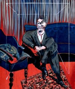
Early this year I went to see the Queer Art Exhibition at the Tate Britain and one of the pieces they had there was Francis Bacon’s “Seated Figure”. I was aware of this piece already before attending the exhibition, however seeing it in real life was quite an experience. When I saw it I found it deeply unsettling and it is not too often that seeing an art piece makes me feel something. I won’t go into too much detail but it brings up some not so happy memories. It also remind me of some nightmares I had as a kid where there would be a mysterious silhouette of a man sitting in a chair in a shadowy room. Another interesting point to pick out is the colours of this painting are colours I gravitate to in my own work.

I think there is a huge value in seeing work in the flesh because a photo of a painting for example could miss some very important details which are essential to the piece. When I googled “Seated Figure” for this task, there was colour and quality variations which ruin the overall feel of the original piece. A photo can only capture so much!


Task 4

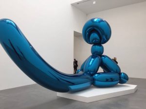
Late last year I went with a friend to Jeff Koons’ exhibition in London. I am not particularly a fan of his work but I was interested in seeing it nonetheless (plus it was free!). When I got there one of the first things I saw was one of his balloon sculptures.

 Since it was a year ago I had to rack my brain a bit to remember everything, but I think after this there was another room with his sculptures. I get the appeal of them aesthetically but other than that I don’t really find them that interesting. In the following room I was a bit startled because I had no idea he had done pornographic art which I found was a huge contrast from his very light-hearted sculptures. I did not really stop to look at that work too much and continued on to the rest of the gallery.

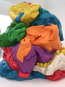
My favourite piece of this exhibition was a huge play-dough like sculpture which I think was made out of something more durable. I really wanted to reach out and touch it but obviously I couldn’t.

 We went through this exhibition quite quickly and I think it was overall very nice for spending a half an hour in.