Category Archives: Fashion & Textile Design

This Category should be selected if you are a Fashion & Textile Design student.

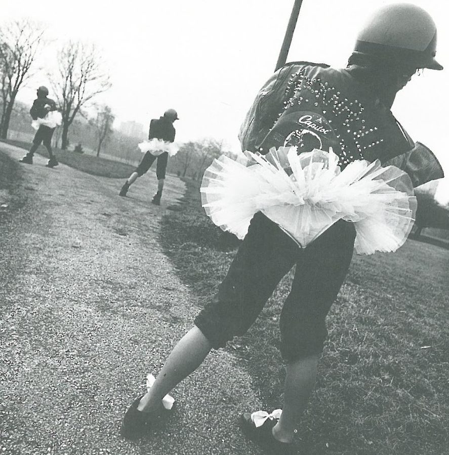
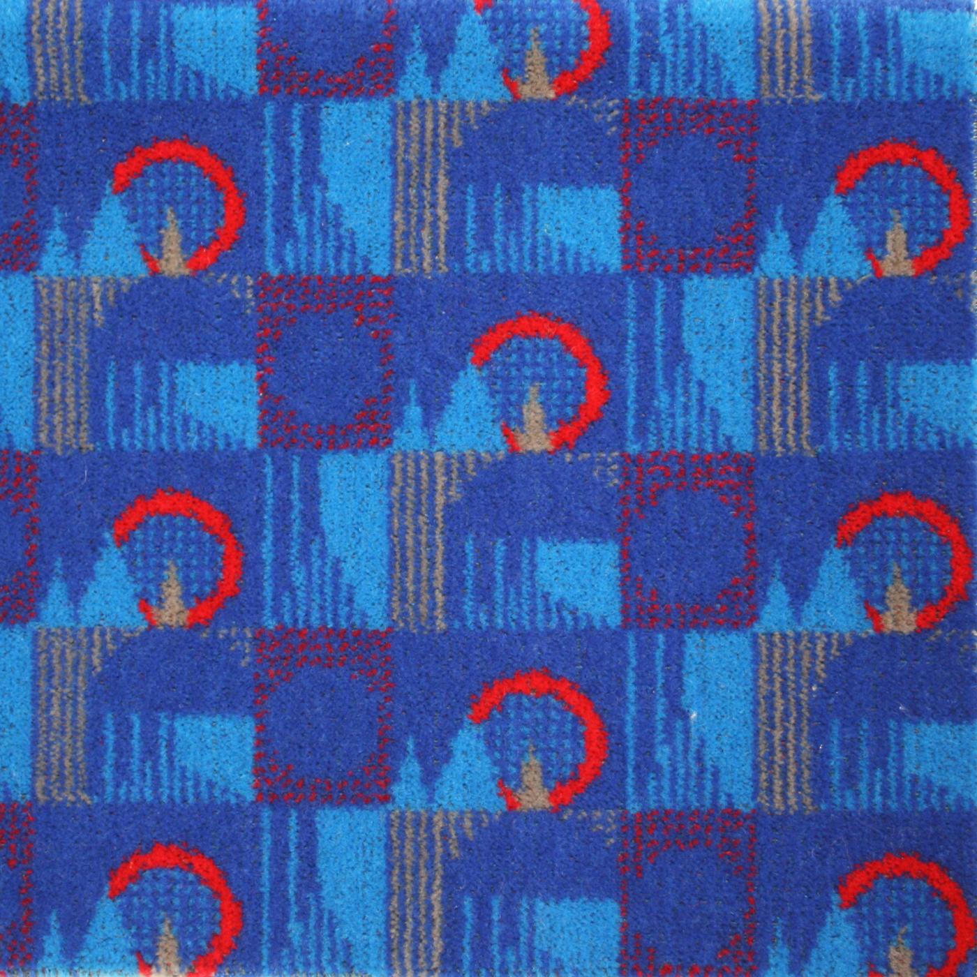
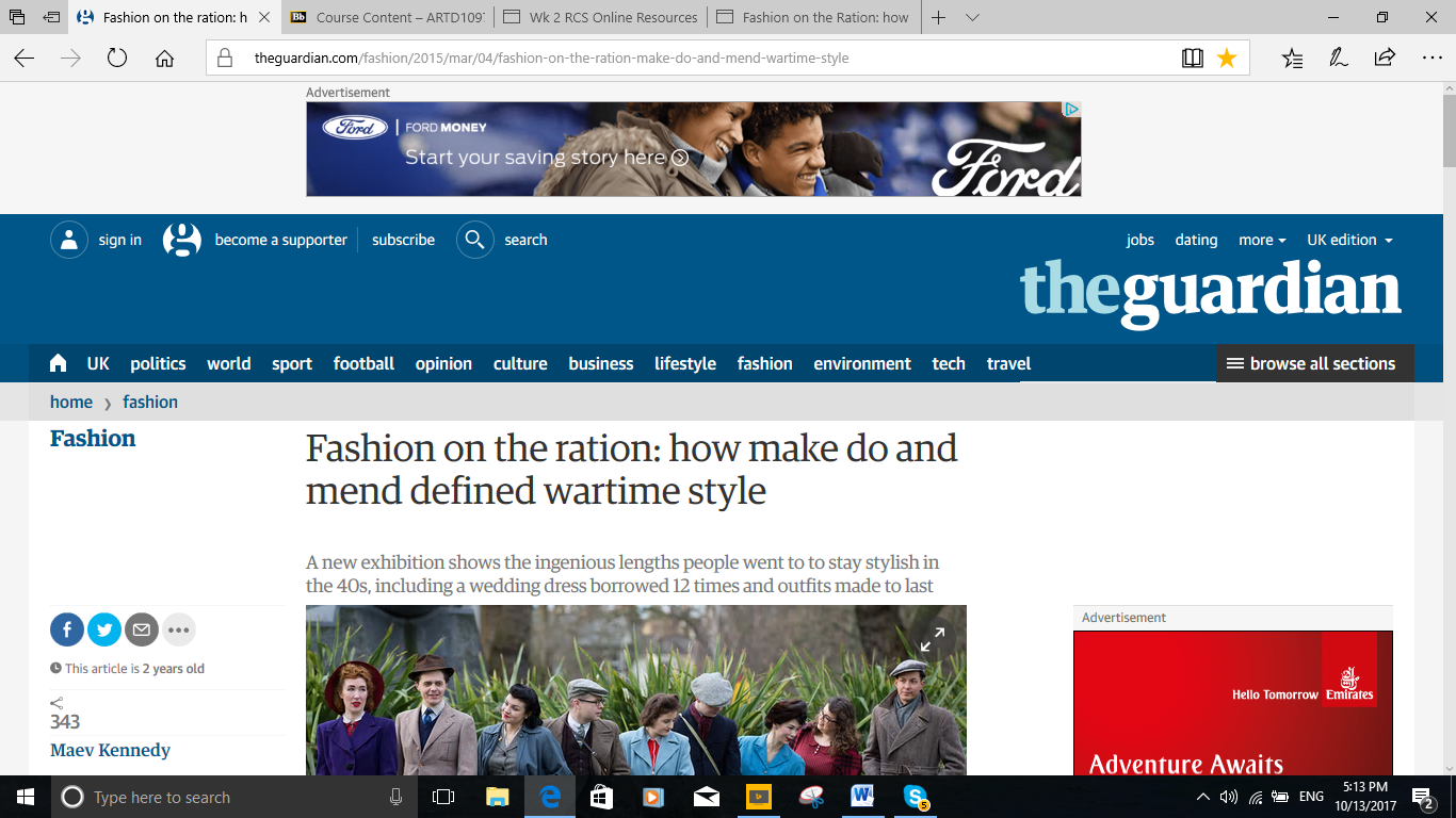
I started off by searching through the Textile View magazine and came across a history trend where designers have been influenced by different eras. In this issue it showed how designers developed their Christmas and party collection by turning to Elizabethan through Baroque and Victorian eras. The key colours during these times were quite dark dull colours therefore the colours schemes of their collections were ‘severe monastic palette of black, winter white and anthracite with a dramatic accent of vermillion red’. Their collections involved fabrics like mixed lace and sheer fabric that were ‘toughened up and contrasted by luxe wool’ along with leather. To pull off the Elizabethan and Victorian style fashion the garments had maxi-coats that would just reach the floor and maxi-shirts, matched with ruffled, high-neck blouses.

Textile View summer 2011/issue 94

https://www.wonderlandmagazine.com/2015/03/13/pfw-alexander-mcqueen-aw15/

task 2 pic


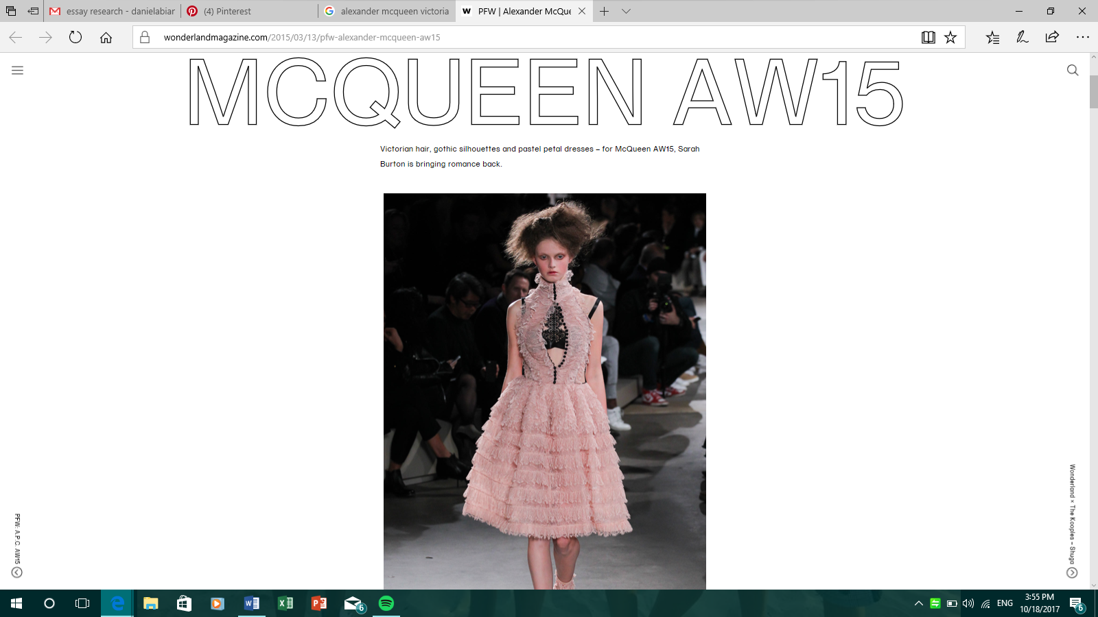
One of the garments from the Alexander McQueen collection used in the article pulled my attention so I researched it further.

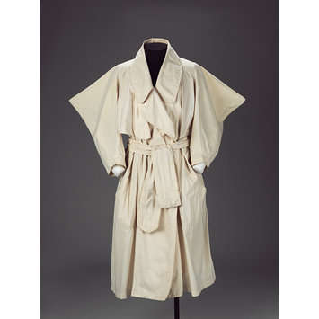
In this article it explained that the collection ‘Gothic Romanticism’ was ‘bringing romance back’ with pastel petal dresses. ‘This collection the use of gothic silhouettes and the Victorian style hair made it easy to understand where the inspiration came from. The collection uses juxtaposition by combining transparent night gowns and petal dresses harmonising ‘gothic silhouettes against romanticised femininity’.

The Victorian hairstyle was used to compliment the Victorian look and the high necklines that were ‘constrained yet conservative’ in order to refer to the upcoming V&A exhibition ‘Alexander McQueen; Savage Beauty’. In particular, a white keyhole dress constructed with a black fenced belt with a high frilled collar to introduce the conservative against liberal design that Burton is so skilled at doing.

For this season much, softer pastel pink was introduced to combine delicate textures against the harsh black lines of detail and the harder surfaces. In order to give the look more of a gothic edge the designer the contrasting black tones to reach its way up to the sheer blouse to create this ‘Gothic Romanticism’ vibe.

http://www.vam.ac.uk/content/exhibitions/exhibition-alexander-mcqueen-savage-beauty/about-the-exhibition/

task 2 .5

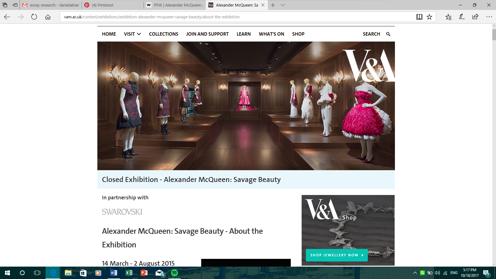
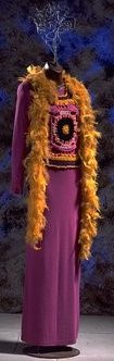
To go a little further, I research the ‘Savage Beauty’ exhibition held at the V&A. It explains that McQueen was ‘particularly inspired by the nineteenth century especially on the Victorian Gothic’. McQueen presents the ‘shadowy fancies’ that are written about in ‘The Fall of the House of Usher(1839)’. McQueen collections often refer to ‘paradoxical relationships…life and death, lightness and darkness, melancholy and beauty’ just like the Victorian Gothic that combines both horror and romance.

Task 2

Social and Communication Skills – Keira Cook

To start I found an image from a collection of postcards by Jessica Harris introducing me to images of Africans in the Diaspora. Harris is a deltiologist (someone who collects postcards) and has been doing so for over 25 years. She now only collects postcards of West of African people working with food, images of festivities and images of women, revealing aspects of material culture. “they show us the faces of those gone before, captured for eternity in the dignity of their work, the calm of their repose, and the  joy of their festive occasions” – Jessica Harris

Following on from this I began looking at the clothes the women were wearing in the different postcards, the style of the clothing, the texture and the quality that was appropriate for that particular time period. Harris’ collection shows images of people from the 1860’s to the 20thcentury. Due to my interest in fashion, textiles and period clothing I wanted to find a garment with strong connections to my original source. Looking at the shape, fabrics and strong silhouettes of the clothing being worn in the postcards I began looking at designers who find inspiration from the same elements and appearances of West African women from various eras.

dress task 2

Collections.vam.ac.uk. (2017). West African | Etches, Matilda | V&A Search the Collections. [online] Available at: https://collections.vam.ac.uk/item/O83594/west-african-evening-dress-etches-matilda/  [Accessed 18 Oct. 2017].

Designer Matilda Etches created this stunning full length evening dress in 1948 made from claret and brown batik printed cotton, inspired by the traditional wrapped garments of West African women now on display as part of the V&A couture collection. “The crisp cotton fabric, printed in Manchester, was intended for export to Africa. The fabric design imitates Indonesian batik, and the borders feature the letter ‘V’
its morse code signal. V-for-Victory was a popular subject for export cotton prints after the end of the Second World War” – V&A museum. The V&A Museum in which this garment is displayed gives an educated summary and information on the garment, furthering my knowledge on the dress, what it was made from and the original inspiration behind why this piece was made.

This has taught me how to create stronger links and relationships between separate sources and has shown how educational and informative research is necessary when looking to create something with a strong context. This task has shown me how to create a good foundation for a project with no limitations in terms of sources and inspiration and has shown the importance of references and giving credit to those who assisted in guiding your project along. Building a good platform to start from will help structure and obtain the flow of a project or task and will ensue that the majority of things I have wanted to discover have been found and analysed accordingly, however I do wish to further my knowledge on the history of the objects I have looked at in the future in order to further understand the meaning behind why they were made and what impact this had on the creator or how this may affect their future work.

Research and Communication Skills Task 1&2

Research and Communication skills

Task 1&2

Scan 4


Picture of Joe Tilson artwork entitled ‘Clip-O-Matic Lips 2’ (1967)

From the book Pop Prints, Arts Council Collection, The Southbank Centre and Marco Livingstone (1993) Page 21


Source found on website Art UK, Joe Tilson sculpture ‘ZIGGURAT’ (1963)

Photograph Credit: Walker Art Gallery

Tilson, Joe; Ziggurat; Walker Art Gallery; http://www.artuk.org/artworks/ziggurat-96875

Tilson, Joe; Ziggurat; Walker Art Gallery; http://www.artuk.org/artworks/ziggurat-96875

Screen Shot 2017-10-18 at 14.27.20

A quick search online showed me that ‘TATE’ archives held a lot of information on Joe Tilson and his artwork.

http://www.tate.org.uk/art/artists/joe-tilson-2043

Screen Shot 2017-10-18 at 14.29.12

Screen Shot 2017-10-18 at 14.30.14


Summery

To start this task, I looked through a few books and magazines I had at home but didn’t find anything too interesting. I then went to the library and looked at some art history books, I finally picked up a book on pop art prints, I found a few of the pictures in the book inspirational (lots of Andy Warhol) but I liked the Joe Tilson picture the most. I really liked the artwork I think because it was quite different to the rest of the art in the book, as it was a photograph that had been slightly photo shopped rather than a painting.

The book had very little information on Joe Tilson so a quick internet search showed me that he was a very influential artist during the 1960s Pop art movement, he was also a sculptor and print designer. I then decided to google imaged search ‘Joe Tilson Sculptures’ and found a picture of a piece of his called ‘ZIGGURAT’.

From this in the in the details of the picture I saw the link of the website the picture had originally come from, this took me to the website artuk.org which I found from looking through the website a bit that it is funded by the Arts Counsel England, who also provided the picture for the pop prints book I originally looked at. This gave me confidence that the website was a reliable source that I could trust.

Again, this website didn’t offer much information as it was just for showcasing. I again googled Joe Tilson and found the TATE archive had lots of information on the artist. It was from this archive I learned that the ‘Clip-O-Matic lips’ picture was part of a collection Tilson produced. Also, that he was friends and worked with many other famous artists at the time such as David Hockney. Tate is a very well know name in the art and design community so again I knew it was a source I could trust to give me relevant and reliable information on the subject.

Overall, I enjoyed this task, I feel that it has really helped me broaden my use of the internet when it comes to researching a subject, I also liked how it made me look at an area and artist that I had not really researched in the past. Before I hadn’t really thought of using archives as a source of information or taken much notice of if a website was reliable and trustworthy, this exercise now given me some useful sources and links I can look back to for future projects and research tasks.


Bibliography:

Pop Prints, Arts Council Collection, The Southbank Centre and Marco Livingstone (1993) Page 21

https://artuk.org/discover/artists/tilson-joe-b-1928 – Art UK website

http://www.tate.org.uk/art/artists/joe-tilson-2043 – Tate archives


R.C.S. | TASK ONE & TWO | SKIN UNDER THE MICROSCOPE

This research task has been focused around the subject of haptic and the influence for this project is skin, quite a broad beginning. My initial research began with thinking about skin and  what different aspects there were to researching skin other than the simple fact that it is where our touch sensors are. Thinking about touch made me think about nerves and nerve endings. Which obviously lead to me looking at skin under the microscope and therefore books about anatomy and the human body. I found many images in a book called Super Vision (Amato, 2003, p126) about human skin but I also came across this fascinating image of a dogs skin under the microscope.

Photo of dog Skin infiltrated by cancer. James E. Hayden in 2003 [1]

Photo of dog Skin infiltrated by cancer.
James E. Hayden in 2003 [1]

 This then inspired me to look into other animals and what their skin would look like under the microscope. Which immediately resulted in finding fascinating images of sharks skin under the microscope and how textile and pattern like it looked. In particular this image of a tiger shark’s skin.

Photo of Tiger shark skin from cracked.com 2017. [2]

Photo of Tiger shark skin from cracked.com 2017. [2]

 I then wanted to find further information about the structure of shark skin. Why it was made up of scales. Firstly I found a BBC article about a scientist George Lauder, who has replicate the structure of shark skin (made up of dermal denticles) with a  3D printer. Both to gain a a better understanding of how it helps them manoeuvre in  the water but also for the potential to develop  innovative textiles for swim wear. As well as this I also found and information on the Smithsonian National Air and Space Museum  (https://airandspace.si.edu/exhibitions/outside-the-spacecraft/online/image-detail.cfm?id=9823) about how shark skin was being used to develop space gloves to give a better sense of touch and grip.

The printed replica of 3D printed denticles from BBC News 2017. [3]

The printed replica of 3D printed denticles from BBC News 2017. [3]


Further online research produced a different train of thought, that of textile weave structures – actually called Shark skin. A type of weave for a particular design of suit found on a blog called Department of Textilesmithing [4] (https://textilesmithing.com/2011/02/22/weaves-with-animal-names/). It is described as having a ‘shimmering’ effect.

Sharkskin weave pattern diagram from Seth Winner blog 2011 [4]

Sharkskin weave pattern diagram from Seth Winner blog 2011 [4]

From a relatively simple search into the structure of the human skin, my research as evolved into scientific 3D printing and innovative textile development. This sophisticated replication of shark skin is something I won’t achieve but it is good to look into how the structures are replicated and be used as inspiration. It was good to get a more in depth inside into the subject of ‘skin’. It was quite difficult to find any museum exhibitions on the subject of shark skin replication but I did find some very interesting articles. And quite varied. I can use this in weave development work as using the very 3D representation of shark denticles but also can use the pattern of the Sharkskin weave.

References

[1] Amato, I. (2003). Super vision. New York: Harry N. Abrams

[2] Cracked.com. (2017). 8 Ordinary Things That Look Insanely Cool Under a Microscope. [online] Available at: http://www.cracked.com/article_20386_8-ordinary-things-that-look-insanely-cool-under-microscope.html [Accessed 16 Oct. 2017].

[3] BBC News. (2017). 3D printing used to model shark skin. [online] Available at: http://www.bbc.co.uk/news/science-environment-27409836 [Accessed 18 Oct. 2017].

[4] Winner, S. (2011). Sharkskin, Herringbone and Houndstooth. [Blog] Department of Textilesmithing. Available at: https://textilesmithing.com/2011/02/22/weaves-with-animal-names/.

Airandspace.si.edu. (2017). Shark Skin Close Up. [online] Available at: https://airandspace.si.edu/exhibitions/outside-the-spacecraft/online/image-detail.cfm?id=9823 [Accessed 18 Oct. 2017].

ArtsThread. (2017). eXTENDING THE BODY, hAIR aND sKIN – Swatch Collection – ArtsThread. [online] Available at: http://www.artsthread.com/portfolios/extendingthebodyhairandskin-swatchcollection/ [Accessed 16 Oct. 2017].

Ewing, W. (1996). Inside information. London: Thames & Hudson.

Muttermuseum.org. (2017). Our Finest Clothing: A Layered History of Our Skin. [online] Available at: http://muttermuseum.org/exhibitions/our-finest-clothing-a-layered-history-of-our-skin/ [Accessed 16 Oct. 2017].

Photograph of a full length romantic-style wedding dress by Jeanne Lanvin in the book ‘The white dress – fashion inspiration for brides by Harriet Worsley’. Page 131 Photographer Hultun

Photograph of a full length romantic-style wedding dress by Jeanne Lanvin in the book ‘The white dress – fashion inspiration for brides by Harriet Worsley’. Page 131 Photographer Hultun

Wedding Ensemble: Dress, Slip, and Headpiece Jeanne Lanvin, French, 1867 - 1946 http://www.philamuseum.org/collections/permanent/150828.html

Wedding Ensemble: Dress, Slip, and Headpiece
Jeanne Lanvin, French, 1867 – 1946
http://www.philamuseum.org/collections/permanent/150828.html

https://www.nationalgallery.org.uk/visiting/floorplans/level-2/room-55

https://www.nationalgallery.org.uk/visiting/floorplans/level-2/room-55

I’m interested in wedding dresses and how the symbolism has stayed the same for so many years yet over the years the style of them changes. I also like how each wedding dress is personal to the women wearing it reflecting them individually. I decided to look through books on wedding dresses in the Library. When flicking through the books on Wedding dresses I came across this image of Jeanne Lanvin’s design.  I loved everything about the image, how unique the dress was and the pose of the bride. It is unusual to see a bride wearing a hat, not a veil and as a result how the photograph is taken from the side to hide the bride’s face whereas a normal veil would cover the face anyway.  

From finding this photo, I was keen to look at other designs by Jeanne Lanvin, I searched her name and came across this other wedding dress that I thought was so unique. On Philadelphia Museum of Art website, they have one of Jeanne Lanvin dresses in their archive. There is a photograph with information written about this dress.  They write ‘This wedding ensemble, designed by Lanvin in 1925, evokes the feeling of early fifteenth-century Italian fashion; its silver lamĂ© appliquĂ© and embroidered feather design as well as its rounded bridal headdress recall Pisanello’s well-known studies of Northern Italian women wearing gowns with winged, cape like sleeves and oversized turbans.’  

From this I decided to look up Pisanello because he was one of the inspirations for Jeanne Lanvin. Pisanello was believed to have worked in the 15th century as a medallist, fresco and panel painter. There is limited imagery on him because his pieces are so old. He did however create bronze medals that have survived well. Although these do not relate completely to Lanvin’s inspiration, you can still see his use of head dresses in them. The depictions of people on them are all of men not woman but you can still see how he has created exaggerated headpieces for them. I did find this image on the national gallery’s website of one of his works that is painted in Northern Italy estimated around 1430–1500, here you can clearly see how Lanvin’s been inspired. The girl is wearing a headpiece not too dissimilar to the original image from the book I found. Maybe this dress was too inspired by him?  

Task 1/2

(1) Primary Source. Primary Source: ‘Louis Vuitton: Icons’, by Stephane Gerschel , Pg 33. Photographer Unknown.

(1) Primary Source. Primary Source: ‘Louis Vuitton: Icons’, by Stephane Gerschel , Pg 33. Photographer Unknown.

I began my research with this image, taken from ‘Louis Vuitton: Icons’ by Stephane Gerschel which I found in the University’s library. I found this particular book under a section in the library which specifically had books about various fashion designers and fashion houses which was the topic I was eager to research. This particular book interested me as it looked at the idea of ‘stylish travel’ and focused in on the fact that the fashion house originated from its bags and giving a more glamourous look and style to travelling. I was intrigued to explore images of designs from Louis Vuitton through the different era’s and time periods. The image above that I have used as my primary source is clearly a photograph that has been taken in the past yet we can still identify it as glamorous and luxurious. Therefore this photograph is a primary source as it is a photograph found in a book from the past.

Screen Shot 2017-10-18 at 12.02.11 PM

(2) Secondary Souce: photographer and source unknown. Taken from fastcodesign.com. Article, ‘What It Was Like To Fly During The Golden Age Of Trvael’, 12.05.13 by John Brownlee.

When searching the internet for my secondary source, an object, I came across this photograph of an airplane from the 1950s. This image relates to my primary source as the topic of the article is about glamourous and luxurious travelling. The article, written by John Brownlee discusses how air travel was not as sumptuous as ‘The Golden Age of Travel’ makes it sound. Although the primary and secondary sources that I am looking at in my research have comparisons in that they discuss luxurious travelling around the 1950s period, they contrast as well. They contrast as my primary image, taken from ‘Louis Vuitton: Icons’ presents a woman looking as though she’s elegantly travelling, whilst the article I’ve used as my secondary source argues that travelling in this era was not as glamorous as it would appear. John Brownlee debates that air travel in the 1950’s was not luxurious as a result of how expensive it was to travel by plane: 40% more than it is today. Furthermore, there were more plane crashes and deaths occurring during the ‘golden age’ which meant it was more dangerous. Other factors that Brownlee discusses is the racist aspect of travel: only white people tended to be allowed to travel and the fact that anyone was allowed to smoke and drink as much as they wanted on flights which meant passengers could be sitting in planes full of smoke for long periods of time.


Screen Shot 2017-10-18 at 12.35.38 PM

(3) Solent Sky Museum, Southampton. Taken from tripadvisor.com. Source and photographer unknown.

When researching various archives and museums which would give context to my primary and secondary research about travel in the 1950’s, I came across a nearby museum in Southampton called the ‘Solent Sky Museum’. This contributed to my understanding of aircrafts and travel in the 1950s as the pictures of the museum on the internet showed detailed images inside and out of aircrafts which enables you to imagine what travelling in the 1950 era would have been like.


Bibliography:

‘Louis Vuitton: Icons’ by Stephane Gerschel, Pg. 33.

https://www.fastcodesign.com/3022215/what-it-was-really-like-to-fly-during-the-golden-age-of-travel

https://www.tripadvisor.co.uk/LocationPhotoDirectLink-g186299-d215546-i273025591-Solent_Sky_Museum-Southampton_Hampshire_England.html

Task 1/2- How to use online resources

For my first project, Deconstructed Geometry, I want to look at deconstructing the urban things that surround me like signs, road markings and general industrial patterns to see how they can be translated into knitwear for fashion. I went ahead and brought in some of what I had done during the summer project as I had picked a similar theme’s because it interests me deeply. Towards the end of that project, I homed in on the patterns that are used to warn and symbolise specific meaning on the roads. For example, road signs, road works, double yellow lines, road work fences, warning signs for unauthorised areas etc. I decided to revisit this and research further and inevitably I came across a photo of two parallel chalk lines drawn on a dry desert lake, in the book “After Constructivism” [1- Taylor, B]. Although slightly contrasting to my initial inquiry, the unnatural urban nature of the lines in that specific environment is what interested me as it showed a different take on the relationship between photography and place I had looked at earlier. The lines from my perspective give an urban and regimental feel to an otherwise isolated and bare environment. They give direction in an open field, almost like a road would in an urban area and this links hugely to the theme of geometry.

Walter De Maria, Mile-Long Drawing, 1968.
Two parallel chalk lines 4 inches wide, 12 feet apart and 1 mile long

This idea of structure in an urban area lead me to research the period of constructivism in art and design. I searched the internet, which proved to be the most helpful for finding a lot of information that was already filtered, and found the artists in this period didn’t necessarily believe in the abstraction of ideas, rather they wanted to link their ideas to tangible outcomes. A lot of the work dealt with social and economic problems and so art then became more practical and geometric. The outcomes of this were very much products of linear meaning, aka signs and posters guiding an individual to do something specific, like the road signs and warning signs I am interested in. To help add some context to this I found some constructivist artists through the Tate website [2], Alexander Rodchenko, and this then led me to an article on an artist turned Textile designer by the name of Liubov Popova.

http://www.tate.org.uk/whats-on/tate-modern/exhibition/rodchenko-popova/rodchenko-and-popova-defining-constructivism

[2] http://www.tate.org.uk/whats-on/tate-modern/exhibition/rodchenko-popova/rodchenko-and-popova-defining-constructivism

http://www.tate.org.uk/research/publications/tate-papers/14/liubov-popova-from-painting-to-textile-design

[3]http://www.tate.org.uk/research/publications/tate-papers/14/liubov-popova-from-painting-to-textile-design

The article [3] I looked at explained her struggle to bridge between constructivist art and textiles but it’s clear she succeeded in her own way. The image of her textile design in 1924 [4] shows her work heavily concerned overlapped geometric forms that were practical to aid the constructivist ideal, yet more desirable to the consumer so fashion in soviet Russia could make an eventual comeback. The element of ridged structure was still there, but more commercialised. The limited colour palettes of the constructivist time still made an appearance but in a more aesthetic way and overall her deconstruction of the constructivist ideal has influenced my design ideas for my own project. The information and research I found from this task has proved helpful but I definitely feel I need to research further so that my project is fully developed, and I can now do so with the range of sources that has opened up since.

Textile Design, 1924 Pencil and Ink on Paper 234 x 191 mm Private Collection Found on: http://www.tate.org.uk/research/publications/tate-papers/14/liubov-popova-from-painting-to-textile-design

[4] Textile Design, 1924
Pencil and Ink on Paper
234 x 191 mm
Private Collection
Found on: http://www.tate.org.uk/research/publications/tate-papers/14/liubov-popova-from-painting-to-textile-design


Bibliography

  1. After Constructivism- Brandon Taylor. Yale University Press, London and New Haven. 2014
  2. http://www.tate.org.uk/whats-on/tate-modern/exhibition/rodchenko-popova/rodchenko-and-popova-defining-constructivism  Accessed: 17/10/17
  3. http://www.tate.org.uk/research/publications/tate-papers/14/liubov-popova-from-painting-to-textile-design  Accessed: 17/10/17

Task 1/2 – Online resources

1

(1) Leather, studs and tulle By Peter Moss for Blitz magazine February 1986

Androgynous Fashion

This image was found in “Women and Fashion: A New Look” by Caroline Evans and Minna Thornton. I picked up this book and found this picture (1) and the text on the page lead me to start to explore this topic of ‘androgyny’ which refers to the combination of both feminine and masculine characteristics.

2

(2) Witches raincoat and belt, Vivienne Westwood and Malcolm McLaren, 1983


Whilst researching into androgyny I came across many figures such as Grace Jones, Marlene Dietrich and David Bowie. With further research I came across this review on WordPress about an exhibition in the V&A to do with androgyny and it included Vivienne Westwood. I explored the V&A records using Vivienne Westwood and came across an article called “Vivienne Westwood: Punk, New Romantic and beyond” which included many garments she has made that the V&A have in their possession. I looked into some of the items and read the information but found the “witches” coat (2) to link to androgyny because it was the first item that was not linked to either male or female clothing but visually you can see how it is unisex as it takes the traditional practical trench coat and infuses the creativity amongst women’s clothing through the exaggerated sleeve shape.

3

(3) Purple dress with tank top and feather boa Biba 1971 V&A archives

Before looking into androgyny I thought it was only referred to as unisex fashion that was a modern fashion trend due to the rise in feminism and acceptance of the LGBT community. One article by oxford student stated that androgyny can be dated back to the 17th century with western European styles consisting of men wearing wigs and petticoat breeches that looked like skirts. There were key people who were involved in making androgyny popular such as Chevalier d’Éon in the 18th century who was a soldier was known to dress either masculine or feminine and Marlene Dietrich in the 1930s who helped popularise women’s suits.

I browsed the V&A archives of their collections and typed in androgyny and found an outfit that consisted of a dress, tank top and feather boa (3). It was made by Biba in 1971 and worn to the Gay Liberation Front ball in Kensington. Biba is said to be a brand that was worn by feminists and members of the LGBT community. There was also a photograph taken in the 80s of Jeny Howorth who has short hair and is dressed in a double breasted suit which is fitted with a long coat with shoulder pads. At a quick glance you wouldn’t see the feminine features as the silhouette creates a male figure the background image of a zoom in of Jeny’s face highlights the feminine features.

Bibliography

http://www.vogue.co.uk/gallery/fashion-androgynous-icons-annie-lennox-prince-david-bowie

https://collections.vam.ac.uk/item/O136252/witches-raincoat-and-belt-vivienne-westwood/

https://www.vam.ac.uk/articles/vivienne-westwood-punk-new-romantic-and-beyond

A History of Androgyny in Fashion

Androgyny in V&A

http://collections.vam.ac.uk/item/O140982/dress-biba/

http://collections.vam.ac.uk/item/O1061098/photograph/

TASK 2/3 – ONLINE RESOURCES

For my first pathway (knit) I’ve decided to focus on architecture and public transport interiors. I’m drawn towards bright colours and repeat patterns. I think we often dismiss the full depths of our transport, so it would be a fun idea to put interior and fashion together to get playful knitwear outcomes. i will do this through use of appliquĂ© and knitting techniques.

[1] charcoal on paper 37.3 x 24.8

The image on the right is from a book called ‘The abc’s of the Bauhaus and design theory.’ Max Pfeiffer-Watenpfuhl was a student at Bauhaus in Germany, he created this simple charcoal drawing in 1920. It reminded me of the geometric designs from the 80’s which I’ve been looking at for my first pathway (knitwear) so this links in well.

Wallace Sewell is a UK based company that specialises in the weave industry, making everything from scarves to rugs.  In 2010, they won a competition to collaborate with ‘Transport For London’ in designing the moquettes for the underground.

116-large

(2) Transport for London – underground moquette

This is the most commonly known design on the underground. The use of primary colours gives a very post modern feel to the overall design and they smartly merged 4 of the main London landmarks (Big Ben, London Eye, St. Paul’s Cathedral and Tower Bridge).  This can only be recognised through great attention to detail. Not only that, they designed many of the scarves in the Tate galleries over the United Kingdom.

Furthermore, Sewell’s work was immensely influenced by the Bauhaus art college for their simple, yet effective graphics and this can clearly be identified throughout their woven designs.Although, many could argue that they’re bored of seeing the same design, i personally think the design it’s self can never really age.


Finally, I chose to look at a similar website that linked to Wallace and Sewell’s work as a vast amount of their work is on there.The London Transport Museum holds a lot of textile based works that have been commissioned and can

(3) overground moquette desing – wool rug

also be purchased online.There’s a huge range of unique furnishings that will give your home a little bit of London but it comes at a steep price. There’s something really sentimental about this website as the materials used aren’t available anywhere else.

In conclusion, I found this research task helpful for my current project as I’ve found new sources and artists that link to my work. Not only that, it’s inspired me to look at different websites which i wouldn’t normally look besides Pinterest which I think I sometimes overuse.

When researching, I also find it beneficial  to cross over between the arts as it can broaden my initial concept in ways I wouldn’t expect and takes you down many different avenues. For example, I tend to look at photography and graphics to help inspire me with more innovative ideas for fashion and print.

Bibliography

(1) Book – the abc’s of the Bauhaus and design theory

(2)(2010),wallaceandsewellavailable from: http://www.wallacesewell.com/project/transport-for-london–underground-moquette   [accessed 14th October]

(3)itmuseumshop,available from: https://www.ltmuseumshop.co.uk/homeware/doorstops-mats-rugs/overground-moquette-design-wool-rug [accessed 14th October]


Research and communication skills task 1- 1940’s fashion

warPhotograph of a women in 1940’s. Photograph by Cecil Beaton, Vogue (British edition) September 1941, London, Gelatin-silver print

I found this photograph when looking in the University library, the book was titled “The V&A Gallery of Fashion”. I was really captivated by where this photo was taken and who the model was in the picture. From reading further on in the book I found out that this image was taken in front of the ruins of the Temple church in London after it was bombed on the 10th of May 1941. Vogue used this image as a selling point for maintaining their status and readership. The title of this photograph was called “Fashion is Indestructible”. In the photo the model, who is unknown wore a suit designed by Digby Morton. Fashion was considered to still be important during the Second World War as a morale booster.

hydt

Fashioned in New York, the latest American ‘siren suit,’ 1941. Photo: IWM, http://fashion.telegraph.co.uk/news-features/TMG11446271/Fashion-on-the-Ration-how-World-War-2-finally-let-women-wear-the-trousers.html

From further research online I found a relatable source from the Telegraph in an article about how World War 2 finally allowed woman to wear trousers due to the shortage of clothing and rations. It stated that introduction of slacks first appeared on the market in the 1930s but were not popular to begin with; it was only until the war began did slacks become well known and a fashion trend. Vogue featured slacks in 1939 when presenting them in their fashion magazine modelled by a woman in an Eastern headdress paired with red slippers. Whilst Vogue was determined to not let attitudes to outward appearances be forgotten due to the war, the magazine Home and Country offered more practical and realistic advice. In its September and October issue they published darning and patches as well as knitting patterns for matching vest and underwear.


fdsfds

I was really intrigued about rationing in Britain during WW2 and decided to develop my knowledge and understanding further. From looking at an article in the Guardian titled “Fashion on the ration, how to make do and mend defined wartime style.” I found interesting information on what women would use in the absence of certain beauty products, for example they would wear beetroot juice in the lack of lipstick and use Moondusk Cyclax fake stocking cream. Not only did the women use Moondusk Cyclax they would also paint on a false seam to make the look more realistic. What I found most interesting was when utility clothing was made, I originally believed them to be in poor condition; however after reading the article I found that this was not the case. Utility clothing was in fact made well as they were expected to have a long duration. The restrictions for clothing were never to be taken out of line. There could be no more than five buttons, two pockets and two pleats on garments. The government released bracing ideas like pamphlets showing how to patch and darn as well as films being shown which included instructions on how to remodel a man’s felt hat. Fashion during the war was difficult especially when trying to keep up the morale with the limited supplies they had, however it seemed many women found interesting ways to keep up their daily beauty tricks and sense of style.