Category Archives: Fashion & Textile Design

This Category should be selected if you are a Fashion & Textile Design student.

TASK 5/6 – VISUAL RESEARCH – THE MOODBOARD


Screen Shot 2017-11-01 at 20.37.32


REFERENCES

(2011),showstudios,Available from: http://showstudio.com/project/dynamic_blooms/fashion_film

(2015) , showstudios, Available from: http://showstudio.com/project/craig_green_aw15 ,

(2015),pinterest, Available from:

‘ROMANCE’ screenshot of logo, mint and berry Available from:https://theworldneedsmoreromance.mint-and-berry.com/en/

(2016),wikimediacommons,Available from: https://commons.wikimedia.org/wiki/File:Symmetric_religious_symbols.svg

(2017),readytogo,Available from: http://getreadytogo.nl/coachaanbod_voor_werknemers/outplacement


Task 5/6 : Prabal Gurung

Task 5/6

I have chosen Prabal Gurung as the designer who inspires me and his collection of t-shirts in his Fall 2017 runway show which were inspired by the feminist movement. In the finale of Gurung’s show, the models walked the runway in a series of t-shirts which displayed his own feminist statements. This inspires me as I believe he made a bold statement to a current issue and used his voice through his platform and runway show during NYFW. His t-shirts consisted of statements such as ‘The Future Is Female’ and ‘Nevertheless, she persisted’ along with making references to powerful female figures such as Michelle Obama and Coretta Scott King.

fullsizeoutput_613

I created a moodboard based on what Prabal Gurung took inspiration from, which I learnt from the interviews he gave based on this collection.

Gloria

Gloria Steinem for author Jennifer Baumgardner’s book ‘Abortion and Life’, (2008). Photographer: Tara Todras- Whitehill. T-shirt designed by Jennifer Baumgardner.

The picture that takes my attention is this image of Gloria Steinem, a Spokeswomen for the feminist movement in America between the years of 1960’s to the 1970’s. This photo was taken for the author Jennifer Baumgardner who was writing a book based on the topic of abortion in 2008. Steinem supported this book and the project ‘I had an abortion’ which was aimed at giving women back the power to make decisions for themselves and have control back over their own bodies.

I believe the composition of the image is effectively simple. As a result, the photograph emphasizes the words on the t-shirt and the message that Baumgardner is putting across stands out. The monotone colours of the image further create a sense of simplicity. Furthermore, I believe Steinem’s facial expression, a smile, is effective to the photograph as it conveys a confidence and that she is not afraid to show her support for the feminist movement of pro-abortion.

I believe this image and the collection of feminist t-shirts by Prabal Gurung is relevant today as a result of the anti-feminist attitude of Donald Trump. It is apparent that many of the biggest and most relevant fashion houses are using their voices to convey their political views in light of the new President of the United States.

Bibliography:

www.gloriasteinem.com/

wwd.com/eye/…/a-meeting-of-feminists-in-the-prabal-gurung-front-row-10980234

www.jenniferbaumgardner.net/abortion-life/

www.hollywoodreporter.com/…/prabal-gurung-explains-his-nyfw-feminist-finale-975..

www.harpersbazaar.com/fashion/fashion-week/…/prabal-gurung-fall-2017-finale/

https://graziadaily.co.uk/…/prabal-gurung-new-york-fashion-week-show-feminism/

Task 5/6: Visual Research:

Simone Rocha Visual Reference Moodboard:

Simone Rocha Visual Reference Moodboard:

In this instance for this research task, I chose ‘Simone Rocha’, newly found designer and daughter of re-nowned fashion designer ‘John Rocha‘, in which I looked into her Autumn/Winter 2016 Collection as it was truly mesmerising and the garments themselves were beautiful and clearly linked to her main theme/basis idea for her final collection. Adding on, her main form of inspiration came from the idea of ‘Motherhood’ which came to mind after giving birth to her child Valentine due to the fact she took in everything from the wardens dress, surgeons medical attire, hospital decor and even historical influences in which she researched further once developing the start of her final A/W 2016 collection. Below is a selection of images from her Autumn/Winter 2016 Collection:

Simone Rocha A/W 2016 Collection: Catwalk 1:

Simone Rocha A/W 2016 Collection: Catwalk Image 1:

Simone Rocha A/W 2016 Collection: Catwalk 2:

Simone Rocha A/W 2016 Collection: Catwalk Image 2:

Simone Rocha A/W 2016 Collection: Catwalk 3:

Simone Rocha A/W 2016 Collection: Catwalk Image 3:

Simone Rocha A/W 2016 Collection: Catwalk 4:

Simone Rocha A/W 2016 Collection: Catwalk Image 4:

Simone also used references of ‘gothic horror’ to coincide with her quite sinister and dark hospital theme as well as taking references from sweet and tranquil themes and ideas such as motherhood and childbirth. The whole gothic horror visual reference was played in her garment designs in basis with colour schemes and material/fabric selection of choices due to the fact they contrasted strikingly with the theme and idea coinciding well together as the blend of thoughts, notion and ideas worked successfully. As well as this, she also took reference from what she wore in the hospital herself which was the ‘hospital/medical dressing gowns’ in which created quite an ill-fitting and loose silhouette which she found inspiration from and leading her into the victorian silhouette, Edwardian references and surgical background.

'Gothic Horror Reference' Kenilworth Castle:

‘Gothic Horror Reference’ Kenilworth Castle:

'Hospital Attire Reference' - Medical Gown.

‘Medical Gown Reference’:


Image Analysis:


Smock by Leslie Poole for Annacat. Small smock from Little Things.

Smock by Leslie Poole for Annacat. Small smock from Little Things.

To research further, I decided to analyse this specific image (shown below) from my ‘Simone Rocha Visual Reference Moodboard’ as I feel it envisions the whole collection in one and I can truly see how the Simone Rocha Autumn/Winter 2016 Collection took inspiration from this in particular. The image I chose was an old-style inspired 1970’s smock designed by a fashion designer known as ‘Leslie Poole’ for the brand Annacat which was taken by Barry Lategan and scanned by Miss Peelpants from Vogue, March 1971, which contains a mature women with a child both wearing the infamous smocks posing displaying the garments in a subtle and elegant manner – in which I assume is for an ad campaign for one of the iconic and most well-known fashion magazines ‘Vogue’. The way the image is composed comes across quite subdued and minimal just purely on the fact both models, mother and child, are acting in way in which is quite affectionate and loving therefore not distracting from the garments itself – but still creating a dynamic, high-end and commercially viable ad campaign. As well as this, the way the models are posing; holding out the smock so its fully open, is eye-catching and distinct as it enables the viewer of the image to clearly see the detail and design elements of the garment up-close. On the other hand though due to being vintage and taken in quite an old-style (assuming 1970’s the image was taken with a fuji/canon film camera) which meant the image won’t be as crisp or crystal-clear/high definition as it is it todays modern technology – therefore leaving the image in an unfocused and non-clear state. Below the image on the website it does specifically say that it’s ‘Glorious Pre-Raphaelite…’ is what the main visual reference they gain from looking at this image in particular. This is a particular style/art movement/society which was carried throughout the mid-late 1800’s founded in London by young artist’s such as ‘William Holman Hunt’, ‘John Everett Millais’ and ‘Dante Gabriel Rossetti’ all of which started this secret society opposing the works produced by The Royal Academy – after which they became highly influential. In comparison with this image, the work of Sir John Everett Millais’, Bt ‘Ophelia’ 1851-2 Tate. Painting, I find links in well with my desired image purely on the basis that what Ophelia is wearing has a vague resembalance to the Leslie Poole 1970’s smock. The image in particular is based upon a scene out of one of Shakespeare’s infamous plays ‘Hamlet, Act IV, Scene vii which consists of the storyline where Ophelia is driven to suicide – out of pure madness (drowning herself in the river), when her father was murdered by her lover Hamlet. In particular, I find that the storyline carries a similar theme alongside Simone Rocha’s motherhood theme as it contrasts in the fact they’re opposites and both discuss the ideas and notions of love and affection and how people are treated by it. Simone Rocha’s collection was inspired by motherhood in the sense of creating new life and bringing into the world in a warm and welcoming environment taking inspiration from her surroundings. Where as, Shakespeare depicted a more sinister and dark sense of “motherhood” – from a fathers side of view, showing that love can be quite darkening and untruthful leading to more heartfelt and saddening emotions and feelings – which I feel would’ve taken Simone Rocha’s A/W 2016 Collection down a  whole ‘nother avenue of inspiration. Linking it back, the Ophelia painting works will in context with the original image of analysis I was researching into purely based on the style of dress the character was wearing as it was of old-victorian-style of which contained design elements such as gathers, lace, length, volume and even bishop sleeves – vaguely seen in the painting for reference, which allows me to see the connection more clearly.

Ophelia 1851-2 Sir John Everett Millais, Bt 1829-1896 Presented by Sir Henry Tate 1894 http://www.tate.org.uk/art/work/N01506

Ophelia 1851-2 Sir John Everett Millais, Bt 1829-1896 Presented by Sir Henry Tate 1894 http://www.tate.org.uk/art/work/N01506.

References:

Information:

  1. https://www.vogue.com/fashion-shows/fall-2016-ready-to-wear/simone-rocha – I used the ‘Vogue‘ website to locate my chosen designer’s collection and find out more about her inspiration and visual references she used within her design work.
  2. http://www.dazeddigital.com/fashion/article/29944/1/simone-rocha-s-twisted-take-on-motherhood – To gain a more in-depth analytical in-sight into my chosen designer’s collection I came across this particular website feature/article which went into vivid detail about her thoughts and ideas of the her final collection.
  3. https://i-d.vice.com/en_us/article/kz8yvx/simone-rocha-fallwinter-16-explores-the-reality-and-fantasy-of-motherhood – This website was incredibly helpful as it included specific quotes in which Simon Rocha (my chosen designer) had spoken at the time about her influences and visual references for her garments.
  4. https://www.independent.ie/style/fashion/fashion-news/motherhood-proves-to-be-inspiration-for-simone-rocha-as-she-debuts-latest-collection-at-london-fashion-week-34473798.html – An article in which gave me a closer look into Simone Rocha’s final collection.
  5. https://emmapeelpants.wordpress.com/2013/06/10/inspirational-editorials-these-smocks-are-the-shape-of-things-to-come/ – This is the website where I found more contextual and background information on the image itself I specifically decided to analyse more in-depth to.
  6. http://www.tate.org.uk/art/art-terms/p/pre-raphaelite – Background information on the secret society of the ‘Pre-Raphaelites’ opposing the Royal Academy.
  7. http://www.tate.org.uk/art/artworks/millais-ophelia-n01506 – This site allowed me to look into a painters infamous painting researching more in-depth into the art’s history and contextual background.

Images:

  1. surgical gloves – Simone Rocha was inspired by medical wear and focused on the surgeons surgical gloves and designed similar gloves in which took a more victorian elegant twist.
  2. tulles fabric samples – This was her own take on the hospitals old Edwardian style curtain furnishings and bed sheets taking reference to her sense of touch and sight.
  3. 1950s matrons smocks – After childbirth, Simone Rocha was inspired by her midwives hospital attire so focused historically into 1950s matron smocks for the basis of her garment design ideas/ and entirety of her final collection.
  4. lancaster house decor  – Lancaster House was Simone Rocha’s location for her final location in which she still took inspiration for her garments mainly from the decor.
  5. historical witches – After looking into multiple visual reference for her collection she could see links to quite dark gothic horror so researched into ‘historical witches‘ aspects to tie-in a more dynamic and distinct theme.
  6. edwardian hospitals – Since her main theme is based on ‘motherhood’ and she got her final collection idea from the birth of her child ‘Valentine‘ she researched into Edwardian hospitals assuming for contextual background information and to enhance her garment design ideas and final collection outcome.
  7. victorian fashion – These were the main silhouettes formed as inspiration for her final collection garments in instance with the ‘1950s matrons smocks‘.
  8. https://showstudio.com/collection/simone_rocha_london_womenswear_a_w_2016/instagram_119991 – I used this website as it contained images in which I feel showed of Simone Rocha’s A/W 2016 Collection of in a aesthetically pleasing way.
  9. https://en.wikipedia.org/wiki/Gothic_fiction#/media/File:Kenilworth_Castle_England.jpg – Kenilworth Castle Image – No Reference Needed (on the website stated as a free image).
  10. hospital dressing gowns – Used as a visual reference for what Simon Rocha was inspired by during her stay at a hospital during childbirth for her final A/W 2016 Collection.
  11. http://www.tate.org.uk/art/artworks/millais-ophelia-n01506 – This site gave me an image which I used for a comparison with another image I was analysing.


Yiqing Yin – Spring of Nuwa – Task 5&6

yiqing yin moodboard

Zeng Hao – Oriental God Artist

 The main inspiration of Yiqing Yin’s Fall 2012 collection is the legend of Nüwa. A chinese goddess of nature. She used the artist, Zeng Hao to portray her inspiration in her own moodboard.

nuwaThe way Zeng has painted her is in a very serene and beautiful way because most of the legends show her a serpent goddess. Either way she influences nature therefore he seems to have latched onto that aspect instead.

He painted her painted her perched on a large stone, the details of which are intricate yet blurred at the same time, forcing us to focus on Nüwa herself. The way her head is tipped draws the eye to follow onto the flower she’s holding, then naturally our eyes will follow from there to her torso then eventually down to her feet. Her eyes being closed also makes it seem much more intimate.

 Zeng’s artistic technique allows us to appreciate her whole position slowly and methodically. He turned an originally quite sinister deity into a ethereal, distant being. His style is very realistic, adding to the intimacy of her being real.

goddess chineseLooking at more of Zeng’s work, this one being an example, he seems to never have their eyes open or looking directly in front of them. It gives the impression that he’s not supposed to be capturing them. He does it in a way where they look in the middle of something mythical. All the goddesses are sat down on the same sort of stone chair, which I have started to view as a throne. They also have same flowers.

legend

This last picture is also one of the goddess Nüwa. This painting is much more of an traditional and ancient Chinese painting. She is portrayed as just a head on the body of a snake. Which makes it seem less enticing than the work of Zeng Hao. Especially since she doesn’t seem to have a particular place to be like the thrones. However, the place around her looks healthy and alive and that is supposed to be because of her since she is the goddess of creation. Chinese people who grew up on this legend may see this painting in a much different way.

By Monique Olowu

Memory – Task 3&4


memory

Contributors – Adamson, Glenn; Lee Alter, Linda; Burko, Diane; Chave, Anna; Cozzolino, Robert; Gardner-Huggett, Joanna; Haveman, Anna; Herzog, Melanie Anne; Mileaf, Janine; Moriuchi, Mey-Yen; Throckmorton, Jodi; Wallace, Michelle – The Female Gaze: Women artists making their world – published 2012 – published by the Pennsylvania Academy of Fine Arts, Philadelphia

Website – Stanford encyclopaedia of philosophy – Michaelian, Kourken and Sutton, John – Available from: plato.stanford.edu/entries/memory – April 24, 2017

News article – Tran, Cindy – published 2017 – Woman, 27, who can recall everyday of her life – DailyMail – issued 24 April

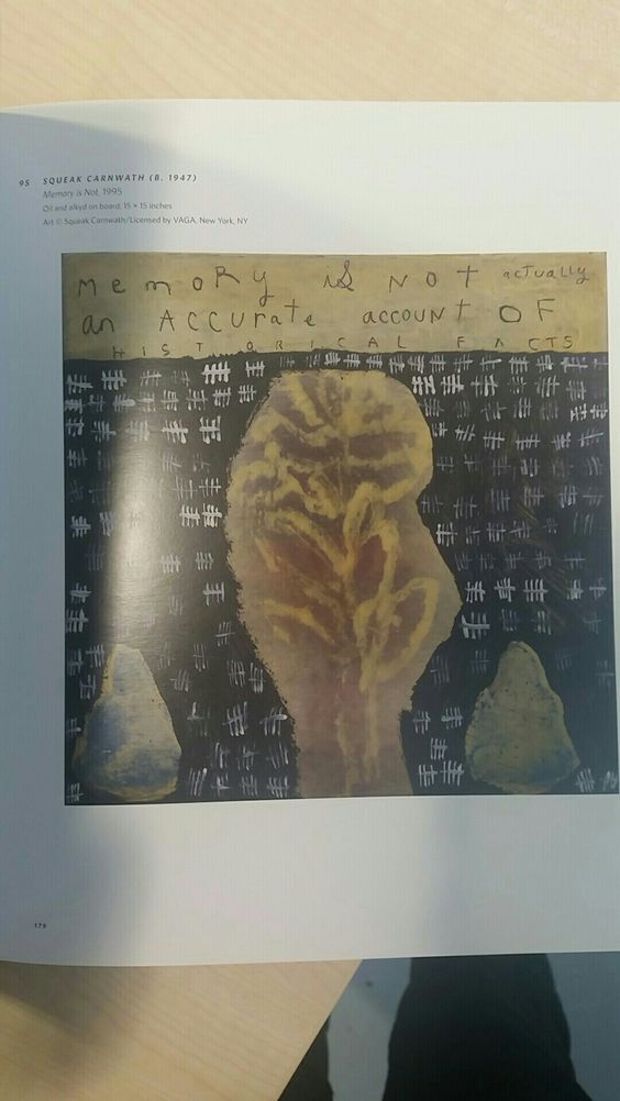
My theme throughout this research is memory and it’s qualities. The book I chose clearly states that memory is not an accurate recollection of historical events. Which I then researched further and found that there are in fact different types of memory that each human could possess. I understand that sometimes the human brain can trick itself into believing something was there that wasn’t or something happened that didn’t within their memories. However, it counteracts the fact that history books and facts were sometimes written by memory. It is not to be assumed that everything was recorded immediately until much more recent times. It is true that by now, people of newer generations would have proved or disproved said historical events but if they were proved right does that not mean that the original discovery, written from memory, was an accurate account?

To oppose my original picture from the book in a more drastic way, I found an article of a woman who remembers everything that has happened to her since she was 12 days old. Which is a rare condition that only 80 people in the world have called Highly Superior Autobiographical Memory. She shared that she had the ability to remember unnecessary details like what she wore or what she ate or what the weather was like.

Considering memory as being somewhat of an unstable thing, I think it’s unfair to believe that it’s a completely inaccurate account of historical events. Even though, having an autobiographical memory is rare, people without the condition can still recall events as precisely as is necessary.

By Monique Olowu

Task 5/6 Darcy Edwards

za posen 10 zac posen 1 zac posen 2 zac posen 3 zac posen 4 zac posen 5 zac posen 6 zac posen 7 zac posen 8 zac posen 9


zac posen 2

This is an image of the cartoon character Olive Oyl. This character is from Popeye, a well known cartoon created by Elzie Crisler Segar in the 1930s. I can see Zac Posen’s influences and inspiration through this cartoon as his work is quite cartoon-like and focused on main parts of the body such as knees, bust and waist that a cartoon would think about and use mostly. Women in cartoons are portrayed in a certain way to become more feminine in society’s eye. This is femininity is shown through Posen’s work in an extravagant, exaggerated way – for example shown in the teal garment the waist is very exaggerated and very much only for the runway yet still has an elegant, haute couture, expensive feel to it. Popeye himself is known for having large arm muscles, so exaggeration on Olive Oyl seems appropriate. Her arms and legs are very skinny which fits society’s culture at the moment – women having to be skinny in the right places to appear attractive to others. This in itself is unachievable for some women as they are just not made like that and celebrities that have the ideal figure in photographs are very likely to be photoshopped. Zac Posen’s work is influenced by feminists and this fits in with it nicely. This image shows Olive Oyl wearing all orange including a small hat which is quite iconic of the cartoon Popeye. Her hair is always in this style – slicked back in a small bun at the bottom. I picked Zac Posen because the links to his work were quite clear yet still needed to be thought about – feminism is now quite a generic idea/ concept but this has been done in an original way to hint at the idea but not showing it too publically/ obviously.


The-Godfather-Poster

This is the original film poster for ‘The Godfather’ produced in 1972. The poster depicts a sinister looking face of the main protagonist in the film (actor Marlon Brando) who is captured emerging from the darkness as a chiaroscuro lighting effect highlights the form of his emotionless face.

Within the poster there is a simple yet effective use of composition which makes the poster bold and pleasing to the eye. The actor’s face is on a ‘power point’ towards the top left of the poster, which makes it stand out as the focal point. The face is also met by a leading line as we follow the white tuxedo to the quote below which reads “I’m gonna make him an offer he can’t refuse”. Having this specific quote (anchor) on the film poster, makes an impact on the viewer as a sense of mystery and danger is conveyed.

The sinister looking face of the actor, whose eyes have been blackened to invisible, reinforces the sense of danger within the quote below and captures the viewer’s eye. Using a strong contrast of black and white there is a suggestion of symbolism of contrasting themes such as that between heroes and villains. The actor is wearing a tuxedo which is often a classic signification of a ‘film noir’ and the darkness within the poster enforces this. There is little colour in the poster, only the red of the rose which in this context subconsciously suggests feelings of danger and possibly blood therefore violence within the film.

Overall, the film poster is successful in communicating the target audience to the viewer which is the adult male, this is due to the boldness and sense of danger and violence as well as the featured actor being an older male. The poster fits in well with other ‘film noir’ posters produced around this time and is a classic example of these with muted or absent colours and the use of chiaroscuro lighting to convey a sense of danger, appealing well to its target audience.


RCS Task 5&6 – Visual Research

rcsJulian Roberts is one of the artists that I’ve looked at in the Fashion rotation. His ways of creating garments, the cutting and the simplicity have honestly grasped my attention. Because of this task, I dug in-depth of where his inspirations came from,  who and what influenced him and helped him to carry on experimenting towards the final masterpiece.


julain roberts

This is one of Julian Roberts’s early work from a catwalk show. Tunnel technique was used to create and design the garment, which is also known as the subtraction cutting. Two fabrics composed the garment: the white ink-wash style contrast with plain dotty orange fabric. But the flowing lines and drapes establish the elegancy successfully without being distracted by the collision of the exciting orange and the bright yellow. According to Roberts’ other works, he kept the simplicity of the bodies throughout most of his subtraction cutting works, then his concentration will be investigating the essence of the tailoring method.

From my research about Julian Roberts’ working process, his type of tailoring does not consist of the precise accuracy of the measurement, and he would often have the fabric two times longer than the body length or even more. Hence, the creativity that he can spread on one piece of cloth won’t be limited.

However, this particular garment has more elements on decorating, visual awareness than many of his other works where he was obsessed with exploring the potential of subtraction cutting and make interesting shapes and forms to give the clothing different volumes. Although some of the garments might look a bit elementary, it does involve some attractive colour combination and illustrate the beauty of lines, creasing and draping with a quite straightforward format. In addition, it’s this style of simplicity that makes the garment effective and delicate which applies to the Japanese designers who has influenced and inspired him.


Reference :

[1] Tumblr (2001) Subtraction Cutting by Julian Roberts. Available from: http://julianand.com/ [ Accessed 17 October]

[2] University of Derby (2016) Julian Roberts Fashion Designer at the University of Derby Part 1. Available from:  https://www.youtube.com/watch?v=N2xnUoCVWbI [Accessed 30 October]

[3] University of Derby (2016) Julian Roberts Fashion Designer at the University of Derby Part 2. Available from: https://www.youtube.com/watch?v=OC25scyJx9U [Accessed 30 October]


Paisley

I first started by finding a book about textiles and inside I came across a photograph of a textile that was described as, ‘Hand blocked piece-cloths from Bokhara and the surrounding villages, designed as a prayer cloth’ Harvey J, (1996) Traditional Textiles of Central Asia, Hong Kong: Kwong Fat Offset Printing Co. Ltd.

FullSizeRender

After that I was intrigued by the paisley pattern on the fabric and wanted to find out more about it.

I then researched the history of paisley pattern. The site described the paisley pattern or form as a teardrop or a kidney. This teardrop symbol was called boteh which means shrub of leaves in Persian.

Ancient Babylon in the present day Iraq is claimed to be one place of origin of the paisley form, possibly dating back to 1700BCE, Paisleypower (2017), The History of Paisley Symbol and Paisley Pattern. Available from http://www.paisleypower.com/history-of-paisley.

Jonathan-Saunders-London--024

Paisley pattern were very popular in the 1960s especially with the young generation. So I then went on to look at any newspaper article about paisley in fashion. The pattern had not been popular since 1990s until 2011 for 2012 spring/summer collection.

But then the pattern made a surprise appearance at this London fashion week. Here, a model walks the runway at the Jonathan Saunders S/S 2012 show, where the print played a defining role in the designer’s collection. Jonathan Saunders’ collection offered a stunning, updated revamp of a print which can easily be fussy and overcomplicated. Crowling S, (2011) London Fashion Week; A Brief History of Paisley, The Guardian, 26th September.

Task 5/6- Alessandro Michele Gucci AW17

Moodboard featuring 60's Sci Fi inspiration

Moodboard featuring 60’s Sci Fi inspiration

4be13c4368a2497b44dd59efecd1990d

Image of the 2008 Stan and Vince poster

AAHTUAAAJUA7IAIAAAAAATIB6QA7777774AAAAAASAAVQAQA

Stan and Vince Jurassic Park

Creature_from_the_Black_Lagoon_poster-1

Original Poster not 3D

1 sheet a

Original Poster with 3D.

Creature from the Black Lagoon

The image from my moodboard that I have chosen to review is the poster from the film ‘Creature of the Black Lagoon’. As well as inspiration to Gucci, it is also a huge inspiration for my knitwear portfolio project. After researching further into this image I discovered that this poster is not an original from the 1950’s. This poster was made in 2008 to advertise the release of the original movie with new 3D technology. The artist of the poster Stan & Vince, has also recreated posters for Jurassic Park (another film which inspired Alessandro Michele) in a very similar style. The digital style of the poster is different to the hand drawn original, however you can still see the connection of them both. Keeping the original style of 1950’s artwork made it hard to notice that the peter was a remake. I am glad that i researched further into this image as I would have had the incorrect information about the poster.

I began to look closer into the original poster and found that the original film was released in 35mm Polarised 3D strips. They also created a range of 3D posters however they were never issued. Attached are images of the original posters from before and after the 3D snip. This original 3D poster is one of the most sort after poster from the 1950’s due to its limited number of issues. In 2015 one copy sold for $20,315. The images of the original poster, Albert Kallis, has done a number of sic fi posters for other films. The brain Eaters, Invasion of the Saucer-men and Not of this Earth are a few of his posters which show his clear style. It was great to see the connection to the poster, film and the Gucci collection, it shows how research can be translated into fashion.