Category Archives: Fashion & Textile Design

This Category should be selected if you are a Fashion & Textile Design student.

Task 7/8: Reflective Writing:

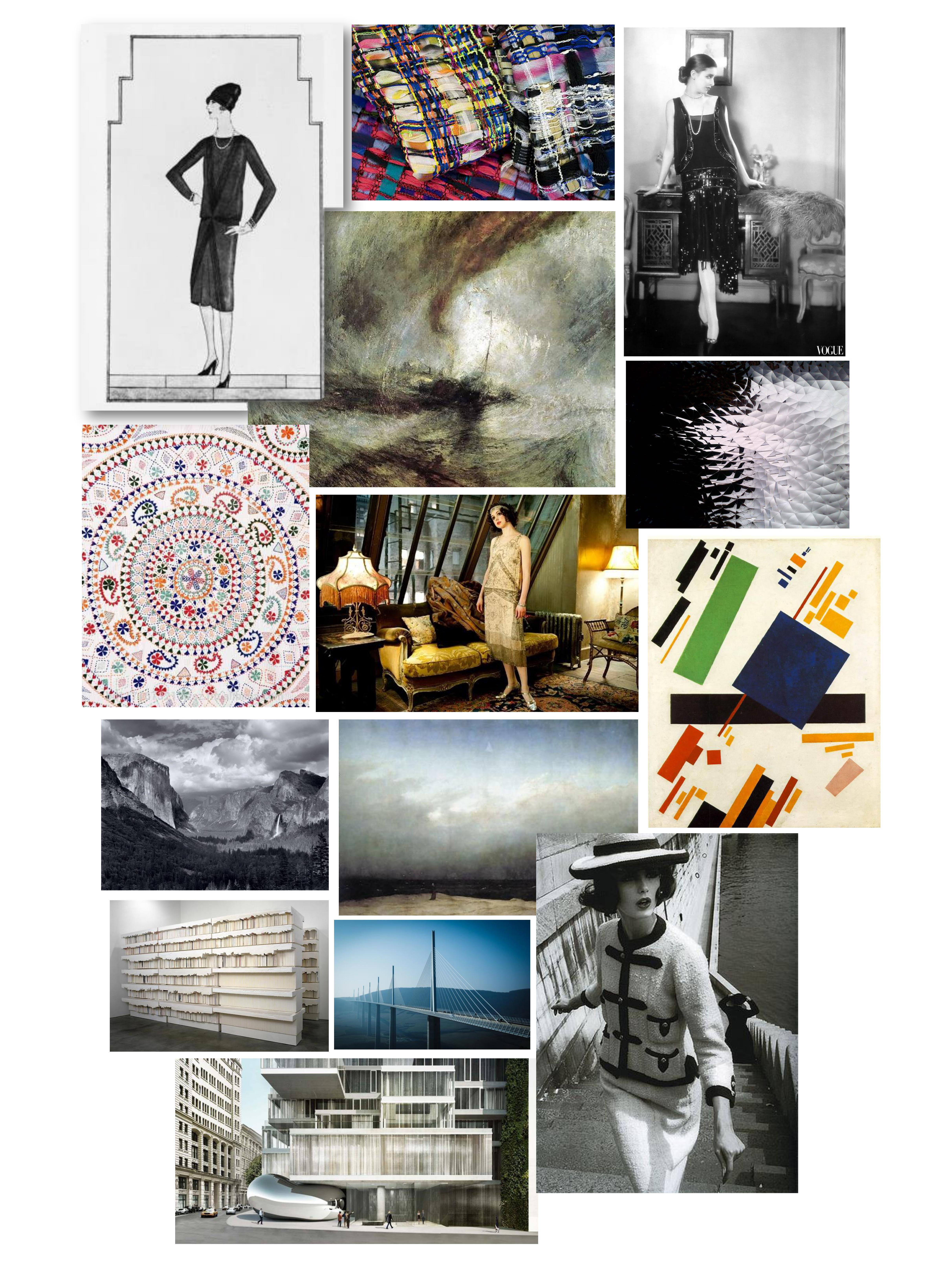
Out of the two articles provided, I decided to choose the first article given which was an extract from the Fashion Media: Past and Present edited by Djurdja Bartlett, Shaun Cole and Agnes Rocamora book titled ‘TASTE, FASHION AND THE FRENCH FASHION MAGAZINE by sanda miller’ which I thought would be a more interesting and diverse topic to research, analyse and write in-depth about.

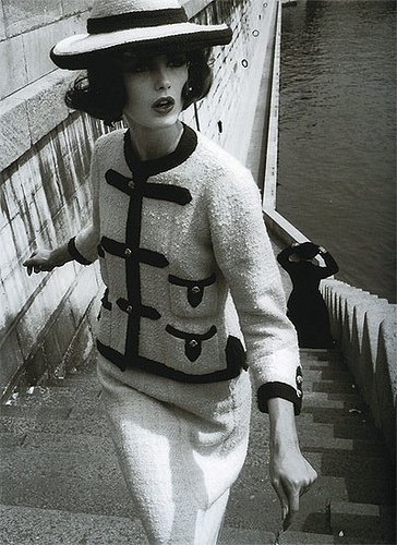
After giving the article a brief read it allowed me to gain a quick overview of the basis topic of subject the article is specifically explaining. The whole article discusses the overall impact and evolution of fashion magazine and fashion illustration’s and how different social classes/ social diplomats and the hierarchal system focuses on the 17th/18th century – how the ‘French Revolution’ affected the fashion industry of that era, and in-contrast to today’s modern era (in correspondence to taste in fashion). When reading through the article, I found that the first segment discussed the views on the revelation of magazines (in France, referred to as Gazette’s) in which first came around in 1672 and how it’s re-emergence gained popularity from 1724 to today’s modern era. Then the article follows on focusing on societies development on taste and how people respond to the artwork themselves as well as talking about philosophical aesthetics and how people’s individual psychologies determines their own opinions not “personal avowals (Bartlett et al. 2013)”. This specific paragraph also discusses the contrast between two societies by stating one of the groups as “ill-educated (Bartlett et al. 2013)” and “largely uneducated public (Bartlett et al. 2013)” and in contrast the other group stated as “art critics (Bartlett et al. 2013)” to show the difference in their intellect and intelligence discussing about a “… complex iconographical programme… (Bartlett et al. 2013)”. Moving on from that, the article then confers about a new emergence of a journalist/reviewer/art critic in which in France at the time was ‘Denis Diderot (1713-1784)’ in which in this time-era denotes the points of development and progression of magazines and art critics. The overall paragraph then ends on how the start of the first publicised fashion magazine in France revolutionised the industry developing people’s understanding on the subject and broadening their tastes and opinions in the art community. Lastly, the final paragraph entails the topic of conversation about fashion illustrators and plates in which they created – as well as discussing the differences and similarities of both Fashion Plates and Costume Plates. However, the writer also moves on to question how the ‘French Revolution’ had affected the taste of fashion? In which led to the occurrence of a new society/customer focal point described as “urban, female leadership (Bartlett et al. 2013)” and the fact fashion magazines soon begin to globally dominate the world. Reading further into this specific paragraph and analysing in-depth, I feel that the up-rise of the fashion plates were quite politically driven and almost used as ‘propaganda’ – as well as used to gain inspiration from.

To evaluate further, I looked at a quote which was “There is room for a good deal of explainable variability since different works of art will appear to different temperaments or at different stages of life. (Bartlett et al. 2013)” from the article in the second paragraph/chapter stated as ‘TASTE AND THE EMERGENCE OF THE CRITIC’ due to the fact it linked well with what I was expressing in my second paragraph about the main subject choice of the article – and discussing the topic of different social classes and how art is seen diversely between a multitude of people. Overall, this quote is discussing the topic of conversation about the arrival of the ‘art critic’ suggesting that in that era’s (the ‘French Revolution, 16/17th Century) society it’s beginning to become less constricted and constraint and more open and accessed to a wider range of people. By using word choices such as variability and temperaments it emphasises the articles point purely on the basis that together both insinuate that, in this specific moment in time, the art critic is “explainable variability (Bartlett et al. 2013)” meaning its spread inexplicably but at “different temperaments (Bartlett et al. 2013)” linking back to the main theme of the article on a wide spectrum of social hierarchy and their individual personalities and acquired tastes (within the fashion industry). Moreover, the quote also implies not everyone thinks in the same way as people’s mentality’s have evolved to contain a wide array of views and opinions. Furthermore, hidden in the text I can relate it back to the way art affects a diverse spread of societies as art is so malleable and easily altered due to the distinct communities of people having “…different temperaments… (Bartlett et al. 2013)”.

Article 1: ‘Fashion Media: Past and Present – Edited by Djurdja Bartlett, Shaun Cole and Agnes Rocamora’.

Article 2: ‘Fashion Brands: Branding Style from Armani to Zara 2nd Edition – by Mark Tungate’.


Developing my analysis further, I decided to find another piece of text from a different book/article which relates back to the main subject of the first article as well as linking to the fashion industry – focusing on the magazines, fashion illustrations and art critique especially. So, when looking for another piece of text similar to the ‘Fashion Media: Past and Present – ‘TASTE, FASHION AND THE FRENCH FASHION MAGAZINE’ by sanda miller’, I came across the book ‘Fashion Brands: Branding Style from Armani to Zara (2nd Edition) by Mark Tungate’ in which endeavoured a chapter about the subject of fashion illustrators stating the fact they’re a form of media to express taste in fashion – linking in with the first article I analysed. I particularly liked the quote from the second article I read which was “the expressionist, abstract aesthetic of illustration is increasingly seen as a fresh, more subtle – and attention-grabbing – alternative to computer graphics and photography (Tungate, 2012)” mainly as it expresses multiple views based on the miscellaneous and diverse array of fashion illustrations and how they are “…abstract… (Tungate, 2012)” and “…alternative… (Tungate, 2012)” which correlates back well to the first article which discusses how the art industry back in the 16th/17th century in France was quite varied and contained “different temperaments (Bartlett et al, 2013)” in which corresponds perfectly with the second article’s discussion on diverse, different and distinct views upon alternative and abstract artworks.

In addition to that, another book I came across was ‘Adorned in Dreams: Fashion and Modernity’ which an extract from Chapter 2: The History of Fashion articulated similarly to both texts the ‘Fashion Media: Past and Present – ‘TASTE, FASHION AND THE FRENCH FASHION MAGAZINE by sanda miller’ and the second book, ‘Fashion Brands: Branding Style from Armani to Zara (2nd Edition) by Mark Tungate’. In particular, the quote “Fashion speeded up and proliferated to keep pace with modern life. Going off in one direction it matched and expressed the compartmentalized, obessionally sub-divided life of the bourgeoisie. (Wilson, 2009)” I find relates well with the first article written by sanda miller due to the fact they both discuss points stating fashion has “proliferated (Wilson, 2009)” and is progressively evolving as well as being “speeded up (Bartlett et al, 2013)” – similarly the sanda miller text conveys the same idealism stating that “…the emergence… (Bartlett et al, 2013)” of taste and fashion “…gradually acquired the wider intellectual profile… (Bartlett et al, 2013)” soon gaining “global dominance (Bartlett et al, 2013)”.

Article 3: ‘Adorned in Dreams: Fashion and Modernity – by Elizabeth Wilson’.


References:

  1. Bartlett, D and Cole, S and Rocamora, A (2013) Fashion Media: Past and Present, 1st Edition, London/New York, Bloomsbury Academic.
  2. Tungate, M (2012) Fashion Brands: Branding Style from Armani to Zara, 2nd Edition, Kogan Page.
  3. Wilson, E (2009) Adorned in Dreams: Fashion and Modernity, I B Tauris & Co Ltd; Rev. ed edition.


Task 5 & 6: References for Hellen Van Rees

Moodboard of References used by Hellen Van Rees, Eleanor Swan, 2017

Moodboard of References used by Hellen Van Rees, Eleanor Swan, 2017

Photograph of Dorothy McGowan modelling Chanel in Paris, France, Vogue 1960, Photographer William Klein Accessed at https://www.balharbourshops.com/images/CultureWatch/ChanelToGo/the-sense-of-places-exhibition.jpg

Photograph of Dorothy McGowan modelling Chanel in Paris, France, Vogue 1960, Photographer William Klein

This photograph by William Klein depicts former model and actress, Dorothea McGowan, wearing a tweed suit by Chanel.  The quintessential white Chanel jacket, wrap-over pencil skirt and hat (with black braid and Chanel buttons) were featured in Vogue in1960, six years after her revolutionary suit collection was first released. This medium shot effectively highlights the fashionable Chanel suit as the focus of the composition whilst subtly juxtaposing the banks of the Seine in Paris, France. Klein captures McGowan as if in motion, presenting her as a busy, independent and modern woman with a purpose, thus reflecting Chanel’s aspiration to liberate women and enable them “to move with ease” (Alexander, 2013).

Although initially disregarded by the French press because of “alleged links to the Nazis” (Nelson Best, 2017), Chanel’s controversial 1954 collection was embraced by the United States as “more than a style; a revolution” (according to the popular American magazine, Life (Chanel, 2012)). At the time the fashion industry was “desperately struggling for modernity” (Chanel, 2012). It had become dominated by male designers creating flamboyant, feminine styles with little consideration for functionality. Chanel’s iconic military-inspired suit revolutionised this 1950’s trend for wasp-waists, balconette necklines and froufrou with a stark, almost masculine “nonchalant elegance” (Chanel, 2012). It was designed for utility, allowing freedom for movement with functional pockets and working button-holes (which were unique at the time).

The classic colour palette of this outfit reflects Gabrielle Chanel’s preference for black and white which was partly influenced by her childhood in the Aubazine Abbey Orphanage. The “Romanesque purity of religious garments” and the “monastic rigour” (Chanel, 2012) in this environment are clearly referenced in the austere and minimal aesthetic of Chanel’s designs. Here the predominant choice of white tweed visually contrasts with Chanel’s original 1926 ‘Little Black Dress’ which famously re-invented black, detaching it from its formal reservation for servants’ uniform and mourning dress.

In summation, Chanel’s revolutionary suit has been a timeless classic since its conception and is still today at the “cornerstone of contemporary fashion” (Karl Lagerfeld, 2012).

References:

Alexander, E. (2013) Vogue.co.uk: Coco And Her Little Chanel Jacket. Available from: http://www.vogue.co.uk/article/coco-chanel-chanel-jacket-story-film [Accessed 28 October 2017].
Anon. (2012) Inside Chanel: The Jacket – Inside CHANEL. Available from: http://inside.chanel.com/en/jacket/video [Accessed 28 October 2017].
Anon. (2012) Inside Chanel: THE COLORS OF CHANEL – Inside CHANEL. Available from: http://inside.chanel.com/en/colors-of-chanel [Accessed 28 October 2017].
Anon. (2014) Littleblackdress.co.uk: Chanel challenges the designs of Christian Dior | Little Black Dress. Available from: https://www.littleblackdress.co.uk/life-of-chanel/chanel-v-christian-dior.html [Accessed 28 October 2017].
Anon. (2017) Tourismelimousin.com: Chanel, Correzian inspired elegance. Available from: http://www.tourismelimousin.com/en/Visionneuse2/Limousin-the-dawning-of-luxury/Chanel-Correzian-inspired-elegance [Accessed 29 October 2017].
Foreman, K. (2014) Bbc.co.uk: The Little Black Dress: Never out of style. Available from: http://www.bbc.co.uk/culture/story/20131209-the-dress-thats-always-in-style [Accessed 27 October 2017].
Harper’s Bazaar Staff (2013) Harper’s BAZAAR: The Real Polly Maggoo. Available from: http://www.harpersbazaar.com/culture/features/g2739/dororthy-mcgowan-profile-0613/?slide=1 [Accessed 29 October 2017].
Klein, W. (2008) YouTube: Qui êtes-vous, Polly Maggoo? (Opening Scene). Available from: https://www.youtube.com/watch?v=I8x40g8bPyg [Accessed 29 October 2017].
Moura, G. (2014) Elementsofcinema.com: SHOT SIZES: Telling What They See. Available from: http://www.elementsofcinema.com/cinematography/framing-shot-sizes/ [Accessed 29 October 2017].
Nelson Best, K. (2017) Google Books: The History of Fashion Journalism. Available from: https://books.google.co.uk/books?id=6L9NDQAAQBAJ&pg=PT142&lpg=PT142&dq=chanel+1954+french+press+information&source=bl&ots=VPDpxrvqva&sig=0XcHE2aSXo67kQukFrAS15YNfw0&hl=en&sa=X&ved=0ahUKEwjR5d2_lZbXAhWmL8AKHdUcBY0Q6AEIWTAM#v=onepage&q=chanel%201954%20french%20press%20information&f=false [Accessed 28 October 2017].

Visual Research

Mood Board of Christopher Bailey’s (Creative Officer and President at Burberry) inspiration

Henry Moore photographed by John Hedgecoe , 1966 Photograph: Topfoto

David Hockney photographed by John Hedgecoe, Platinum print, 1971, 9 3/4 in. x 7 1/4 in. (248 mm x 184 mm)

This image is of Henry Moore working in his studio. In this photograph we can see lots of Henry Moore’s creations around him. Moore is placed just off the centre point of the photograph with the background looking busy from lots of his sculptures scattered around him. I think that John Hedgecoe is trying to capture Moore’s way of working with Moore blending into the forms and neutral colours of the sculptures and therefore the busyness of the photograph which could reflect Moore’s way of working. With Moore’s face in shadow helps show how he is intent on his work.

Hedgecoe is known for his portraits of Artists. I think that Hedgecoe tries to reflect Artists way of working with how he captures the image. Hedgecoe is obviously comfortable photographing Artists in their personal environment which could be considered unusual and maybe uncomfortable to others.

This image of David Hockney in his studio is also photographed by John Hedgecoe. Unlike the photograph of Moore who is crouched over almost trying to avoid the camera, Hockney is shown standing upright ‘proud’ of his artwork. Similarly to Moore’s photograph Hockney is also photographed just of the centre. Instead of the other photograph though only a third of the photo is cluttered with Hockney’s artistry tools and he as the artist stands out much more, the photograph almost seems calmer. This could reflect their different ways of working. In Moore’s photograph though he is the focus, all the sculptures are so mixed up with one another it is difficult to separate them whereas in Hockney’s photograph I think the painting is the main focus, almost like Hockney is placed there to give an impression of the size of the painting. It could also be to show that Hockney has just completed the painting. Interestingly, at first glance it is as if John Hedgecoe is photographing 2 people as the painting in the photo is almost life sized.

Task 5 and 6: Iris Van Herpen

Designer: Iris Van Herpen

Collection: Aeriform AW 2017.


Three fashion designs from Iris Van Herpen Aeriform AW 2017 collection.

These garments seen above belong to Iris Van Herpen’s collection for 2017 called Aeriform. The innovative artist explores in these garments the fluidity of both water and air and the contrast within them incorporating surprising materials and textiles.


Moodboard of 10 references for Iris Van Herpen Aeriform collection.


“Between Music” band while playing on Iris Van Herpen Aeriform fashion Show.

In the image above we observe quite an interesting event happening. It is a band member of Between Music playing with a submerged instrument during their underwater concert called Aquasonic. These musicians and their work transcend and transform the conventional and natural relationship between our bodies and the elements”(Iris Van Herpen website, Aeriform Collection). In other words, they challenge the body and the instruments to a completely different medium.

For years they have explored the different sound possibilities and have been able to produce custom-made instruments developed specifically to be played underwater. It is not only striking and surprising to hear the sounds they are able to make, but also the actual elements that are needed to produce these.

For instance, at the bottom of the vertical image, we can see this transparent instrument full of cables, tubes and pipes as well as small holes that the musician uses to create these sounds. We can see clearly that the person is inside this water tank and is surrounded completely by glass. There is also a strong spotlight that lights up the scene and falls upon her back and shoulders. In fact, thanks to this lighting we are able to distinguish different colours such as red, green and orange. Even though it is a still picture, movement comes across thanks to the slight diagonal angle with which the image was taken. This dynamism, however, comes across as well with the moving surface of the water and her floating-like hair.

Although this doesn’t look like a reference, the Dutch designer actually thought about their “hypnotic biophonic sound” (Iris Van Herpen Website, Aeriform Collection) when creating her designs and it is afterwards that she invited them to perform in her fashion show while the delicate garments made their way into the catwalk.


Bibliography:

Nicole Phelps. 2017. Iris van Herpen Fall 2017 Couture Collection – Vogue. [ONLINE] Available at: https://www.vogue.com/fashion-shows/fall-2017-couture/iris-van-herpen. [Accessed 03 November 2017].

Iris van Herpen. 2017. Aeriform | Couture | Iris van Herpen. [ONLINE] Available at: http://www.irisvanherpen.com/haute-couture/aeriform. [Accessed 03 November 2017].

3D Printing Blog | i.materialise. 2017. The New Craftsmanship: Iris van Herpen and her Inspiration | 3D Printing Blog | i.materialise. [ONLINE] Available at: https://i.materialise.com/blog/the-new-craftsmanship-iris-van-herpen-and-her-inspiration/. [Accessed 03 November 2017].

YouTube. 2017. Dutch Profiles: Iris van Herpen – YouTube. [ONLINE] Available at: https://www.youtube.com/watch?v=9vZktNvLCaI. [Accessed 04 November 2017].

Dezeen. 2017. Iris van Herpen explores contrasts between water and air with Aeriform. [ONLINE] Available at: https://www.dezeen.com/2017/07/05/iris-van-herpen-explores-contrasts-between-water-air-aeriform-couture-collection-design-fashion/. [Accessed 09 November 2017].

The New Yorker. 2017. Iris van Herpen’s Hi-Tech Couture | The New Yorker. [ONLINE] Available at: https://www.newyorker.com/magazine/2017/09/25/iris-van-herpens-hi-tech-couture. [Accessed 04 November 2017].

YouTube. 2017. In Fashion: Iris Van Herpen interview – YouTube. [ONLINE] Available at: https://www.youtube.com/watch?v=bjp8uxXEZHI. [Accessed 04 November 2017].

YouTube. 2017. Iris Van Herpen – YouTube. [ONLINE] Available at: https://www.youtube.com/watch?v=7sdeiVYHsm8. [Accessed 04 November 2017].

YouTube. 2017. Iris van Herpen Interview Video – YouTube. [ONLINE] Available at: https://www.youtube.com/watch?v=ZcaPhkSWkMc. [Accessed 04 November 2017].

Naomi Shavin. 2017. Iris Van Herpen Is Revolutionizing the Look and Tech of Fashion | Arts & Culture | Smithsonian. [ONLINE] Available at: https://www.smithsonianmag.com/arts-culture/iris-van-herpen-revolutionizing-look-and-tech-fashion-180958969/. [Accessed 04 November 2017].

Task 5&6: Visual Research

Maison Margiela Couture Fall 17
Designer: John Galliano

For the Maison Margiela AW17 Couture collection, designer John Galliano cites his main inspiration as ‘Everyday Glamour’. Galliano looked at the meaning of Glamour and what he would identify as ‘Glamourous’- such as a red lip, high heel and sequins. Galliano also turned to images of iconic ‘glamourous’ stars, Marilyn Monroe and Elizabeth Taylor being his main inspirations. Galliano, however, wanted the collection to also reflect everyday wear, hence the introduction and deconstruction of the classic trench coat, and reference of modern muses like Riley Keough- who epitomises this natural kind of glamour that carries through to the everyday.


Elizabeth Taylor in Cleopatra (1963) Courtesy of Twentieth Century Fox, photographer unnamed.


’Iconic Images’ of Elizabeth Taylor were one of John Galliano’s named inspirations for the AW17 collection. Taylor epitomises the glamour within Hollywood during the 1950s and 60s. The image above is taken from the 1963 film ‘Cleopatra’ in which Taylor starred. The image shows the immense detail with which all the costumes were created. Costume designer Renie Conley had a budget of £123,000 just for the wardrobe. Conley won the 1963 Academy award for Best Costume Design for her incredible creations showcased in the film. The costume of the film was extremely influential, reviving a trend for Egyptian style accessories, the geometric bob and especially the Cleopatra eye.

Below is an advert from 1963, advertising the makeup brand Revlon and their eyeliner to create Cleopatra inspired eye makeup. This derives directly from the popularity of the film starring Taylor.


TASK 5/6


Valentino Haute Couture F/W 2015,

Photo by Fabrizio Ferri, for Vogue Italia, September 2015

This image is for advertising purposes, due to it being published in Vogue Italia, September 2015. This image’s subject is deliberately off central. Ferri has done this so the viewer acknowledges the background, which makes up the image. The way the models have been positioned is also interesting. I believe Ferri was trying to capture something mysterious. The models are huddled, as if part of a clan, protecting each other. The image feels mystical and bewitched.

The style of the image fits with the inspiration behind the Valentino collection. Valentino wanted to capture Italy’s routes and this photo also succeeds in doing this. The collection captures many aspects of Rome, including the marble tiles off of the cathedrals, the arches off of the coliseum walls, as well as Ancient Rome. The collection shows a reference to gladiator armour, golden wreathes associated with Julius Caesar’s reign and Roman emperor and empresses clothing. The mood of the image, combined with the dark clothing could also symbolise the darkness during the middle ages. Piccioli himself said, “Rome is just a little bit noir, a little sinister”. The dress at the front appears to be some sort of black bird, this links to the symbol of the Holy Roman Empire that existed in the Middle Ages. The photographer adds to this effect with dark tones and using a backdrop with arches very similar to the coliseum.

This is nothing like what Ferri has done before. He is known for taking portraits of beautiful famous women. He rarely photographs collections, or group photos. He is known for having an Italian style and creating endearing photos, which is why I think he was perfect for capturing an Italian brand. This image is also different to the brand’s usual style. Valentino is known for its ‘glitterati chic’ and usually consists of a very feminine colour pallet, due to the brand being recognised by its femininity. Although the materials used are still intricate and delicate, there is less embroidery and the frequent use of black goes completely against the normal colour pallet.


Bibliography:

  • Neves J (2017) A History Of The Life Of Valentino Garavani,

Available from: www.farfetch.com/style-guide/icons-influencers/a-history-of-the-life-of-fashion-icon-valentino-garavani/

[Accessed 1st Nov 2017]

  • Phelps N (2015) Fall 2015 Couture Valentino,

Available from: https://www.vogue.com/fashion-shows/fall-2015-couture/valentino

[Accessed 1st Nov 2017]

  • Felner J (date unknown) Valentino Haute Couture Fall 2015,

Available from: jeffybruce.blogspot.co.uk/2015/07/valentino-haute-couture-fall-2015

[Accessed 1st Nov 2017]


Task 5/6 – Visual Research

Dolce and Gabbana Inspiration Moodboard:Dolce and Gabbana


A moodboard of Sicilian inspiration in Dolce and Gabbana collections.

My chosen designers are Dolce and Gabbana. Throughout their collection between 2012 and 2015 shows a rich and bold traditional Sicilian inspirations from the Sicily mountain view, this created the colour palette for the Men’s Fall 2016 to Palermo’s vibrant vegetable market which inspired them to create the print for the Spring 2012. An interesting Sicilian inspiration was the designers looked into the history of the Sicily where the Spanish ruling took place.

_DOL0028.1366x2048 [1]


This image is from their 2013 Ready To Wear collection which was inspired by the mosaic pieces in Sicily’s Cathedral of Monreale. The garments in this collection had a loose shaped style with puffed sleeves, they are all embellished with sequins and jewels to insinuate the mosaic tiles. The whole collection had a strong vibrant feel of holiness with the use of pigmented colours like red, green, blue and golden-yellow. I admire Dolce and Gabbana’s attention to small details creating intricate designs throughout the years. The designers love to incorporate ancient Sicilian culture to their collection to show who they really are as designers. They explained that their success as designers is through the investigation and celebration of their roots and their passion of Italian culture [2]. I feel like this also has a similar connection to Oliver Rousting with this Balmain’s Fall 2012 Read To Wear with his baroque inspired collection. Although his colour palette was lighter with a use of soft pastels along with golds and silvers. I thought that both collections are similar in a way of how both designers have looked into historical culture but differentiate in styles one being quite boxed and the other loose shaped. Overall, I feel that Dolce and Gabbana’s use of fabrics and materials to create the Sicilian influences give such a rich and extravagant aesthetic outcome to represent the Italian culture.


[1] Vogue (2013) Dolce and Gabbana Fall 2013 RTW. Available from: https://www.vogue.com/fashion-shows/fall-2013-ready-to-wear/dolce-gabbana/slideshow/collection#3 [Accessed 05 November 2017]


[2] Radaelli M. (2016) The Sicilian Connection: Dolce and Gabbana’s Inspiration has gone Global. Available from: http://www.italoamericano.org/story/2016-8-12/dolce-gabbana [Accessed 05 November 2017]


Task 5/6: Visual Research

Clarissa Hulse Mood board

De Gournay: Design Collaboration 2017 ‘Anemones in Light’
Portrait of Kate Moss by Nikolai von Bismarck
Available from https://degournay.com/kate-moss-de-gournay-design-collaboration-2017-‘anemones-light’
[Accessed 2 November 2017]


I recently discovered the textile designer Clarissa Hulse and immediately fell in love with her colourful and flamboyant style. Strongly inspired by nature, her contemporary botanical designs include luxurious materials like velvet and silk. I did some further research on her influences and came across this portrait of Kate Moss taken by Nikolai von Bismarck.

Kate Moss is standing in front of a new wallpaper design called ‘Anemones in Light’ that she designed herself. She worked with de Gournay to create this piece that depicts the anemone flower in muted blue-grey tones and beams of light printed with sterling silver metal leaf.

Leaning slightly off centre, the model mirrors the shape of the bouquet on the left and breaks from the perpendicular lines created by the panelling. Posing in a nude coloured, silk dressing gown with her face tilted back towards the light, she gives the image a luxurious and sensual feel. By using strong contrasts mixed with cool, silvery tones, the photographer was able to create that chic, glossy look that is recurrent in de Gournay designs. The whole composition of the photograph is carefully thought through, from colour to line and shape: the scene is a harmonious blend of contrasts.

Nikolai von Bismarck has photographed a number of celebrities and in this image he captures the elegant style of de Gournay, one of the high-end designer brands in the décor market. The marriage of classic, artisanal Chinese style and modern, sexy glamour is studiously and artistically depicted.

RCS: Task 5/6 – Visual Research

2016 Pre-Fall

[1]

Christopher Kane’s Pre-Fall 2016 collection was inspired by elements and design features he had used previously from past collections: Graduate collection 2006, S/S 2011, S/S 2013, A/W 2013 & A/W 2014.

Moodboard

Image

[2]

This photograph is a dress from Kane’s SS13 collection, made using gaffer tape and bright coloured fabrics like organza, influenced slightly by punk, to give a ‘Frankenstein’ vibe to his collection. I think this image and collection is showing a contrast of hard and soft in both colour and material within the garments. Perhaps to contrast the typical feminine silhouette and style of cocktail dresses with something more abnormal and abstract to give his collection his own personal flare and to perhaps push the boundaries of femininity in silhouettes and garments. These are elements I am glad he took into his Pre-fall 2016 collection as he once again plays around with bold colours and materials whilst creating some more androgynous silhouettes; similar to the style of David Bowie and general 60’s/70’s fashion. He may be playing with symbolism; materials symbolising how traditional views of style and clothing are barely being held together and are being torn apart by modern, groundbreaking designers such as him. In conclusion, I think the way in which Christopher Kane uses old design features in new inventive ways is very inspirational and something I admire about his work and as it can be hard to do so without making your collections look identical. I also love his play on colour and materials which I enjoy doing in my own work.


Bibliography

[1] Mower S.(2016) Vogue: Pre-Fall 2016 Christopher Kane, available from: https://www.vogue.com/fashion-shows/pre-fall-2016/christopher-kane [accessed 31st October 2017]

[2] Blanks T. (2012), Vogue: Spring 2013 Ready-To-Wear Christopher Kane, available from: https://www.vogue.com/fashion-shows/spring-2013-ready-to-wear/christopher-kane/slideshow/collection#38 [accessed 31st October 2017)

RCS: Task 3/4 – Academic Integrity and Plagiarism

Twiggy

[1]


I chose this book as I felt it perfectly linked with the theme that I chose in task 1/2 and is still a topic of fashion history that I’d love to explore and learn more about so I felt this task was a great segway for starting to do so. An image of Twiggy wearing a sporty shift dress[1] stood out to me as it instantly reminded me of the influence on today’s fashion and trends; the sporty stripes and shift dresses and colour blocking theme throughout. Wanting to expand my knowledge on what other trends from the 60’s were popular again today, I went online to search for more information. I discovered that many staple clothing items that nearly everyone of today own, are trends from the 60’s. These include mini skirts, knee-high boots, military style, leopard print and patterned tights[2].

60's Trends

[2]

Many of these trends are items I possess myself so the discovery of this was very enlightening. Finally, I looked for an article relevant to this idea and found one that related the 60’s style comebacks to fashion designers for the modern era like Marc Jacobs, Louis Vuitton, Christopher Kane and Topshop Unique. There was also a mention of 60’s style influence on the pop culture of now through the mention of the TV show ‘Mad Men’[3].This is an element I also want to look further into; the 60’s influence on not only fashion but also styling and setting of music videos & TV shows etc.


Article

[3]


Bibliography

[1] Sokolsky M., Muir R., and Pepper T. (2009) Twiggy: A Life in Photographs, St. Martin’s Place: National Portrait Gallery Publications, Page 38

[2] Sammy Davis (2012), 10 Ways the 1960’s Invented Today’s Fashion Trends, Sammy D Vintage, available from: http://sammydvintage.com/vintage-style/60s/fashion-in-the-1960s/ (Accessed 23rd October 2017)

[3] Armstrong L. (2013), The 1960’s: The decade of fashion that never went away, The Telegraph, 23rd February, Page 1