Author Archives: Stefan Ahmad

summary post

Over the course of the research and communication skills sessions, I have made significant progress in both my analytical skills and technical writing. I have learned about the importance of research and artistic reference. Finally, I have learned about the correct method of referencing sources and crediting artists and researchers.

My analytical skills have been greatly improved by the tasks set. I have learned to engage in a piece of artwork, writing or media at a higher level and appreciate the choices of the creators more. For instance, in the first task, when reviewing the short film, ‘Terminal Bar’ by Stefan Nadelman, I had to analyse the film and its social and historical context before forming an opinion about the subject matter.

Another area that I have learned a lot about is communication through writing. I feel that a number of the writing tasks have required a development of my ability to communicate my own ideas and thoughts on certain subject matter as well as think critically and contextually about other work. An example of when I have had to use my communication skills is during the ‘story, message and feeling’ writing task when I had to analyse three published illustrative images and discuss their relevance to my own personal practice. In this task I had to understand both the artist’s given style and techniques, as well as the personal context for their work and then express my own opinion of the work. In this task I focussed on artists who have an illustrative focus around their work including Robert Crumb and Dan Hillier. In order to communicate the rational and ideas of the artists effectively, I first had to do extensive research into their own practices before referencing my own.

Research is one of the topics that I feel I have improved in the most over the course of these tasks. What I found difficult about effective research before was choosing appropriate sources that could be valid for use in a discussion. Also, finding enough relevant information to have a discussion about subject matter was also challenging. However, I think that the research tasks have dramatically improved my ability as a researcher, in that I now look for a mixture of sources including texts, books and websites. Also, I think that I have improved the quality and validity of the sources that I now use, looking for writers and authors who have specialist knowledge or qualifications in the given field of discussion.

Finally, I have learned how to use the Harvard referencing system when citing my personal research. This is a hugely important skill for critical writing tasks because it validated the sources I have used and strengthens any conclusions I have made that I have based on the information drawn from my sources. I have learned the importance of crediting the correct writers and including the dates the source was used in order to be able to compare them to other sources.

In conclusion, the writing tasks have lead to significant improvements in my analytical and critical thinking as well as my abilities as a writer. It has also strengthened my ability to cite research and credit sources.

Story, message, feeling and connection

My personal practice is mainly centred around illustration and image making. The images that usually catch my eye the most are drawings, whether they be from graphic novels, posters or artwork. I like the idea of a running narrative in the images that I see.

In my own practice, I like to utilise techniques used by my favourite artists and illustrators. Above is a drawing I made using a mixture of biro and ink pen.

Will Eisner is a famous graphic novel illustrator. I see many parallels in my practice to his massive collection. ‘The Spirit’ was published as a DC comic all the way through the 1940’s. The reason I have referenced his work is because his drawing style was one of the pioneering styles that took over the graphic novel industry. What I enjoy about his work is that all of the imagery is part of a sequence or a story. There is a clear narrative running through all of his illustrations. I try to use a similar style to Eisner’s in that I use large shapes of black to show shadow rather than actually shade or crosshatch. This is similar to many of the illustrators of the time .

Robert Crumb is an iconic illustrator who is known for his explicit drawings and political massaging. Above is a drawing from the magazine ‘A Chronicle Of Modern Times.’ I find Crumbs style interesting because of his unique characterisation and his methods of creating tones. Crumb uses a mixture of crosshatching and dotwork instead of complex shading. This combined with his overexaggerated, cartoonified chaaracters lends to his iconic style of work.

Ellipsis - screen print - 76cm x 76cm

Dan Hillier is one of my favourite artists because he makes very intricate screen prints that incorporate imagery in a very prominent way. Even though it appears as though Hillier has used shading, he has actually used very intricate dotwork. All of his work is inspired by his travels and his own experiences so in that sense there is a story behind every print. I feel like I connect easily to these works because to me they are so powerful in terms of both their imagery and the techniques used to create them.

,


Bibliography

  • http://www.willeisner.com/spirit/, written by Carl Gropper, viewed 05/12/17
  • http://observer.com/2015/01/legendary-cartoonist-robert-crumb-on-the-massacre-in-paris/, written by Celia Farber, viewed 5/12/17
  • https://www.danhillier.com/artwork/ellipsis, created and written by Dan Hillier. viewed 5/12/17

Show, reveal and deconstruct

Postmodernism brought about a plethora of new and exciting forms of artwork either through photography, illustration or through many other media. I found many of these artworks particularly useful in relation to my personal practice in regards to style and artistic techniques. They are also however very useful to interpret the reasons that the artists made the decisions they did when making them.

One of the notions I have been most excited by in postmodernism, is the idea that art can be found anywhere and recreated many times. Marcel Duchamp is a key artist to study when questioning this idea. The piece that Duchamp is most well known for is a sculpture named ‘Fountain (1917).’  The reason this work is so interesting is because the sculpture is essentially a found object. The sculpture is in essence, a urinal. At the time, when it was first exhibited, this caused outrage at how an object such as this could be displayed as a piece of ‘artwork.’ To understand this, we need to understand Duchamp’s rational for creating the work. His intension was to ‘rattle’ art critics by challenging the definition of a ‘piece of artwork.’ Could something as simple as a urinal be classed as a piece of artwork just because it had a signature at the bottom and be standing on a plinth? And even though he encountered some opposing opinions, the artwork is seen as one of the most important works of the period.

Man Ray’s ‘Indestructible object (1933)’ is another piece that is incredibly interesting to me as, similarly to Duchamp’s work, it has evolved and changed over the course of it’s exhibited history; After the original sculpture, entitled, ‘An object to be destroyed (1922)’ was vandalised, Man Ray endeavoured to recreate the sculpture using the insurance money. In response to the event, he changed the name to ‘the Indestructible object.’

However, the artist who has made the largest impression on my personal practice is Rene Magritte through his surrealist painting. ‘The Son of Man’ (1946) is one of Magritte’s most well known works. I find this style of work unique because of its combination of imagery and similar forms which, to me (someone interested in graphic elements of images) can find very interesting. Magritte himself stated that he wanted to obscure the face of the man, as it was a selfportrait. He stated, ‘There is an interest in that which is hidden and which the visible does not show us.’ His interest in obscurity and the unknown draws people in and is what I feel I have taken into my own practice.


Bibliography:

  • Smithsonian American Art Museum – Smithsonian Institution: https://americanart.si.edu/artwork/indestructible-object-33672, Laura Baptiste, visited 2/12/17
  • historia-arte.comMiguel Calvo Santos, viewed 2/12/17
  • www.tate.org.uk/art/art-terms/p/postmodernism, written by tate patrons team, viewed 2/12/17
  • https://www.renemagritte.org/the-son-of-man.jsp, written by website admin (name not stated), viewed 2/12/17


sensibility, spirit and meaning

The period between 1960 and 1970 was filled with interesting new artwork in the form of photography, illustration and much more. A lot of this work is particularly relevant to me and my practice. In particular, those involved in the pop art movement since that style of work links to the type of illustrative drawing that I am interested in.

Image result for soup cans warhol

Andy Warhol’s piece entitled, ‘Campbell’s Soup Cans’ (1962) was one of the earlier examples of pop art imagery. One of the most important reasons for my interest in in pop art is the bold use of colour and strong linear imagery. The scale of the artwork is very large with there being thirty-two almost identical canvases, each of which being 20 x 16″ in size. What I think is interesting about this piece is the meaning behind it. It symbolises an idealised view of modern living and the repetition found in advertising; When Warhol first exhibited this series, he had each canvas shown in rows on shelves as if being inside a grocery store. Warhol said that for the work he wanted to mimic the repetition and uniformity found in his profession (advertising) by carefully reproducing the same image and exhibiting them together.

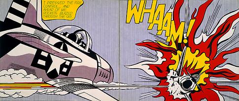
Another famous pop artwork that has to be addressed is ‘Whaam!’ By Roy Lichtenstein made in 1963. This piece is so iconic and completely associated with the movement. In my opinion , Lichtenstein’s style is very illustrative in spirit. His images, including ‘Whaam!’ Have a very clear narrative. ‘Whaam!’ Was inspired by a DC comic strip that Lichtenstein had read. However, the meaning behind the work is perhaps showing the over glorification and dramatization of america’s attitude to the rest of the world in the early 60’s. Particularly because of the wake left after the second world war. After the war there was a feeling of superiority over other nations with america being the most economically stable country left after the war.

James Rosenquist’s Marilyn Monroe I is the final image that I want to address. The reason being that unlike the previous two works, this painting was created in memory of the late Marilyn Monroe. This painting has a more direct meaning compared to the others which is to pay tribute to a specific person. However, relating to my own practice, what interests me about his work is the ralationship between type and imagery. Pop art was important for creating visually striking images and utilising type either for decorative or onomatopoeic purposes.


bibliography

  • https://www.warhol.org/, written by Nicole Dezelon, viewed 2/12/17
  • http://www.roylichtenstein.com/, written by website admin (name not stated), viewed 2/12/17
  • http://www.jamesrosenquiststudio.com/, written by Sarah Bancroft

Is it possible to be truly authentic?

The definition of authenticity is to not be false or copied. In modern times, it is very difficult for any publication to be truly authentic. With the media so overly saturated with authors, publications and conflicting reports, it has become increasingly difficult to maintain authenticity. With the creation of the web; the worlds largest sharer of information, it seems to me that every modern writer will unknowingly, subconsciously plagiarise the work of others. However, with such a massive platform for people to share information, this does create a very accessible way to check for authenticity and fact.

Authenticity relies on information being correct. This, in my opinion, is the evidence to how truly authentic pieces of work can be created. The world wide wed had created such a huge platform for researchers to share information and theories with one another. In turn this allows for viewers and piers to review publications and check for truth. For example, if a historian was to write an article about an historical event and made an error of the date of that event, the internet would allow viewers and other historians to cross check the information and find the error, thus proving the publication was not truly authentic. The historian would then be able to amend the publication. This process of pier review allows for improvements in authenticity.

However, with such a mass of information, the danger for authenticity in the modern world is centred around plagiarism. It has become increasingly easy for information to be deliberately copied and used in other pieces of work. also, with such an overwhelming amount of information available, it is common for a researcher to subconsciously use found ideas or information in their own work without crediting the original source.

This is why I believe that true authenticity is very difficult to achieve in a modern world.

Technology is the mortal enemy of art

I find that the statement ‘Technology is the mortal enemy of art’ cannot be seen as fully true in the broader context of art and media. The reason I believe this is that there are entire artistic styles and processes that are based on the existence of new forms of technological ingenuity. Personally, I see that the ever improving and evolving applications of technology in the new world only cause equivalent strides in the art world. John Lasseter said, ‘The art challenges the technology, and the technology inspires the art.’ It is very clear that in the artistic community, many design based careers such as game design or animation are reliant on technology. It seems that in the twenty-first century, technology makes up the very foundation of a lot of artistic practices.

It is not to say that, the introduction of technology in such a widespread way hasn’t perhaps caused a shift in focus in artistic practices. Advances in visual rendering caused by the introduction of powerful computers and software has lead many to believe that certain careers such as painting and illustration have become redundant in the modern world. Before the twentieth century, an artist’s position in society was very strong with artwork being the main points of cultural and political discussions of the times. but with the creation of social medias in the late twentieth century has lead to a shift with the focus leaving artwork.

However, even in our modern world, artistic media still has a huge place in social discussion and the introduction of technology has also played a part in strengthening that place.

Bibliography

A.Rodchenko. (1921)100 Artist Manifestos from the futurist to the stuckists, by Alex Danchev

John Lasseter. animator and filmmaker, 2013. Available at: http://www.azquotes.com/quote/168904?ref=art-and-technology (Accessed: 1 November 2017).

Contrasting Different Disciplines

The image I have chosen to analyse is entitled ‘Pachamama’ by an Artist named Dan Hillier. I have been very interested in Hillier’s work after seeing several of his pieces exhibited at the Saatchi Gallery. His prints and drawings have both commercial value as well as being stand-alone artworks.

Hillier himself is an artist, illustrator and printmaker. His prints, as well as being works of fine art, have other commercial applications e.g. Album Cover artwork and advertising. He has been repeatedly commissioned by the band ‘Royal Blood’ to create album covers and supporting artwork for their music. Because of this, his work could be classed as examples of both illustration and graphic design.

Pachamama, Dan Hillier

The piece entitled ‘Pachamama’ was inspired by Hillier’s love of travelling. Whilst visiting the Andes, he grew familiar of the culture. ‘Pachamama’ is a goddess from the indigenous culture of the Andes also known as the mother of earth and time. The image is interesting to me because the artist has communicated his own experiences through his work.

In comparison to Hillier, I have been looking at the fashion photography of Richard Avedon. The reason being, similarly to Hillier, his style does not simply fit into one of the four listed categories. Avedon’s work has multiple applications ranging from fine art photography to fashion and advertisement. His work could be classed as both photography and graphic design.

Veruschka, dress by Kimberly, New York, January 1967, Richard Avedon

Similarly to Hillier, Avedon manages to communicate his own culture and experiences through his photography. His New Yorker background plays a large part in the themes of his photography. Both of the artists’ work crosses the boundaries of several different creative disciplines and both have cultural and personal motivations behind them.


Terminal Bar by Stefan Nadelman

Terminal Bar (2003) by Stefan Nadelman is an award winning short film. It centers around Nadelman’s collection of photos taken at his father’s bar over the course of ten years. The film is full of anecdotes and story snippets from the ten years that Stefan Nadelman’s father (Sheldon Nadelman) ran the bar. The film won awards at three major film festivals in 2003 including Sundance Film Festival.

This film is classed as a documentary as well as a short film. Nadelman uses real life images of customers and bar workers taken over the ten year period. It shows a raw and uncensored look into the lives of the working class New Yorker during the late 20th century (1972-82). The audience is able to delve into the lives of the bar’s patrons through the large number of photographic portraits and sobering narration by Tom Clifford.

What is truly unique about the short is how the photographs are presented to its viewers. Nadelman uses his stills in a very cinematic way, almost choreographing his images to the time of the film scoring. Other times he positions dozens of stills across the screen in large patterns or configuration. He uses a mixture of real-time recordings and stills to allow us to glimpse into the actual life of the Terminal Bar and its inhabitants.

What confuses many about the film is Nadelman’s motivations to publicise such a bleak and unmoderated look into the lives of working class American Citizens. But as Nadelman’s father states in the final few moments of the film, ‘Nothing had changed, but if I hadn’t documented it no one would know about it.’