
The period between 1960 and 1970 was filled with interesting new artwork in the form of photography, illustration and much more. A lot of this work is particularly relevant to me and my practice. In particular, those involved in the pop art movement since that style of work links to the type of illustrative drawing that I am interested in.

Andy Warhol’s piece entitled, ‘Campbell’s Soup Cans’ (1962) was one of the earlier examples of pop art imagery. One of the most important reasons for my interest in in pop art is the bold use of colour and strong linear imagery. The scale of the artwork is very large with there being thirty-two almost identical canvases, each of which being 20 x 16″ in size. What I think is interesting about this piece is the meaning behind it. It symbolises an idealised view of modern living and the repetition found in advertising; When Warhol first exhibited this series, he had each canvas shown in rows on shelves as if being inside a grocery store. Warhol said that for the work he wanted to mimic the repetition and uniformity found in his profession (advertising) by carefully reproducing the same image and exhibiting them together.
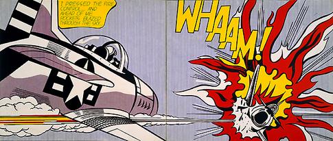
Another famous pop artwork that has to be addressed is ‘Whaam!’ By Roy Lichtenstein made in 1963. This piece is so iconic and completely associated with the movement. In my opinion , Lichtenstein’s style is very illustrative in spirit. His images, including ‘Whaam!’ Have a very clear narrative. ‘Whaam!’ Was inspired by a DC comic strip that Lichtenstein had read. However, the meaning behind the work is perhaps showing the over glorification and dramatization of america’s attitude to the rest of the world in the early 60’s. Particularly because of the wake left after the second world war. After the war there was a feeling of superiority over other nations with america being the most economically stable country left after the war.

James Rosenquist’s Marilyn Monroe I is the final image that I want to address. The reason being that unlike the previous two works, this painting was created in memory of the late Marilyn Monroe. This painting has a more direct meaning compared to the others which is to pay tribute to a specific person. However, relating to my own practice, what interests me about his work is the ralationship between type and imagery. Pop art was important for creating visually striking images and utilising type either for decorative or onomatopoeic purposes.
bibliography
- https://www.warhol.org/, written by Nicole Dezelon, viewed 2/12/17
- http://www.roylichtenstein.com/, written by website admin (name not stated), viewed 2/12/17
- http://www.jamesrosenquiststudio.com/, written by Sarah Bancroft