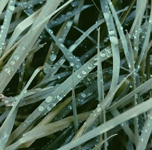
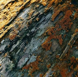
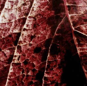
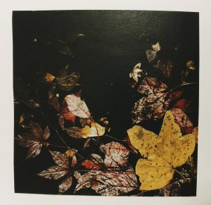
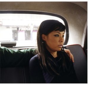
For this task I decided to use my 3 images that I took for my final outcome in the contemporary project. I wanted to have texture and movement as the main themes in the images and from my group critique I found that that was successful. I printed them out size A5 but it would be interesting to see them a lot larger. I usually tend to work quite small because I like how the viewer has to pay close attention to my work.
The reason that I picked these 3 images was because I think it would be interesting to see the difference that the size can have on the overall outcome of how the viewer perceives the images. I would also like to play around with how the images are displayed. For example you could layer them on top of each other slightly off center so you can only see part of two of the images. I also think that if the images were bigger then they would be a lot more textured because of the pixels which would again give a different outcome because they would look more futuristic and unfocused. I also want to play around with the sequence of the images as well and get peoples opinion to see if that changes the way people interact with the images.

