Author Archives: Lewis Evans

Task 11 and 12

Summary

Over the past 10 weeks we have been given a range of tasks to help us obtain new skills and grow/work on skills that we may have already had, each task being posted weekly to the WSA digital blog. This task involves reflecting on my research and communication journey over the past weeks and seeing how much these tasks have built up my confidence in writing and essay writing skills.

Task 1 included gathering 3 images from varies sources such as a magazine or website but based on our current studio project or something we were interested in. I found it difficult at first to find an image and spent a few hours excessively searching through the library to find a book that I could relate to, this was due to my lack of knowledge on how to use the WSA library, something I have now improved on over the past few months I have been here. I focused my images on Alexander McQueen, one of my favourite designers who inspired me to start my journey into the fashion industry. Through doing this task I was able to get a deeper understanding of actually how easy it is to find museums and journal articles relating to what you are studying and really vary your knowledge and range of sources.

I found Task 2 particuly easy has I had previously used the Harvard referencing system in college to reference all my work so when this task came around, to reference a book, website and paper article, I relished the task and was able to complete it with ease giving me reassurance that I was confident with this skill.

I found task 3 both challenging but surprisingly quite interesting. The task was to research into an artistā€™s inspiration and create a mood board based on what we find. This bit I found really interesting, the artists I based this of was Iris Van Herpen a Swedish modernist fashion designer who I was very inspired by myself, however, when looking into what inspired her I wasnā€™t shocked with the outcome. Each of the artists/designers that I found I could see within her work, she had taken bits from each and combined to create her own outstanding pieces of work.

Task 4 for me was the hardest. I find reading complicated texts very tedious and quite boring especially when Iā€™m not interested in the subject of the text. In this case many of the words within the text were very complicated to me and of which I did not understand, because of this I put of doing this task for a while. I did however complete this task with hast and learnt that Iā€™m not as shy and nervous about writing as I thought I was boosting my confidence in writing better improved essays.

Task 5, the final task to talk about was by far my favourite. I was so interested in the ethics subject to the point I could have kept writing about it way beyond the boundaries of the 500-word limit. This is something I defiantly want to look into further in the future.

I have learnt so much over the past 6 weeks and gained a large skill set in which I can now take on into the future. I am so much more confident in writing and am now more prepared for essay writing next semester.

Task 9 and 10

Ethical issues in fashion and textile advertising

Instead of talking about just one of the pictures I have decided to talk about them has a whole as they both share the same problems and ethical issues. Both of these images draw a close line between advertisement and soft pornography. I understand that advertisement is about pushing boundaries and capturing the audienceā€™s attention, however, both of these images approach ethical issues that have been fought over for many years and continue being argued about to this very day.

Even though both of these images relate they do differ from each other for example Duncan Quinn touches on the idea of male dominance, the gentleman in this picture dressed smart to represent this idea of power and importance. He stands over her barely touching her with what looks likes a stick as if to say that she is not worth it but some how he is forcing her to do things she does not want to be doing. This closely relating to many films like ā€˜Fifty Shades of Greyā€™ and ā€˜Fatal Attractionā€™.

On the other hand, the American Apparel advert seems to portray that she is willing to be used as sexual exploitation. Even so both of theses images put the viewer on edge, they are almost disturbing to see, erotic advertisement to sell clothes to the general buyer should not be the way to go especially when it comes to feminist theory.

Amanda Monteiro has written an article on collective evolution called ā€œIf men were exploited the same way women are in the fashion industryā€¦ā€.

She goes into saying that if the roles were switched so the male became the subject instead of females would it be less upsetting. In my opinion I think it would be a lot less upsetting purely down to the fact that the advertisement industry in primarily run by males for example one photographer that stood out for me who has exploited women in many advertisements is Terry Richardson. I found a news article in the guardian stating that ā€œA string of fashion magazines and brands have said they will no longer work with the photographer Terry Richardson, who has been the subject of allegations of inappropriate sexual behavior at photo-shoots for almost two decadesā€. The problem I have with this is why has it taken people so long to realize that what he and many others are doing is wrong and inappropriate with a professional environment like the fashion industry. I understand that things are finally changing but even so companies and advertisers are still finding way to push the bounderies for example the ethics within culture or child sex-ploitation. It needs to come to the point where they need to realize that the normal consumer does not want to see this and it is important in my eyes that things continue to change and develop with the advertisement industry.

https://www.theguardian.com/artanddesign/2017/oct/24/terry-richardson-photographer-dropped-fashion-brands-allegations

http://www.collective-evolution.com/2017/02/01/if-men-were-exploited-the-same-way-woman-are-by-the-advertising-industry-images/

Task 7 and 8

Fashion Media and my views on the meaning of the word taste

I am going to be looking at Sandra millerā€™s opinionated extract on the growth of fashion magazines and the criticised taste behind it. The ā€˜fashion magazineā€™ first came around in 1672 by a man called Jean Donneau de Vise who published ā€˜Le Mercure Galantā€™. These magazines were said to be ā€˜self-styled barometers of tasteā€™. (Miller, 2013) What soon followed was the idea of taste and the Philosophical aesthetics (critics) who sought to understand the feelings and emotions of a piece of artwork then whether a person liked it or not, therefor the theory of taste as a measure came along.

Thomas Reid a well known Scottish philosopher claims that ā€˜the beauty of objects resides in their ability to express certain emotions and mental traits rather than causing those emotions or traits in the beholderā€™. (ā€œEssay VIIIā€ of the Essays on the Intellectual Powers of Man) He is also opinionated on whether asthetics qualities are primary or secondary qualities. I agree with both of these valid points. How can a critic judge a piece on taste when every single person on this earth has their own separate personal feelings, tastes or opinionā€™s. For example, how it is stated in Millers extract told by Hidalgoā€™s valet, Sancho, that two men were called to give their own opinions on a hogshead, one of them tasting leather and the other tasting metal, only to find an old key with a leather thong tied to it. (Hume 1965: 10-11) My opinion is that taste is subjective, as a critic you cannot make a judgment on a piece on behalf of the world if not being almost biased and pulling your own thoughts and opinions into it. Obviously taste is a measure of whether someone likes a piece of work or not but in this modern day I feel like it also comes down to what trends are floating around the industry at that moment and what everyone as a whole has decided what is tasteful at that moment in time.

Fashion magazines are all about trends and informing people what and what not to wear. ā€˜There an attempt to elevate fashion above its existing statusā€™. ( Miller, 2013) If something does not follow the current trends then you could say that it has no taste, however, it has taste just within another season or pervious collection. Now days asthetitics are not just there to judge the beauty and grandeur of an object or even the feelings and emotions that the work gives of but whether it falls under the category of the latest trends and this defines if it has taste or not. Overall I believe that taste cannot be a measure of a piece of work purely due to that fact that opinions and feelings are subjective. An aesthetic cannot make an opinion on behalf of someone else even though to this day they still do.

Task 5 and 6

Visual Research: Reading Images

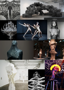
The image that I have decided to choose is an art piece created by the artist Bart Hess. Hessā€™ creations are innovative and ahead of the time. He uses the body and a wide range of materials to create almost disturbing pieces of art work. Thereā€™s just something about his work that I get drawn to personally as a designer myself so I can see why Iris van herpen uses his mind blowing work as inspiration for her own fashion garments. Like Hess, Herpen also explores and experiments with unusual materials in order to create memorable artworks. The specific image I have decided to focus on is is collection of artworks called ā€˜Mutantsā€™. He has covered the body in latex in which he then lit up with a fluorescent tube light giving the latex a reflective effect. I love how ā€˜out of this worldā€™ these pieces look. By using simple materials and such a small concept Hess was able to create something truly magnificent. Not only that but you are also left to interpret his work however you see it. For example, his mutants piece I could interpret many different ways. Not only do I see this extra terrestrial life form recently landed from a different planet but I could also see a new hatched life and egg hatching possibly a human egg hatching. Its crazy where the mind can take you with his work. This is something he wants you to see, and endless possibility of ideas generated from his own artwork. The textures he uses makes you want to touch and feel to get involved with his work something else that herpen also likes to do. That is why his work is hard to translate or read because its left up to you to decide where to take itĀ  in your imagination.

Task 3 and 4

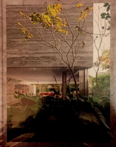
Jodidio, P.J. (2015) 100 Contemporary concrete buildings, Cologne: Taschen

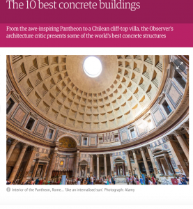
Moore, R. M. (2016) The 10 best concrete buildings. The Guardian, 8 January, 13-14

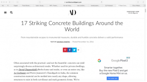
Martin, H. M. (2016) 17 Striking Concrete Buildings Around the World. Available from: https://www.architecturaldigest.com/gallery/concrete-buildings-slideshow [Accessed 20 October 2016].

I decided to choose these sources as they currently relate to the theme I am looking at which is concrete buildings. The first image is the cover of a book based on modernist concrete buildings from this book I was able to gather visual inspiration to start my thought process about what shapes and textures I would use based off of these buildings. The second image of a news article and the third image a website I used to compare some of the most interesting and up to date buildings in the current world. It was interesting to see what buildings were rated first and how different the lists were, however, from these sources I was able to gather information about what is trending within architecture and use that within my own work.

Task 1 and 2


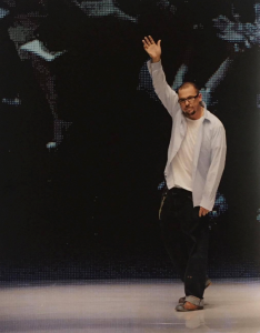
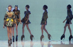
Alexander Mcqueen waves to the audience

At the end of his spring|summer 2010 show

ā€œPlatoā€™s Atlantis.ā€

Below is an image of Alexander Mcqueens spring|summer show in motion called ā€œPlatoā€™s Atlantis.ā€ This image was taken from dazed online.

http://www.dazeddigital.com/fashion/article/32285/1/the-mcqueen-show-that-changed-the-future-of-fashion-platos-atlantis-nick-knight

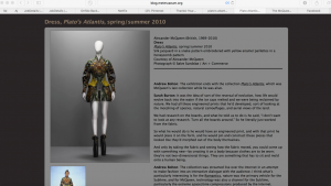
Here is a screenshot of the met museums website in which a few of Alexander Mcqueen garmets from his collection ā€œPlatoā€™s Atlantisā€ were exhibited.

http://blog.metmuseum.org/alexandermcqueen/tag/plato-atlantis/

I surprisingly found this task very interesting. How easy it was to find things that followed on from each other especially when it come to fashion collections. At the beginning I did find it difficult to pick an image from a book as I was concerned whether or not id be able to find a website that would follow on or even a museum exhibition that would relate to the image that I had originally found. However, I was happily surprised when I picked up the Alexander Mcqueen book and scanned through to find my first image. Mcqueen is a big inspiration to me resulting in him being the reason why I started fashion design in the first place. I was even happier when I went online and discovered that daze magazine online had an article based on the collection that Mcqueen was posing for in the first image. Due to it being a well known collection I then knew I would be able to find it being exhibited in a museum somewhere, which it was the met. Iā€™m glad I did do this task as Iā€™m now more open to search though museum archives into finding relatable exhibitions to my current projects.