When I thought about making a large work smaller I was inspired to write about an idea I had remembering an exhibition I saw last year at white cube viewing Anselm Kiefer’s work. Kiefer tends to work on a very large scale using lots of different media to create complex textures. In a series of his work you can see cut outs from other canvases suck onto other canvases to create even bigger pieces of work. This creates more detail in his paintings. The idea of cutting up the actual canvas is a very interesting idea to me. I’d like to experiment with this idea with an opposite effect by simplifying and making the work smaller. For example I might choose a piece I had big ambitions for, a painting that was very complex. From a painting like this I could re-work the piece by cutting around the most visible shapes and forms to take away from other complexities within the painting. I would then place this cut out onto a smaller canvas with a background that would contrast with less texture and noise. This would simplify the main aspects of the original painting and also create some interesting negative space.
Author Archives: Lauren Culloty
task 11
In summary the blog posts have helped me theoretically understand my work along with others. The tasks have allowed me to understand the development of my work and ideas better. In particular the invention of my own mode of practice was particularly useful to narrow down the specific media’s I wanted to work with. Another task I particularly enjoyed was appropriating an image. Before this I viewed using other people’s ideas in my work as wrong. Now looking back I feel like I was being very narrow minded. I wanted to be individual in my work but now I have done this task I can see that you can still make work that is different whilst relating to another’s concept. Task 10 was helpful in thinking about the basic concepts and ideas of my work. The tasks set based on research were also interesting and helpful. The book review was in particular a challenge for me as I chose an in-depth book based on an unfamiliar subject however it was also very rewarding learning about something completely alien to me. I also analysed three pieces of work in depth that I had not looked into before. By far, the task I struggled with the most was comparing texts. From this I learnt to reread over things until you understand them better.
task 10
Memory, Psychological, Terror, Distortion, Abstract, Experimental, Fractured, Presence, Light, Vibrancy
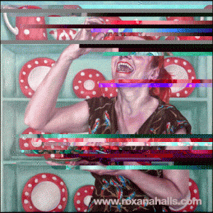
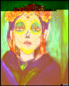 I selected this image to represent my work as it expresses my current practice and illustrates a number of areas I’m presently interested in. The words selected reflect on areas of my study. The observer is initially drawn toward the lightest parts of the image which in this event is the face. Their eye then observes the brighter hues for instance the purple clothing and green background. The yellow and purple contrast alongside each other, creating a fascinating composition. I’m enormously interested in vibrancy drawing the viewer into my work. I have been particularly involved with the awareness of terror and the mark produced in people’s memories from this. This is a glitched photograph of a painting I made of a woman I had a nightmare of.
task 9
Antony Gormely’s contemporary sculpture entitled “Bed” was made in 1980 using hollows of eaten layers of sliced white bread. A key theme in this piece is destruction of matter through consumption of solids transferring to liquids and gasses. Theoretically this could convey religious belief of the body’s ability to transform into spirit. Contrastingly Robert Rauschenberg’s piece “Bed”made in 1955 uses everyday found objects meanwhile Gormely’s materials are bought to construct the art. There is a similarity between the two pieces in that they both depict human form and are very intimate. Gormely’s piece is intimate as the volume of the artist’s body is represented by empty space. Rauschenberg’s piece is intimate too in as it’s a self portrait that uses items that belonged to him used in his daily life. Another personal piece that relates to the of a bed focal point is “My Bed” by Tracey Emin’s made in 1998 with Mattress, linens, pillows and objects. Although this work doesn’t depict human form it is still alike in that there are intimate details of the artist’s life which engage the viewer with ideas of universal emotions. The idea of universal emotions is similar to Gormely’s work in which he believes his work is universal as it refers to the inevitable obliteration of all substances through consumption and furthermore the universal philosophical notion of God’s existence. The main concept for Gormely’s piece is depicting an intimate self portrait that relates to ideas of universal philosophy.
task 8
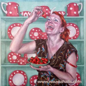
After being inspired by a lecture by Roxana Halls I decided to use her work for my appropriation task. The painting I chose to appropriate is called ‘Laughing While Eating Strawberries’ and was made in 2015 Oil on Linen. This portrait is of a women eating strawberries maniacally looking up at the food laughing. The painting has an obvious colour scheme of blue and red tones. Halls made this in disagreement to women who give up identity and people who think a women can only indulge in food once they look really pretty. She says that she envisions her paintings and what she wants them to look like before starting a piece. I find this to be an interesting concept as working from a mental image relates a lot to memory. As a play on this idea of memory. The method in which I chose to distort the image was to glitch it. This affected the colouring of the image in interesting ways I hadn’t preconceived, for example, exaggerating the blues into turquoise’s and reds into pinks and purples. The glitch also created horizontal lines of colour across the work contrasting against the naturalistic style of the painting and also making it impossible to see some of the painting. This is also symbolic of memory as sometimes we remember parts of a memory but not the full memory e.g. some things in memory are clearer than others.
task 7
Both texts talk about the placement of work. Richard Serra talks about his placement of sculpture not being in the studio but being site location based. Leo Steinberg talks about horizontal and vertical placement of work.
‘The Yale Lecture’ was written by Richard Serra in 1990. Serra talks about his practice and his use of steel in making sculptures. His sculptures are inseparable from the site, unlike some modernist work that ignores location. Serra explains that it’s hard to find commissioned work that doesn’t make you a corporate puppet. He shows interest in pieces of art altering sites. His work is process centered and he says “process can become part of the content”.
Leo Steinberg’s text ‘Excerpt from Other Criteria: The Flatbed Picture Plane’ was written in 1968. He points out horizontal paintings often resemble the human form. He explains in art history during the renaissance only upright pieces were valued. Steinberg says verticality was only first rejected in the 1950s. He views older art as more natural and views Rauschenberg and Dubuffet as radical artists exploring culture. He explains some of Rauschenberg work has developed to be more flat embedding objects into one work surface. He’s interested in Andy Warhol’s art that relating to everyday practice.
Both texts are uninterested in traditional ways of working. Serra’s text rejects ideas of traditional studios. Steinberg shows interest in non-traditional work by talking about industrial methods of printing and mass media production which he talks about seeing in Warhol’s work.
task 6
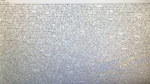
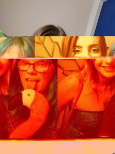
My mode of practice is a glitched stop-motion animation. The subject matter is variable, I intend to leave this decision open to what I decide later. I would take a photograph then tweaking it by editing the code, using the software ‘Notepad++’. Viewing photographs as text, I am able to create glitches in the data which cause effects such as distortion and colour grading. This can be done in many different; swapping code around, deleting, copy, pasting the code and writing random code. This process is done by editing part of the code, viewing the result and saving the file. You can then edit the code further to make the image increasingly distorted.
Here are images of the program and a result I had glitching a photograph.
Next, I will create a stop-motion animation out of glitched files, for each step of the process save a copy of the image. The end result will be an animation of the development of a glitch, from the original photograph to an abstracted photograph that’s been edited repeatedly. Then continue the process until the image is corrupted. The stop-motion animation will be made by importing images from the glitched files using ‘Dragonframe’. Provided the files are in order of the development of the glitch, the video should gradually increase in distortion.
task 5
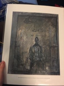 In particular at the Tate Modern’s ‘Giacometti’ exhibition, one of the paintings named ‘Diego’ really caught my attention. This specific painting is of his brother and was created in 1953. He illustrates the figure as alone which I personally found really interesting. He places the figure alongside a grey background with dull blue tones and uses dark black lines to generate negative space contrasting between the body and the background. I was so captivated by this work I bought a print of it at the end of the viewing, however seeing the painting ‘in the flesh’ was somewhat different. Being able to see the image on the scale in which the artist intended it to be observed is one way in which it was a valuable experience but in particular, the paint textures and the expressive mark making is something you just can’t see with a picture of the painting. For example whilst looking at the painting I noticed fluid brushstroke. In addition, I could also see in what way Giacometti had constructed layers inside the painting, with thin paint in some parts and even with some of the canvas showing in parts then building up a thicker quantity of paint around and in the figure which is the center of the piece. For instance, the head is greatly worked in with paint and solid in appearance. The reproduced print sold in the shop is in far less detail and seems like only a reminder of the physical work.
task 4
I went to see ‘Giacometti’ at the Tate Modern which was showcasing the Swiss-born artist Alberto Giacometti’s work. Granted, Giacometti remains perhaps most well-known for his distinctive bronze elongated figures which are practically instantaneously recognisable. However, in this exhibition, he is shown as an artist with an interest in surfaces and materials, with a number of rooms showcasing countless pieces using a wide-range of media. The display consisted of books, plasters, and sketches not often seen before. The showing takes the spectator on a jam-packed five decades’ development of the artist’s working lifetime. For instance, the show includes his later works such ‘Walking Man I’ completed in 1960 but moreover includes former works such as ‘Head of a Woman’ (Flora Mayo) made in 1926. It is also obvious during the course of the show that his subjects were regular, for example, one of his greatest used models was his younger brother Diego and as I walked about the exhibition I observed loads of paintings and sculptures using him as a model. Throughout the viewing of this exhibition, I thought about the total mass of work Giacometti had produced over his lifetime. In my opinion, the exhibition is celebratory of just how hard working the artist was. The exhibition was organised by Tate Modern and ‘Fondation Alberto et Annette Giacometti, Paris’ with both sculptures and paintings. For example some of the paintings where ‘Diego Seated 1948’ and ‘Caroline in a Red Dress c.1964-5’, as well as sculptures including ‘Falling Man 1950’, ‘The Hand 1947’ and ‘Man Pointing 1947’. Overall, the exhibition included more than 250 pieces.
task 3
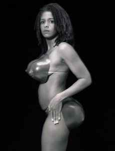
Renée Cox is a Jamaican born artist who makes straightforward statements about gender and race through the use of her body in her work. I believe Cox is using her physique to redefine her individuality as a black female and likewise demonstrating further women similar to herself. For example, this black and white photograph entitled ‘Hot-en-tot Venus’ is based on a woman called Sarah Baartman. She was born in 1789 and was exhibited along with others as ‘freak show’ attraction in 19th century Europe under the name Hottentot Venus or “Hottentot” due to her large buttocks.
Renée Cox deliberately depicts female nudity and appears to be revelling in self-love for her body whilst trying to raise awareness of Sarah Baartman’s life. I find this piece very controversial as there are many ways in which a person can interpret the image. In my opinion, the image is symbolic of female expression but also keeping the body confined. In the photograph, the artist is posing herself with oversized sexual features of the female body, in this case wearing only a prosthetic buttocks and breasts making her body way out of proportion.
The composition is placed so Cox is standing sideways with her head turned to the camera. Cox’s stance show freedom and appreciation for her body, depicting it however she likes, but it is also easy to see how the image can be seen to reflect on racial stereotypes. Cox highlights how mass media frequently sexualises and negatively represents females. The photograph also is against society’s disrespected dealing of Sarah Baartman’s sexual organs which were on display in a Paris museum until 1974. She wasn’t buried until 2002.
Overall this image is a strong objection to how black women have been depicted sexually in media. The image, therefore, is still important in today’s society as a reference to the history of black women’s lives and the constant fight against racism and sexism.
Bibliography
https://en.wikipedia.org/wiki/Sarah_Baartman
https://www.onthisday.com/events/date/1994?p=4
https://www.artspace.com/renee_cox
http://topics.nytimes.com/top/reference/timestopics/people/c/renee_cox/index.html

