

The publication I decided to investigate and analyse was a cover from ID Magazine. The reason I chose this publication is because I connect with the way in which the photograph is trying to be portrayed to the viewer. The colour pallet is absent with a replacement of a mono toned black and white. The reason the black and white works so well in my opinion is because the image itself does the talking and the colour isn’t required to fill that role.
Typography that is present is located in the top left hand side in a bold lower case font. Excess text is placed around the publication regarding much less relevant information, hence why it is so small and placed in corners of the page.
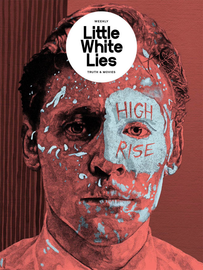
The secondary publication choice was a poster for the movie “High Rise”. The cover was illustrated by Samuel Hickson for the Little White Lies weekly magazine. The cover is very similar to actual movies poster however it contains content of Little White Lies typography, fonts and logo layouts.
The typography used here is very interesting as it has maintained the usual logo that the magazine always has within the white circle, however there is additional text over the face of the man in the photo. The colour pallet used here is very strained and has been toned down, there is no vibrancy or impactful presence. I believe this publication is striking in the way it is presented and the minimal contents is very simplistic.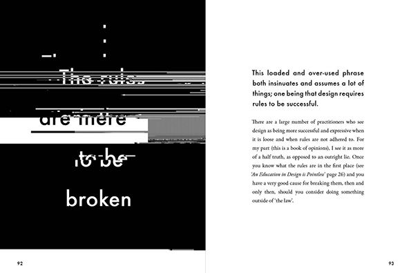
The third publication I went with was an extract double page spread from Craig Ward’s “Popular lies about Graphics Design”.
There is very minimal content to go with however on one side of the double page spread contains altered typography and on the other half there is a minimised box of text with relevant information. The altered typography has been digitally manipulated for a broken effect whilst being on a black background the white typography really stands forward to the viewer.
ID Magazine – “no rivals”
(https://www.designscene.net/2017/08/i-d-magazine-fall-2017-covers.html)
Little White Lies – “High Rise”
(http://cargocollective.com/samuelhicksonillustration/Little-White-Lies-Weekly)
Craig Ward – “Popular lies about Graphics Design”
(https://www.itsnicethat.com/articles/craig-ward-popular-lies-about-graphic-design)