Author Archives: Georgina Docherty

Week 9: Summary.

The lectures were all interesting and helped to contextualise the practical work. I liked the fact that we call all raise our own opinions and contribute when we felt like we needed to.

I find the writing element of the course very difficult and need help and support to put my words down on paper, I found the last Reflective Writing exercise very difficult and am having a dyslexia test in December to see why I find writing so hard.  I know what it is that I want to say but really struggle to write it.

I found the Online Resources task quite challenging. My immediate plan was to link the image to fashion and clothing but whilst undertaking the research I found information, mainly from the V&A website, that inspired me to link the image to interior design and furniture. I felt that the use of primary and secondary materials helped me realise more about the resources available and to be prepared to think a bit more widely about the final written piece. I ended up writing about something completely different than my initial planned item.

The Visual Research task was initially pretty challenging and I could not see how I would be able to find out such detailed information about the designer and what the inspiration was for their range. I approached this very differently than I would have previously. I researched and found an up and coming designer, I then found her pinterest board which showed a wide range of items that inspired her and her collection. This in turn led me to discover new images, designers and photographers – which I then researched further – as well as seeing that she was inspired by some of the same designers and photographers that inspire me too.

The Ethics module was incredibly difficult to write about and I felt that the images used were very shocking, particularly the Terry Richardson images which I felt were totally unacceptable, crossing over into pornography. I would question why such shocking images were used in the task – particularly where the photographer has been accused of sex crimes against women. Ethics covers a whole range of subjects and the task seemed only to focus on sex and sexploitation whereas race, politics, drugs, inequality, gender could all quite easily have been the subject matter for the task.

Whilst accepting that fashion uses sex widely to sell, I felt the images shown were at the extreme end of the spectrum and obviously unacceptable. The task would have been more relevant and challenging if the ethical dilemma represented in the image was less sexually overt and more mainstream – where the ethics were more questionable, for example the Vogue India 2008 editorial has a much wider set of ethical arguments that could be made. I was unhappy with this task.

With the exception of the material in the ethics module I have really enjoyed the challenges set out in both the written work and in the workshops. I found the Online Resources and Visual Research tasks the most valuable as they have taught me to think differently in how to approach the use of resources and how to search for the information relevant to the activity in hand.

Week 8: Ethical Issues in Fashion/Textiles Advertising.


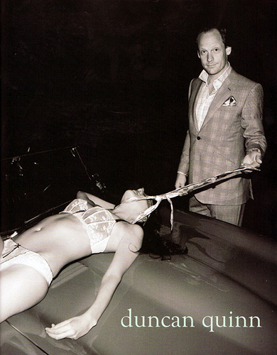
Images such as the one shown in the Duncan Quinn advertisement seek to reinforce gender stereotypes and, by association, extend the definition of power to the clothing worn by the male – particularly through the use of the tie as a control mechanism. The entire composition of the image is to demonstrate male superiority – from the clothing, the use car, to the height of the male, the use of the tie and of course the semi naked physically oppressed woman.

Whilst the fashion industry often seeks to shock and provoke thought by the use of imagery my feeling is that this image does nothing other than reinforce the gender stereotype with a deeply concerning image that is shocking by what it represents rather than conveying any underlying message. I would hope that the image was banned and that the advertiser received a lot of negative comment as a result of portraying women in this way.

The advertisement is obviously aimed at successful men – promoting bespoke hand-made suits that cost between $4,000 and $30,000 – seemingly giving the message that you can get away with anything because you are a wealthy, well dressed, white male. The male is seen to be using the tie from his suit to strangle or control the scantily clad female – over the bonnet of an expensive sports car, associating power and wealth with the wearer.

The ethical issues that need to be taken into consideration are male domination, murder, rape, gratuitous violence, anti-feminism, male superiority, money/power, humiliation, slavery, abuse, sex, sexual exploitation, disregard of human rights, oppression, subordination, gender stereo-typing.

It is clear, to most people, that the image is completely unacceptable and you would wonder who might find this imagery appealing or lead them to buy a product, you would also wonder why an advertiser would think that it is acceptable to portray a woman in this way – or indeed reinforce the macho gender stereotype. The only explanation I can find it that the advertiser wants to shock and to build some notoriety around the brand, but it must be assumed that many women would find this brand unacceptable and discourage their partner from associating with it.

If the person viewing the image was unfamiliar the work of Duncan Quinn or did not see the image in the context of a fashion magazine – would they interpret the image differently?

The image would appear to be a direct provocation to feminism, particularly radical feminism, where the definition of power is represented by some in terms of dominance/subordination or master/slave relationships.

The work of legal theorist Catharine MacKinnon closely ties domination with gender difference, stating that “if gender difference is itself a function of domination, then the implication is that men are powerful and women are powerless by definition.” MacKinnon goes on to state that “it is a basic fact of male supremacy that no woman escapes the meaning of being a woman within a gendered social system, and sex inequality is not only pervasive but may be universal (MacKinnon 1989, 104-05).

References:

TrendHunter.com. 2017. Disturbing Sexist Ads: Duncan Quinn Suit Campaign Depicts Strangled Woman. Available from: https://www.trendhunter.com/trends/duncan-quinn-suit-ad-depicting-strangled-woman. [Accessed 24 November 2017].

MacKinnon, Catharine, 1987. Feminism Unmodified: Discourses on Life and Law, Cambridge, MA: Harvard University Press.

Week 6: Reflective Writing in Fashion and Textiles.

Fashion as communication – Etymologies and definitions of fashion and clothing

The piece starts by using etymology to attempt to clearly define the term ‘fashion’ and then explores the family of associated synonyms to help the reader to understand the scope of that definition. It seeks to provide the reader with as wide a sense of the term as possible, linking the term ‘fashion’ with ‘fetish’ – perhaps to give some explanation to both the idea of fashion as an obsession and fashion as challenging the norm.

Having defined the term, the piece then goes on to contrast it against anti-fashion and ceremonial or tribal costumes and argues that certain social conditions must be met in order to support the establishment of fashion – those being the need for union and the desire for an individual to be part of a larger society (Simmel, 1971:301). This point is backed up by the statement that “Fashionable clothing is used in western capitalist societies to affirm both membership of various social and cultural groups” (Wilson 1992a:34).

It goes on to discuss how fashion is viewed from different perspectives and raises the argument that fashion is both fraudulent and trivial, fit only for the intellectually disenfranchised. The argument for stating why fashion is both trivial and fraudulent is not very comprehensive, the piece then states three reasons why this is not the case; firstly that it is an inevitable consequence of socio-economic organization (class), second that it is a cultural response and third that it is about decoration – none of the three arguments are very strongly made and very little reference is made to fashion as an art form and also the commercial contribution made to the economy.

In the text it states that tattooing is fashion, this point is challenged by Matteucci and Marino claiming that “for tattooing to belong in the domain of fashion, it must reflect the wish for a fashion that does not change…tattoos have made a start toward anti-fashion status and they are surely intended to be anti-fashion”. (Matteucci and Marino: 17).

I am disappointed that the author does not draw a stronger parallel with the Arts world, preferring to spend more time in defining the term. The author Elizabeth Wilson compares fashion to photography explaining that “both (are) liminal forms, on the threshold between art and not-art. Both are industrially produced, yet deeply individual. Both are poised ambiguously between present and past”, (Wilson, 2003). To me this definition is easier to comprehend and links fashion far more strongly with the Arts.

Given the amount of text in the introduction to defining the term fashion, I feel the arguments raised in support of fashion not being trivial are quite weak, the author clearly shows their personal opinion by stating that “the idea that fashion and clothing are trivial pursuits is just one popular prejudice” but the main argument they use to support this is that fashion is “inevitable”. The second argument, social justice, is also poorly made with little reference made to the issues associated with third-world production, child labour, pollution or sustainability or, conversely, the economic contribution of the fashion industry to the global economy.

References:

Matteucci, G. and Marino, S. (2017). Philosophical perspectives on fashion. London: Bloomsbury.

Google Books. 2017. Adorned in Dreams: Fashion and Modernity – Elizabeth Wilson – Google Books. Available from: https://books.google.co.uk/books/about/Adorned_in_Dreams.html?id=j-kBAwAAQBAJ&printsec=frontcover&source=kp_read_button&redir_esc=y#v=onepage&q&f=false. [Accessed 12 November 2017].


Week 4: Visual Research.


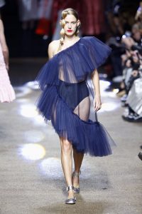
Molly Goddard

Based In: London

With a couple of seasons already produced, Molly Goddard is in the early stages of getting her talent and fashion recognized. In December, She won the British Emerging Talent Award at the 2016 Fashion Awards. Goddard’s Spring 2017 collection was full of dreamy and playful runway looks.

http://www.harpersbazaar.com/fashion/fashion-week/g2933/new-designers-to-know-0913/


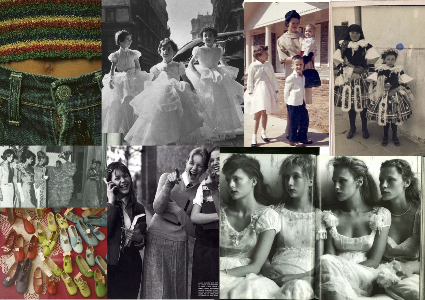
Molly Goddard’s References for her work.

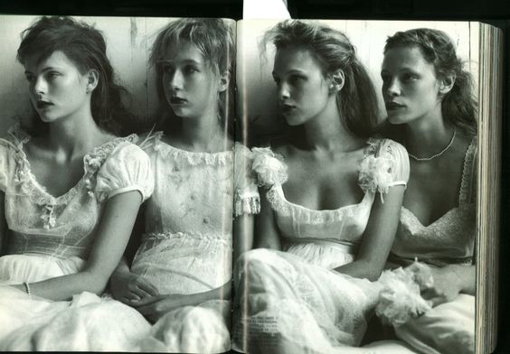
Grumpy girls at the prom, photograph by Mario Testino.

The image consists of four girls all looking at something to their right, all have very serious expressions considering they are at a prom. Testino is well known for his portrait photography and this image differs in that it focusses on the wide shot of the girls, the informal composition shows the girls sat closely together, their sullen expressions suggest they are unhappy.

Their facial expression could be because they do not have a date for the prom – there could be religious reasons why this may be the case – they may be from an all-girls school. They are all wearing beautiful white soft dresses – suggesting some religious connection?

The photographer is well known for his portraits, including royalty and fashion photography. His work regularly appears in Vogue, he was famous for his informal photographs of Princess Diana – and has continued photographing the royal family in this style ever since.

His photographs of Diana showed her as a happy vivacious person, whereas the reality is she was deeply unhappy. He seems to like to capture a persons mood – in the image of the four girls it might be coincidental that they all looked unhappy at that particular moment.

Pinterest 2017. Grumpy girls at the prom, shot by Mario Testino, a reference image for Molly Goddard AW15. Available from: https://www.pinterest.co.uk/pin/215680269631241656/. [Accessed 28 October 2017]


Sustainable fashion.

Book

“The total amount of clothing and textile waste arising per year in the UK is approximately 2.35 million tonnes.”

Fletcher, K. (2008) Sustainable Fashion & Textiles, Design Journeys. United Kingdom and United States of America: Earthscan.

Knowing facts like this makes you aware of the problem and consider how I might do something differently when I have my own business.

Website

“Christopher Réburn is a British fashion designer with a unique and innovative approach to creating menswear, womenswear, and accessories collections. A graduate of London’s prestigious Royal College of Art, Christopher became known for his re-appropriation of military fabrics and in particular for iconic outerwear created from de-commissioned parachutes.”

Londonfashionweek.co.uk. (2017). London Fashion Week – Christopher RÆBURN. [online] Available at: http://www.londonfashionweek.co.uk/designers_profile.aspx?DesignerID=1136 [Accessed 25 Oct. 2017].

I have been inspired by Réburn’s work for a long time and find his work incredibly interesting. I have been lucky enough to go to his studio and talk to him about the process of his work. In the future I hope to work with materials that have already served one purpose.

Newspaper

“Birdsong is a British brand whose clothing is made by women’s organisations, including knitwear made at a day centre for older women, and garments produced by highly-skilled migrant seamstresses at a factory in London. Their clothes are traceable – the name of the woman who made the garment is on the label.”

Emine Saner, (2017) Sustainable style: will Gen Z help the fashion industry clean up its act. The Guardian, 25 April 2017.

Many designers are looking at how to produce clothes in a more ethical way – especially after the Rana Plaza disaster, where 1,135 garment workers were killed and thousands were injured.

Week 2: How to use online resources?


1

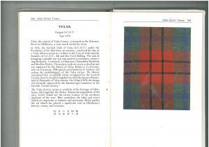
Photograph of Tulsa Tartan, 1978, book chapter “Other District Tartans”, photographer unknown.

23

456

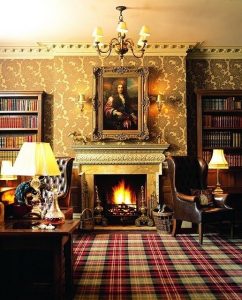
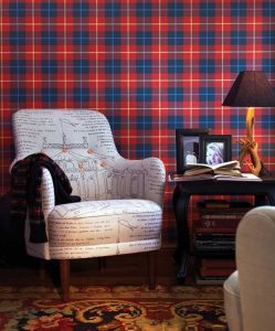
A variety of Tartan in the home showing floor, chairs and wall coverings. Photographer unknown.

Primary source found on an interiors website.

Kelly Nichols | Snuggle Up With Plaid in Your Home

Livinator https://livinator.com/snuggle-up-with-plaid-in-your-home/

6

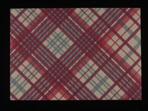
Vivienne Westwood Tartan Wallpaper, 2009, From archives of the V&A, photographer unknown.

I knew that the V&A would have an archive of various designers using tartan so I made a search on their collections, I was aware that Vivienne Westwood used a lot of tartans in her clothing design work in the punk era. “Tartan” was my keyword and I was not surprised to find Vivienne Westwood at the top of the list, however I was surprised to see how much tartan was used in upholstery and interior design – even wallpaper.

Tartan | Vivienne Westwood | V&A Search the Collections

Collections.vam.ac.uk

http://collections.vam.ac.uk/item/O1242318/tartan-wallpaper-vivienne-westwood/


I initially chose the Tartan image from the book as I really liked the contrast between the muted colours around the exterior and the bold red in the middle. I am really interested in weave and feel that this particular image gives an almost three-dimensional effect through the use of shades.

After choosing the image I initially thought about where tartan was used in fashion and clothing, for example the famous Burberry checks used in their classic raincoat linings and scarves and of course the Punk era use of tartan. However, whilst researching the subject the thing that really stood out for me was the use of tartan in interior design, with a large number of interior designers having used tartan to good effect.

I came across Livinator’s website which showed a variety of ways tartan could be used in interior design. It was surprising to see how tartan was combined with other very strong patterns – you would think that tartan would have to be paired with plain or complimentary colours. The images above show that most of the interiors have one or more tartan or other bold and strong patterns that are used to build layers of colour and texture in the room, for example the pairing of a tartan upholstered sofa with highly patterned curtains in the image above.

It was interesting to see Tartan used in both formal and informal settings and as both a wall and floor covering. This has made me think more about pairing and combining strong patterns, I would have previously thought that they would compete for attention and/or clash but having seen that with careful consideration it is possible to put strong patterns together.

I found using the V&A online resource extremely useful as it showed me designers work across different disciplines.

This exercise has helped me to think beyond the initial image and to research an idea or subject to see how it links to other areas beyond all my normal thought processes.