Author Archives: Evie Webb

11/12 – Summary

I have thoroughly enjoyed attending the lectures each week and have found the research and communications module extremely educational. My writing style has seemed to improve and I think I have become more articulate when writing than when I first started this course. I have enjoyed most of the tasks and found each one beneficial for different reasons for example task 7/8 Reflective writing allowed me to develop my own writing through analysing another’s work, and task 1/2 Online Resources forced me to use different forms of researching available to me which I wouldn’t have explored otherwise.

I would like to reflect on some of the tasks which I think have helped me develop the most during this module. Task 1/2 Online Resources was a lovely starting point for this module as it opened up what the research and communication module would consist of. The Online Resources task exposed me to the basics of finding and using all forms of research media I could access such as the library but also online newspapers and websites. It also allowed me to practice comparing and evaluating different forms of research which I enjoyed. The task which I responded to the best and I thought produced the most development in my writing technique was task 7/8 Reflective Writing. Although I found reading the text difficult and tedious because of the constant repetition and backing up of points and ideas this task gave me the opportunity to evaluate someones elses work which I really enjoyed and I think benefited from. There were parts of the chapter which I found eye opening as I hadn’t considered some of the points made in the text before. Reading and analysing small details within another writer’s work made me analyse, develop and then adapt my own writing technique and style to become more formal and professional within my own response to there work.

My favourite task was task 9/10 Ethics as I found it to be the easiest and since, in the previous task, I had developed my writing technique to a stage that I was happy and this task took on that form. I enjoyed this task the most because it derived completely from your own opinion and assessment of an image. I found it odd talking about such a sexual image yet it gave me the chance to really think about how the advert made me feel knowing that this had been publicly released and advertised. I found it different from task 5/6 Visual Research as it wasnt so much about pulling apart every detail of the image, like Visual Research, more about analysing the meaning of the advert and how imagery like this is insensitive. This task made me consider what was crossing the line in fashion from an Ethical point of view and recognise that you have to take responsibility for your actions in industry and even now as a student.

Overall I found this module very educational and a steep learning curve in the way that I research and present my findings. I now love my writing technique and enjoy reading my work however I do still have areas I would like to improve on within my writing that I can touch on in the next semester.

 

Task 9/10 – Ethics

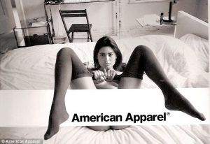
The idea that an image speaks a thousand words has been considered throughout time since it was first observed. But like most imagery it can be interpreted differently by each individual who views it. Therefore a message you might at first perceive to be acceptable advertising, for example, might turn out to have severe back lash if it touches on an inappropriate or offensive topic. Ethical issues must be thought of when creating imagery or media that is portrayed to the public as one wrong image could cost you your reputation or affect many lives in a negative way. You need to consider culture, religion and gender stereotyping to name a few so that you can create a good message for the public, one which will not offend anyone. American apparel is known for their suggestive and provocative advertising however no one really understands what they are trying to sell in these adverts. The advert I have chose to analyse portrays a woman in her early 20’s wearing underwear lying back on a bed pulling her legs back by her tights with them in the air. My initial thoughts I had were that it was a very sexualised image for a clothing brand and I wondered what were they trying to sell through the black and white advent? As there was no clothing visible in the image which stood out or was highlighted. The logo of “American Apparel” is placed on a white banner which covers the woman’s private areas, the wording itself is in black and placed within the banner over her pants to draw the eyes into the most sexual area of the advert. Her legs are cut out and hanging over the banner giving brackets to the company’s name.

To consider the ethical issues within this advert I would say that the company/photographer/creative director are over sexualising the female body and women in general more than they need to. Sex is said to sell, however when thinking about the consequence of the wide spread sexualisation of women (or men) you have to ask yourself is it really worth it? Showing images like this of women to young boys who are at an impressionable age means that they are going to see this as the norm and start to sexualise the girls around them who are too young to be introduced into this type of attention. If you teach boys from a young age that women and girls are there to be perceived in a sexual way it will affect their perception of women throughout their whole lives altering their relationships with women and their views of how women should be treated creating a generation that could end up looking at women as objects rather than people.

When creating a message it must have direction and intention. I don’t want to look at simplistic and inappropriate advertising I want to see interesting and mentally engaging advertising. An ethnically inconsiderate advert can lead to a negative mentality for the people who view it whereas a positive advert with a strong message can change a person for the better “Weak messages create bad situations” and to avoid an ethnically insensitive society we need to consider what messages we project through all of our work, not only advertising.

Book – Shrigley, D.S, (2014) Weak messages create bad situations A manifesto, Canongate

Task 7/8 – Reflective Writng

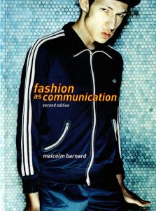
‘Fashion as communication’  chapter one can be summarised in the way that Barnard tries to find the meaning of the word ‘Fashion’. Barnard says that fashion itself has no singular meaning and can be used loosely in many different ways, words such as ‘style’ ‘dress’ and ‘clothing’ are ones that can be defined and linked by one another. “It could also be said that, while all clothing is an adornment, not all clothing is fashion”[Source 1, Page 9, Paragraph 3, Line 8] this shows how all these words are connected and can be used in different ways. A main aspect of this chapter which I found interesting was taken from Simmel and it is the concept that without the natural human instinct to be apart of social groups contrasted with the need to be seen as an individual fashion would be non-existent. Fashion exists within society because, Wilson writes, ‘we want to look like our friends but not to be clones’  The want to be an individual within society forces people to use fashion as a way to show their personal identity. Carrying on from this he says fashion trends in the western world change fast. This is because, as it says in the first chapter, the constant consumption of fashion comes from people’s desire to climb the social ladder. Keeping up with the trends suggests someones need for change in their life and in the world they live in.

I want to focus on the concept of clothing as a way to climb the social ladder and develop the ideas behind it further with more research and opinions, an article I found online gives evidence supporting this theory. The title “Women ratchet themselves s up the social ladder one high heel at a time” [Source 2, title of article] gives an interesting insight into social group dynamics. This text reviews research of women’s shoe shopping in different states in America. The results show that the richer the state the more likely it is that a woman will base her shoe choice on what those around her are wearing, where as in poorer states women will try and avoid fitting in with their surrounding when choosing shoes. This text contributes to aspects of ‘Fashion as communication’ taking forward the ideas that we as a species want to fit in when in socially achieving and wealthy groups whereas in comparison want to stand out when in lower ranking social groups to distinguish yourself as an individual. I find this very intriguing as I had not considered fashion as a social construct previous to reading about it. Comparing this idea to the contents of ‘The Sociology of Taste’ the overall concept is laid out simply, questioning how fashion, as a social need, can produce “the process of collective taste”[Source 3, page 93, paragraph 4, line 6] This then comes back to the ideas within the first source, that as fashion evolves and changes so does the western world.

Fashion is a construct developed to show social status and wealth. However, fashion can also be viewed as a personal preference, not every trend is always followed and although we are told subliminally what we should and should not wear I believe that at the end of the day it is up to each individual what fashion means to them and the social group they associate with.


“Fashion seems to embrace two opposite goals—fitting in with the crowd and standing out from it”[Source 2, Paragraph 1, Line 1]

[Source 1] Book – Barnard, M.B (1996) Fashion as Communication, Routledge [Accessed 10th November]

[Source 2]  Website – The University of North Carolina at Chapel Hill (2016) Women ratchet themselves up the social ladder one high heel at a time, Available from http://uncnews.unc.edu/2016/05/04/women-ratchet-social-ladder-one-high-heel-time/ [Accessed 20th November]

[Source 3] Book – Gronow, J.G (1997) The Sociology of Taste,  London, Routledge [Accessed 20th November]

Task 5/6 – Visual Research


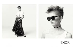
advert for DiorThe advertising for the Maria Grazia Chiuri for Dior spring/summer 2017 captures the energy of the whole collection showcasing both the feminine side in the clothing and the tomboy style in the choice of model, Ruth Bell. I love this collection for its use of contrasts such as the detailed embroidered, dark zodiac sign skirt mixed with the simple white t shirt with the graphic text printed onto it, inspired by Linda Nochlin’s fight for feminism, seen in this image. The use of black and white in this advertisement adds to the use of contrasting imagery. The plain white studio background forces the viewer to evaluate the garments and the model without the distractions of a noisy background, where as usually photographers choose to tell a story in their adverts by adding accompanying surroundings which can take away from a designers meaning behind a collection. The use of a diptych in this advert creates a comparison of imagery adding to the viewer’s subconscious view of the collection having a contrast with in every detail. I think that the use of a body shot and a head shot makes the viewer focus in on the smaller details in the full body image as there is not a lot going on in the head shot, it is plain and simple with few details compared to the full body shot of the Dior spring/summer 2017 garment in which the skirt is filled with embroidery and vintage imagery which is mesmerising to explore once you acknowledge it.

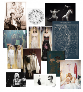
Over all you can see most of the inspiration for the collection in this advert. Both the feminine embellishment, constellation and zodiac references and the fencing, sporty, tomboy elements of the collection are shown within the two images with simple taste in the photography allowing the garments to show through in the advert. I love this collection by Maria Grazia Chiuri for Dior as it represents a new age of females.
Mood Board
Sofia Coppola, The virgin suicides, Film (1999)

William Shakespeare, A Midsummer Night’s Dream, A 1900 book front cover

Blondie and Debbie Harry (1970’s)

Linda Nochlin, an active feminist (1968)

Vintage star constellations and Zodiac signs

Maria Grazia Chiuri, Dior (spring/summer 2017)

Task 3/4 – Academic Integrity

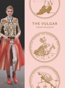
The Barbican - The Vulgar CoverI have been interested in the Barbican’s exhibition of ‘The Vulgar’ ever since I went to see it in January of this year. I found my first source on the Barbican’s exhibition in the Winchester School of Arts library. The book was called ‘Barbican The Vulgar Fashion Redefined’ and was the Barbicans own documentation of the event itself, with references to the inspiration for the show and the best examples of the outstanding concept of vulgarity through fashion. For more information regarding ‘The Vulgar’ exhibition at The Barbican I headed to the Barbican’s online website and found the Gallery’s personal write up of the exhibition, which was an overview of the show, thanking everyone involved in the creative process and all the designers who donated their own work for the huge project. I wanted to find an outside opinion on the exhibition so looked up reviews of the show. I chose a article from The Telegraph on the Barbican’s exhibition which had high praise for the work referring to it as “dazzling and delightfully subversive” [Paragraph 1, Line 2]. My favourite insight into the show that the author, S.Davies, gave was how we can sometimes not perceive our own hypocrisy when it came to personal taste “the show’s relentless probing of the hypocrisies of taste nudge at something deeper about how mankind sees itself” [Paragraph 7, Line 3] For me this gives the exhibition an extra layer of reality which is not obvious until you see the connections between the viewer and the exhibitions vulgarity.

Book – Alison, A.J, Clark, J.C and Phillips, A.P (2016) Barbican The Vulgar Fashion Redefined, London, Koenig Books.

Website – The City of London Corporation (2017) The Vulgar: Fashion Redefined, Available from https://www.barbican.org.uk/the-vulgar-fashion-redefined [Accessed: 25th October]

Newspaper – Davies, S.D (2016) The Barbican’s history of the vulgar is delightfully subversive – review, The Telegraph [Accessed:25th October]


Task 1/2 – Online Resources

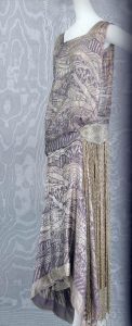
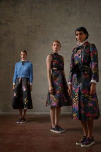
I started my research with a secondary image from the book ‘FASHION, A History from the 18th to the 20th Century’ by TASCHEN. The image I chose was of an Evening dress from 1921 theErdem and H&M 1 image stood out to me because the garment was very elegant yet simple in style and the overall design and embroidery of the evening dress was detailed and looked expensive. The description in the book next to the image states that the evening dress is made of ‘Silk jacquard of lavender’ it has ‘bead embroidery and fringe at the hip’ detailing the evening dresses style and hinting at the expense. Adding primary research to my work I went online and visited the ‘Vogue’ website and typed the weave technique ‘Jacquard’ into the search bar as it was a feature of the secondary research that I found intriguing so i wanted to find more modern uses of the weave technique. As my prErdem and H&Mimary research I discovered, on Vogue’s website a new collection/collaboration by Erdem x H&M coming out November 2017 which uses jacquard as one of the collections main features along with lace and frills. I found it interesting how Erdem x H&M used jacquard in a very modern way and how it did not make the garments look dated but rather added to the overall look of the final design. I associate jacquard with the 1800’s and the detailed tapestry’s the jacquard loom produced, so for the Erdem x H&M collection to use the technique in modern designs and make them  relevant and interesting is a great achievement. I personally love the collection and think that they used the heavy material to create interesting shapes and lines within their garments.

To further my research I googled ‘jacquard loom’ and found on the national museum Scotland website a reliable source of information regarding jacquard looms and their contribution to the society we live in today, such as there punch hole method used in Jacquard looms is the bases of modern computer programming. The overall technique was more complex than the previous way of weaving in the 1800’s and allowed the weaver to create more detailed and jacquard loomlarger textiles than before. I find this interesting  as jacquard looms are still being used today in the fashion industry, such as the Erdem x H&M collection, and for high street sale to create interesting and fashionable garments showing that it is still as relevant in  today’s fashion industry as it was when first produced in 1801 and used by liberty and co Paris and London for their silk evening gowns.

I found this research process interesting as it allowed me to explore an area of fashion that I had never looked into before, showing me the basics of complex fabric designs and the start of a revolutionary piece of equipment still used in the fashion industry today.


http://www.vogue.co.uk/gallery/first-look-hm-erdem-collaboration-pictures

https://www.nms.ac.uk/jacquardloom