
For my counter culture research I found an album cover by Paula Scher employed by CBS Records to design and promote. This was her first record sleeve, vibrant and unusual typographic work for Charles Mingus duo album “Changes One and Two” 1974. During this period Helvetica typeface was fashionable in the 1970’s but she states “the cleanest, most boring, most fascistic, and repressive typeface.” She started to explore other forms of typefaces by drawing some ideas for her first album design. This album cover gives a sense of happiness and spirit through the use of vibrant colours. The typography she used is based on wood type that had a thick heavy lined appearance. This may suggest that art and design is changing as well as music – jazz. The high saturation also creates the meaning that jazz is joyful and exaggerated.
The second image “I Heart New York Logo” by Milton Glaser and first used in 1977 to promote the city and state. Glaser’s idea was originally a doodle on a back of an envelope which then became the most successful advertising campaign in America. The font has been created in a slab serif typeface- American Typewriter giving an indie style, combined with the abstract simplistic appearance. This logo has an important meaning to represent New York and the simple red heart is to illustrate spirit and love. This was a simple way to communicate with the people crafting a truthful message that is memorable.
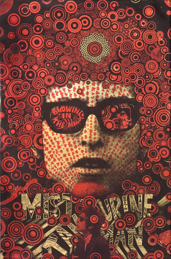
Finally the last image illuminates the pop and psychedelic art of Martin Sharp “Blowing in the Mind” 1967. A period of music, colour, drugs and youth culture. “Want to know what the 60s were like? Then look at Martin Sharp’s work.” – Germaine Greer, 2009. It was constructed by the technique silkscreen print in red and black on silver metallic foil reflective paper. This poster was produced to signify it’s time and cultural youth spirit, peace and love through the use of saturated colours. Additionally the use of repetition of circles creating a pattern with the black bold background to connect with the “Blowing in the Mind” element.

Paula Scher (1974) Changes One and Changes Two. Available from: https://eyeondesign.aiga.org/wp-content/uploads/2016/01/Paula_Scher_Changes_One_and_two.jpg [Accessed 2nd November 2017]

Milton Glaser (1977) I Heart New York. Available from: https://upload.wikimedia.org/wikipedia/commons/thumb/d/d5/I_Love_New_York.svg/196px-I_Love_New_York.svg.png [Accessed 2nd November 2017]
Martin Sharp (1967) Blowing in the Mind – Mister Tambourine Man. Available from: https://media.artgallery.nsw.gov.au/collection_images/Alpha/DA17.1970%23%23S.jpg [Accessed 2nd November 2017]
Paula Scher (2014) Paula Scher – Designer at play. Process & Skills. Available from: https://processandskills.com/2014/10/25/paula-scher-designer-at-play/ [Accessed 3rd November 2017]
Abstract: The Art of Design (2017). Netflix Official Site. 6. Paula Scher: Graphic Design. Available from: https://www.netflix.com/gb/title/80057883 [Accessed 2nd November 2017]
Michael Organ (2014) Blowing in the Mind. Martin Sharp’s 1967 Bob Dylan poster, Greer, 2009. Available from: http://sharpbobdylan.blogspot.co.uk/2014/05/martin-sharps-1967-poster.html [Accessed 2nd November 2017]