Author Archives: Anna Bond

pavillion soviet union

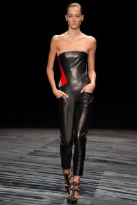
J.Mendel Spring 2015 Ready-To-Wear
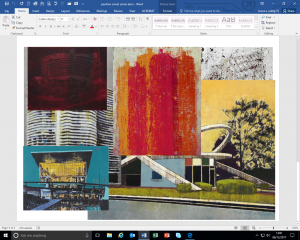
J.Mendel collaborated with Enoc Perez and used his work for inspiration. Through their mutual love of architecture J.Mendel created this collection.


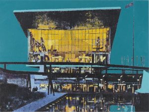
Enoc Perez, Pavilion of the Soviet Union, Expo 67 2009
The reflection appearing in the water at the front of the painting mimics reflecting towards the historical content of the Pavilion of the Soviet Union. The bright colours can represent nostalgia as it celebrates culture and achievement. The structure is almost all painted in black. The shadows of this building can relate to the backward time-zone this image is emphasising.
The building has a relatively modern structure. The roof appears almost as a graduation cap which would be apt for this building as the chapters of history put on display have successfully completed their roles and have proved worth celebrating.
According to expo67.ncf.ca the theme of this building was chosen by the U.S.S.R to be “in the name of man, for the good of man”. I believe this theme is reflected in the colours of this painting. The saturated teal colour of the background is contrasted by the exceptional, bright yellow illuminating from the windows. This emphasises mainly the point of “for the good of man” as it breaks up the dusk-seeming background with a bold and exciting, happy colour.

The teal could also be construed as the step before night. Something that might be interpreted as the coming of an end to an era or perhaps pride. The looming background could foretell disaster and evil. Alternatively the fact that the building shines through could demonstrate human success and hope. Particularly the peace elements of the content in this building.
ethics

This image from the brand/designer Duncan Quinn depicts a smart and well-dressed man holding a woman in her underwear by her neck with what seems to be a tie that he would have removed from his outfit. This image is considered highly controversial due to some heavy underlying messages.
The suggestion of dominating and authority is quite a common theme in today’s society. We believe that men should be ‘men’ and what being a ‘man’ means is usually being strong, not showing emotion and having power. In this way, the photo may be directed towards a female audience as it shows elements of what women should find attractive in a man. The idea of women as the weaker sex relying on a man could be attractive due to the idea of being looked after and feeling safe. This man may not be protecting the woman but appearing in a suit would suggest success which also then suggests financial support. The subliminal messages could evoke something sexually appealing in this image.
This photo can be perceived as demeaning to women. The woman is bound by the man, implying that she is subservient to the man. He has her powerless. This could be seen to have a fetish implication. The woman is in her lingerie which has an obvious link to sex. “In fact, both men and women find the sexual innuendoes of female bodies to be emotionally appealing, which helps incline both men and women to want to buy the product.” Her neck is bound and controlled by the man, which would scream to a lot of people “DANGER” however it is not uncommon for that to be found exciting and erotic. This says to me that she has become his sex slave however. Even the bible writes about how women were created from a man’s rib in order to serve him. “The woman made of Adam’s rib was designed to be a “suitable helper” for Adam (Genesis 2:20).”
This use of sex in advertising is by no means the first of it’s kind. “Advertising, for almost as long as it has existed, has used some sort of sexual sell, sometimes promising seductive capacities, sometimes more simply attracting our attention with sexual stimuli, even if irrelevant to the product or the selling point.” An example would be how this picture can now be seen to advertise a lifestyle as well as clothing. It almost says: ‘if you buy our clothes, you too could have all of this! The beautiful women will want to sleep with you!’.

In all of this, however, one must consider that we assume each member in this photograph would have been a consenting adult. The man would not have been forced to hold the woman nor would the woman have been forced to strip down into her underwear. Some may argue that the photo could be empowering as the female is not ashamed of her body. The ethics surrounding this photo can have a bit of a blurred line as it is only a photo and therefore subject to unlimited different interpretations.

Cohan, J.A. Journal of Business Ethics (2001) 33: 323. https://doi.org/10.1023/A:1011862332426

reflective writing

The passage titled ETYMOLOGY in FASHION AS COMMUNICATION, CHAPTER 1 pulls apart the many definitions and interpretations of the words to describe ‘fashion’. They assess the range of definitions of fashion from the past up until modern western society. I feel the author gives this insight as means to reflect upon the concept of “fashion” in a more cautious and considered context.
They write the sentence “encourage people to believe that these words are somehow more synonymous than they really are” however in some way I believe these words are in fact more alike than not. For example: ‘style’ can be used to both style one’s hair or produce a style as a result as touched upon in the passage. In my opinion, both illustrate the idea of the creation of something decorative and imperative for appearance. I do however agree with the following statement:” the impossibility of, trying to provide a final or rigid definition of the meanings of any of these words” expressed in the sub-paragraph FASHION, STYLE, CLOTHING, DRESS. The concept of fashion is such a broad one, there are so many areas it may cover which is why I think it is so fought over. Fashion can cause endless outcomes even if they are unbeknownst to most.
FASHON AND ANTI-FASHION talks about the desire to fit in with wider society but still maintain a degree of individuality. I performed some research into the subculture of ‘Punks’ in 1976, this style or fashion was designed to provoke, or turn fashion against the norm of the wider society by wearing non-conformist or atypical items such as bondage wear or household objects such as paper clips, however by doing this somehow created this microcosm of culture to become a macrocosm in the mainstream of England thus rendering the initial purpose obsolete. “And still people find solidarity, revolt, and individuality by inhabiting a shared costume marking their membership in a subculture.” (Clark, Dylan. 2003. “The Death and Life of Punk, The Last Subculture,” pp. 223-36, In David Muggleton and Rupert Weinzierl (eds.), The Post-Subcultures Reader. Oxford: Berg.) I find this quote very important in making an example of the general idea of what this passage is trying to tell us about fashion. How people want to fit in as a whole whilst not becoming lost in a sea of clones, still remaining special to a degree.
As a personal response to this entire chapter I would say that it has given me wider angles to look at when analysing fashion, be it garments, creation or concepts. The writer has taken some elements that may even be slightly controversial, or people may take offence to and admitted as such which makes me value the integrity of this chapter more so even when I know not everyone can agree with everything including myself. In reading this chapter I have come to conclude that etymology can be argued over but actually everything can change based on society, nothing to do with fashion as a whole is stable.

summary task

During this semester we’ve been given 6 complete essays to write. Although I am unsure of how I’ve done or if my writing is successful, I have found that throughout this experience I have developed many new approaches to my writing I had not before explored.

Written tasks have never been my strong suit so the separation of each paper into weeks at a time really helped manage my work. It kept my time management in check so that the stress of the task didn’t build up on me. Admittedly I left the ‘reflective writing’ too long as it was the most daunting task to perform as said by many of the class and the lecturer. This was a poor decision of mine as it then made the next task slightly more rushed.

When writing the paper on ‘ethics’ I found coming up with ideas was a lot easier. In the lecture everything was very interactive and therefore as a class we shared opinions, and this inspired some of my work. I found it easier to find things to say as the photo we used in regard to the topic as it was very bluntly questionable. When I saw a bit more passion towards the subject the whole experience was less taxing and took a lot less time to write. It also came to my attention that when a topic is so controversial you will find a number of papers from activists or researchers who want to stop or reduce the stigma perceived in society. This also then made it relatively easier to find academic quotes and also quotes from regular people too. In result of this I plan to, whenever I am in need of breaking down an image, choose something topical and relevant to really stimulate myself.

The problem I found with finding sources was that I mainly searched the internet but it is very hard to tell sometimes If a source is reliable to quote of if the ideas are entirely the writers. Surprisingly the library became an easier source than I thought based on how specialised to our subjects it is.

I found learning to Harvard reference in the academic integrity essay exceptionally helpful as with everything I write I can now give appropriate credit to areas where it is due. This will definitely be a skill I will take forward to me and that has already been proved through the use of it in further essays. Also posting my personal work onto a shared blog made me think with more consideration as I was putting it out there for everyone to see and judge and I personally find this kind of pressure helpful.

Looking back at this entire process it is clear to see that I have developed my understanding but also identified some weaknesses in myself that I need to work on and now I may do so and continue to improve my work. I look forward to one day using these skills professionally.

Task 3&4: Referencing WWE

Pantaleo, S (2015). WWE Ultimate Superstar Guide. NY, United States: Bradygames. p1-2.

John Clapp. (2012). Bring It Back! Announcer Uniforms. Available: http://www.wwe.com/classics/bring-it-back/bring-back-announcer-attire. Last accessed 25th Oct 2017.

Oestriecher, B (2017). WWE Fans Don’t Want To See Brock Lesnar Vs. Jinder Mahal At Survivor Series. Forbes. Nov 2017, 37-38


I chose this book, website and article due to many years of fandom and loyalty to the sport of WWE.

The book I have chosen contains the huge names in WWE. What inspires me about this is that each character created for these wrestlers comes with a personality, a backstory and (most importantly) a great costume to match. Looking to affiliate with the world of clothing, these costumes offer great food for thought. They wear clothes to tell a story, or express themselves whilst also being breathable and flexible enough to perform the function which in this case is wrestling. The designer for these would have to create pageantry without obscuring the main purpose of the show.

The website I chose expresses another interest in costume except this time it is directed towards the announcers – an arguably less central and more admin role than the wrestlers. They have a whole separate purpose and the website expresses how perhaps the clothing of choice should be the same across all those in similar positions as to not confuse the audience. The purpose and design of this garment is to display a role of the employee. It has to look presentable to the audience watching on TV.

Finally the article I chose is another example of the character and influence of WWE as a whole and to its fans. I believe costume has a great part to do with this.

Research And Communication: At The Morgue

body

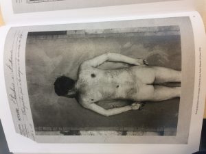
My chosen image is a photograph of a dead body that was taken at a morgue, Poeckoes case, Saint-Mande on the 25th June 1913. The body appears to have had suffered injuries to the back which we can assume from the title of the book, “Images of Conviction. The Construction of Visual Evidence”, played a role in this body’s death.
This photo is taken out of a police report back in 1913. According to the website: http://deskarati.com/2013/03/04/history-of-forensic-photography/, forensic photography only became more mainstream in larger cities in the 1870s, therefore making this photograph a relatively new practice of criminal evidence. This photo would have been taken so to document the body and all the clues it may show, before it begins to decompose and change.

costume

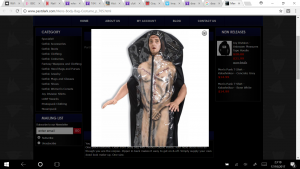
(http://www.pastdark.com/Mens-Body-Bag-Costume_p_705.html)
This photograph is of a Halloween Costume of a man in a body bag. Images of death are closely related to the theme of Halloween and here is intended to make light of a scenario similar to one In the original picture. Here too the body is naked and has surface wounds. The naked body is clearly an important aspect to the image and its functionality which would be to investigate the cause of death. However, this costume is currently on the market in 2017 which is over 100 years the future of the original photograph so we cannot assume the markings on this body is still commonplace today. This photo is also for a commercial use and is suggested to be comedic so trusting the details in the costume would not be completely advisable.

The Science Museum Brought to Life ‘exploring the history of medicine’ identifies a man named Alphonse Bertillon who was alive from 1853 until 1914, so just encompassing the year of the morgue photograph. He tried to identify criminals through their physical features. Using photographs he would document person marks that wouldn’t change such as the eye colour or tattoos.
In the online archive “Nature” there is an article called “the scene of the crime: Rodolphe A. Reiss (1875-1929)” this depicts a man they refer to as a “pioneer of forensic photography”. He apparently left all details from his images so the viewer must look at the image objectively as it is the only source of information and to see what evidence they can find. These images are currently on display in Lausanne’s Elysee Museum, however the exhibition comes with a warning as these images are too graphic for the feint hearted and children as they come from real life with nothing hidden as these were designed for function.
Ive started with this source because topics such as crime and death will always be relevant. As Halloween is coming up, images of fake horror and comedic wounds are everywhere and this doesn’t represent real life. I have discovered more about how far an image can actually take you in multiple directions from the smallest of details if you look for the right things.