Image references; David Salle [Ugolino’s Room]
Week 6: Post modernism
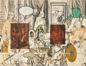
This piece of art makes multiple unconventional fusions between styles, colours and mediums. I have always been interested in mixed media but this is the first time I’ve seen a piece of art with such jarring combinations yet somehow comes together well due to the careful compositional planning. The overlays of images, prints and colour creates a sense of distortion, also indicates to the viewer that this is a postmodernist/contemporary work that link together events of very different times, thus inviting them to find the criticism and meaning within the rather complex and chaotic scene.
Image source [Banksy- https://i.pinimg.com/736x/84/07/8a/84078a3bcb73ef1076856a5a9e34db74–street-art-banksy-banksy-graffiti.jpg]
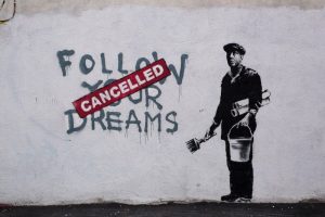
Banksy is an artist known for his political commentaries in the form of vandalizing street art, with even his choice of method is considered a crime, which is in itself, already a form of social criticism and symbolic of the fact that what he says is considered “criminal” also in modern society. I like his distinctive style of using minimal colour to convey a succinct and clear message. The use of black and white suggests a sense of cynicism in his artworks with a splash of red suggesting that the only stimulation in modern society is violence. He juxtaposes hyper realistic prints with scruffy lettering which adds reality and dimensions to his statement bringing them more relevant to real life circumstances.
Image source: [Text] by Matt Swain
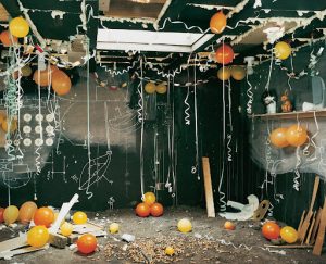
Unlike most postmodernist works, this photograph of the installation is actually quite aesthetically pleasing in its colour balance and ornaments. At first glance it doesn’t appear to be a photograph set out to expose the ugliness of life, due to the pleasant colour scheme, but upon further scrutiny, the room can be seen as dirty, unkept and sketchy even, with the pretty ribbons and vibrant balloons distracting from the background. I like how the image is constructed to be interpreted further, but on the surface it is still a lovely looking set. As said by Richard Mosse, “beauty is the sharpest tool in the box”. This artist understands the audiences’ psychology and made his piece specifically to “lure” viewers, which could also be a criticism in superficiality itself.


