
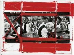
William Klein, race garcons de cafe, Paris, 1993.
William Klein uses Painted Contacts to create a new style of his own photography combining his notorious stimuli of street life with what Keiln had learnt ‘about graphic art, painting, and charcoal drawings’ (Famighetti, M. 2015). The uses of paint creates a more ‘graphical’ style of imagery, adding structure and experiments alongside communicating a message to the audience. The thick, bold red strokes of gloss paint present a DIY aesthetic, mimicking the idea of the expressiveness of ideas. For instance, circling and crossing out images on a contact sheet which you like and dislike (hence the name Painted Contacts). Personally, I feel the use of loose, free brush strokes juxtaposes but compliment his energetic photography and create a playfulness to his style.
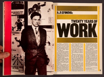
Spread from Mayakovsky: Twenty Years of Work, the catalogue to the accompanying 1982 show at the Museum of Modern Art in Oxford, designed by David King.
King’s ‘Twenty Years of Work’ double page spread applies bold, primary colours, contrasting with harsh, black photography and typography, highlighting Mayakovsky and the controversial work in his career. The bold, sans serif typography is an iconic style that whilst reflecting Mayakovsky’s futurist attitude, helps demonstrate in a forceful manner the scale of his work. This presentation could be considered professional due to his heavy influence of politics and culture as he said himself, ‘It challenges those nations that still settle their judgements by imposing the ultimate penalty’ (Moore, D. 2017). This pairs nicely with the large scale portrait of Mayakovsky himself, using monochrome to connect visually with his expression to show the seriousness of his want for change. The primary colour scheme helps provide structure for the overall composition.
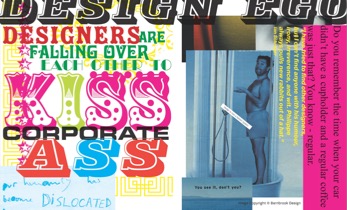
Jonathan Barnbrook, Adbusters, 200.
Barnbrook’s ‘Adbusters’ uses powerful graphical elements to produce a comical, yet triggering effect, to communicate the corruption of corporate company’s in the design world. The over powering use of different type faces, mocks the idea of professionalism and ‘big buisnesses’ by making it child like and overbearing. It ties in nicely with the meaning of the type itself, designers are acting like children to get what they want (being part of a corporate business) – it is not simply based on enjoyment but a ‘fashion system’ of who can be the best. Similarly, the use of bright and mis-matching colours portray that he doesn’t really care. As Barnbook says ‘The bigger corporations obviously tent to keep away from us, because most of them don’t like designers with opinions’ (Wall, D. 2016), which is exactly what he over exaggerates in the piece – being extremely opinionated and going against standard graphic design rules (e.g. alignment, complimentary type faces).
Bibliography:
Famighetti, M. (2015). An Interview with William Klein. Available: https://aperture.org/blog/magazine-interview-william-klein/. Last accessed 03/12/2017.
Moore, D. (2017). David King and the power of graphics – an appreciation of the late designer’s work. Available: http://www.bjp-online.com/2017/11/davidking/#closeContactFormCust00. Last accessed 28/11/2017.
Wall, D. (2016). Ryan Jefferson Hayes. Available: http://www.iloveoffset.com/jonathan-barnbrook/. Last accessed 29/11/2017.