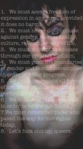
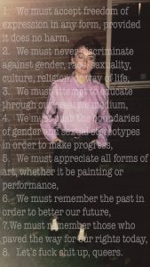
For my ‘Manifesto’ project, I produced two A3 posters. Ideally, these images should be on a much larger scale due to issues with legibility, as, to understand the imagery and the typography on a smaller scale, the audience has to come closer to the piece. Along with this, while being exhibited in a large space, the images run the risk of being swamped by the other imagery on display and drowning in the space.
I believe that a successful manifesto should demand attention from its audience; being large and bold so not a single person can ignore its presence and importance. Therefore, the manifesto pieces I produced remain too modest- especially for the subject matter I am dealing with. In order to fully encompass the spirit of gender fluidity, freedom of expression, and Queer Theory, the piece needed to be bigger and bolder.
Had I had more time to produce my ‘Manifesto’ pieces, I would have utilised professional print processes to create extremely large, glossy images- preferably 8ft X 4ft. The likely outcome of this would be more overwhelming, overpowering pieces that demand the full attention of the audience. Therefore, becoming a better representation of a triumphant manifesto and a dominant subject matter.


