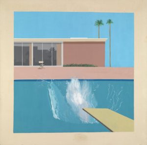
Tate Britain- A Bigger Splash, David Hockney,1967
In many of Hockneys pieces he has painted water. I thought ‘A Bigger Splash’ was one of the most striking pieces within this series. The painting is of a Californian swimming pool where there is a splash, which is implying someone has jumped into the pool. The idea of capturing movement in a ‘still’ is something we cannot do in real life and seeing it in a painting is satisfying. I think this painting is one of the most memorable contemporary paintings I have seen, due to the simplicity and the colours cleverly used in the painting. When I see Hockney’s photo of his paintings they look very smooth but in the flesh have much harsher strokes than expected. This piece had a smoother surface compared to the
rest of his pieces in his exhibition. I believe it needed to be smoother because in the piece there is a use of a lot of solid colour and without the brush strokes being smooth the painting would have not had the same finish. The piece was also much bigger than anticipated and the size of the piece created further impact. The marks around the canvas were not clean which surprised me because I always tried to clean up around the canvas by going over it in paint. But this showed part of the process of making, which was interesting to see.
The first thing we are drawn to by looking at “A bigger splash” is the splash in the pool. Compared the rest of the images we can feel more movement and energy. The shapes compared to the splash are very rectangular, which emphasizes the movement. Such artists like Jean Dubuffet and Bernard Cohen has inspired Hockney how to draw the movement in the water. Additionally, it is also the placing of the yellow diving board contrasting with the blue making the water look more vivid and alive.

