
Explain the Grid System & its relation to the Golden Ratio
The grid system is a way of laying out text & illustrations on a (generally) 2D grid in order to make the design look aligned and “in conformity with objective and functional criteria” (Müller-Brockmann, J, 1981). The grid system would be used by many different designers including web designers, architects, typographers but also designers that you wouldn’t expect such as exhibition hosts and shop merchandisers. They would use the grid system to position product in an aesthetic way. Josef Muller-Brockmann’s book “The Grid System in graphic design” also states that items aligned in a grid system “will not only be read more quickly and easily, but the information will be better understood”. This shows us that there is also a mental reason as to why we prefer seeing items placed aligned to a ‘grid’ and not placed randomly.
This relates to the golden ratio as this is also a grid-based design system that is used to position text, images, diagrams, etc in a proportion that is considered ‘perfect’ or ‘divine’. The golden ratio is used a lot in design for architecture, logo/icon design, and illustration.
Demonstrate examples of this in game UI, UX, and design
Most video game UI follows this principle of a grid-based system as this makes the game UI visually appealing to the player, as well as giving the player an organized and structured view to the game UI. If this is not the case, the player might have difficulty finding information on the screen, such as controls, HUD, settings menu etc.
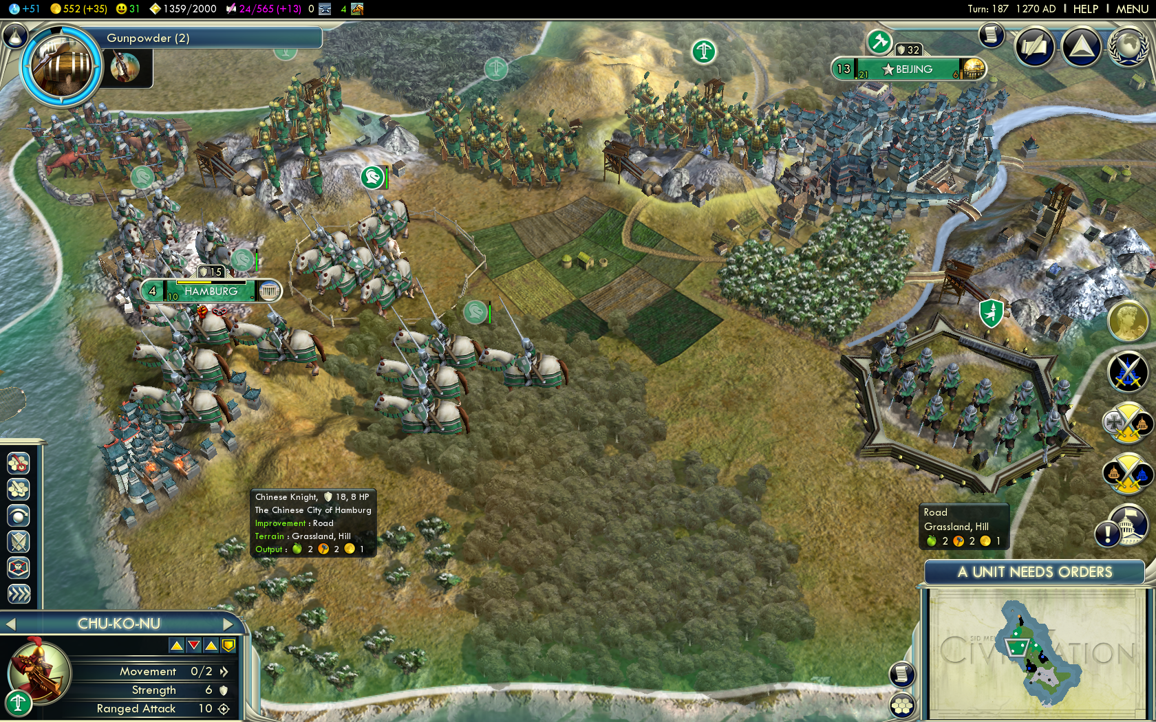
When thinking about games that use the grid system well, I feel that Civilisation V is a good example of this.
http://www.ericsbinaryworld.com/2010/09/21/civilization-v-first-thoughts-part-2
The game has a lot of information on the screen which can help the player see what is going on with their Civilisation without having to look through menus or remember hotkeys. We can also see that a lot of the information falls on to a grid, where things are the same size such as icons and warnings. We can see that the yellow circles on the right are all the same size and that are equally spaced away from each other and from the boundary of the screen. We can also relate this back to Müller-Brockmann the designer organizes his elements “in conformity with objective and functional criteria”. We can see that the designer has created this UI with an objective in mind as everything in the UI is placed in a way that the player can easily read and all information that isn’t directly visible is visible after pressing a button in the UI. Müller-Brockmann also said that items aligned in a grid system will be “read more quickly” which the designer of this UI has followed this principle as stated previously, the elements of this UI are easy to read and key information is placed in a way that the player can visibly notice at a glance.
Bibliography
Müller-Brockmann, J. (1981). Grid systems in graphic design.