Counter culture was a movement that developed post war during the 1960/70’s. During this time people were looking towards a much more positive future. This was an era of love, drugs, liberation and freedom. This led to new and exciting art and design.
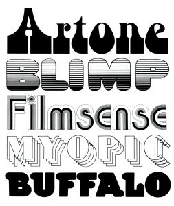
The style of typography that was used changed massively during this era, it became a lot more expressive of the mood and spirit of the time. An example of this would be the work of Seymour Chwast.

These examples of his typography were created between 1964 and 1978. The type looks very psychedelic and fun. I feel as though this is down to the extreme curves, use of multiple lines and repetition.
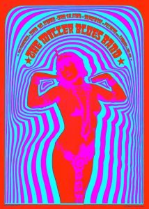
Perhaps some of the most iconic images of the psychedelic era were produced by Victor Moscoso. This poster “Neon Rose #2” was produced in 1967 and was extremely popular. I believe this is due to the bold composition and even bolder choice of colours.
“My work was about the craft of putting opposing colours together. It had nothing to do with acid” (V.Moscoso, 2010)
Although poster was made very specifically for the era, as an aspiring graphic designer I can take a lot from his work such as colour theory and composition.
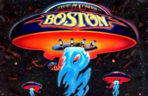
As society was changing, so was the music and in particular the album artwork. An example of an iconic cover would be “Boston- More Than a Feeling” designed by Paula Scher.

The cover was prooduced in 1974 but even decades after it was produced, people are still fascinated and love the cover. Scher cannot understand why and says that:
“The Boston cover is dumb (…) I am still mystified by how something like that really resonates in culture.” (Scher. P, 2017)
I think it was so successful because of the era it was created in. To a certain extent it is ‘dumb’ but people were interested in the weird and the humorous. The cover is bold, colourful and fun, just like the era in which it was produced.
I feel as though the counter culture movement is a great example of art and design reflecting what is happening in society at the time. The artists took risks but produced work that people loved and needed. I think this is still important to remember as someone in the creative industry today.
References:
- Seymour Chwast Archive (2017) Available at: http://seymourchwastarchive.com/collection/assorted-typography/?c=1960s (Accessed: 16/11/2017).
- Moscoso, V. (2010) ‘Victor Moscoso’, Grafik, Issue 181
- Victor Moscoso (2017) Available at: http://www.victormoscoso.com/gallery1.htm (Accessed: 16/11/2017).
- ‘Paula Scher: Graphic Design’ (2017) Abstract: The Art of Design, Series 1 episode 6, Netflix. Available at: www.netflix.com (Accessed: 16/11/2017).
- Heller, S. (2015) The Atlantic, More Than a Feeling. Available at: https://www.theatlantic.com/entertainment/archive/2015/03/the-immortality-of-the-more-than-a-feeling-cover/388739/ (Accessed: 16/11/2017).
