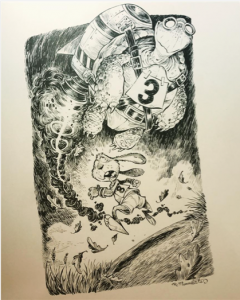
 The first image [1] is an illustration by Robb Momaerts. This piece, as with the majority of his work is created with ink and follow the theme of surreal and fantasy which are bold and easily recognisable. This piece follows the child’s story ‘The Tortoise and the Hare’ which is easy to see at first glance.
I love how even with the contrast of the black ink and the paper the effect of mid tones can still be found by using smaller brush strokes and leaving larger areas blank to show lighter tones. I particularly enjoy using stippling to recreate objects realistically and would like to expand my work further by using either stippling, or a similar method that Robb Momaerts has used with lines.
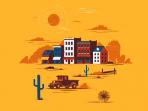
 The second image [2] could be considered a cross between illustration and graphic design due to the digital nature yet illustrative nature of it. The creator of the second piece is Matt Carlson who is both a freelance illustrator and designer. He has only used around 5 colours for this piece which works well as it makes the i mage appear bold and very simple even with the small details by using other colours on top of others as shading.
This image doesn’t tell a story as the other image does but it is still interesting and aesthetically pleasing to look at maybe more so than the first due to it being more eye-catching due to its colours. It also doesn’t have as many details as the other image does but still achieves a contrast throughout the piece. I have only recently started to work digitally and am still working on it and would like to try to take into consideration only using a few colours so as to not overcomplicate the image.
Bibliography:
[1] Instagram. @robbmommaerts. Mommaerts, R. https://www.instagram.com/robbmommaerts/
[Accessed 16/10/17]
[2] Dribble LLC. Carlson, M. https://dribbble.com/shots/2884953-Wild-West-Town
[Accessed 16/10/17]
