Tag Archives: Task 4

Authenticity, Is It Still Possible?

Society is constantly exposed to new things all of the time; through media, art, technology or even music. Things are so new that companies hold them back because they have already created something “better” (N4g.com, 2017). So is it still possible to be authentic, “Of undisputed origin and not a copy; genuine” (Oxford Dictionaries | English, 2017)?

If we look at Modernism, “A rejection of history and conservative values, innovation and experimentation with form with a tendency to abstraction” (Tate, 2017) we can decide what an authentic piece of work is. Apply these values to mobile devices with the edges merged with the screens or films that have shared universes. Ten years ago these things where something un-heard, because they weren’t old or traditional ideas. Just these two ideas can show us that we in fact do live in a world where, actually authenticity is possible.

“Inspiration is for amateurs — the rest of us just show up and get to work. And the belief that things will grow out of the activity itself and that you will — through work — bump into other possibilities and kick open other doors that you would never have dreamt of if you were just sitting around looking for a great “art idea”.” (Fig, 2009) This quote emphasizes this concept of just creating an idea with no inspiration of past ideas and purely developed from what is in your head only, what you then create is solely your own.

That creation, by definition, is Authentic.


References,


N4g.com. (2017). New Sony laser technology 20 times better than Blu-Ray. [online] Available at: http://n4g.com/news/568528/new-sony-laser-technology-20-times-better-than-blu-ray [Accessed 19 Dec. 2017].

Oxford Dictionaries | English. (2017). authentic | Definition of authentic in English by Oxford Dictionaries. [online] Available at: https://en.oxforddictionaries.com/definition/authentic [Accessed 19 Dec. 2017].

Tate. (2017). Modernism – Art Term | Tate. [online] Available at: http://www.tate.org.uk/art/art-terms/m/modernism [Accessed 19 Dec. 2017].

Fig, J. (2009). Inside the painter’s studio. New York: Papress, p.42.

Task 4 Rachel Whitread

dav

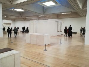
Rachel Whiteread at Tate Britain, organised by Tate and National Gallery of Art, Washington, celebrates 30 years of acclaimed artist Rachel Whiteread’s works. Reflecting Whiteread’s career, the show includes inspirational found objects and investigative drawings as well as casts, for which the artist is renowned, in a mix of eminent pieces, such as Untitled (staircase) 2001, and previously unseen works.

While there are photographs of some of Whiteread’s momentous works such as Untitled monument, a resin sculpture of the fourth plinth in Trafalgar square the exhibition pays homage to the artist’s practice as a whole as she “explores the human imprint on our everyday environment”. The exhibition deftly captures key focuses of Whiteread’s works such as negative space, material and scale and leads the viewer through the artist’s journey of transforming the mundane in to the unexpected and beautiful with a steady flow of change in these ideas from piece to piece. Concrete casts of the underside of tables and beds leads on to casts of hot water bottles in resin, plaster and rubber,  then in to a dolls’ house in resin; a plaster and  fibreglass cast of the inside of a room; and insides of toilet paper rolls in multiple colourful media.

The uncluttered space and deceptively familiar shapes of the pieces make the exhibition a relaxing and comfortable place to be. In the space that reflects the artist’s architectural and orderly feel in the cast concrete ceiling and white walls, unfocused, top down lighting of the exhibition creates additional depth with shadows and highlights. Playing to Whiteread’s use of both opaque and translucent media as well as the contrasts between shiny and matte, this brings to life hidden details and imperfections, such as those on the walls of the Victorian room, that change as the pieces are viewed from different angles.

Author unnamed (2017) Tate Available from:http://www.tate.org.uk/whats-on/tate-britain/exhibition/rachel-whiteread

[Accessed 6/12/17]

Human Computer Interfacing

Select one game of your interest and explain why it has good/bad game UI. Discuss how technology augments human abilities. Reflect upon the implications of the future of HCI. 

When I think about the games that became the cornerstone of my understanding of just what a game could be, The Last of Us is always the first one that comes to mind. The UI of the game was almost obnoxiously intuitive, there wasn’t a moment in game that pulled me out of the experience. So how is it that a game that only started focusing on the UI of their game in the last eight months of a four year development ended with an interface so seamlessly intuitive that you barely notice it’s there?

Breaking down the whole UI of The Last of Us is obviously a heavy task, so I’ll focus mostly on the HUD. The HUD felt like an extra limb that I’d spent my whole life learning to use, it stayed out of the way and it never overcomplicated anything. Naughty Dog UI designer for The Last of Us, Alexandria Neonakis, said herself that “the main thing you generally hear people complain about with UI is not how it looks, but that there’s too much cluttering the screen” – and taking that on board she eliminated that clutter almost entirely. Another thing that works beautifully is that the position of elements of the HUD relate to their controlling buttons on the controller, e.g. the weapon selection area is at the bottom right corner and is changed by the d-pad. All of these design features combined make for an intuitive, non-distracting user interface, in which the controller is simply an extension of your hands, merging you together with the game that you’re playing.

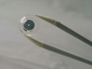
But video game controllers are just the tip of the iceberg when it comes to technology that augments human abilities. Innovega, a small start-up company, have been working on a pair of contact lenses that work in conjunction with glasses to produce its very own Heads Up Display. The technology works by putting a screen on the inside of a pair of glasses, but unlike a lot of VR set-ups that require the screen to be a certain distance from the wearer’s face in order to focus on it, it incorporates a pair of contact lenses which are “outfitted with dual focal planes similar to bifocals, let wearers focus on the screen without its having to be set inches away from their eyes” (Lerman, 2017).

What makes this idea particularly innovative is that the company recognises the issues with current human-augmenting technology and works to make it more intuitive, closer to the human body itself. It seems to me that the further time goes on, the more designers are starting to realise the key to incredible HCI is to make the technology a further extension of the human body, rather than a fresh piece of technology that requires fresh learning of its nuances to properly experience. If it’s possible to do with contact lenses, what other possibilities could there be?


Reference List:

Neonakis, A. (2014) How We Made The Last of Us’ Interface Work So Well, kotaku.com

Lerman, R. (2017) Startup Sees Contact Lenses as the New VR Screens, The Seattle Times


Helpful links:

https://kotaku.com/how-we-made-the-last-of-uss-interface-work-so-well-1571841317

https://www.cnet.com/news/augmented-reality-contact-lenses-to-be-human-ready-at-ces/

http://www.govtech.com/products/Startup-Sees-Contact-Lenses-as-the-New-VR-Screens.html

https://www.theverge.com/2013/1/10/3863550/innovega-augmented-reality-glasses-contacts-hands-on


Caroline Perkins: Task 4 An Exhibition

Task 4

Frieze London

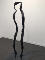
This Year I went to the Frieze Fair Exhibition.  it was exciting to encounter contemporary art in one place.  It really helped me understand the depth and breadth of the art being produced.  Seeing these works first hand and not on the internet or other digital representation made me see that there is no way you can really reproduce a work digitally and expect a viewer to experience it in the way it was made to be seen – to examine the mark making, and appreciate the reality of scale and colour.


I  looked at  varied ways in which artists are making art.  All the exhibitions I had previously viewed were of historic art.  At institutions such as the Tate and the Royal academy.   My eyes were opened to the new possibilitie
s and artists I hadn’t previously come into contact with.

I was overwhelmed by the sheer size and number of exhibits on show, I couldn’t possibly give the pieces I engaged with as much time as I would have liked.  However, it highlighted those galleries I might visit that held the kind of art I would like to see more of.Â