Tag Archives: graphic arts

Final Summery

Through this course I have been able develop my knowledge of how to research different subjects, being given starting points meant I then had to learn how to use resources to get a deeper understanding of the topics. I learnt how to use the library by being able to look up books that are relevant to my work using the library sites online. I also had to learn how best to use the internet to get the most reliable information, the going right to the source (the artist page) although not always the easiest came with the best information. I have also learnt how to reference artists work and other information in the Harvard style.

I enjoyed learning about all of the different artistic movements, and how world events has moved artists to create new art that all has the feelings of the time. Learning the meaning behind the art made the art mean so much more than it did at face value. How so many different artists felt the same thing at the same time and felt the need to make art all with the same themes. Some of the art was directly made for these movements like the posters made by the students for the 1968 Paris protests. Then other art which was influenced by current events, DADA movement, people started making art which was so different to what was made before it was collages sound poetry sculptures photography, it was created as a reaction to the end of World War One, the art was without sense or logic it just expressed the artists deep sadness with war and violence.

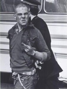
I felt a lot of connection to art which has been created based on events which were happening at the time as that is what I have done in my previous work, I always prefer my work to have a political meaning to it no matter how serious. The art I felt most of a connection though was photographers like Nick Knight when he documented what it was like to be a skin head, him showing the skin heads as more than their violent reputation allows them to be was important to help get the public to be more comfortable around them. I feel connection to this piece of work specifically because I would like to be able to go into a group of people who are seen as outcasts and humanise them again though photography.

Overall I found this course beneficial to me and my writing skills, practicing how reseach different artists I wouldn’t normal of had looked into has been helpful so I feel more ready for when I have to write about artists I am using to influence my work in the future.

Skinhead (1982), Knight. N

wk8 Publish or Perish

A lot of Ken Garlands photography has a very personal feel to it, the way he gets down to the same level to the people he is photographing makes the audience feel almost as if they are actually with the people in the photograph like you’re standing next to them. Being able to bring a connection to your audience from your work is what a lot of artist try to do, people will be more drawn to images they connect to. It is helpful when you’re trying to give a message through the imagery, in the image of Peggy Duff, he has took it for a local newspaper in preparation for a peace walk, the images give a message of happiness and safety which is what a peace march would want to promote the woman in the image looks sweet probably makes the audiences think of people like their grandmas, which is helpful to try and make sure people don’t get annoyed by the march.


During the Paris marches in 1968 students and workers came together to protest, Workers went on strike for the whole day protesting the poor state salaries, the students wanted the end of the “bourgeois” universities and the police state. The art students used their skills in screen printing to create signs to hold while protesting. Although I don’t know what most of them are saying they tell the story of upset you can feel the vibe of the protest through the images.


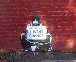
Banksy is a graffety artist who has also started making different types of work he has made fake bank notes, and a whole ‘theme park’ one theme that goes through all of their work is that the art always about a social or environmental issue. All of his work is made put out to the public, it is spreading awareness to the world that the world is in a state need.


All of these artist are making art to show the world there are issues that need to be addressed which is what I have tried to do in most of the work I have made over the years I find art like this the most interesting because they have the best stories behind them.

Garland, K (1964) Spicers Papers

Garland, K (1964) preparations for Easter march

On this day BBC (1968): workers join students Paris protest

Anonymous art Paris Protests (1968)

atelier populaire (1968)

I want change (2004) Banksy

wk6 Postmodernism

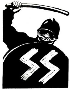
Postmodernism describes a movement which happened between the mid to late 20th century a time when people became more sceptical people wanted the truth they knew the truth of human nature. This scepticism probably came from people living through two world wars, it made people come more face to face with reality the depression which lasted years after the war was finished made the younger generations rebel more against what the older generation had said, through the depression came a new voice for the working class who were angry or searching for their own identity. The skin heads were angry about immigration and the lack of jobs which came after the ww2.


Nick Knight followed the skin heads and made a book showing illustrations of how they dressed and images of them in the real world. The images show them doing what they would normally do they would, listen to music, spend time with their friends in public, but also them getting in trouble with the police. The Skinheads were notorious for their bad behaviour.
Jamel Shabazz is a photographer who went around working class parts of America taking pictures of the culture in the 80s. His work is empowering of black culture at the time showing how although they didn’t have a lot of money they still worked hard, took pride in their appearance, and had a great sense of community.


Tracy Emin’s work is a great example of postmodernism she is very blunt in her work, she doesn’t make art to make people feel good. Her honesty is what most people like about her work, she visualises the pain of the modern world. Her most famous piece, ‘my bed’ was created in the worst time of her life when she was so depressed she couldn’t leave her bed for months.


I take influence from all of these artists work, I enjoy photographing people but I work for them to be honest images of people even if it is painful.


Skin Head (1982) Nick Knight

Back in the days (1980) Jamel Shabazz

My Bed Tate gallery (1999) Emin

wk5 Counter Culture

The post war generation came out with new types of art work which were controversial at the time because they often looked at sex and drugs. The new magazines of the time were explicit with this with pictures of penises on the front cover, they didn’t care about how people outside of the culture thought they wanted the shock factor.


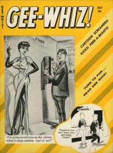
GEE-WHIZ! Is a Humorama magazine, it was started in the mid-fifties and finished in the mid-sixties. It featured cartoons and black and white images of pinups, they were a mixture of soft core pornography and funny cartoons, teen boys probably got the most out of this magazine. The Humorama publication probably helped break the ice of explicit art for later publications like ZAP! Being able to show off women’s bodies would have been more acceptable then later artists created work with male bodies.

With the rise of hippie culture people started to create art to go with the scene, making psychedelic art to imitate the experience of being on hallucinogenic drugs, the art started becoming a big part of the culture. The hippie culture came about to comeback the ongoing trauma of the Vietnam War the hippies had a message of free love and peace. Hippies were the outcasts of society they were seeking spiritual experiences through the use of drugs.
Victor Mosocoso’s work is a key example of some of the psychedelic art which came out of the 60-70s, filling up the page in patterns, bright clashing colours, and the iconic font which now then people see it making them think of the hippie era.


I’m inspired by Mosocoso’s work because of his use of pictures and illistrations, although I have never mixed illustration and photography together in this style I have done it previously. It does make me want to try the style in my future work. The Zap and Gee-Whizz Magazine also make me want to try drawing in the vintage cartoon style.

Gee Whizz Comic Cover july (1958), Ward, Hamilton, Available at: https://www.flickr.com/photos/56781833@N06/7857599358

Zap Comix, R. Crumb, Available at: https://www.slideshare.net/incognita/underground-comix-1381706

The Chambers brothers Iron Butterfly (1967) Moscoso

Wk 4. Is it possible to be truly authentic?

To be authentic means something is real, to be genuine. When something is copied the copy will never be authentic.
Being truly original today when making art is close to impossible because although an artist may create something thinking no one has done anything like they’re doing before there normally is something close to what they’ve made. The way artists are taught in school to look at other artists work for reference also discourages independent thought, so new artist will often have a hard time creating something new, instead they will take old work further, like how Christoph Niemann shows in his 2002 cover of the new Yorker, he created the same image of the first cover of the new Yorker but he portrayed it differently by making the image entirely of pixel squares then turned it into a completely new image making it an authentic Niemann piece.
I agree that a lot of the principles of good design are still relevant depending on what you want your outcome to be. But some principles like ‘Good design is thorough, down to the last detail’ are helpful when you’re creating to not become lazy in your work. Most of these principles are made for very minimalist work, and not everyone who creates wants that from there work, some artists want there work to be busy because that’s part of their distinct style. Although a lot of contemporary style is very minimalist you can see this with our technology most of the designs of apps are very minimal with their use of block colour there’s little use of outline or shading in their appearance.

The New Yorker Cover (May 27,2002) Niemann

Ten Principles for good Design, Dieter Rams

Wk 3 Avant Garde- technology is the mortal enemy of art

Traditional artist may come to the conclusion that technology is the enemy of art, because they feel that true art is organic and has come solely from the artist’s hand. But then you have to ask how far you can take that statement, the definition of technology is ‘The application of scientific knowledge’ Oxford English Dictionary, but then you wouldn’t be able to use paints because of the chemistry used to make them, you wouldn’t be able to use most materials. It seems that the traditional artist who still want to live in the renascence where only charcoal and oils were used. They have a bias against new ways of making art.
The Avant Garde movement was fighting against the people who don’t want art to move on, they did it by making art which had never been seen before, and showing the world that art is everywhere like Marcel Duchamp’s Fountain, it was a urinal, and it pushed the boundaries of what was to be considered art having something which was just a piece of technology be on display as art.
So in our modern age when programmes are made purely to make art with, is it the enemy of art? Artist don’t have to spend as much time in photo developing studios to get their images or take time making sure all of their work is straight, to me it is helping art.


Oxford English Dictionary, technology 2017

Fountain (Duchamp)(2017), Wikipedia, Available at: https://en.wikipedia.org/wiki/Fountain_(Duchamp)

wk2

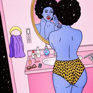
For the picture of my chosen graphic art discipline I have chosen an illustration made my Robin Eisenberg, The image is of a purple woman with only her pants on, she is flossing her teeth in the mirror which is when you realise she has vampire teeth. The image is very surreal showing a mythical creature doing something so normal seems very weird. Showing women as creatures like this is a big part of Eisenberg’s style she very rarely brings out work shows women with natural skin colour.

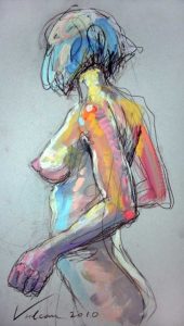
The second piece of work I am looking at is a fine art piece by Raluca Vulcan it’s a very sketchy piece that shows a woman stretching naked, Vulcan has used lots of colours not keeping within the black outline of the woman. These images both have women in common and not keeping to natural colours. I feel that Vulcan’s work is looking a lot more at the beauty of the natural form women have, whereas Eisenberg looks a lot more at making women look superhuman. This is a recurring theme for a lot of new illustrators who want to make work that praises women to show them as powerful. Vulcan I don’t think is following any feminist themes in her work, although neither of the pieces are obviously showing political themes, I feel like Eisenberg looks to build women up in more ways then just celebrating their physical beauty like Vulcan has in her work.

Vampires after dark, Eisenberg 2017, https://www.instagram.com/robineisenberg/

Marie 2, Vulcan 2010,https://www.artmajeur.com/en/art-gallery/portfolio/marie-2/4519711

wk1 Terminal Bar

This film has documentary aspects but it has been made differently to how most documentaries are. It has a more personable feel to it, as if Nadelman is taking the audience though a photo album telling stories of what the bar and the people were like, but each photo led to the other which made it easy to follow. Nadleman was also able to show how the people aged over the years to show how their lifestyle was affecting their bodies, showed how time had passed. They were able to use the music and the pictures together at points the pictures moved to the beat of the music that helped the whole film to flow a lot more. The film gave a special insight into what it is like living in that part of New York the bar owner was able to show us in the view of the observer he stayed at the same place when the people who came to the bar changed so he was able to tell us all about the people he had insights into their lives other people didn’t know. The music and the photographs gives the audience more of a feel of what the atmosphere of the bar would have been like when everyone was in there being able to show all of the people who were in the bar in their most relaxed environment when nothing was expected from them.

Counter Culture

Counter Culture in the 1960s came about through the frustrations of a post war generation.

Image result for 1960s counterculture

The world still struggling with racism, sexism and other political issues the youth rebelled. And the tools of their rebellion were sex, drugs and music.

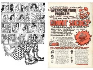
the publication ‘Zap Comix’ was created  in late 1967 by R. Crumb. The first few issues were described as “rowdy documents of the 1960s counterculture” NyTimes.com they also went on to describe how “it set off legal battles and conversations over censorship, brought attention to cartoonists as artists, and set an example for generations of alternative comics creators” which just shows the influence this comic series had over the generation being able to legal battles by simply stirring controversy within its pages. Touching on important subjects that spurred serious conversations that helped define the era.

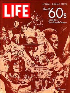
Life magazine is still a ongoing magazine today in America and just as it was back then its still tackles important issues.

Image result for 1960s counterculture album covers

this particular image is of the cover of the magazine published on December 26, 1969. so this issue was a culmination of all the major topics the happened the the previous decade. As you can see from the cover it has images such as JFK, The Beetles, Dr Martin Luther King, Marilyn Monroe and Snoopie just to name a few. Each of these individuals helped to define the 1960s.

JFK was the president of America at the time of the Vietnam war and during the cuban missile crisis. The Beetles and Marilyn Monroe were pop culture icons of the time.

In my personal opinion the most important there is Dr Martin Luther King as he fought for equality of black people in America. With peaceful protests and speeches he inspired not just people across America but across the world to stand up and fight for their rights and it worked. this forever changed the lives of black people in America, yes there is still racism in America but the impact he had on it cannot be ignored.


Image result for 1960s counterculture photography

Lastly this photograph is of the famous musician/guitarist Jimi Hendrix an important symbol of the rock and roll movement. in my opinion Hendrix is a symbol of Counter culture itself. he embodies the the phrase “sex,drugs and rock and roll”


Author Dana Jennings
Article title: Zap Comix, Now in a Coffee Table Boxed Set
Website title: Nytimes.com
URL: https://www.nytimes.com/2014/11/02/arts/design/zap-comix-now-in-a-coffee-table-boxed-set.html
Article title: LIFE Magazine December 26, 1969 @ Original LIFE Magazines.com, Unique Gift Idea, Vintage LIFE Magazine, Classic LIFE Magazine
Website title: Originallifemagazines.com
URL: http://www.originallifemagazines.com/LIFE-Magazine-December-26-1969-P2077.aspx
Website title: I.pinimg.com
URL: https://i.pinimg.com/736x/e7/c1/07/e7c107587aa3898b72e0e240a33e95a1.jpg

Authenticity

The meaning of authenticity is very broad as it could suggest a number of standards to use within a practice, as if there are certain uniform ways in which to construct, create and make a piece of work. When applying the word ‘authentic’ to my own practice in graphic design, it is hard to choose a truly authentic way of creating a piece of work, to be able to apply a uniform way of creating a piece of graphic design. The constructivists believed this to be true as according to Hans Neuberg, ‘a design is developed out of the subject matter and is unique to each job’ he then explains how designers use functional principles that serve its function rather than being formalist and be truly authentic.

Chris Nielman works in a very simplistic manner and uses the resources he has around him, in particular I like the way he uses Lego to create very simple block/cube style shapes and objects. He does this by choosing form over function to create city scenes or items of food out of very simple shaped blocks.

Concluding the meaning to be truly authentic is hard as within my practice as a graphic designer depending on the subject matter we have to choose function over form or vice versa. To be truly authentic in my opinion doesn’t hold much value today as the majority of graphic design has to be functional to serve its purpose for the recipient or audience.