”technology is the mortal enemy of art”

As human beings we have always been afraid of changes because our brains have evolved to fear uncertainly, fear of being unable to adapt, whether it is interacting with people, or change in environment, it freaks us out. We have to recognize that change can be good for us. Changes often force us to adapt in ways we have never experienced, which can be a major driver of personal, growth and development.

When photography was born over 175 years ago, some of us saw it as the mortal enemy of art. However, in reality, the creation of photography greatly influenced art over the coming years and provided growth to numerous art form in 20th century.

Todays technology’s like computer, gadgets and cell phones has strong bonded with art, it has become inseparable. With the help internet, people are more have knowledge, everyone have access to artists from whole round the world. this has helped help to share they artist work and inspire/ influenced them to create their own artwork. from today’s social media its clear to see technology has huge positive influence on modern artist

But there also some negative aspects in arts relationship with technology. Artist work being online has made people stay at home and view the artwork instead of going out to visit a gallery in person.

However, I disagree with the “technology is the mortal enemy of art” because there are more positive aspects then negative. Technology has given birth to a whole new genre of art and the internet has become a medium for artist to communicate their ideas.

Reference

https://www.theguardian.com/education/mortarboard/2012/may/09/students-procrastinating-exams

https://www.goldensquared.com/blog/59/

http://www.bbc.co.uk/news/entertainment-arts-19576763

View at Medium.com

task 5

Counter culture is the lifestyle of people who reject or are against values and behavior that society is trying to make them follow or be.

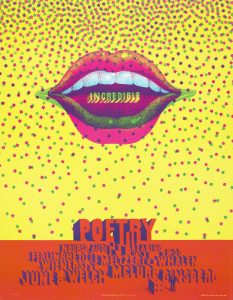
I decided to look into the logos of advertisement in the 1960s and 1970’s as illustration in advertisement is also something I’m very interested in.  The 1960’s and 1970’s were very colourful times with it being a very popular era for hippies so a lot of advertisements, posters and logos were full of colour and detail, ‘the 1960’s was a magical time when people really believed in a new utopia’ sent jumpin’, 2012, Posters article.

Moscoso, V. (1968). neon rose. [printed on white index stock].

This poster by Victor Moscoso called ‘Neon Rose’ I really like this piece because I feel like it represents the 1960s as a whole, with all the bright and neon colours contrasting each other. In my opinion, relating back to the quote about the utopia, the poster as a whole has more of a positive effect rather than a negative because again of the colours as if it were to be the opposite and had duller colours it wouldn’t have the same effect on the audience. This is relevant to my interests as a practitioner because of the illustrative vibe from the poster asa lot of it looks illustrated rather photographed which was a popular thing to do back in the 1960’s as photography wasn’t really used for things like posters.


Caroff, J. (1961). West side story

I then went on to find this image of another poster which is the poster for the film ‘west side story’ and compared to the poster above there are only three colours in the posters with not much detail. I like this poster tho because of the simplicity it shows as I feel if it was too detailed it would be too much to take it in at once but with black and white against the red it’s still eyecatching.


Moving on from the 1960’s I got this movie poster from the 1970s’ from the film ‘Grease’ and although it’s still being illustrated the poster is much more realistic to look at in comparison to the 1960’s ‘west side story’ this being as photography was becoming a more embraced and popular thing to use but they still wanted to keep the illustrative look going. I really like this poster because of the detail and because im aware of what the film is about I see there is more of a meaning behind it as the two characters on the front are deeply in love and are embraced with eachother.


Task 3\4- Academic Integrity

Balenciaga: Shaping Fashion

I chose to reference my 3 sources on the Balenciaga exhibition. I went to visit the exhibition at the V&A, the exhibition follows the life of the brand and the journey of Cristóbal Balenciaga. The exhibition showed the how the brand started and how the structures of certain garments where made. I found this exhibition interesting as not only seeing the illustrations and initial ideas but also the finished garments as well as a few
garments tailored for certain people or events.

The book I referenced gives more of an insight to how he worked. The book describes the illustration process, choosing fabrics for each garment and who the garment was for, the struggles around perfecting each one and inspirations and fabrics and ideas for his famous collections.

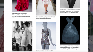
The website I referenced I found it gave me a brief understanding of what the exhibition entailed. Photos of his most famous pieces from the beginning of his career up to more intricate detailed designs on this current work. Quotes from other designers such as, Christian Dior, reflects on how his fashion influence developed the fashion industry. The website also has a gallery section showing different garments from some of his pervious collections as well as other collaborations with other designers that feature in the exhibition giving dates of when the garment was made by who and where it was taken.

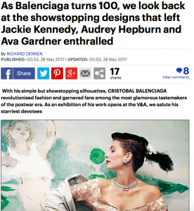
The newspaper article i referenced reflected on the 100 year anniversary of the brand, looking back at some of his most famous pieces worn by big celebrities and fashion influencers in their time. the article reflects on his time as a designer and the 80th anniversary of his Paris salon. This article gave a personal twist and a closer look into people with a higher status whom wore his designs.

Bibliography

Book:
Miller, L.E (2017) Balenciaga: Shaping Fashion, London, United kingdom, Harry N.Abrams

Website:

V&A Balenciaga: Shaping Fashion (2017) Available from:
https://www.vam.ac.uk/articles/about-balenciaga-shaping-fashion (Accessed 29th November 2017)

Newspaper
Mail online Reporter (2017) As Balenciaga turns 100, we look back at the showstopping designs that left Jackie Kennedy, Audrey Hepburn and Ava Gardner enthralled. Available from: http://www.dailymail.co.uk/home/you/article-4534778/As-Balenciaga-turns-100-look-designs.html
(Accessed 29th November 2017)

comparing two images


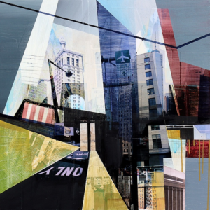
Jon Measures developed his own approach to making mixed media artwork. This involved combining multiple views of Los Angeles and other urban areas through cutting and chopping different characteristic of the city’s rich fabric together. The images are digitally edited photographs. The Paint is used to stylize as well as emphasize certain aspects of the photographic materials, to add texture, layering and colour. This is known as hybrid between painting, photography, digital art and collage and echoes the layering of history that takes place in cities.

Stephen left school with a photographic career already certain in his mind. Following college, he started assisting ‘up North’ before moving to London in 1998. Lenthall specialises in studio-based still life photography. This means he attracts a variety of clients from editorial to commercial as well as advertising. Enjoying the pace and choreography of still photography, Lenthall is able to bring simple, graphically observed object to life in an imaginative way.

Examining Lenthall’s and Measures work, a visual difference can be noted. He uses different shades of black creates a deeper personality of a building composed of basic shape structure. Using layering to construct a building, it allows you to focus on different infrastructures that create surrounding environment.

Although both images differ, they portray similar perspective on buildings. From analysing the art work it is possible to tell that the artists are keen on exploring the aspects of environment that focus on structure, infrastructures as well as scars of human development.

Reference

https://www.artslant.com/global/artists/show/10641-jon-measures?tab=PROFILE

http://www.theniceniche.com/this-week/jon-measures-mixed-media-artist

http://www.lenthall.co.uk/about

https://www.itsnicethat.com/articles/748-stephen-lenthall


Task 11/12 Summary

With this research and communication skills module I found it very interesting and challenging at the same time. Each week I was given a task which involved research and critical thinking. Once I had analysed the task I could then publish my understanding and knowledge of the given subject onto WSA blog.
Task 1/2 I had to find an image in a book then relate that image to an online article and museum or archive. With this task I wasn’t sure on what subject image I could find and how I could develop from that. But it didn’t take me long to find something I was interested in and could develop my knowledge and understanding of. This task gave me the understanding of how to research with a range of resources. After I could relate the 3 steps of the task I knew how I would work together.
Task 3/4 was looking at plagiarism in the Fashion industry. I felt it was quite interesting to look at as I had to choose a fashion image from a book which I could then relate to an online and article source. This was straight forward for me as I knew what I wanted to consider. But I knew that from doing this task I could understand how to relate sources and reference them so that I and others would know where I got my sources from. Referencing is critical for everything and is something I can always do especially when using others work.
Task 5/6 I had to find a designer collection and research the theme to it, which I could then collect 10 images to create a mood board and pick 1 image to analyse. With this task I decided to pick one of my favourite designers’ Valentino to then analyse and write about. I found this task good to do as it’s sometimes easy to notice where the designers get their inspiration from.
Task 7/8 I had to read a chapter from a fashion book, I then had to look for another 2 books sources which could relate to the original chapter I read. With this task I found it quite hard to know what to write. As I noticed that it took a bit of time just to look for other books and to read them. Majority of the time I wasn’t fully sure what the subject matter was about. And it took me a bit of time to know what exactly I wanted to write about.
After completing these tasks, I realised how important it was to reference everything! Sometimes it’s not always clear where sources come from. I’ve also learnt how to use a range of resources not just online. There’s so much online now that it’s easy to get information. But it’s also good to look at books as there could be more interesting articles. Overall, I found this module very interesting and I now feel more confident in analysing and researching sources.

Design 101

> What are the key components of Post Modernism?

As a simple way of putting it, Post Modernism is a critique of modernism and the structures of our modern world with the key point being made that there is no absolute truth. Expanding on this ideology you can see that often social constructs are brought into question or torn down by those with the Post-Modern view. Where the majority followed the belief of things being very black and white (Good vs Evil, male or female) the perspective of Post Modernism was the shades of grey in between, weakening the once powerful and unquestionable ideologies. These shades of grey offer light to minorities such as those in the LGBT+ community, ethnic/religious minorities and movements that strayed from the ideals of the time that were often barely regarded by the masses. Why should gender and sexuality be so binary and restrictive? Why should minorities be ignored or walked over? These are just two of the questions that PostModernism asks.

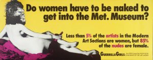
Do Women Have To Be Naked To Get Into the Met. Museum? 1989 Guerrilla Girls null Purchased 2003 http://www.tate.org.uk/art/work/P78793

The image above was created by an anonymous group of radical feminist, female artists called Guerrilla Girls who were dedicated to fighting both sexism and racism within the art world. Their entry to the art world ‘Do Women Have To Be Naked To Get Into The Met. Museum?’ in 1989 called out the museums, critics, curators and artists for the lack of artwork created by women and artists of colour in mainstream exhibitions.  The Guerrilla Girls and their work falls under the post modern title as it brings into the question the sexism of the art world with the question as to why female artists can’t seem to get their artworks in museums yet so many of the nude pieces in art gallery’s are of women.


What games do you think exemplify this in their design decisions?

If PostModernism is a critique of the norms and structures, then I can only think of prime example that shows this critique; Bioshock: Infinite. Where the game may stand as the weaker entry in the Bioshock trilogy it does stand as a rare case where the game is in some way critiquing itself and other games like it. The ending, if convoluted, took a long hard look at the series, Elizabeth/Anna quoted as saying “There’s always a lighthouse, there’s always a man, there’s always a city.” This stands as a critique of the formulaic structure of the series as well as breaking down the idea of the player playing the game, instead suggesting that the game has been playing with you.  Video games offer a truth that players have the ability to choose but Bioshock: Infinite makes the point that really, the player never really had the ability to choose to start with, Bioshock is still linear and predetermined as any other game but this one is just somewhat better at hiding this fact.


Wong, K. (2013) Three Postmodern Games: Self-Reflexive Metacommentary [online] Available at: https://the-artifice.com/three-postmodern-games-self-reflexive-metacommentary/ [Accessed 1 December 2017] Padilla, P. (2015) Bioshock Infinite and Postmodernism [online] postmodernmystery Available at: https://postmodernmystery.wordpress.com/2015/03/11/bioshock-infinity-and-postmodernism [Accessed 1 December 2017] UnboringLearning(2012) Post-Modernism
Available at: https://youtu.be/DO_gaxFIRXw [Accessed 1 December 2017] ‘Do Women Have To Be Naked To Get Into the Met. Museum?’, Guerrilla Girls, 1989 Tate [online] Available at: http://www.tate.org.uk/art/artworks/guerrilla-girls-do-women-have-to-be-naked-to-get-into-the-met-museum-p78793 [Accessed 1 December 2017]