TASK 1 & 2

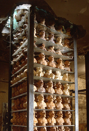
Sugar Tower (SchimmelMuseum)

Hamburg . 1994 . 445 x 96 x 96 cm

Wood, glass, sugar, food and acrylic paint

I found this interesting art installation in a book by Dieter Ross called Unique pieces. I chose this because of the interesting use of materials used to create this piece; the incorporation of food items such a sugar in an art installation intrigued me. In the description, it tells you its displayed in SchimmelMusuem; Upon heading to the Museums website I find that this Museum brings two floors of Dieter Ross installations to life. I believe this gave his work more of an experience to see and a proper setting to house his installations. The building is described as ‘somewhat mouldy’, and with its slightly worn, damp walls’. The piece I am looking at was from the ‘Sugar Kitchen’ room, however annoyingly on this website there is no explanation about what the sugar kitchens purpose was and why it was created. It just had details about how the little sugar statues were created, which is not what I wanted to know. Apart from a brief description in the Foundation section of the website which stated ‘individual pieces on show to represent each of his creative phases but also their individual mode of presentation’. The mystery behind his work and the museum really intrigued me, especially since Dieter Roth’s most consistent art forms was printing and binding books, which is completely different to his textural almost completely unexpected and random art installations. Upon further looking for more information about the artist I stumbled across another Museum website which housed another of his installations called Hauser & Wirth.

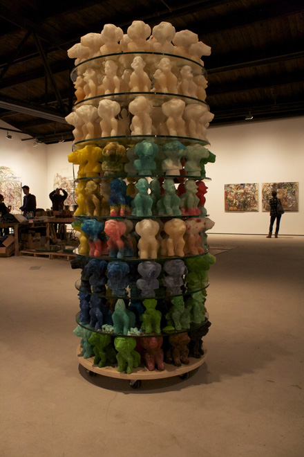
Self Tower(Schimmelmuseum) Hamburg · (Idea: 1969) 1994 · 740 x 77,5 x 77,5 cm Chocolate casts of portrait heads of D. R. as an old man, between sheets of glass, held together by steel supports

‘Fueled by artistic restlessness, Roth’s wildly experimental approach to drawing, printing, and book making eventually found its way into ambitious large-scale sculptural installations’ and ‘shared by the father and son artmaking team, that includes furniture, books, and an array of personal items reflecting not just the Roths’ practice but a defining philosophy in which art and daily life are indivisible. In seeking to pulverize traditional boundaries, Dieter Roth elevated the processes by which things happen, embracing accidents, mutations, and accretions of detail over time.’ So now I start to have an understanding of what his installations in the Schimmel Museum might be about, however it is still very loose.

I decided to revisit the original book for more information about his art installations. Interestingly I found out his introduction of more complex materials such as sausa

Dieter Roth, Zuckerturm (Sugar Tower) (1994-2013)

ge, cheese and this case sugar; was to introduce a fourth dimension to his work – ‘his works were left to age and decompose, two characteristics diametrically opposed to conventional ideas surrounding works of art. In a section called The Dieter Roth Foundation’s Schimmel Museum, I find my answer. The Selbstturm (Sugar Tower), consists of self-portrait busts, recreating a sculpture from 1968, ‘at that time Roth Parodied James Joyce’s A Portrait of the Artist as a Young Man, by portraying himself, then aged 38, as an old man. The towers were described to be arranged in almost military formation, and upon first glance quite menacing.

I look on Spark note to get a brief over view of the book, to see if I can find out anything else; it was genuinely about the life story of a catholic boy and his life struggles, sins and family and about him trying to find wings to become an artist. This leads me to believe that Dieter Roth, maybe was atheist or didn’t like the ‘dreamlike’ approach James Joyce had on being able to become and artist. You could almost argue that Dieter Roth’s sugar statue and even the whole of the Schimmel Museum was an act against the genuine ‘pretty’ artist, and using time and decay was his retaliation to the boundaries of what art can be. And that being an artist wasn’t as simple as ‘finding wings’ and being a in a dreamland, it was a competitive industry and career and required thinking out of the box; which he most certainly did with his Sugar Tower and the whole of the Schimmel Museum.

Task 2

What does avant garde mean?

Avant garde is a term that is used to describe artists and work that is experimental, radical or unorthodox with respect to art, culture and society. essentially work that is out of the box and out of the ordinary, avant garde is considered to be the hallmark of modernism by some artists. In french the term avant gaurd means vanguard or the advanced guard , essentially the peoples ideas are ahead of their time this is sometimes seen in movements in the art such as dadaism or in politics anarchism. The term can also be used to describe something that is cutting edge or something people are new too. usually the art work done by such artists is made to challenge the norm in today’s media, meaning to try and break the boundaries set by society too of what you are able and unable to create. The movement was created in the early 20th century by the artist Dada. The movement was originally created by Dada because of his disgust towards the social, political and cultural values of the time especially the horrors of the first world war, Dada’s work cause massive outrage leading to one of his exhibitions to be closed by police due to his work challenging the norms of society. The avant garde movement was created in France and lead from one artist challenging society to an entire movement of artists and this is now a term used by artists in many countries across the world, this shows how much impact a single artist can have.

Image result for avant gardeImage result for dada art

(Art by dada on right)


Is it still possible to be truly ‘avant garde’?

I don’t believe that it is still possible to be avant garde in current games because of social boundaries that people are too scared to cross, for instance games like GTA have been banned in countries such as Australia because of extreme violence and so on which is why I believe that games like that may not sell as well as games that don’t have that kind of themes, as a game producer I would like to try and make my game socially acceptable and a game that all people can play in every country without fear of it being banned or having a bad name. I also believe that it would be hard to be avant garde in this day since most games seem extremely similar, this is probably because most games are just different versions of the same thing, like the fact that every MMO RPG just seems like the same quest after quest boredom, nothing really seems new anymore to me.

Image result for gta v banned in australia

Task 5

The artworks of the counter culture developed more from the 1960s to the 1970s. Sometimes they are called underground publications because those comics and magazines can get in the psychedelic stores which sale goods such as marbles, cigarettes, tie dyed fabric and books.


Mylar Chamber image used by Life magazine, 26 December 1969, in its special issue to mark the end of the 1960s. The image illustrated a section on drugs which stated that ‘few came as close to explaining the euphoric distortions of hallucinogenics’ as Cohen. I am interests in the light and shadow in this photo, and combining the color, it really looks like a hallucination. It seemed to express the freedom, the self-indulgences and relevant to one of the core spirit of  the counter culture. Similarly to Dickens, it could be said that counterculture of the 1960s marks for some the best and the worst of times at the same time.


The second image is the cover of an album called Cheap Thrills which is one of the famous work related to the counter culture. It published in 1968. The cover was drawn by underground cartoonist Robert Crumb. Using comic form as a cover is clever, because the readable of characteristics is easy to pass message and information. In at least one early edition, the words “HARRY KRISHNA! (D. GETZ)” are faintly visible in the word balloon of the turbaned man, apparently referring to a track that was dropped from the final sequence. The words “ART: R. CRUMB” replace them. A variation of the title on the cover is used as the logo for the Cheap Thrills record label, owned by British DJ HervĂ©.


The third image I chose from Oz (No.3 May 1967) which is a successful underground magazine. It is 3 page Martin Sharp foldout What Beautiful Eyes She Has with Revlon Invents Wet Lipstick on the reverse. The color of the poster is the typical of that period, bright, vividmaking a sense of psychedelic.


According to Musgrove (1974), the counter culture expresses the dissatisfaction with the prevailing culture or social system, and influences the way of life through the impact of cultural shock, so as to make the system change. This is the meaning and value of that period.


References

Musgrove, F., 1974. Ecstasy and holiness: Counter culture and the open society (Vol. 530). Taylor & Francis.


Images


https://i.guim.co.uk/img/static/sys-images/Guardian/Pix/pictures/2011/5/12/1305210097754/Ira-Cohen-2-001.jpg?w=880&q=20&auto=format&usm=12&fit=max&dpr=2&s=6da


https://upload.wikimedia.org/wikipedia/en/9/9e/Cheapthrills.jpeg


http://ro.uow.edu.au/cgi/viewcontent.cgi?filename=0&article=1002&context=ozlondon&type=additional


Task 7 – History of Art

Leo Steinberg in his book of essays is talking about the way the old masters have drawn attention to their work through different devices, illusions, radical color-schemes, certain details and proportions and the different ways of compositions. He also talks about the way this has changed in modernist paintings but seems to come back in post-modernist paintings. He argues that by doing that the old masters not only promoted their own work but also art in general and sucked the viewer’s attention towards art whereas with modernist paintings which is more about deconstructing art as we knew before and by postmodernism these virtues not necessarily consciously but seems to come back to practice.

Most of his theoretical work is focusing on paintings, in contrast with Richard Serra who is a practicing artist, a sculptor with big and robust works, industrial metal structures with little aesthetic appealing to people who are not proficient in arts.

In his private letter’s Serra also mentions the way the old masters have made work although he is more interested in the way their works are constructing and de-constructing the buildings they take place in.

While they are talking about two different things the two ideas are not fundamentally antithetical to each other, in fact, they have many common points. Richard Serra writes that the works of the old masters, their frescos, and namely the frescos on the walls and ceiling of the Sistine Chapel have deconstructed the place, metaphorically destroying it’s walls and abolishing it as a construction.

It is easy to see how Steinberg’s statement applies to Serra’s ideas. By directing the attention to their paintings and creating illusions the old masters are essentially stealing the viewer’s attention. By doing that they distorting space making it into a strange little universe where walls and ceilings do not exist only illusions.

They smartly using the surface to bring out the best from their work, turning it into an interactive painting. The buildings are only buildings from the outside they ultimately function as a painting that you can enter and be a part of at any time.

Summary Post

Over the last ten weeks, I have been able to constructively analyse a range of art from different disciplines and time periods and have learnt about different movements that have helped to shape the world in which we now live. In particular, I have learnt how photographs and animations can been turned into short filmed, enabling space for greater comparison, such as within ‘Terminal Bar’. I have been able to see how art has influenced and aided these movements, from propaganda posters which were mass-produced to stand alone photographs which have become symbols of revolution. From this project, I have been able to obtain a better understanding of just how powerful art can be and the wide range of topics that it can be used for.

Adding a deeper meaning to my artwork is something that I wish to continue with, working different layers of subtlety to create a piece which is ultimately stronger. By looking at this project and all the different forms of art, I have begun to realise that I need to think more about the smaller details, like the choice of the typeface, colour and symbolism which will all aid to produce a more powerful piece. I should also research my chosen topic, before jumping straight to the design. This way, I believe I would be able to produce a piece which is more informative and that I could hide information also, incorporating it into the visual design. I feel also that I now have more courage to start experimenting with different techniques and disciplines, after looking at all the different results which can be produced.

I feel that I have been most influenced by the subcultures of the 1960’s; how they denied following the set rules, how they challenged and experimented with colour, typography and a new way of living. I found it fascinating to see how it was able to accumulate to such a grand scale despite not having all of the technology we have available today. Additionally, I enjoy learning of current protests today, how meaning and symbolism has been translated into our own consumer society. One particular example of current protests is the company ‘Adbusters’ who commonly play on phrases set by big businesses and highlight negativity or corruption.  I admire all the courage and defiance put in to making these pieces of art and hope to bring these ideas to my own future work, particularly with the theme of veganism. I was amazed at how one piece of art could spark such a radical change.

Overall, I do feel that this project has been beneficial for me. I have gained a greater knowledge of the history of art, terminology and of all the disciplines available on this course. I have also been able to reflect upon my own work and compare it to professional practitioners, gathering inspirations and targets for improvements.

Research & Communication Skills Final Week: Reflective Summary (30/11/2017)

Laura Neal
30/11/2017
Research & Communication Skills Final Week: Reflective Summary
“Please make sure you complete all the question pairs for all 6 topics and upload a 500 word reflective summary for the module to the blog.
As discussed for the 500 word summary really think about how this module and the content will now impact your game making process and your thoughts around game making having been exposed to the topics we have covered.
Some Reflective writing and hand in tips are now on blackboard.”

For this short reflective essay on the Research and Communication Skills module, I will be reviewing my progress in my own work and remembering the feedback exercises for this part of the Games Design and Art course. I will also proceed to reiterate and refine my positive and negative outlook on this module.

Before I begin, I believe it is important to note that I have consistently enjoyed attending Research & Communication Skills lectures. I found it very beneficial that each lecture focused on a different subject matter relating to Games Design, from ‘Indie’ gaming to copyright and ownership. I now feel that my knowledge of the subject has broadened significantly. For example, I was not very aware before that Human Computer Interaction played a large role in the games industry. I have also never had a problem with writing, although it was certainly more difficult to write about some subjects than others, such as Artificial Intelligence. On almost all occasions, I managed to complete each question pair task weekly and so did not have a build-up of work to finish by the end of the module.
By far, my favourite and most informative lectures were week three for Interactive Narrative and week six for copyright and ownership. Both lectures did not just inform, but stimulate ideas to explore. That is why I found it very straightforward to go into greater depth on both subjects when writing. There were more examples of games I could examine in relation to the question pairs.

I will now refine my more negative experiences of the RCS module.
What I did find frequently difficult was how to correctly reference academic sources in my blog posts. I have not used a cohesive and dependable referencing system in the past. Therefore, I have chosen to seek advice from my course lecturers and properly learn how to use the Harvard Referencing System for future tasks. Using the Harvard system will also help me to decide whether a source I am utilising is reliable and worthy.
This is not to say I have not been referencing sources, but rather whether I have been properly referencing the ones I have used.
I also found that it would have been very useful to have recommended reading related to each week’s subject matter and question pairs on a professional workspace website such as ‘Slack’ or ‘Blackboard’. The preferred reading could have been placed in a separate area or ‘channel’ so it could be accessed at a moment’s notice as well as remaining afterwards to be referenced or noted down for the future. I believe this is worth mentioning so that I can further improve my work.
If I had more time, I think that I would return to each blog post individually and re-read everything I have done. Now that I am adjusted to the course, seven weeks later, my writing has improved, and I could enhance each post to a better standard, as well as finding more sources to reference.

Is it possible to be truly authentic?

According to me, the easiest way to describe authenticity is that, authenticity is something that is genuine, not replicated or plagiarized. In terms of art, I do not believe that it is possible to be truly authentic. There are various artists who usually use ideas and concepts of other artists and try to replicate the design with a twist of their own and some also try to something that is more relatable to the modern society. But, there is a huge difference between replicating and creating. An artist who replicates other artists work basically shows their studio skills and an artist who creates something from scratch shows their creativity, for example- The replication of Leonardo da Vinci’s The Last Supper artwork has been done multiple times, one of the famous replication of this artwork is by Andy Warhol.

By Leonardo da Vinci

This is the original artwork of The Last Supper by Leonardo da Vinci, he is one of the most famous artist and his work has been admired worldwide.


Replication by Andy Warhol

As we can see in this replication by Andy that there are not many changes, and it does not show much as creativity as the original painting. There is also a term ‘genuine fake’ where the work of the original artist is recreated by a fake artist but it is usually hard to identify since it seems to be authentic. So, although we can say that this is a replication but it is definitely not authentic.


https://www.leonardodavinci.net/the-last-supper.jsp

https://www.flavorpaper.com/wallpaper/murals/last-supper-mural


Task 6 – Modes of practice

My work on this project started out as a simple synesthesia practice with my boyfriend who is a classical musician. The project’s aim was to find a common ground between painting and classical violin. Through some paintings and various videos and some experimenting with making music together evolved this project into something that’s more about making music from a fine art perspective rather than the connection between music and painting.

What started out as paintings trying to imitate the music and the sound of the violin slowly started to become something that instead wants to create music and wants to use the violin and the musician instead. For this new idea, I photocopied my boyfriend’s chords and cut them up into small pieces so I can rearrange them in different orders, making it a sort of hand-made remixing practice.

Similar to how the film-editors worked long ago.


To make my collages I chose the works of the English composer Thomas Campion who is usually considered a renaissance composer and mixed it with European Baroque composition’s most notably with Bach to prove that he was very well influenced by European, mostly Italian composer’s work and he was way ahead of his time.


Publish! – Story, Message, Feeling, Connection

With so much corruption and problems within our modern world, it is only natural for people to create art with strong meanings and connections, whether they are clear or hidden. These often connect with a wide range of viewers, sparking a reaction and a call for change.


I greatly enjoyed the irony within this piece and the direct contrast to the magazine and the subject. I feel it relates to the irony most people feel within times of war – how can we create peace by using weapons and bloodshed? The addition of the missing teeth portrays a shocked emotion upon the skull which only adds to the irony. I also admired the use of the dark background, emphasising the dark atmosphere and meaning. Furthermore, I liked how it wasn’t pure black as if the subject was placed into a void; there are smudges and scratches which make it appear more life-like but also as if someone was trying to wipe away and hide something.


For me, there is a large depth of contrast within this image. We see a young boy, who normally is full of connotations of innocence, points the gun at the viewer with an expression so full of anguish. This contrast sparks a call for change regarding gun laws. The power play in this photograph is interesting; the viewer has become victimised, the gun so close that it is no longer in focus, as if we are unaware and searching for the reason behind our fate. We see a character in the background with their back towards us, as if this is a daily occurrence which we have become immune to. I feel that the use of the smaller boy is also key, he looks to the older child in admiration and we regret that he will most likely follow in the same path. However, he has his hand upon him, is this in support or to stop the event?


The business and clutter within this photo directly relates to the way the majority of the population lives their lives – following the crowd, buying into consumerism. The lifelessness of the female on the bed along with the small and cramped conditions of the room help to reinforce ‘the less you live’. She is alone within the photo and has become victimised by the society we live in. The use of the second person within the text also directs the image at the viewer and I liked the wordplay of the title ‘Buyological Urge’. It is not within our human nature to desire these objects, it is because of marketing that we have fallen into this downward spiral of misery.

Image one: Protect and Survive, Peter Kennard (1980)

Image two: William Klein, Gun 1, New York, (1955)

Image three: Adbusters, Buyological Urge


Final Summary