Postmodernism

Postmodernism essentially contradicts and challenges all aspects of modernism. The artwork created by postmodern artists opposes the “modernism’s utopian visions, which had been based on clarity and simplicity.”
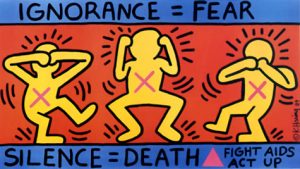
 

Keith Haring’s ignorance=fear was created to promote awareness of AIDS,


for the activist group, AIDS Coalition to Unleash Power. The three figures represent “see,hear and speak no evil” to show how people refused to acknowledge those who suffered with AIDS.

The use of bold shapes and primary colours creates a visually interesting style of pop art that is prominent to Haring’s work that makes everything very simple, due to the fact you’re not distracted by anything within the piece. The bodies created by simple shapes,clearly show what the figures are doing. This makes you question what the campaign is about because you assume due to its simplicity its aimed at children, when the actual reason promotes a very serious topic, that was coming out as a near epidemic for the time period.
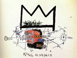
Basquiat’s “King Alphonso” really interested me, once again, because of it’s limited colourscheme. The use of purely primary colours mixed with child-like fluidity to the drawings really drew me in. I found it interesting how Basquiat used colour only in the centre of the piece of work, which your eye is after you see the huge signature crown in which has become essentially a signature for Basquiat, which is seen as a sign for greatness, ‘Even if no one else sees it, he’s a king in his own right.’
I like how the disorderly scribbles in which produce a mind map that sit underneath the crown, they sort of connote how Basquiat knows post-modernism is going to be a
crucial movement within art.

Jamal Shabazz’s Back to the World beautifully documents the subway in quite a contradictory way. Though what is being photographed isn’t seen to be beautiful, the way in which Shabazz captures those going about their daily life in an rough area, “It’s an interesting mashup of the elegance of humanity in spite of the decay of the city and those photographs had a warm, yellowy, upbeat quality to them.”


Jamel Shabazz,back to the world,1980
http://www.jamelshabazz.com  -Young, B

http://www.vam.ac.uk/content/articles/p/postmodernism/


Keith Haring, Ignorance=Fear, 1989

Ignorance = Fear


Basquiat King Alphonso,1983

http://aloversanthology.com/king-alphonso/

task 9

Antony Gormely’s contemporary sculpture entitled “Bed” was made in 1980 using hollows of eaten layers of sliced white bread. A key theme in this piece is destruction of matter through consumption of solids transferring to liquids and gasses. Theoretically this could convey religious belief of the body’s ability to transform into spirit. Contrastingly Robert Rauschenberg’s piece “Bed”made in 1955 uses everyday found objects meanwhile Gormely’s materials are bought to construct the art. There is a similarity between the two pieces in that they both depict human form and are very intimate. Gormely’s piece is intimate as the volume of the artist’s body is represented by empty space. Rauschenberg’s piece is intimate too in as it’s a self portrait that uses items that belonged to him used in his daily life. Another personal piece that relates to the of a bed focal point is “My Bed” by Tracey Emin’s made in 1998 with Mattress, linens, pillows and objects. Although this work doesn’t depict human form it is still alike in that there are intimate details of the artist’s life which engage the viewer with ideas of universal emotions. The idea of universal emotions is similar to Gormely’s work in which he believes his work is universal as it refers to the inevitable obliteration of all substances through consumption and furthermore the universal philosophical notion of God’s existence. The main concept for Gormely’s piece is depicting an intimate self portrait that relates to ideas of universal philosophy.

Final Summary

Throughout the writing and research of the blog posts and their topics, I’ve broadened my knowledge in the world of design about areas that I wouldn’t usually look in to, and discovered that I actually find many of them fascinating. I discovered new artists that I am fond of and can learn form that goes outside of my usual style, allowing me to experiment more, such as Gilles Beloeil who uses traditional medium and painting styles for his conceptual illustrations. Before discovering this artist, I’ve always separated fine art and digital concept art, especially for such a commercial instance like video games, as two separate things, but now I see how they could be overlapped and combined to create something beautiful and meaningful.

Learning about famous art movements such as Avant Garde and Postmodernism has given me the ability to criticise art from a new perspective beyond aesthetics, and to be able to add deeper meanings into my own pieces of work instead of deciding based on visual appeal and cleverness in the design. It has also given me a deeper appreciation to art and design, knowing that it has the potential and capability to alter the course of social establishment; to create and destroy, which is absolutely astonishing. I’ve never been one to appreciate art that is on the abstract side, due to they’re presumed “pretentiousness” and lack of traditional use of skills and methods, but caring to look beyond the superficial (which is something that I learned from the Modernism movement), I’ve learned the importance of art that ventures outside the convention and mainstream appeal, which is key to the evolution of the art industry as a whole. Prejudice in perception of art is hard to overcome, but I see this as a start to pulling down the inhibitions one naturally has when approaching something unfamiliar.

Exploring new topics in depth also inspire new ideas which has aided my practises to becoming more experimental and wide ranged. It also allows more possible combination of methods and style instead of sticking to traditional formulas. I have also been able to improve some of my transferable research and critical skills, which will be very helpful to my future projects, regardless of the topic. When I needed to find references, image sources and just generally more information about the thing I’ve chose to analyse, I had to make use of every method, especially for works that are obscure with engines such as google reverse searches and google scholar and the library’s resources to obtain the bit of facts that I needed. I realised that on the way I am also exposed to new inspirations that aren’t actually relevant at this time but could be in the future, such as new artists, and blogs like Widewalls that I could go back to in the future.

In conclusion, this project not only exposed me to new ideas, it has also expanded my way of thinking and understanding of the world of art and design, and I can’t wait to see how my works in the future will change and the new directions it can take.


Ben Teague – Own (Week 9)

What do you see as the positives and negatives around copyright?:
I see the protection of your own creations as a positive of copyright. As a game developer, knowing that all of my assets are safe, ensures that I can do what I want with them. I don’t want someone ripping a mesh from my game and using it in their own for free, without anything being done about it.
Something that I am seeing a lot lately, especially in the world of video games is law suits. Big companies suing smaller ones for names, people suing company’s for compensations due to their game affecting them, company’s suing cheaters, etc. To me, it seems that they are just doing it as a money grab. They seem to try and find any excuse to sue someone just to get money.


Is it possible to make anything new?:

Yes it is.
In video game terms, I don’t think a yes or no answer will suffice.
Every now and then there comes a great game; ‘Bioshock’, ‘Witcher’, ‘Dark Souls’. But only one of them is unique. In that example it is ‘Dark Souls’. Yes it’s an action RPG, but they have taken that and made it unique by adding a classic arcade twist to it, where when you die, you restart. A simply twist, but that is all it takes to make that game unique and loveable.
I do not think that there is ways to make game mechanics that are truly original and never done before these days. Everything has been done. But, I feel that making a unique game is not unheard of these days, as my above example shows; taking a standard game and adding your own twist to it. Or, merging two games together.
“I really wanted to create a narrative-led game that mixes elements of open-world adventure with point-and-click titles.” (Hartup, 2017) This is exactly what I am talking about, merging genres together, to create new genres. It creates great results!
It only seems to be indie developers that are trying this method though. I rarely seems amazed by big company produced games, as they are always the same rubbish copied and pasted every year to drag in more wallets to keep their companies a-float. I think it the bigger companies put their time and money into making games that were more unique it would change up the current market. It would force other developers to do it too, producing more fun and different games for use to play.

Bibliography:
Hartup, A. (2017). Zelda meets Twin Peaks in… Falling Sky, the game you’ve never heard of, made by one person, and up for one of gaming’s top awards. [online] gamesradar. Available at: http://www.gamesradar.com/zelda-meets-twin-peaks-in-falling-sky-the-game-youve-never-heard-of-made-by-one-person-and-up-for-one-of-gamings-top-awards/ [Accessed 6 Dec. 2017].

Ben Teague – Artificial Interlligence (Week 6)

Some definitions state that AI is when a system thinks/acts like a human and other definitions state that it is when a system thinks/acts rationally. Why do you suppose AI developers wish to hold up human intelligence as a standard rather than pure logic?:
I think they do this because we are the “smartest” species we know. Nothing on the planet can compete with our intelligence, so comparing something that we are trying to make intelligent is the easiest comparison we can do.
I think it also has this competition sort of component to it. This competition revolves around whoever can program an artificial intelligence that can mimic human intelligence the best. And that’s all.
In terms of video games, I think this has its place. Especially for characters in games that are human. So giving them an AI that one could compare to an actual human seems logical. But, for other NPC’s in games, I don’t think this is the best. For example an animal or alien. For the animal the AI should just act in a highly logical way, as they do in real life, but we shouldn’t be able to perceive it as smart or stupid in the game, we should be able to compare it to an animal.
Now the alien; this is something that I think could act in either a smart way, or a logical way similar to the animal AI. This is because it is something that has no real comparison in the real world, therefore can act in the game however the developer wants.


A lot of people are scared by the prospective of AI. What do you think would be the ramifications of us achieving true “strong” AI?:

Personally I think those people are overreacting. The whole “AI’s are gonna take over the world” thing is stupid and has no research/proof backing it. Humans will always be smarter than AI’s, end of.
However, I think that in time, a long time, there could be a sort of… freedom to how an AI could work. For example, it would be able to actually communicate to humans, rather than being programmed to say things. This would be something that would really advance media such as games and movies. If the NPC you were talking to in a game, was actually talking to you, in its own words. That would be like entering a new world.
So far, these are all positive things. There would definitely be negative effects from this type of advancement. The programming time, especially to implement into a game, would probably be ridiculous thus making the development process of games take even longer.
The AI’s could eventually be changed to be used with things such as windows, it already has Cortana who likes to annoy you every update, but imagine if Cortana could actually talk herself, and you couldn’t just simply turn her off. She is the only way to use the computer.
“Unfortunately, there will always be limits of AI, which is why Grobman states that human-machine teams will be key to solving increasingly complex cybersecurity challenges” (Kh, 2017)
It is already being implemented into security at an early state like this. But image a future where someone could hack into the AI of a bank, then they gain full control of the bank. It could make cyber terrorists, criminals, etc operate more frequently and with more ease.

Bibliography:
Kh, R. (2017). How AI is the Future of Cybersecurity. [online] Infosecurity Magazine. Available at: https://www.infosecurity-magazine.com/next-gen-infosec/ai-future-cybersecurity/ [Accessed 6 Dec. 2017].

COPYRIGHT

Advantages of copyright – The most obvious advantage of copyright is its main purpose, the protection of your work being stolen by others. When work is taken by others and passed off as their own, we call it plagiarism. Copyright law was designed to give creators the security they desired so that others could not take their work and use it for their own purposes. This means that if i was to create a character for a videogame then i could protect my idea from being taken by another developer. This also means that i can’t take a popular character such as Mario and claim it as my own.

Another example of a benefit to copyright is that you can share your work with who you want and benefit accordingly. This means that if i was to design something and place it under copyright protection then i could essentially allow other benefactors to use it and earn money in their work. For example, if a company wanted to add Mario into their game they would first need to contact the company who owns the rights to Mario and ask for permission. This allows the company responsible for Mario to negotiate a deal in which they claim a certain portion of profits.

Disadvantages of copyright – One of the biggest disadvantages of copyright would be that it makes it harder to promote your work if you’re new to an industry. For example, if you are a musician, it can be hard to share your music as others wouldn’t want to share your songs for fear of copyright. Many websites that share content have had copyright issues in the past. YouTube being one of the worst for copyright issues. For a while on YouTubes platform, audio from games weren’t allowed to be shared which resulted in streamers suffering major loss to channel growth and income as their videos were being removed without their knowledge due to copyright strikes. An interesting website I discovered whilst researching highlights most of these issues.

http://copyrightkills.blogspot.co.uk/2009/12/copyright-advantages-and-disadvantages.html

Is it possible to make anything new? This question itself seems a little pointless when talking on a broader spectrum. As every day every single living person creates something new, memories, bonds and even items. Narrowing it to game design in particular the answer would still be the same. Every year millions of individuals create brand new ideas, characters, environments and mechanics. Every single thing that has even been invented has had some sort of inspiration because everything we imagine is drawn from what we have perceived throughout life. Whether that be simply noticing the shape of an object and using that as material, or the sound of your environment around you. If you thought of it then it will be created in your image. No one perceives an idea the same as another. Its one of the many things that seperate us and make us unique. So yes, its as possible to make something new as it is to copy an idea.

Task 7/8- Reflective Writing

Task 7/8- Reflective Writing

I focused on the extract named ‘Etymologies and Definitions of Fashion and Clothing’ from the book titled ‘Fashion as Communication’ written by Malcom Barnard. I chose to focus on this chapter as I find the strong mirror image of society in fashion interesting and would like to investigate it further.

The chapter gives an overview of the definition of fashion in terms of the etymology, related terms and it’s prevalence in various societal structures. The etymology of fashion was explored through the word being used as both a noun and a verb as well as the salient link to the latin root of the word fetish (suggesting fashionable items are fetishised items for consumerists).

One particular phrase, of Marx, in the article struck me;

“Every day we make decisions about the social position and role of people we meet based on what they are wearing: we treat their clothes as social hieroglyphics”(Barnard, 1996)

The metaphor of clothing being like hieroglyphics I find to be a very accurate depiction of fashions place and importance within society.

Flügal put forward concept to distinguish whether clothing being worn is fashion or not, he called these modish (fashionable) or fixed clothing. He believed the difference between these types of clothing lay in their relation to time and space. For example modish clothing is widespread but changes rapidly overtime, whereas fixed clothing is in fixed places but changes very little over time. Modish clothing can be exemplified by the current trend of belts being used to pinch the waist of silhouettes that is currently featured in the 2017 AW/W collections of fashion houses globally. In contrast fixed clothing can be exemplified by the traditional Malay dress known as the ‘baju kurong’ the same style of which has been worn for generations in Malaysia and surrounding countries alone.

However, Flügal stating that the modish costume ‘predominates the western world’ (Barnard, 1996) I believe to be outdated and inaccurate. It is a location-bias statement from a western perspective that has not taken the increasingly fast speed at which the Asian market is growing into account. Seoul, South Korea is an ultimate example of a thriving leader in fashion today, as demonstrated by the coverage of 2018 Spring Fashion Week by Vogue. An article by Business Insider also confirms Asia as a growing market through Mulberry expanding to Asia and experiencing an increase in profits. These prove that modish clothing is not exclusive to the western world but is growing elsewhere.

Another criticism of Flügals theory may be that it does not take reoccurring fashion trends into account or the use of vintage clothing. For example the style of the Teddy boys in the 1950’s was partly inspired by American Stars but also used old Edwardian suits. The inspiration of American stars means that the aspect of ‘space’ can be applied as however the use of Edwardian suits from decades previously means that the teddy boy style choice, according to Flügals theory, may mean that their clothing was not modish despite it being a renowned movement in fashion today.

Despite my criticisms of FlĂźgals theory I do believe the general concept is perceptive, interesting and generally applicable when distinguishing between modish or fixed clothing.

Bibliography:

Barnard, M. (1996). Fashion as Communication. 1st ed. London: Routledge, pp.7-24.

Vam.ac.uk. (2017). History of Fashion 1900 – 1970 – Victoria and Albert Museum. [online] Available at: http://www.vam.ac.uk/content/articles/h/history-of-fashion-1900-1970/ [Accessed 7 Dec. 2017].

Aris, G. (2007). The Power and Politics of Dress in Africa.

Pithers, E. (2017). The Autumn/Winter 2017 Trends. [online] Vogue.co.uk. Available at: http://www.vogue.co.uk/gallery/autumn-winter-2017-trends [Accessed 7 Dec. 2017].

Profits, A. (2017). Asia is turbo boosting luxury bag maker Mulberry’s profits. [online] Business Insider. Available at: http://uk.businessinsider.com/rise-in-mulberry-profits-following-asian-expansion-digital-sales-2017-6 [Accessed 7 Dec. 2017].

Vogue. (2017). The Best Street Style From Seoul Fashion Week Spring ’18. [online] Available at: https://www.vogue.com/slideshow/seoul-fashion-week-spring-2018-street-style#9 [Accessed 7 Dec. 2017].

Ben Teague – Human Computer Interaction (Week 5)

Select one game of your interest and explain why does it have a good/bad game UI:

I am going to go with a game that I am very fond of on this one, which is ‘Dark Souls 3’. Not all of the UI in ‘DS3’ is horrible, but it needs to be improved in a lot of areas.
This screen shot I took in game of one of my characters. This is the so called “statistics” screen. It displays to you all of your character statistics, but, I feel it is just too confusing. Especially for new players. It’s full of numbers, different names, weapons slots, and all these other confusing things. The worst part about it, is at no point in the game do you get a tutorial where it goes over any of these or what they mean.

They did include a help button at the bottom, however, it doesn’t help. It just describes to you in little details what a few of they stats are, mainly the attributes. It does not explain to you where the numbers come from, how to change the, what they mean for you, etc.
Example number 2; this is another screenshot I took. This time I am in the “Equipment” menu. This one is better in my opinion than the “status”. The thing that I think is bad in this is how it displays some status elements from the other menu.

On the right hand side you’ll see the same confusing words and numbers from the first one, I can see why they would have done this, but I don’t think it works. This is meant to be an inventory menu, so why not just have the inventory screen that is one the right hand site, the “additional effects”, “number held/stored” and “equipment load” status as that is all they need to include.
I feel that the additional status on this screen not only makes the menu too cluttered for the player, it also reminds them and adds to the confusion on the game. All of this leads to a bad UI in this game.

Discuss how technology augments human abilities. Reflect upon the implications of the future of HCI:

“Advances in cognitive neuroscience and brain imaging technologies have started to provide us with the ability to interface directly with the human brain. This ability is made possible through the use of sensors that can monitor some of the physical processes that occur within the brain that correspond with certain forms of thought.” (link.springer, 2017)
I have seen a lot of things on the internet mentioning or talking about BCI, which is Brain Computer Interfaces. This is where a computer is controlled only by a human using their brain.
It’s not something that is amazingly complicated at this time, but It has seen some good progress, especially with games. This image is from the video that is probably the most famous scene of a BCI in use on the game ‘Pong’.

It doesn’t necessarily augment human abilities, but more along the lines of; makes them easier. It takes away the use of hands from a computer and allows them to use it with thought alone, which to some people, seems like something from the future and amazing. But to me, it seems like another gimmick for money, a lot like ‘VR’ was. It even resembles a ‘VR’ helmet…
However, I feel that developments like this will have a big impact on the future of HCI (Human Computer Interaction), as it opens up new ways of people using computers. Image turning your pc on with your brain, then using Youtube or Spotify by thinking about it. It would revolutionize computers on a global scale.
Not only computers. Mobile phones, laptops, game consoles, calculators, watches, vending machines, even cars. Anything that has or is operated by a computer, that can be interacted with by a human, will then have a new interaction method opened up by this. So imagine “Brain Car Interface”. You want to start your car? Just think about it. It’s go future written all over it, and it isn’t a fantasy.

Bibliography:
Tan, D. and Nijholt, A. (2017). Brain-Computer Interfaces and Human-Computer Interaction [Accessed 6 Dec. 2017].

Counter Culture

Counterculture was born into a time of austerity due to the cold war.Rebellion was a crucial key to the counterculture movement, “summarised in (embracing) an alternative lifestyle characterized by…, brightly colored clothes, communal living, free sex, and rampant drug use”. The art created represented this hedonistic yet antipathy towards politics of the time.

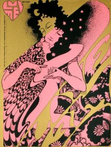
Hapshash and the Coloured Coat consisted of two graphic designers, Michael English and Nigel Waymouth.

I find it interesting how in the left-hand corner, the same male figure thats in the centre, is posed differently,slightly distorted and in this gold ink. I feel this alongside the repetitive patterns of the flowers and elongated shapes emphasise the psychedelia that strongly influenced the work of this time period.

The collaboration described their work as “a precursor to a sort of graffiti.” which I feel is shown in the colour scheme which solely consists of three colours.

Wes Wilson is seen to be the ‘godfather’ of psychedelic art that emerged
within the 1960s. His most well-known work would be the typeface he created which was heavily used within the 1970s in the psychedelic and counter culture movements. The piece of work which interested me the most that Wilson created was for a playboy magazine cover. I find the way in which the type frames and creates a sense of movement to the central image, but also makes up the body of the girl, i think the use of movement was pivotal to the whole psychedelic movement.

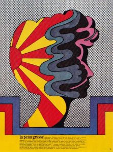
Milton Glaser’s work, though still in the vain and strong within the counter culture movement, this particular piece of work has rather colour palette compared to the work of other artists within the movement, this piece of work compared to Wilson’s playboy cover shows how the colour schemes within the movement, though still bright, did not necessarily have to have that bright fluorescent or metallic look to them. I found this particular piece interesting because of the way in which the movement created by the abstract-esque shapes are all contained within a silhouette of a face.


(1)http://visualarts.britishcouncil.org/collection/artists/hapshash-the-coloured-coat

(1)quoted in Summer of Love Art of Psychedelic Era, Tate 2005, p. 107

Hapshash and the coloured coat-Luv Me Promotional Film Poster,1967: https://paddle8.com/work/hapshash-and-the-coloured-coat/102695-luv-me-films-promotional-poster


Johnson,K Summer of Love:

http://www.coldwar.org/articles/60s/summeroflove.asp


Task 8 – Appropriation

In terms of appropriation, I was mostly interested in the everyday pictures we see on a daily basis like advertisements, posters, and political advertisements and turning them into pieces of art-work.

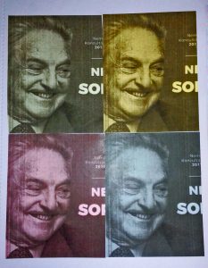
For my work, I chose the Hungarian government’s propaganda campaign against the Hungarian-born billionaire George Soros. While it might be unheard in the UK, but the figure and especially the face of Soros became kind of iconic or anti-iconic in Hungary due to the current government’s attempt to demonize him through an excessive poster campaign and also trying to shut-down the Central European University founded by Soros in 1992 and passing legalizations to force non-governmental organisations to declare themselves “foreign-funded” making a very xenophobic atmosphere in the country.

The poster campaign includes the face of Soros printed on a poster with a text saying “Let’s not allow Soros to have the last laugh!” The posters themselves are put in metro-stations, or the walls of buildings as giant posters, and even on the floor of busses, metro-trains, and trams often more than one next to each other, just to illustrate how un-subtle this campaign is.

The Hungarian government is targeting Soros because he spent a lot of money on open society foundations and on civil organizations to help reduce the poverty in Hungary and in other post-communist countries in eastern-Europe.

Understandably many Hungarian Jews are upset and find this very anti-semitic mainly because Soros has Jewish roots and the posters are often becoming the targets of Anti-semitic vandalism and graffiti, and the posters on the floors of Budapest trams were deliberately placed so passengers would have to tread on Soros’s face which brings back many disturbing memories in holocaust survivors.

For my work, I took the face of Soros from the posters and printed it on different colored papers influenced by Andy Warhol’s prints of Marilyn Monroe to illustrate how much it pushed into people’s face and everyday life and how un-subtle this campaign is.

REFERENCES

BBC News. (2017). How a university became a battle for Europe’s identity. [online]
Available at: http://www.bbc.co.uk/news/business-39780546 [Accessed 7 Dec. 2017].

BBC News. (2017). Hungary vilifies financier with posters. [online] Available at:
http://www.bbc.co.uk/news/world-europe- 40554844 [Accessed 7 Dec. 2017].

Herszenhorn, D., Baume, M., Ariès, Q., Ariès, Q. and Bayer, L. (2017). Hungary’s Freudian
political fight: OrbĂĄn vs Soros. [online] POLITICO. Available at:
https://www.politico.eu/article/hungarys-freudian- political-fight- orban-vs- soros/ [Accessed 7
Dec. 2017].