Week 4 – The History of Indie

> A) Why could you say that the ā€œIndieā€ game scene is not a new thing and explain, give examples ?

Modern released indie games tend to be experimental, unpopular or weird. However this is not new, many well-known companies such as Ubisoft and Nintendo started off their game development in very small studios, releasing games that were experimental and limited due to the technology available during those time periods. More people are now creating games as a hobby in their personal studios and more independent studios have evolved from this in the modern day. Programs such as Unity, Unreal Engine and Stencyl that are used by prominent game studios have been made free for personal use to the public encouraging game development for individuals. Web sites such as itch.io and Steampowered.com have communities where individual game developers can share their work and receive feedback. Such communities are largely visited by gamers and other developers so the indie game scene is something that the gaming community is aware of. In popular game store websites such as steam store indie games are being considered as a genre, although they tend to be multi-genres. This is because indie games have been recognised as games that are strange, quirky or unpopular to mainstream gamers. Ā The level of anticipation for some indie games are becoming competitive with triple A title games, this is because of the hype created through social media and funding sites such as Patreon and Kickstarter where the developers will showcase their game and receive support from the gaming community Ā Ā 


> B) Has the term indie become meaningless ?

The term indie has not become completely meaningless as the popularity of the development of indie games has given the word a different imagery. When using the term indie to describe a game typically a gamer would think of weird, experimental and unpopular themes. Referring to a game as indie creates the imagery of a game emulating the 90ā€™s and 80ā€™s experimental styles and keeping its flaws as aesthetic to induce nostalgia. The term Indie also communicates the idea of an individual or group who create work catered to people similar to themselves or to people who have interest in investigating personal work.

However, the term indie has different stereotypes attached to it. Using the term can be uplifting to describe a hard working individualā€™s product, but it could also paint such products with one brush as trying hard to be quirky, unique or clever. When a product has the word indie associated with it, the consumer may feel like an initiate to the creatorā€™s work as the product is not popular in mainstream media, news or advertisement. Ā Ā 

In conclusion, the term indie has not become meaningless, but it has rather become a word that can depict work made by an individual similarly to every other creator trying to strive in a field, or a word that cultivates the sense of innovation to create a trend.

What does the term Avant-Garde mean?

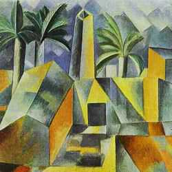
Avant-Garde means to be innovative and original; to challenge existing ideas and to push the boundaries of creativity. It praises exploration and experimentation, and promotes the belief that art should be primarily judged on the originality of the artistā€™s visions and ideas. Works that take an Avant-Garde approach can sometimes cause controversy as they often express radical ideas by going against widely accepted existing ones, Cubism for example, a revolutionary approach to portraying reality in the 20th century.

Image result for cubism

Is it still possible to be truly ā€˜avant gardeā€™? and if so provide game examples

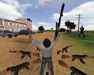
I believe it is very possible, as there is plenty of space left for new and innovative ideas, especially with the technological advancement that allows some of these ideas to be developed. An example is the third-person game Waco Resurrection, created by designers at c-level in 2004, designed to be exhibited in a gallery setting. It takes the subject of the 1993 Waco siege, in which government agents were sent into the Branch Davidian cult compound. Controversially you play as the cult leader, David Koresh, with your aim being to defend the compound against the government agents using the weaponry at your disposal. Players are also required to wear custom helmets designed for the experience, which are modelled to look like low-polygon versions of David Koresh. The purpose of this is to increase the immersion for the player but also to hide the identity of the player for spectators, which add mysterious and disturbing elements to the experience. Players are also equipped with a microphone to voice commands in the game for special abilities.
As can be expected due to the shocking nature of the game, there were criticisms directed towards the game, mainly to point out that the game was in bad taste and exploitative. A reason for this could be that some people fail to consider that games can be used to teach about serious issues, or that perhaps they are used to the protagonist in a game being a hero. These criticisms show that this game was successful in defying the normal conventions of games.

Image result for waco resurrection

Another example is The Witness, a 3D puzzle game released by Jonathon Blow in 2016. Set on a remote island with no other living humans around, the player progresses by completing puzzles on a grid and finding secret paths hidden in the environment. The game is not for everyone as there are absolutely no instructions; the player must understand what they have to do through working it out themselves through either trial and error or piecing together subtle hints in the environment. To solve the majority of the puzzles it helps considerably to use pen and paper or other similar tools; the suggested use of external materials shows that this is not a typical game. The game challenges conventions of modern gaming as in the past couple decades there has been an increasing reliance on tutorials and ā€œhelping handsā€ to help players understand game mechanics.

Isbister, K. (2016). How Games Move Us. London: The MIT Press, pg 13-17.

Tate. (n.d.). Avant-Garde. Retrieved from Tate: http://www.tate.org.uk/art/art-terms/a/avant-garde

Tate. (n.d). Cubism. Retrieved from Tate: http://www.tate.org.uk/art/art-terms/c/cubism

Widewalls. (2016). Understanding the Significance of Avant-garde. Retrieved from Widewalls: https://www.widewalls.ch/avant-garde-movement-theater-music-photography-contemporary-art/

Image 1: https://www.artyfactory.com/art_appreciation/art_movements/cubism.htm

Image 2: http://eddostern.com/works/waco-resurrection/

Task 7- Publish or Perish

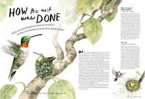
The first illustration by made by Byron Eggenschwiler, and published in a magazine called Cottage Life. The message is an educational one- the illustration accompanies an article about birds and how they made their nests.Ā  The illustration, I think painted in watercolour, really draws the viewers eyes in, and the double page spread catches your eye when you’re reading it. I think the colour scheme is effective; the range of pale greens and browns is cohesive and is pleasant to look at, as bright colours would just be overwhelming.

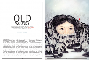
The second illustration was published in fine art magazine calledĀ Maisonneuve, and by an artist called Selena Wong. Her piece “OId Wounds” won gold in the lllustration category. I’m not sure what style her illustration would fall into- it has aspects of surrealism and pop surrealism, but I think her imagery is very effective. The story behind the piece is to show the struggles of aboriginal woman with domestic abuse, and the woman’s hair being twisted around the trees shows the message of being trapped, with only half of her face showing like she’s hiding. At first I didn’t understand what the illustration was trying to show, but when I read the article I suddenly understood all the details in the painting. I think it’s a very powerful image.

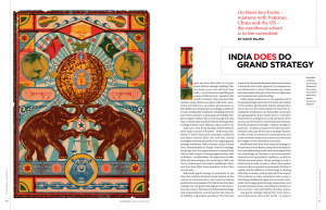
The third and final illustration is by Christian Northeast, published in Global Brief,Ā an affairs magazine. The piece is titled “India does go grand strategy” and is screenprinted. What stands out to me about this illustration is the aesthetic and the overall look of it, it reminds me of an old circus poster. I can see how this links in with the content of the article- elephants and tigers are animals found in India, however I think if he included some mandala patterns the link would be more obvious. To be honest I think the illustration doesn’t go well with the message- the colours look dirty and muted, whereas Indian culture is very colourful and vibrant. However I didn’t really understand the article, so maybe that’s why I can’t appreciate the little details in the illustration.

Eggenschwiler. B, 2015, How The Nest Was Done, Published in Cottage Life Magazine, Available < atĀ  <https://blog.magazine-awards.com/2014/05/15/top-10-canadian-magazine-illustrations/>

Wong. S, 2016, Old Wounds, Published in Maisonneuve Magazine, Available at <Ā https://blog.magazine-awards.com/2014/05/15/top-10-canadian-magazine-illustrations/>

Northeast. C, 2016, India does go grand strategy, Published in Global Brief.Ā  Available at <https://blog.magazine-awards.com/2014/05/15/top-10-canadian-magazine-illustrations/>


Week 6 – Postmodern Images

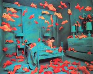
This postmodern photograph shows a surreal image of goldfish in a room with a boy. This is showing an image which is clearly not real. By deconstructing different elements from different walks of life and merging them together you are able to revealĀ a new image. The gold fish are in a way in their own environment because the blue tones in the photograph have connotations and are revealing a presence of water in there. However there is a boy in the photograph too. He is also feeling like he is in his own environment because in the blue tones there is the first bedroom which obviously belongs to him. This shows that together both focuses of the photograph are showing they are in their own environments but its made to be surreal and merged together.

This postmodern image is an illustration in the style of a pop art image. This is a contemporary image and shows it is living in the present. The colours are not so vibrant in this image, theĀ only part of the image is the yellow that is standing out and drawing your eyes in. The background is quite boring and not revealing much about the image.

This postmodern image is a mismatch of photography, collage, and editing. I think this image is quite a conversation starter, rather an odd piece if I am honest but a complete contrast to my previous images. This image is very contemporary and modern in society these days as mismatch art is quite on trend. I think the colours in this image do not show it in its best light because they do not complement each other. The picture has quite an ugly outlook to be honest.

To summarise I do not feel a connection with these images and I do not feel that they tell an amazing story. I feel if you are trying to make a contemporary image they are a little odd and out there. The feelings and messages these images send me are a little muddled, the only image I feel tells a story and connects with me isĀ the first one.

References: https://www.bing.com/images/search?view=detailV2&ccid=zPSscIUm&id=F53F5700EB269ECFABF9DE8D06603E929661FAD6&thid=OIP.zPSscIUmpVgaEsNHWZRuKgEsDt&q=postmodern+photography&simid=608008117942749220&selectedIndex=0&ajaxhist=0

https://www.bing.com/images/search?view=detailV2&ccid=5Zpwrzgz&id=5EABA75DDC2ECAB564154E59880DC845DCF25643&thid=OIP.5ZpwrzgzuvuxGPqsSsRtowEsDH&q=Postmodern+Art&simid=608054967434742708&selectedIndex=0&ajaxhist=0

https://www.bing.com/images/search?view=detailV2&ccid=8xeIsr7h&id=2A1AB1389231A11C7A3DA3A88CA39C73238B72DF&thid=OIP.8xeIsr7hlQPeUU-ACqq-tAEsC7&q=postmodern+photography&simid=607996697641878044&selectedIndex=2&ajaxhist=0z

Design and Games 101

What were the key ideas of the Bauhaus?

The Bauhaus is one of, if not the most influential modern art school of the 20th century. The key ideas and concepts of the Bauhaus was its approach to different methods of teaching and understanding the meaning behind art and how to relates to society and technology. The motivation behind the Bauhaus started in the 19th century in that time people thought that art does not have a purpose in society and it was rejected, therefore the Bauhaus bring together that creativity and manufacturing and bring them together again because they were going apart, so they wanted to bring it together and create better designs and bring it back to life and create a fresh experience. Their focus was to bring together fine art and techniques to a modern society. The Bauhaus brought down the hierarchy for different types of art and placing them on a level field and leading the way for different artist. The Bauhaus is in fact all about new techniques and a different attitude and state of mind and new construction and bring them forward, because this way artist start evolving and evolutions therefore leads to unusual, new and interesting pieces of work which influenced the development of graphic design, the Bauhaus also emphasized how important simple designs were because the best designs were often the most simple, The Bauhaus often sways towards more pure forms and clean designs and that should be the main characteristic when It comes to design.

The Bauhaus School

Examples of a piece of art that came from the Bauhaus school

Artist: LĆ”szlĆ³ Moholy-Nagy

Artwork description & Analysis: Moholy-Nagy worked with engineer Istvan Sebok and technician Otto Ball to realize the Light Prop. Uniting the artist’s enthusiasm for the look of machines, and for material innovation, it is one of the most famous early examples of kinetic art.

http://www.theartstory.org/movement-bauhaus-artworks.htm

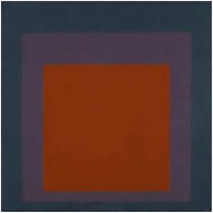
Artist: Josef Albers

Artwork description & Analysis: Josef Albers described his most famous series, Homage to the Square, as “platters to serve colour.” He began the series in 1949 and worked on it until his death in 1976. This early version demonstrates his systematic approach to investigating the optical effects of colours.

http://www.theartstory.org/movement-bauhaus-artworks.htm

Do you feel that the ideas could have an influence on contemporary games design?

Yes, I do feel like the ideas could have an influence on contemporary game design, because the Bauhaus represents a movement and this was extremely important for design and art and bringing it to the modern ages examples of the Bauhaus influence can be seen in the 21st century as seen in products such as the iPhone, as it was a simple but elegant design and when it was first unveiled it was ahead of its time, so I think the Bauhaus can have influence on game design, if designers take influence from the Bauhaus and how simplicity is often the best as there is beauty in simplicity and if designers take upon that mentality it can result to really good end products which could revolutionize the way we think about game design the way the iPhone did.

RCS, a blast from the recent past.

RCS has been an interesting ride from subject matter to subject matter, each one standing out in its own way but all managing to hold my interest on the topic presented. I did very much enjoy the variety of subjects from a look into the history of gaming to the possible future to come and everything in between.

The use of questions pairs helped when it came to the writing of the blog posts as they at least gave some variety to the questions and made it easier to write about the topic because there was choice in which questions you wanted to do. Choosing the questions meant that at least you werenā€™t stuck with a question that you either, didnā€™t like, didnā€™t understand or just didnā€™t want to answer making the whole process easier and flow better.

The same can almost be said for the lectures because although you couldnā€™t choose what the lectures were about, the variety made them interesting to listen to and engage with. The added lists of artists, writers, books and other reference material with each lecture aided with a lot of research and discussion, further improving the overall quality of the blog posts and experience.

My only real criticism comes in the form of the blog posts. I did not mind writing them, not at all, itā€™s more so the accessing of the blog site through the vdi, which one regular occasions was irritating with its refusal to respond or work. Nevertheless, with my issues with the vdi aside, the blog posts were a good format for the mini essays. The word limit left no room for waffling and made it so we had to get right to the point and being able to see other students posts was very helpful, especially if you were facing a bit of a brick wall when it came to writing.

TL;DR: The course has been a very interesting one but still a little tedious to do.

Own

– What do you see as the positives and negatives around copyright?

The copyright system is one that allows people to complete and total ownership over their intellectual property, which is fair as itā€™s something you made so you should have control over it. The .gov.uk page on copyright states that ā€œCopyright protects your work and stops others from using it without your permission.ā€ Which is fantastic for the creators as it means that their work canā€™t be used, copied, distributed, adapted or even put on the internet without their expressed permission. The problem with having all this copyright protection it does make content hard to share, which I know is contradictory because surely you donā€™t want your intellectual property to be shared, that defeats the point. But from the point of view of a small-time artist or writer, sharing is one of the only ways to get their work out there to an audience and if their work does get copied or used without permission then there is little they can do about it as taking copyright infringement to court is expensive which not a lot of smaller time creators can afford.


– Is it possible to make anything new?

Yes, but thatā€™s somewhat down to what your definition of new is. To explain my statement, imagine a robot made up of part of old robots, no part comes from the same robot, but they are all put together to make this new robot. Though the robot is made from parts of previous robot designs, it is still something new because the parts have been repurposed and put together in a different way giving a different look and feel, that is what I mean with my statement. One can argue that nothing can ever be new, and in some aspect yes, that is true because everything has already been done before but itā€™s taking what has already been done and working it with other ideas, other concepts to form something new. There will always be something similar to what you produce, but that does not mean that what youā€™ve made isnā€™t new, or what the other person may have made isnā€™t new, thereā€™s just some similarities and thatā€™s okay.

How copyright protects your work -GOV.UK [online] Available at: https://www.gov.uk/copyright [Accessed 6 December 2017]

task 12

When I thought about making a large work smaller I was inspired to write about an idea I had remembering an exhibition I saw last year at white cube viewing Anselm Kieferā€™s work. Kiefer tends to work on a very large scale using lots of different media to create complex textures. In a series of his work you can see cut outs from other canvases suck onto other canvases to create even bigger pieces of work. This creates more detail in his paintings. The idea of cutting up the actual canvas is a very interesting idea to me. Iā€™d like to experiment with this idea with an opposite effect by simplifying and making the work smaller. For example I might choose a piece I had big ambitions for, a painting that was very complex. From a painting like this I could re-work the piece by cutting around the most visible shapes and forms to take away from other complexities within the painting. I would then place this cut out onto a smaller canvas with a background that would contrast with less texture and noise. This would simplify the main aspects of the original painting and also create some interesting negative space.

Reflection of RCS

Reseach and Communication skills was a module that involved skills that I have had little experience with. However, this module has definitely helped me improve these to a point where I am happy and confident toĀ complete a similar task. I had written essays before, but never in the form of a blog so this challenged me to create a blog post that I was not only happy for myself to read but also every other student at WSA.

When choosing the question pairs to answer, I made sure to plan in my mind how I could answer each question. In the end, it often came down to the question I understood the most. I always felt somewhat confident with the question I chose as I didn’t want to end up answering the wrong question in my blogs or to ramble about something I wasn’t entirelyĀ sure on. I did notice, however, that some questions, such as HCI, I started writing and realised that the question was a lot harder to answer than I initially expected. This pushed me out of my comfort zone and I found it harder to get my point across.

This module has helped me think a lot about aspects of video games that I hadn’t really thought about before. The interactive narrative blog really got me interested in how games can be based on the narrative and the dialogue and not just the gameplay. I enjoyed writing about AI as this is something that I had an interest in before and also, it gave me a lot of information to write about as the topic of AI particularlyĀ broad.

I have improved a lot in researching skills and I had noticed that there are a lot more places of information than Wikipedia pages. I had used Harvard referencing before at A-level however not to the extent that I have on these blogs and this has really helped me improve on this. I hadn’t really ever written in a blog format before either, so the module has helped me improve my writing skills so that much that I feel I am writing in a much more professional way.

In the future, I’d definitely complete each blog before getting a new set of questions. This would mean I wouldn’t have to worry about extra work and would also mean that a potentially better quality blog post could’ve been produced.

I have enjoyed this module a lot more than I thought I would as writing and researching weren’tĀ  my strongest skills when starting the course. I found that the lectures both informative as well interesting which really helped to develop these skills.

Online Resources

The first book that I looked at was by Alan Kennedy and it was published in 1990, its interesting as it shows the culture and understanding traditional aspect of Japaneseā€™s fashion back in the days, the book focused more on the women but kimonos was worn by all genders. I was captivated by the patterns and history by the garments. I love the gold appliquĆ© by one of the textile artist, it was very simple yet affective. Woman in the 18th century was not about showing a specific silhouette to look sexy but showing the humility and pureness of the colours and patterns in the garment, as they were about class and status back then.

There is an exhibition about Japanese kimonos in Victoria and Albert museum, the museum showcase illustrations and garments created in the ages. The museum definitely has a variety of Japaneseā€™s heritage of different people with different stories and meaning. Such as social backgrounds whether they work for the royal family or in the royal family. It is exciting to see that these garments have been through as it teaches us about how far we have come after centuries of modernising the world.

The second book I choose was about Mexican costume by Chloe Sayer and published in 1985 was about the Mexican cultures and traditions. I chose this because of the vibrant colours and different weave pattern produced throughout the history of their ā€˜Sarapeā€™ which is a traditional poncho worn by men and ā€˜Huipilā€™ which is a traditional dress worn by women, the women in Mexico had some of the most awesome and lively dress styles back then. I was attracted to the colour and simple designs and it was a very outstanding way of Mexican heritage.

Thereā€™s an exhibition in The Royal Ontario museum in Toronto about Mexican culture. The museum offers a range of textile design produced traditionally by people using traditional equipmentā€™s back in the days and from today. They first draw their inspiration by their Aztec ancestors by incorporating loose fitting and colourful garments; from time to time their clothing has become refined and more elegant. Especially we used the technique that they use to create their ponchos such as weaving. It is what we used on our clothing these days. The Mexican people showcase vibrant and exiting ways of how people incorporate and draw inspirations by their surrounding such as the colours and different landscapes.

Overall I choose to dip into the culture and tradition by two different countries, because they both offer exciting colours and silhouette back in the days and with limited resources like fabric and colours both countries have showed how to still work with what theyā€™ve got. With both they are different in some ways as the Japaneseā€™s fabric are finer and more elegant to show their status back in the days, whilst Mexican fashion offers and cater to all the people, they draw in consideration of the people.


book 1 – Kennedy, Alan (1990), Japanese Costume: History and Tradition

book 2 – Sayer, Chloe (1984), Costume of Mexico

website –

https://www.vam.ac.uk/?gclid=EAIaIQobChMIvLSb0o341wIVhpPtCh2EPADDEAAYASAAEgLbCfD_BwE

http://www.rom.on.ca/en/exhibitions-galleries/exhibitions/viva-mexico-clothing-and-culture