Category Archives: Uncategorized

Do not use, you should categorize each and every post.

Story, message, feeling and connection

My personal practice is mainly centred around illustration and image making. The images that usually catch my eye the most are drawings, whether they be from graphic novels, posters or artwork. I like the idea of a running narrative in the images that I see.

In my own practice, I like to utilise techniques used by my favourite artists and illustrators. Above is a drawing I made using a mixture of biro and ink pen.

Will Eisner is a famous graphic novel illustrator. I see many parallels in my practice to his massive collection. ‘The Spirit’ was published as a DC comic all the way through the 1940’s. The reason I have referenced his work is because his drawing style was one of the pioneering styles that took over the graphic novel industry. What I enjoy about his work is that all of the imagery is part of a sequence or a story. There is a clear narrative running through all of his illustrations. I try to use a similar style to Eisner’s in that I use large shapes of black to show shadow rather than actually shade or crosshatch. This is similar to many of the illustrators of the time .

Robert Crumb is an iconic illustrator who is known for his explicit drawings and political massaging. Above is a drawing from the magazine ‘A Chronicle Of Modern Times.’ I find Crumbs style interesting because of his unique characterisation and his methods of creating tones. Crumb uses a mixture of crosshatching and dotwork instead of complex shading. This combined with his overexaggerated, cartoonified chaaracters lends to his iconic style of work.

Ellipsis - screen print - 76cm x 76cm

Dan Hillier is one of my favourite artists because he makes very intricate screen prints that incorporate imagery in a very prominent way. Even though it appears as though Hillier has used shading, he has actually used very intricate dotwork. All of his work is inspired by his travels and his own experiences so in that sense there is a story behind every print. I feel like I connect easily to these works because to me they are so powerful in terms of both their imagery and the techniques used to create them.

,


Bibliography

  • http://www.willeisner.com/spirit/, written by Carl Gropper, viewed 05/12/17
  • http://observer.com/2015/01/legendary-cartoonist-robert-crumb-on-the-massacre-in-paris/, written by Celia Farber, viewed 5/12/17
  • https://www.danhillier.com/artwork/ellipsis, created and written by Dan Hillier. viewed 5/12/17

500 Word Reflective Summary

Looking into topics that have impacted on cultural and art based theory has enabled me to apply and practice different approaches to thinking creatively, making my work more sophisticated and meaningful. A variety of different research findings have helped me to add a purpose to my work and motivate me to experiment and develop ideas, whilst learning about myself.

Whilst questioning ‘Can work be truly authentic?’, I came across Theo Van Doesberg’s view on artists being influenced by other artists. This inspired me to recycle old ideas and adapt them. Doesberg’s idea that, ‘the new artist does not imitate, he creates’ (Wilk, C ,2008), encouraged me to revisit old artists I had been influenced by such as David Carson, and using new technical knowledge I had been taught in Semester one to experiment with negative space and the postmodern style in a more professional way. This enabled me to produce a sophisticated set of two posters for my Graphic rotation which focused on a play of words, where I used Adobe InDesign (a programme I have never had confidence to use) and considered technical skills such as gridding, scale, alignment and type face to finalize this. It has taught me that reflecting on old influences does not affect the authenticity of the work, but that recycling old successes into something more exciting and up to date can also help me see how my skills and knowledge have developed.

One thing in particular that I felt was an important skill to take away from the lectures was to investigate chronologically how artists responded to cultural and social issues. Historical movements such as Avant Garde were discussed and presented, enabling me to reflect on how an artist reacts to contemporary issues. Being of a younger generation, I felt it was important to learn about such events so that I can consider my own culture and society in future projects.

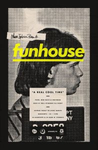
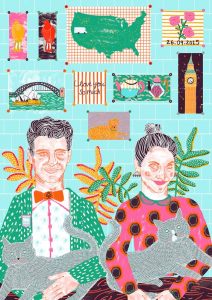
Something I found to be influential in the lectures was discovering and comparing techniques in other fields of Graphic arts such as Illustration. The pieces of illustration presented enabled me to pursue my illustration rotation in a confident manner. In particular, a task comparing a piece of graphic design with a piece of illustration. ‘Funhouse’ a graphics poster by Michael George Haddad uses a screen printed, black and white half tone effect of mugshots to advertise a DJ. Camilla Perkins illustration of ‘Kayleigh and Steve’ uses details in her illustration to build a visual story of the couple and to express their personalities. Looking into a piece of illustration enabled me to consider how to create a visual story through detail. For instance, adding detail to the background of the hotel kitchen to reveal my character was a butcher. Also, after looking deeper into screen printing, I pushed myself to screen print my final piece, giving it a gritty, underground aesthetic which is what I liked about Haddad’s piece. It also linked well with my story line being a comedic horror.

Left: Funhouse by Michael George Haddad, 2013.   Right: Kayleigh and Steve by Camilla Perkins, 2015.


Bibliography:

Wilk, C (2008). Modernism: Designing a New World : 1914-1939. England: V&A Publishing.

Task 11

Looking at my earlier works compared to my later works on my blog my critical analysis has developed as my project has continued, as my work has become more complex and my research has deepened I have been able to look more critically at what I’ve made. Furthermore, as we have continued to be given tasks my research skills have developed and my understanding of what the artist or author is trying to convey within their pieces or accounts. Within their accounts and piece catalogue and description I have been able to extract certain hidden themes and deeper meanings that I could weave into my work to further develop my own project. I feel that the blog has helped me to develop my own working style as I have isolated and been selective in which pieces I have focused on and used within my research and for certain projects. In a way certain tasks have proved to be very useful as they have instigated certain regions of research I myself would not have looked into unless prompted and they have lead me to artists and philosophies that I have found interesting on a personal level and have used to investigate my contemporary project that has allowed me to realise that certain sections have been dead ends and I have altered it to be relevant to what I’ve found in my research and my given tasks. Overall, the blog has allowed me to develop my critical analysis skills and also my depth of research skills and the ability to seek relevant material.

Task 9&10 – Ethical Issues

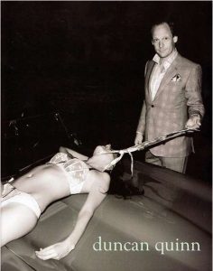
I have chosen the image of Duncan Quinn, whose advertisement caused controversy with the media. The photograph depicts a smug male character, pulling his tie which is wrapped around a dead female, lying on what is presumably his convertible car.

The male character wears a slick, expensive suit by Duncan Quinn, which makes his appearance seem powerful and professional. It is to be assumed that he has removed his tie from around his neck and used this to strangle and detain the woman. When researching the advertisement further, I came across a blog written by Deig. L. 2011, which discusses the concept that the tie is a phallic symbol. Considering this point stated in the blog, I agree that the tie represents phallic power and male dominance. The way the photograph has been taken presents the audience with the impression, that the man has been caught, possibly by Police, as the black background makes the dominant male stand out, as if a flashlight is highlighting his criminality. He seems to be pleased that he has been caught as, it shows the power he has over the innocent woman.

The woman in the advertisement lies lifeless on the bonnet of the car. She has been stripped of her innocence as she appears to have been raped. The woman is photographed in her white underwear, which is known to represent innocence, purity and virginity. The colour white represents cleanliest, which contradicts the blood stained car bonnet. As the female isn’t naked, it could be considered that the advertisement wanted to represent respectfulness rather than, a symbolism of sex.

The advertisers of Duncan Quinn have portrayed the idea their suits provide power and authority. However, this has had the adverse effect as, the advertisement has desensitised the idea of abusive relationships/rape and seems to promote abusive behaviour and sadomasochistic activity.

What effect did Malcolm Barnard want the advertisement to have? When the suit was originally designed, did designers want their suit to be an advert of abusive, indecent, sexual offences? A contradiction to this argument is stated in: “Fashion as Communication” by Malcolm Barnard. It states “the designer, the buyer, the wearer and the audience all contribute to creating and transforming the messages that are communicated by means of fashion and clothing”. In our society now, these images are seen more frequently. I wouldn’t be surprised, if the whole advertisement was created to shock viewers.

The recent trilogy “Fifty Shades of Grey” supports the advertisement as it presents both characters: the dominant, powerful male, and the innocent, pure female. Christian Grey is seen to be a dominant male, who wears expensive, fitted suits, very much like the gentleman in the photograph. Mr Grey seduces Miss Steele, who is transformed from an innocent virgin to a submissive. Like the advertisement, it could be said that Miss Steele was a victim of sexual assault. However, the contrast between the Fifty Shades of Grey dramas, and the advert is that Miss Steele consented to the S&M activities. In contrast, it appears that the woman in the advert has been killed. From the facial expressions of the gentleman, he seems pleased that he has murdered the woman.
Do we have to accept that this behaviour is occurring, whether it highlights a woman’s vulnerability and a male’s dominance?

Bibliography

  • James.E.L (2017) Fifty Shades of Grey. [Online website] Web address: http://www.eljamesauthor.com/books/fifty-shades-of-grey/
  • Winn. S. (2008) Trend Hunter. [Online website] Web address: https://www.trendhunter.com/trends/duncan-quinn-suit-ad-depicting-strangled-woman
  • Deig. L.(2011) Blog post – Suit Up [Blog post found online] https://ldeig.wordpress.com/2011/02/03/assignment-2-suit-up/
  • Barnard. M. (1996) Fashion as Communication London: Routledge.


Task 7&8 – Reflective Writing

I have decided to research further into Fashion as Communication by Malcolm Barnard. The section of the chapter I found most interesting was about etymology. Before reading this section, I was unaware that the word fashion originates from the Latin word, factio, which means making or doing.

The section goes on to discuss the change that has occurred over time, how “fashion was something that one did, unlike now, perhaps, when fashion is something that one wears”. It reflects on how society has changed over time, how fashion now symbolises the perception of an individuals’ personality, rather than the physical process of “making” fashion. An individual’s fashion statement gives an insight into how they are feeling and how they want to express themselves.

Fashion defines the individual and how they want to be perceived by others. The passage discusses that, by the way an individual dresses; their clothing certifies their allowance to be in a certain social group. “Fashion and clothing, that is, may be the most significant ways in which social relations between people are constructed, experienced and understood”. From this quote I have found from the text, it could be said, that fashion is used as a stepping-stone into a social group. Only, by the way in which, an individual dresses, can they be accepted into the social group they desire to be in. This forms our society, how people dress forms groups and different socialisations between individuals from all different backgrounds.

However, it could be argued that in our society today, people aren’t expressing themselves through clashing patterns, colours and trends. Instead, they dress themselves in a way to secure a place in the social group they want to be part of. Rather than communicating their emotions through clothing styles, nowadays, people copy others fashion, allowing themselves to secure their membership into their desired social group.

When reading further into this topic, I read a chapter from the book, “Fashion Brands”. (Tungate, 2012). He discusses how significant fashion is when dividing individuals into social groups. He quotes Vincent Peters, a fashion photographer, “You don’t buy clothes – you buy an identity”. I think this quote epitomizes my argument as in today’s society, in my opinion; fashion has lost its main meaning. Rather than expressing oneself creatively, through crazy, clashing colours and patterns or moving away from the “ideal” woman idea, individuals mirror others, to ensure that they do not embarrass themselves. Today, through so much social stigma and an increase in social media, fashion has become something that only certain, brave individuals wish to publicise and express themselves creatively. In conclusion therefore, I believe fashion has lost its original meaning as rather than creating statements in bold, wacky directions, fashion now is about imitating others to ensure that they are able to be part of a friendship/social group.

Bibliography

  • Barnard, M., 1996. Fashion as Communication. London: Routledge.
  • Tungate, M., 2012. Fashion Brands. London: Kogan Page Limited.


Task 3 // Image Analysis


In this painting, the main subject is the naked man apart from wearing glasses and he is smoking a hash pipe. He is sitting very relaxed on a white rich couch, with a dark wooden frame. As the composition of this piece is cropped, the rest of the sofa is cut out of the frame including the shirt which is hung on the sofa, on the right-hand side beside the man. The shirt has repeated prints of a white woman looking towards the naked man. This makes the piece complicate its racial and sexual politics further also broaden by its intentionally provoking title. The background has vibrant colours of Moroccan tiles. The rug below which is shown a little, on where the  man stretches his left leg, has a repetitive pattern similar to the tiles above. This makes the piece more framed as a border with the Moroccan Tiles. His brush strokes remind me of Bhupen Khakhar’s style of painting, of how the texture is smooth and the strokes are blended in well. What mainly appealed to me to analyse this piece is the tiles in the background, the patterns are repetitive with minimal colours. They caught my attention as they contrast against the sofa.

The title of this piece is “No Naked Niggahs”, this statement could be a rule at the time and it shows how representations of African American nudes have received, feared and censored. However, the title juxtapositions the painting as the man’s expression shows that he isn’t bothered about breaking the rule, sort of rebel on and breaking stereotypes. He is looking into to the audience as he may know that they might have a discomfort of looking at this piece. This could be a way of expressing pride of his colour. Having researched the artist, Hendrick often paints Black Americans against monochrome interpretations of urban north-eastern American backdrops. He wanted to express the unheard voices of Black Americans in the 60’s and 70’s.

http://www.tate.org.uk/art/artworks/hendricks-family-jules-nnn-no-naked-niggahs-l02979

https://theartstack.com/artist/barkley-l-hendricks/family-jules-nnn

Task 1 // Module Introduction

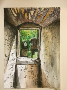
These are quick paintings of these castle ruins in Hohentwiel, Germany.  During the summer,  I went on a hike with my cousin to the castle ruins, I painted a few primary observations as I was walking along the trail. Both these paintings were completed around in 20 minutes. I vaguely and quickly sketched the shapes with grey watercolour and I then started to build up the painting with darker tones. I then used colour pencils to make areas darker and to speed up the process. I used fine liner to go around areas to make it bolder. If I had to do this again, I would probably not use colour pencils as it looks messier and should have taken a bigger size brush to speed the process. I would use these paintings as references if I were to paint it in a different medium such as acrylic to develop this piece further. Also, I would scan these paintings and use photoshop and merge them together and use the opacity tool. This would make the painting look like an illusion. I am pleased with the painting of the castle and the blue sky however, I am not satisfied with the  one I’m in the castle as it looks messier because of the colour pencils.

Task 5&6 – Visual Research: Reading Images

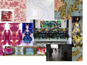
Moodboard of 10 visual research references which could have influenced the “Bedsit” collection by Timorous Beasties

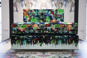
Bedsit Collection


I have decided to look at Timorous Beasties’ “Bedsit” collection.

The contemporary print makers studied together at Glasgow school of Art and some of their work depicts their student days whilst studying in Glasgow during the 1980’s.

It could be said therefore, that the designers were inspired by the Art and Craft Movement and, their art school experience. They create dramatic, contrasting prints which ooze with creativity through bold, bright, exciting combinations of colour. Their prints are filled with imagination, craziness and freedom, which is how art schools are perceived.

In the 1980’s, Glasgow was struck with poverty and their “bedsit” collection was inspired by their student accommodation and the general idea of grotty, dirty bedsits.

Their wallpaper print seems simple. From a distance, a single line of pattern runs around the paper however, only when you take a closer look, do you realise the single line is actually insects following each other. The designers wanted to change the “stereotyped” concept of bug-ridden, poor accommodation, to create a response from the audience that shows the prints to be beautiful and luxurious, whatever the subject matter. “That’s one of the things a designer should do out of duty, changing the way that people have preconceived ideas.” Paul Simmons, one half of the brand, wants viewers to change their thoughts, through producing prints which, from the surface, look bold and bright but underneath, have a personal response from the designers experience.

Alexander McQueen’s “Plato’s Atlantis” collection reminded me of the “bedsit” prints due to the bright, bold colours that seem to have a kaleidoscope based print. It could be said that both designers were inspired by what is perceived as ugly and dirty, but is actually beautiful. As McQueen said, ““I think there is beauty in everything. What ‘normal’ people perceive as ugly, I can usually see something of beauty in it”.

Bibliography

  • Anon., 2016. Arts and Crafts. [Online] Available at: www.vam.ac.uk/page/a/arts-and-crafts/ [Accessed 1 December 2017].
  • Anon., 2016. Timorous Beasties: The Devil in the Detail. [Online] Available at: www.vam.ac.uk/content/videos/t/video-timorous-beasties-the-devil-in-the-detail/ [Accessed 1 December 2017].
  • Anon., n.d. Chic Blotch wallpaper. [Online] Available at: www.timorousbeasties.com/shop/wallcoverings/61/chic-blotch-wallpaper/ [Accessed 1 December 2017].
  • Anon., n.d. Movement and Shape | Nyasha Matonhodze by SĂžlve SundsbĂž for Vogue Japan November 2011. [Online] Available at: https://noirfacade.livejournal.com/1013172.html [Accessed 1 December 2017].
  • Art, P. S. o., 2016. Plymouth School of Art Calender. [Online] Available at: https://www.plymouthart.ac.uk/latest/calendar/timorous-beasties-exhibition [Accessed 1 December 2017].
  • Auguste, C., n.d. [Online] Available at: http://www.meublepeint.com/toile-de-jouy.htm [Accessed 1 December 2017].
  • FAFA, 2010. Alexander McQueen Tribute: Top 10 Fashion Moments. [Online] Available at: http://www.tonguechic.com/style-snaps/alexander-mcqueen-tribute-gallery-and-video/ [Accessed 1 December 2017].
  • Gilbert, J., 2016. Raymond Depardon’s stunning photos of 1980s Glasgow to feature in city exhibition. [Online] Available at: http://www.glasgowlive.co.uk/news/glasgow-news/raymond-depardons-stunning-photos-1980s-11318306 [Accessed 1 December 2017].
  • Jeffries, S., 2007. The Writhing On The Wall. [Online] Available at: https://www.theguardian.com/artanddesign/2007/feb/08/design.britishidentity [Accessed 1 December 2017].
  • Packer, S., 2016. In Pictures: Tactile textiles, bugs and bedsits, Timorous Beasties take over The Gallery. [Online] Available at: https://www.plymouthart.ac.uk/latest/blog/in-pictures-tactile-textiles-bugs-and-bedsits-timorous-beasties-take-over-t [Accessed 1 December 2017].
  • Pain, A., 2016. Explosive and Alluringly Beautiful – ‘Bedsit’ by Timorous Beasties at the PCA Gallery, Plymouth. [Online] Available at: https://costumecritiques.blogspot.co.uk/2016/03/explosive-and-alluringly-beautiful.html [Accessed 1 December 2017].
  • Treggiden, K., 2014. [Online] Available at: https://www.we-heart.com/2014/02/25/timorous-beasties-interview/ [Accessed 1 December 2017].
  • unknown, 2016. Artist’s Statement: Timorous Beasties’ Alistair McAuley on creating a Bedsit in a gallery. [Online] Available at: http://www.culture24.org.uk/art/architecture-and-design/art548904-timorous-beasties-art-alistair-mcauley-plymouth  [Accessed 1 December 2017].


Task 10

  • layered
  • coloured
  • textured
  • bold
  • small-scaled
  • subtle
  • vibrant
  • distorted
  • obscured
  • abstracted

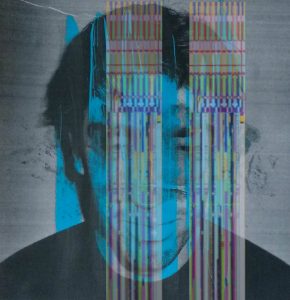
I chose this particular picture because it is a perfect example of my work as a whole, as I have been combining abstract painting and photography. I have chosen these ten words because these are most suitable to describe the picture and the emotional response I have to the piece and other aspects of my work.
I have chosen the word ‘layered’ as I tend to enjoy experimenting with depth using colour, creating layers upon a flat image. I also have been experimenting using different mediums in one image. For example, this image was once just a photo to which I then painted some thick yellow lines down the face in order to hide any emotion. I then photocopied it and made it black and white with blue stripes, I then re-uploaded the image onto my laptop and placed some work by Liu Wei upon the top.
Colour is very important in my work, particularly vibrant colours. I like to see the effects that the same images but of different colours have on the audience. I find it interesting how the difference in colour effects how the viewer perceives the image or what they think the meaning behind it could be.
Furthermore, I have been looking into textures and how different materials effect the image, although this isn’t the case with this image. In other aspects of my work I have been using materials such as cling film and tissue paper to cover the face and distort it. I often photocopy the piece which leaves an image to which can be quite uncomfortable to look at, because it looks as though its more than just a flat surface. Creates an illusion of texture.

Research & Communication Skills Task 11&12

Through completing the Research and Communication Skills tasks, I have become more knowledgeable in the academic realms of fashion and design. There were some tasks in the module which I found notably more difficult to write yet these in the end rewarded me with knowledge and a newfound understanding. Particularly tasks 7 and 8 as the text which we were to analyse was written in a style less natural to me. It was helpful to study the text with another person, also use a dictionary to allow me to understand new vocabulary and later respond accordingly.

The most interesting study for me was task 10, learning about ethics, because it was here I realised the affects of advertising on society. For example, the violent ideas conveyed by the Duncan Quinn advert can negatively influence younger generations as well as cause women and men to feel disgusted and demoralized. Knowing this, I am more aware of advertising, paying attention to the message the advert is trying to convey and thinking about the ways this is done. Tasks 1 and 2 felt simple for me to complete and I learnt to select a range of sources related to my study without using the internet. I found this rewarding as a woman who is part of a ‘digital generation’ and although library research seemed like a chore, it sparked creativity and enticed me to explore a variety of interesting books I wouldn’t have otherwise.

A difficulty I had during this module was concerning constructing essays, expressing my thoughts and ideas in a text format was a challenge. Editing my work was necessary and occasionally I would ask someone to proofread my work to check readability and clarity. I have learnt throughout the module some personal skills in writing by noticing how I could improve my written communication.

In task 5, I was required to arrange a mood board of inspirations related to a chosen designer. I found this challenging due to the lack of specific information available on designers websites and instead resorted to finding generalised images on themes mentioned in interviews with the designers (such as ‘moth wings’ inspiring Rodarte’s collection which I found an internet image for). This task was helpful in my understanding of the creative processes of designers and encouraged me to take inspiration from a variety of sources (films, books, poems, music, environments etc) and combine these to form a style and concept unique to me. Learning about the conflict between designers and artists was useful to me as a young designer, I now have an underpinned knowledge of how history has formed the status of fashion as well as the hidden psychology and cultural importance of clothing. This has shaped my new-forming identity because I understand how the work I produce will contribute to the fashion world; whether it be an artistic garment or a functional everyday outfit.

To conclude, I have found the module a key factor in my growing knowledge of fashion. To get the best out of this module with short contact time, I was independent and made use of resources; however in future with a better understanding of time management, I would be sure to set aside more time for the tasks around my practical projects as I struggled to complete work to my highest standard in the time I allowed.