The passage titled ETYMOLOGY in FASHION AS COMMUNICATION, CHAPTER 1 pulls apart the many definitions and interpretations of the words to describe ‘fashion’. They assess the range of definitions of fashion from the past up until modern western society. I feel the author gives this insight as means to reflect upon the concept of “fashion” in a more cautious and considered context.
They write the sentence “encourage people to believe that these words are somehow more synonymous than they really are” however in some way I believe these words are in fact more alike than not. For example: ‘style’ can be used to both style one’s hair or produce a style as a result as touched upon in the passage. In my opinion, both illustrate the idea of the creation of something decorative and imperative for appearance. I do however agree with the following statement:” the impossibility of, trying to provide a final or rigid definition of the meanings of any of these words” expressed in the sub-paragraph FASHION, STYLE, CLOTHING, DRESS. The concept of fashion is such a broad one, there are so many areas it may cover which is why I think it is so fought over. Fashion can cause endless outcomes even if they are unbeknownst to most.
FASHON AND ANTI-FASHION talks about the desire to fit in with wider society but still maintain a degree of individuality. I performed some research into the subculture of ‘Punks’ in 1976, this style or fashion was designed to provoke, or turn fashion against the norm of the wider society by wearing non-conformist or atypical items such as bondage wear or household objects such as paper clips, however by doing this somehow created this microcosm of culture to become a macrocosm in the mainstream of England thus rendering the initial purpose obsolete. “And still people find solidarity, revolt, and individuality by inhabiting a shared costume marking their membership in a subculture.” (Clark, Dylan. 2003. “The Death and Life of Punk, The Last Subculture,” pp. 223-36, In David Muggleton and Rupert Weinzierl (eds.), The Post-Subcultures Reader. Oxford: Berg.) I find this quote very important in making an example of the general idea of what this passage is trying to tell us about fashion. How people want to fit in as a whole whilst not becoming lost in a sea of clones, still remaining special to a degree.
As a personal response to this entire chapter I would say that it has given me wider angles to look at when analysing fashion, be it garments, creation or concepts. The writer has taken some elements that may even be slightly controversial, or people may take offence to and admitted as such which makes me value the integrity of this chapter more so even when I know not everyone can agree with everything including myself. In reading this chapter I have come to conclude that etymology can be argued over but actually everything can change based on society, nothing to do with fashion as a whole is stable.
Category Archives: Uncategorized
summary task
During this semester we’ve been given 6 complete essays to write. Although I am unsure of how I’ve done or if my writing is successful, I have found that throughout this experience I have developed many new approaches to my writing I had not before explored.
Written tasks have never been my strong suit so the separation of each paper into weeks at a time really helped manage my work. It kept my time management in check so that the stress of the task didn’t build up on me. Admittedly I left the ‘reflective writing’ too long as it was the most daunting task to perform as said by many of the class and the lecturer. This was a poor decision of mine as it then made the next task slightly more rushed.
When writing the paper on ‘ethics’ I found coming up with ideas was a lot easier. In the lecture everything was very interactive and therefore as a class we shared opinions, and this inspired some of my work. I found it easier to find things to say as the photo we used in regard to the topic as it was very bluntly questionable. When I saw a bit more passion towards the subject the whole experience was less taxing and took a lot less time to write. It also came to my attention that when a topic is so controversial you will find a number of papers from activists or researchers who want to stop or reduce the stigma perceived in society. This also then made it relatively easier to find academic quotes and also quotes from regular people too. In result of this I plan to, whenever I am in need of breaking down an image, choose something topical and relevant to really stimulate myself.
The problem I found with finding sources was that I mainly searched the internet but it is very hard to tell sometimes If a source is reliable to quote of if the ideas are entirely the writers. Surprisingly the library became an easier source than I thought based on how specialised to our subjects it is.
I found learning to Harvard reference in the academic integrity essay exceptionally helpful as with everything I write I can now give appropriate credit to areas where it is due. This will definitely be a skill I will take forward to me and that has already been proved through the use of it in further essays. Also posting my personal work onto a shared blog made me think with more consideration as I was putting it out there for everyone to see and judge and I personally find this kind of pressure helpful.
Looking back at this entire process it is clear to see that I have developed my understanding but also identified some weaknesses in myself that I need to work on and now I may do so and continue to improve my work. I look forward to one day using these skills professionally.
7/8 Reflective Writing: Fashion as Communication
In Fashion as Communication, Malcolm Barnard challenges and explores the complex meaning of “fashion” and the many different interpretations around the world. Challenging social structures, tradition and psychological factors that dictate the direction of “fashion” trends.
What I found most interesting was the summarisation of both “fashion” and “anti-fashion”. Barnard stated that fashion predominantly existed in first world countries where hierarchal structures existed to climb, where personal style becomes communal style and everyone longs to belong. He also stated that the only people that truly embraced “fashion” were the ones that wanted to achieve social status and climb from their current step on the social ladder. “Anti-fashion” was then said to either subsist in primitive societies, religion or in communities where there wasn’t a step higher to climb; where things were accepted as they are and had no incentive to change. Fashion was regarded as a purely egocentric and tainted industry, as opposed to the liberating and personal practice I believe it to be. Another point I found fascinating was the double standards he spoke of in the fashion industry, regarding gender equality and the arts superiority to fashion; a point I whole heartedly believe to be true.
Malcolm Barnard failed to acknowledge the French. In a country where men and women dress for practicality and timeless elegance as opposed to ulterior motives and social climbing tendencies. Rich or poor, you see Parisians in simplistic clothing that pride quality over quantity. While the rest of the Western world use their wardrobe as a platform to reach higher places, the French get dressed to make the climb to the top more comfortable. Men and women alike have the freedom and confidence to wear what makes them comfortable, they aren’t restricted by words like “feminine” and “masculine” (the words that should really be studied), they merely choose pieces they like and wear what makes them feel content and relaxed. As said in Chanel’s fashion memoir: “simplicity will undoubtedly be the last word in luxury”.
I think what they, and the many followers of French fashion possess is a heightened appreciation of individuality. English designer Bella Freud put it perfectly in her interview with ‘The New Garconne’ saying ‘All my interest in fashion is in identity’. I think its pointless to stereotype and restrict this incredibly freeing term embraced world wide. I don’t think “fashion” is something that can be studied and result in a definitive answer; I think the reason its such a bewitching industry is its meaning is endless and personal. In regards to art surpassing “fashion”, I think its a continuation of chauvinistic white male domination of previous decades. Personally I believe “fashion” is the more practical approach to art, what makes art better than being able to whip it up into a design that will keep you warm and protect your modesty.
Batliwalla, N.B (2016) The New Garconne. London: Laurence King
Baudot, F.B (1958) Fashion Memoir Chanel. London: Thames and Hudson.
R.C.S. SUMMARY
There were a variety of different tasks set as part of the R.C.S. module. All of which I found to enhance my thought processes for the course as a whole as well a teaching important academic points. Skills such as analysis, comparison and researching were all learnt.
The research element was possibly the most important and valuable. Learning to use online resources along side the library. To have to find relating sources as well as conflicting sources was a great skill to be introduced to. This skill can be transferred for use when researching for a fashion design project. All sorts of sources can be found that build on your initial idea. The Visual Research task made me realise that designers with true integrity use a huge, varying portfolio of sources. Analysis of these sources was also a good skill to exercise. Going deeper into an image than just the initial glance.
The Ethics Task also required this level of thinking about an image. It means you get so much more out of an image than you first realise. The other side of the Ethics task was interesting as well. As designers we have a responsibility in the industry and to really think about ethics was essential. There are many different elements and god debate to be had about a lot of aspects of ethics.
The writing side of all of these tasks required a certain level of thinking and made a difference to the largely very creative side of the course. The Reflective Task in particular required a bit of brain work. It was good to try and write with a certain level of academic input as well as read fully academic text. I enjoyed doing this at secondary school in subjects such as history and politics and it was good to exercise it again. The philosophy and history in the text we were set for the Reflective Task was a good basis to think about the subject of fashion as a whole. Having to think about the bigger picture makes for a better designer.
What was a bit of a struggle was the academic integrity, I understand the need for it – plagiarism is a very serious subject. Putting the explanations of this subject area was difficult, I also feel I have covered this area rather too much in the past.
All in all the different elements of this module covered a good spectrum of thinking. The research and getting into the habit of collecting references I feel will be the most beneficial for enhancing my other modules which are more creative. Finally the module has made me think about the fashion industry as a whole more and in a broader and more in depth way.
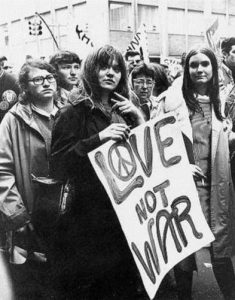 Underground culture also better know as counterculture is an anti-establishment phenomenon in the 1960s that developed in the UK then spread through the western world. From the Beatles to twiggy and everything in between, underground culture was everywhere.
Hippies are one of the first things that come to mind what I think of the 1960 – 1970, however, it was not just about the flower power fashion that made them so iconic they were one of the most distinctive features of the decade.
The hippies made up no political subgroup of a large group known as the counterculture, however, it did not include just the hippie’s several groups criticised the development in American society. Groups such as New Left convinced the government didn’t consider or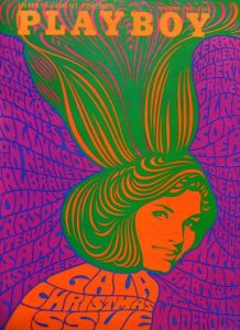 dinary people, African Americans, The Anti-Vietnam war movement, equal rights, civil rights and also the women’s rights movement.
The hippies are the third broad group of the dissenter to mainstream American values, like New Left, hippies were critical of the society that their parents accepted. Politics they were the game played by conventional adults the hippies wanted no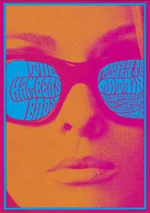 part of election lobby protest and other common ways to bring social change, however, hippies wanted a new society based on peace love and pleasure.
In the sixties and the underground culture, drugs played a part in the art movement and in the hippie community, the drugs used among hippies was a controversial part of their lifestyle, many insistence’s it was an essential part of rejecting the establishment. LSD the most well-known drug of the era was available legal until 1966. Leary, a profession from Harvard, experience of taking LSD was “incredible acceleration and intensification of all sense and all mental processes” this translated into the art world and in a style called psychedelic art. Psychedelic art is an art or visual display inspired by the psychedelic experience and hallucinations known to follow the intake of LSD.
The art movement made an impact in the sixties it was used within different art forms and its bright graphics shapes made it stand out as one of the most colourful eras in history despite what was going on within the world.
information:
http://ic.galegroup.com/ic/uhic/ReferenceDetailsPage/ReferenceDetailsWindow?failOverType=&query=&prodId=UHIC&windowstate=normal&contentModules=&display-query=&mode=view&displayGroupName=Reference&limiter=&currPage=&disableHighlighting=true&displayGroups=&sortBy=&search_within_results=&p=UHIC:WHIC&action=e&catId=&activityType=&scanId=&documentId=GALE%7CCX3441300020&source=Bookmark&u=j071909004&jsid=70771243f9f31aa0ce39bf5531cc7b7a
images :
http://jpdubs.hautetfort.com/archive/2010/08/01/l-epoque-psyche-pop-60-s-70-s.html
http://www.comicsreporter.com/index.php/briefings/commentary/4440/
Task 9/10: Ethical Issues
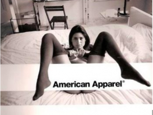
One of the most controversial brands of the 21st century, American Apparel originated as a wholesale supplier. It became synonymous with high quality cotton t-shirts and favoured by merchandise printing companies. Soon moving on to becoming one of the largest retailers specialising in preppy American basics, with over 250 stores in 2010.
Responsible for creating and printing their infamous campaigns, American Apparel faced massive criticism for their sexually charged advertisements. While they continuously boast about their ‘Made in USA’ and sweatshop free production, they seem unbothered by the fetishisation of young girls. Continuously romanticising sexual objectification and degrading girls for attention. The lack of airbrushing doesn’t compensate for their psychological scarring on young girls. While sexual liberation is beautiful and should be respected, it shouldn’t be morphed to fit the male fantasy; it should be personal and selfish.
The photograph in mention contains a young woman laid on a neatly made bed in a sparsely decorated room that appears uninhabited and cold. Based on AA’s advertising campaigns, I think this is constructed to resemble the ‘classic bachelor pad’, the girl representing an innocent and willing guest. Wearing nothing but nylon tights slipped down to her knees with her legs in the air. She’s pulling her tights towards her body instead of off her body, as if out of urgency or non-committal convenience. The most disturbing part of this image is that she’s pictured with a completely emotionless expression, as if powerless and trapped. The photograph is predominantly white, the colour of virginal purity, further advocated by the age of the girl; yet her dark features and black stockings reveals a more seductive layer. It’s taken from above, giving the illusion of domination and superiority. The bottom of her breasts and buttocks are in direct eye line down the centre of the image, cleverly placed hands and a bold white logo cover the bare minimum, just enough to be marketable.
While I believe the brands identity was influenced by the style of the 90’s supermodel where child like qualities were favoured: doe-eyed, shapeless, skinny girls with innocent expressions (who were made to model in the nude, in their seemingly pre-pubescent bodies). I think the desire was to capture what the majority of generations wish they still had: youth. While the intention may have been harmless enough, the standardisation and insensitivity of pedophellia and sexual exploitation is unforgivable.
I sometimes imagine American Apparel had Vladimir Nabokov’s ‘Lolita’ (1962) playing continually in the back ground as they brainstormed their advertising campaigns. At the time of this campaign the company solely stocked woman’s clothing, and it disgusts me that they used their massive influence to broadcast this image of a powerless and desperate girl with no other want than to be objectified. Strong and independent is just as sexy, it just puts the power in the woman’s hands. The fetishisation of young girls, or boys, is something that cannot be allowed. We have a moral obligation to protect and defend whats right and wrong, especially when it compromises the safety and happiness of future generations.
Task 5 // Single Exhibit in Flesh
Recently, I visited the Royal Academy of Arts to see the Jasper Johns Exhibition called ‘Something Resembling Truth’. He explores the complex transformations of objects and images throughout his work.
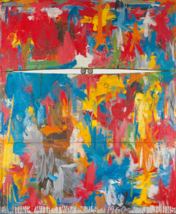
The piece I found very interesting is called ‘Painting with Two balls’ completed in 1960. Johns’s use of brushstrokes and colour creates a chaotic landscape with confused emotions. The white stencilling of the letters against the vivid background enhances an bold impact. He has painted it on three separate panels with two wooden balls forced into a darkened slit between the top two panels. By creating a gap in the painted surface, he wants to create a world of painting allowing the viewers to leap through the canvas. I feel after seeing this painting in flesh, it changes my perspective of the way of thinking on painting, it made me think of creating and incorporating different elements into my work. I realised to create a painting beyond what it is suppose to be. There is a great value in witnessing this piece in flesh as I was able to understand the layers of meaning through visually and verbally. Initially, I didn’t understand why he incorporated two balls but I had an audio guide along the exhibition. I then had understood on why he named and used two balls because it was an anatomical reference within the work itself reflected on his personal concerns. He is a gay and reserved man, he had a little respect for the overtly masculine displays. He was painting his feelings in abstract form.
The whole atmosphere makes it very thrilling and intriguing as there were more of his paintings around the rooms, they represent the styles he explored in his years. I was allowed to walk around the room understanding why he was working on this theme at the time.
Summary of what I have learnt and experienced
During this semester the research and communication skills course has educated me on how art and design has changed and progressed through time as a result of various artistic movements. Lectures by Steve Sanderson have informed me of how culture and society affect the style and approach of artists and designers from different artistic periods, from Avant Garde to Post-modernism and contemporary practices. This has helped me to think about what impacts contemporary culture and society can have on current designers as well as my own work.
I found the lectures on modernism and postmodernism particularly interesting, seeing how design and type has changed between the two art periods is fascinating. I enjoyed learning and seeing how typography changed from the clean, ordered and Swiss style to a more complex and deconstructed style. The task I found most interesting was the most recent task about published images because I got to look at and explore the works of artists I hadn’t come across before. I love discovering new artists and designers whose work inspires me with my own practice and through last weeks task I was able to find three designers Cécile + Roger, Bradbury Thompson and Barbara Dziadosz whose works are I think are visually aesthetic and beautiful graphic designs.
A designer from the post modern period, Rosmarie Tissi, who I came across when completing the week 6 task, has been an influential reference for me. Her playful use of letterforms is what I like most about her work and is what has inspired me to try and be more playful and creative with the way I use type and letterforms. Composition plays a key role in her work and is an element of my work that is also greatly significant. The works of designers like Rosmarie Tissi help me inform me of what is important in design and it also helps me to determine what is significant in my own work. It allows me to think carefully about what I am trying to convey and what the most successful way of conveying that might be.
The weekly tasks have also helped me establish and confirm the pathway I want to study which is Graphic Design. I have found particularly during the more recent tasks I am drawn to images with a strong typographic influence like posters, confirming my interest to pursue Graphic Design as a specialist pathway in my degree and also a further career. Through these tasks I have also learnt that all elements of graphic arts are involved no matter what pathway you choose to take. Many of the practitioners I chose to look at combined multiple elements of graphic arts in their work, for example Bradbury Thompson combined photography with graphic design in many of his works, and I aim to also use elements from other areas of graphic arts in the work I do on the graphic design pathway and also in the work I will do as a graphic designer.
Task 4 // Exhibition Review
During the summer, I visited the Sammlung Rosengart Collection in Luzern, Switzerland. The collection holds more than 300 works by different artists, it was assembled by a Swiss Art dealer called Siegried Rosengart and his daughter, AngeIa, who followed her father’s business. They have collected majority of Pablo Piccasso’s and Paul Klee’s, which makes the museum’s main strengths. They have 32 of Picasso’s paintings, mainly of his later years and also, up to nearly 100 drawings, watercolour prints and sculptural works. His later work often combines elements of his earlier styles.
It was really inspiring looking at pieces from diverse artists that explored various different styles. There was Kandisky’s abstract works, Seurat’s pointillism, Matisse’s Fauvism and Post-Impressionism and many more. Upstairs, there was room filled of photographs of how Picasso was working in the studios. I was able look into the world he works around in.
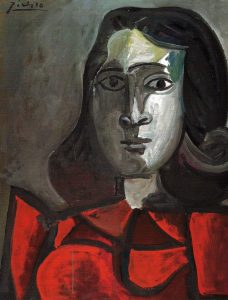
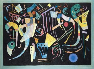
One of my favourite paintings by Piccasso’s was a portrait of Dora Maar, 1943. It reminded me of ‘Weeping Woman’ at the Tate Modern when I visited it a few years ago. Although, the colour schemes are different but the emotion I saw was similar. The sadness in both paintings were thought provoking the feeling towards me. Majority of his paintings were portraits of women, I was so curious on why and found that he was known for his intense personality, he had a complex series of overlapping wives and lovers during his lifetime. He continued to produce art and love women with undiminished force until his death in 1973 at 91. Also, another favourite of mine was Kandinsky’s Moody Forms, 1936, his lines were so playful and floating against the dark background. It reminded of music playing and sound.
After seeing “Weeping Women” in flesh, I was so amused and intrigued on how cubism works. I wanted to see more of his cubist paintings so I was interested to visit the Rosengart. The use of colour is something different, he uses block colours to represent the figures and shapes. Looking up closely, I noticed he uses various different tones from that one colour and blends it really well. This exhibition left me with wanting paint more and explore different styles of art.
Task 9/10 – Ethics
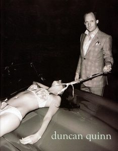
Duncan Quinn, (2008), Advert [ONLINE]. Available at: https://www.trendhunter.com/trends/duncan-quinn-suit-ad-depicting-strangled-woman [Accessed 4 December 2017].
Investigating him as an individual I found that Dunncan Quin is portrayed as no different from the man in the photograph even in the ‘About’ section in his own website ‘He’s also been known to throw the occasional party, indulge in the odd cheeky lunch, drive too fast and enjoy life just a little too much in the company of his friends’ this suggest he’s a stereotypical ‘womaniser’ that shares the same male chauvinistic views as portrayed through his advert.
The advertisement shows the disturbing image of a young attractive woman, in nothing more than her underwear, being dragged, by a tie around her neck, across a car bonnet, as if she were no more than a sex object, by a well-dressed man in a suit. The expensive looking suit and pocket square handkerchief suggest he’s a wealthy man and the sports car gives the notion that he’s accustomed to an exciting and expensive life style. The man’s blatant eye contact with the camera suggests he’s proud of what he has done, and he has no problem with the act of dehumanizing women as no more than an object of his amusement and sexual arousal. ‘no we are not merely lifeless mannequins that can be fucked or positioned however you please’ states Namata Sherinah from her article on ‘The Sexual Objectification of Women in Fashion Media: A Contemporary Cultural Perspective’.
As you can see in this photo the woman’s face is hidden and out of view so as to give her no identity or power and the almost lifeless stance as the tie is pulled taught around her neck almost suggests that she has no will of her own and is being completely dominated by the male figure pulling her towards him. This antiquated and stereotypical portrayal of male dominance over obedient women is old-fashioned and should play no part in today’s society. Any attempt at its reprisal – such as advertising campaigns like this – should be squashed instantaneously.
However, with quotes like ‘Sexy is fashion. If it is not arousing and sexual, it’s off vogue.’ doesn’t help the feminist cause. This quote suggests that to gain the public’s attention and to sell magazines women need to be seen showing some skin or be in a sexual pose as like in this advert.
Whilst many may agree with this statement I believe that the very fact that there’s an uproar every time the fashion industry is seen dehumanizing women proves that society doesn’t agree or support this notion and our society, whilst celebrating the differences between men & women, still strives to achieve a more balanced and ethical approach to gender equality.
Bibliography:
Sherinah, N, ‘The Sexual Objectification of Women in Fashion Media: A Contemporary Cultural Perspective’, Available from: http://www.kas.de/wf/doc/kas_21095-1442-2-30.pdf?161206174939
http://duncanquinn.com/

