Category Archives: Uncategorized
Task Twelve: Scale and Ambition
In one of the drawing workshops I created a sculpture which was about 50cm high and wide using two old, used wooden frames and connected and stabilised them using yarn in an upright triangular position (to resemble the roof of a house).
If I were to change its scale I would make it much larger- 8ft by 8ft or bigger. I feel this would emphasise the feeling of unease created by the juxtaposition of the solid, heavy wooden frames and the delicacy of the yarn keeping it all together and upright. I would of course screw the wood together to make sure it is safe- but cover the screws with the yarn. I would also possibly put wire in the yarn to make it stronger (but keep it hidden to keep the idea of fragility and instability).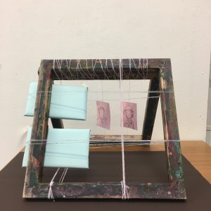
I would also take away the blue blocks, the blue horizontal yarn (as that was only put in place to keep the blocks upright) and the two hanging drawings as I feel they would take away from the importance of the materiality and the structure of the sculpture and the tension between the two mediums would be lost through the distraction of the drawings and the clutter of the other shapes within the frames.
I feel if this sculpture was created on a much larger scale and people were then able to walk underneath and around it, it would be quite intimidating and also interesting to see how people interact with the piece- if the feeling of unease and doubt of its stability is created as intended.
Task 12
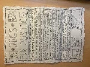
The work I would chose to increase the scale of would be my own manifesto piece. I would’ve loved to increase the scale as when we were installing our pieces for the manifesto exhibition I realised how much space we had to work with. Looking at my piece in amongst the space I realised how lost it looked, I would make the piece larger not only to have presence in the scale of the room but also because whilst doing my research for the piece I found many more facts or messages I would have included within the piece. I would expand the depth of what would be included in my piece including areas of the transgender community and make the piece deeper in content and more detailed in decoration to make it look more significant and official.
R.C.S. Ethical Issues
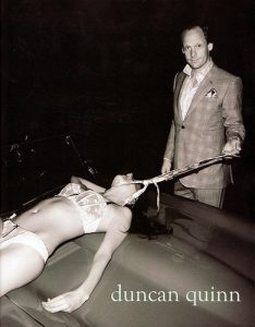
The setting for this advert appears to be outside with a luxury car. The male in it is fully dressed in a smart tweed suit, as though he could be outside a drinks party or restaurant. His appearance also suggests he is a respectable, upstanding man – perhaps someone with a high powered job. The women however is only in her underwear and being pulled across the bonnet of the car. The difference in the fact he is dress and she isn’t already indicates a difference in respectability or maybe even social standing.
This firstly flags up the ethical issue of social class differences and the fact the image appears to be supporting this.
The body language also hints towards this. He is standing over her and almost throttling her with his tie. An ethical issue as well because of the on going issues of domestic abuse from domineering men. You cannot tell from this image her facial expression as well as where this is her choice or not. Obviously some people like this sort of ‘role play’ but wether there is enjoyment or not in this image it is impossible to tell. So it begs the question why is it used? What other message is the mage trying to put across to the public?
The use of that look like a luxury car also plays a part. It had to the feeling of the man being strong and powerful and the women one of his play things – like the car.
Domestic violence, sexual violence, social standing are all ethical issues that need to be taken into account when looking at this image. Of course it is just a harmless image in the fact the women isn’t actually being throttled. But what message could it be suggesting to the public as a whole. It seems to be normalising dominance of women and quite possibly in a sexual manner. A study of ‘Sexual violence in the Media’ “suggests that certain cultural factors (including mass media) and individual variables interact to affect some people’s thought patterns and other responses that may lead to antisocial behaviour, including aggression” (Malamuth, N. M. and Briere, J. (1986). This article certainly seems to suggest that constant exposure to sexual violence in the media may actually be being repeated in the actions of real people.
Although this is just an advert, the ethical issues behind it are quite severe. The need to have this composition in an advert is unclear. There are a million other ways to promote a brand. What is clear is the possible harmful message it is conveying – the normalisation of male domination and sexual violence.
Malamuth, N. M. and Briere, J. (1986), Sexual Violence in the Media: Indirect Effects on Aggression Against Women. Journal of Social Issues, 42: 75–92. doi:10.1111/j.1540-4560.1986.tb00243.x
Authenticity and modernism today
Authenticity is something of a hot-button issue for the creative world. For many creative enterprising individuals, the work they endeavour to put out into the world is what sustains them financially, so attempts to appropriate another’s art for the purpose of personal gain are widely reviled. If something is authentic it is simply not fake or fraudulent but now thanks to the internet, art is more visible to all than ever so it’s difficult to pass existing artwork or designs off as authentic without being called into question by the community.
The more divisive counterpart to authenticity is originality. I believe the debate over what constitutes harmless inspiration or unfair appropriation is what remains more pervasive and significant in my time. This can lead to the question ‘is it possible to be truly authentic?’ or original for that matter. As designers we actively seek historical and contemporary sources of inspiration through research in order to learn to be design more effectively and create more interesting things. One can decide whether or not they want to borrow any kind of idea from past work they’ve seen and alter it enough to make it their own new thing. What is not decided is how knowledge attained and visuals experienced influences our ideas without us even knowing. True authenticity must be consciously strived for as it was by many modernist artists in the 20th century through the rejection of strict normality. Even today there are still boundaries to push and conventions to test and modernism remains a school of thought that artists can subscribe to in order to strive for authenticity.
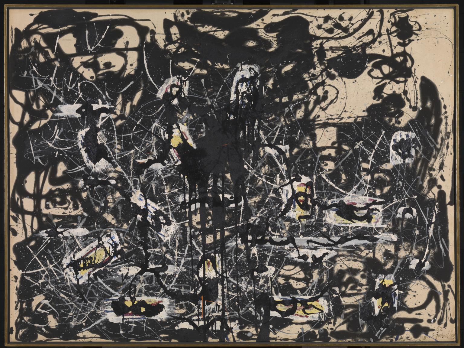
Yellow Islands 1952 Jackson Pollock 1912-1956 Presented by the Friends of the Tate Gallery (purchased out of funds provided by Mr and Mrs H.J. Heinz II and H.J. Heinz Co. Ltd) 1961 http://www.tate.org.uk/art/work/T00436
Task 9/10 – Ethics
The image I have chosen to discuss is an advertisement released in 2008 by the menswear brand ‘Duncan Quinn’. The image shows a smartly dressed male (wearing a Duncan Quinn suit) dragging a woman in lingerie across a car bonnet by a Duncan Quinn tie fastened around her neck.
There are many ethical issues surrounding this advertisement. Firstly and most obviously is the issue of sexual objectification of the woman in the photograph. She is strategically placed in the foreground of the image so that her near naked body is the first thing that the viewer sees. This has most likely been composed like this so that it catches the eye of the male viewer and potential client but although effective, it is an unusual technique considering the product being advertised (the Duncan Quinn suit) is the second thing that the viewer sees.
It is concerning that the viewer cannot see the woman’s face which instantly strips her of any identity or individuality, whilst in contrast to this, the dominating male in the image stares directly into the camera with what could be read as a slight smirk on his face, almost as if he is proud of his ‘possession’. There is certainly a sense with this image that woman’s body’s are there to be a subject of admiration and desire for men and that a woman’s purpose in life is to satisfy the requirements of men. The novelist and art critic John Berger incapsulates this when he spoke in the second episode in the BBC TV series ‘Ways of Seeing’ –
“She has to survey everything she is and everything she does, because how she appears to others – and particularly how she appears to men – is of crucial importance for what is normally thought of as the success of her life.”
Another issue to address is the fact that this image has been released by a high fashion brand which is well respected in society, meaning that the treatment of women depicted in the advertisement is more likely to be viewed as acceptable behaviour. This position in society along with the artistic photography almost makes the abuse and violence shown appear glamorous or stylish. The overall impression given is that if the male customer chooses to wear the Duncan Quinn brand then they will look so good in their suits that they will attract the attention of beautiful woman (like the one in the photograph) who will be submissive towards them and allow them to abuse them.
Summary
Throughout this 10 week Research and Commination Skills brief, I have learnt multiple skills, improved my critical thinking, strengthened my research and referencing ability and widened my knowledge of art movements and artists. I have learnt much more about art history and how society, politics and culture can affect whole art movements and brand new styles of working through acting against the ‘norms’ of that culture. Towards the end of the 10 week module I understood the connection between Research and Communication Skills and studio practice, learning the history of the art movements is influential and teaches you to think in different ways and allow your social, cultural or political surroundings to inspire your work for the majority.
These lectures and further research on the topics have led me to realise and understand the importance of art movements and how strongly art and design can impact social and political decisions. I will use this point of keeping up with contemporary issues to further impact my future work. I was also thoroughly entertained by the ‘Abstract’ Netflix series we watched after the last 3 lectures; this really helped me to understand how different artists work and what influences and inspires them to do so. It was fascinating seeing what a day to day life for an artist involves and this helped me to further research artists and answer the relevant weeks task by using quotes from the Abstract series revolving around a specific designer.
Personally, I really enjoyed the lectures about postmodernism and publishing images and found these most interesting. I particularly enjoyed learning and researching about postmodernism because it allowed artists to be freed from the ‘norms’ of that culture and design what they liked. Like stage designer Es Devlin said “design should show, reveal and deconstruct”, I feel like this quote fits perfectly into the postmodernism movement.
One of my favourite artists when researching postmodernism was Jamel Shabazz, a photographer who documents and captures various aspects of life in New York city. He photographs the Urban areas to show perspective. I found this really inspiring as his photos prove that even urban life is cultured and beautiful. By going into the unknown you capture difference and this was a big deal within the postmodernism art movement. ‘His work is testament to the beauty that can be found in the places considered least likely to provide it’.
Overall, by completing this module it has allowed me to understand previous art movements and the art history timeline. This has also helped me to differentiate between the graphic art pathways and has helped me to confirm which pathway I want to pursue. By researching specific artists, it has helped influence my choice to choose the graphic design pathway, also within this I am going to continue to practice and improve my photography skills and incorporate this within my graphic design briefs and design work, also personal work.
R.C.S. Reflection Task – Fashion Media
In Sandra Miller’s chapter on ‘taste, fashion and the French magazine’, the concept of the first magazine is introduced. They are described as “mirrors of their time” (Miller) referring to the fact they contain archives of the current fashion trends, as well as the “social, political, cultural and artistic” (Miller, 2013) changes happening at the same time. The ‘birth’ of the fashion magazine is thought to be as early as 1672 with the publication of ‘Le Mercure Galant’ with the link between fashion and art first becoming apparent.
Additionally this was believed to be when the first form of advertising was seen in fashion magazines. They began appealing to the masses, telling the public what to wear, advertising everyday fashion. Bringing fashion out of the realm of “merchants, tailors, shopkeepers” (Miller, 2013) and making in accessible to everyone. It was not really until the late 18th century though that magazines truly began to do this. With the Industrial Revolution printing costs were dramatically reduced and publications could reach both rural and urban areas. “Affordable printing presses with machine-made parts were readily available, even to rural communities” (Hill, 2004: 2). This meant that the audience of people “voraciously eager for the news of current affairs” (Hill, 2004: 2) was hugely expanded.
It is argued that this was the beginning of what was to become the link between fashion and the “development of merchantile capitalism” (Wilson, 1985). The idea that capitalism needs to grow and fashion was an avenue for doing so. And the medium for allowing this to happen was through fashion magazines and the advertising within.
Fashion magazines, even in their humblest origins were a platform for showing the public, or even telling the public, what the latest trends are. Once the magazines had reached the general public, as early as the 18th century, they had become public adverts.
Hill argues that by the late 19th century there was now a “tripartite relationship” (Hill, 2004: ix) between fashion magazines, the capability of mass production of clothes and advertising. As with the earliest publication of ‘Le Mercure Galant’, the fashion magazine os the 19th century were “mirrors of their time” Keeping up with current trends and commentary on the social and political changes happening in the world. But they had now become tools for “mass-media” (Hill, 2004: ix) advertising and thus “fuelled capitalism’s need for perpetual expansion” (Wilson 1985).
Doris Langley Moore (Moore, 1949) states however that this is somewhat too conspiratorial, that fashion is not as clear cut as this. Either way though the birth of the fashion magazine and the subsequent commentary that came with it must surely play a part in directing the public on their opinions on what the latest fashion trends and ‘must haves’ are.
References
Barnard, M. (2010). Fashion theory : a reader. London [etc.]: Routledge.
Bartlett, D. (2014). Fashion media. London [u.a.]: Bloomsbury.
Belloc, H. (1967). On. Freeport, N.Y.: Books for Libraries Press.
Moore, Doris Langley (1949) The Women in Fashion, London: Batsford
Wilson, Elizabeth (1985) ‘Explainging It Away’, in Adorned in Dreams: Fashion and Modernity 1985 I. B. Tauris. Reprinted by permission of I. B. Tauris.
pavillion soviet union
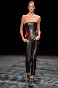
J.Mendel Spring 2015 Ready-To-Wear
J.Mendel collaborated with Enoc Perez and used his work for inspiration. Through their mutual love of architecture J.Mendel created this collection.
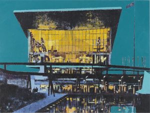
Enoc Perez, Pavilion of the Soviet Union, Expo 67 2009
The reflection appearing in the water at the front of the painting mimics reflecting towards the historical content of the Pavilion of the Soviet Union. The bright colours can represent nostalgia as it celebrates culture and achievement. The structure is almost all painted in black. The shadows of this building can relate to the backward time-zone this image is emphasising.
The building has a relatively modern structure. The roof appears almost as a graduation cap which would be apt for this building as the chapters of history put on display have successfully completed their roles and have proved worth celebrating.
According to expo67.ncf.ca the theme of this building was chosen by the U.S.S.R to be “in the name of man, for the good of man”. I believe this theme is reflected in the colours of this painting. The saturated teal colour of the background is contrasted by the exceptional, bright yellow illuminating from the windows. This emphasises mainly the point of “for the good of man” as it breaks up the dusk-seeming background with a bold and exciting, happy colour.
The teal could also be construed as the step before night. Something that might be interpreted as the coming of an end to an era or perhaps pride. The looming background could foretell disaster and evil. Alternatively the fact that the building shines through could demonstrate human success and hope. Particularly the peace elements of the content in this building.
ethics
This image from the brand/designer Duncan Quinn depicts a smart and well-dressed man holding a woman in her underwear by her neck with what seems to be a tie that he would have removed from his outfit. This image is considered highly controversial due to some heavy underlying messages.
The suggestion of dominating and authority is quite a common theme in today’s society. We believe that men should be ‘men’ and what being a ‘man’ means is usually being strong, not showing emotion and having power. In this way, the photo may be directed towards a female audience as it shows elements of what women should find attractive in a man. The idea of women as the weaker sex relying on a man could be attractive due to the idea of being looked after and feeling safe. This man may not be protecting the woman but appearing in a suit would suggest success which also then suggests financial support. The subliminal messages could evoke something sexually appealing in this image.
This photo can be perceived as demeaning to women. The woman is bound by the man, implying that she is subservient to the man. He has her powerless. This could be seen to have a fetish implication. The woman is in her lingerie which has an obvious link to sex. “In fact, both men and women find the sexual innuendoes of female bodies to be emotionally appealing, which helps incline both men and women to want to buy the product.” Her neck is bound and controlled by the man, which would scream to a lot of people “DANGER” however it is not uncommon for that to be found exciting and erotic. This says to me that she has become his sex slave however. Even the bible writes about how women were created from a man’s rib in order to serve him. “The woman made of Adam’s rib was designed to be a “suitable helper” for Adam (Genesis 2:20).”
This use of sex in advertising is by no means the first of it’s kind. “Advertising, for almost as long as it has existed, has used some sort of sexual sell, sometimes promising seductive capacities, sometimes more simply attracting our attention with sexual stimuli, even if irrelevant to the product or the selling point.” An example would be how this picture can now be seen to advertise a lifestyle as well as clothing. It almost says: ‘if you buy our clothes, you too could have all of this! The beautiful women will want to sleep with you!’.
In all of this, however, one must consider that we assume each member in this photograph would have been a consenting adult. The man would not have been forced to hold the woman nor would the woman have been forced to strip down into her underwear. Some may argue that the photo could be empowering as the female is not ashamed of her body. The ethics surrounding this photo can have a bit of a blurred line as it is only a photo and therefore subject to unlimited different interpretations.
Cohan, J.A. Journal of Business Ethics (2001) 33: 323. https://doi.org/10.1023/A:1011862332426

