Category Archives: Fine Art

This Category should be selected if you are a Fine Art student.

Caroline Perkins: Task 1, Passport: Identity and Obscurity

PASSPORT

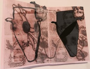
I separated the information into two categories, Ā what I can’t change, and who I have become.Ā  The watermark is made up of images of my finger prints and pictures of me in different stages of my life. On the surface of this printed paper I put things that I had done that symbolised things that I have experienced and things I am interested in.

At the front of the passport IĀ placed a recent picture cut into strips to obscure my identity. Ā I disagree withĀ the concept of passports they restrict and separate humans by birthplace and nationality. Ā 

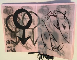
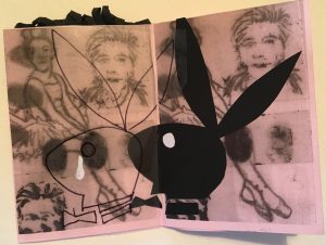
Inside I put representations of clay pots as I used to be a ceramicist. Ā I heard the news of Hugh Heffner’s death on the day of the project and it reminded me that, I’m ashamed to say, I worked for Playboy Ā I believe that Playboy stands for the subjugation of women by the patriarchal society and the constraints that put on me.

The three symbols for the male represent the three men in my life: my partner and my two sons.

This project is only a start as it has unveiled areas of my life I would like to explore further things in my memory that I have buried or hidden from myself.

Connected

DSC08160

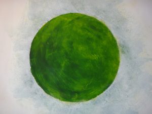
Having previously explored ways of expressing human connection I became interested in the green dot used on Facebook to show that someone is online as a symbol of connection or connectedness. When people who are important to me are online I find myself feeling comforted by the presence of that little green dot even if we are not actually communicating. It is as if the green dot takes on its own companionable presence while symbolising a passive connection with an absent person.

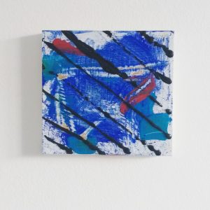
. I wanted to bring the green dot in to the physical world; to give it a tangible presence to embody the feeling of connectedness. The digital dot is 2D so I began with acrylic paintings on lining paper.

The paintings developed from the way I see the dot. Although the dot is a flat green, my eyes perceive a lighter colour around the edge so I tried to express this in the paintings to give the dot more character and depth in 2D. I painted it large on the paper to give the object more of a presence and to make the body appear singular I experimented with textures and colour in the back ground.

. There is a lot of potential in 3D to make this abstract idea a tangible presence. An idea of the mobile app being akin to a modern omnipresent connection, like amulets connecting wearers to abstract gods, leads to wearable representations of connection which I would liketo develop with this concept.

Module Introduction + Developing Ideas

IMG_20170616_162648_160

For this account I’m using a piece of work that I completed during my own project at college. I chose the word ‘layers’ and from that developed numerous pieces of work. I began by getting ideas from the real world and translating them into sketches and ideas in several sketchbooks. Eventually I began working outside of my sketchbooks and worked on other surfaces, ti decided to use wood for this piece, which was my favourite material to work on because it was much smoother than canvas and the paint was much easier to manipulate across the surface. For this ‘layers’ project I began by layering numerous amounts of paint on a canvas until it was so thick it would nearly sit off the page. I then began to experiment with layering shapes over the top of the abstract paintings in order to disguise and hide the painting.
To develop this idea further I could use other materials and mediums to layer over the paintings, such as string, tape, wire, cloth, charcoal or graphite and discover which creates the most interesting outcome. I could also develop the concept further by changing the medium of the painting beneath by using pastels, oil crayons or by using photos or drawings and manipulating the composition by hiding specific sections, this may create mystery and intrigue for the viewers.

Ā 

Task 2.

ROTHKO, C. (2004) Introduction by Christopher Rothko IN: ROTHKO, M. The Artistā€™s Reality: Philosophies of Art, New Haven and London: Yale University Press, xiv.Ā 

ā€œThe true value of The Artistā€™s Reality is not the thoroughness of Rothkoā€™s arguments or how consistently he wins his debates; rather, the treasure here is that we get a glimpse of an artistā€™s worldview, expressed in the written word and in considerable detail.ā€Ā 

The Artistā€™s Reality: philosophies of Art is essentially 12 essays written by artist Mark Rothko that explore his ideas on art theories and philosophies. The reason I chose this quotation from the introduction by his son Christopher is because it is a good quote to contextualise the book. Rothko in his essays which are summarised in chapters, talks about the great masters of art, social and political art stances of the time and even how an artist should deal with making art.Ā 

Rothko never meant for these ramblings to be published so the book itself is a little all over the place, and whilst his son Christopher did a fantastic job at editing the book, it is a little hard to follow consecutively.Ā 

The book itself is almost like an advanced art theory lesson with the way Rothko discusses aspects that contributed to making modern art work. As an artist, already knowing these things it can be quite tedious to read but on the other hand as a Rothko fan, it is very interesting to read his views and opinions on what was happening at the time of him making artwork.Ā 

Task 1, Passport

Passport

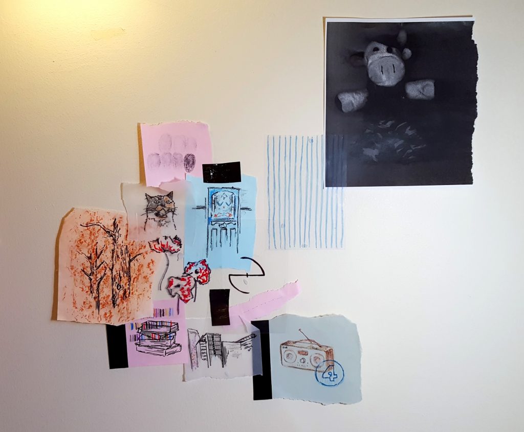
The first project that we were set on our Fine Art course was to create a ā€˜passportā€™. This project made me consider what constitutes a ā€˜passportā€™ and what can be seen to shape oneā€™s identity. I immediately hadĀ several ideas and possible routes to explore ā€“ is the layout and format of a passport important or can it be changed to reveal information in a different way? What information about myself should I add that isnā€™t usually included on a passport? Should I use images or numbers or a mixture of both to describe myself? Of course there are many ways in which I could go about this idea, and it is difficult to know where to start or which materials to use, etc.

Despite being a seemingly straight forward task (a way to get to know the other fine artists in the room and provide information about yourself) it is complex in that there is no clear end point; you can make as much or as little of the project as you wish.

Personally, the idea of sharing personal information to others makes me feel nervous, and I chose to instead provide only the main information about myself to form the starting point of my passport, tracing or drawing things of relevance on different pieces of paper. These drawings included my front door, pets, toy cow, local area, favourite band, hair colour, etc. I then experimented with photocopying things (e.g. Cowie) and took a tree rubbing over my tree drawing as I have always loved the texture of trees.

Other ideas that I considered include providing only a list of important dates and/or numbers in a way of simplifying my existence into statistical means. I also considered overlapping acetate, placing more obvious details on top thus making them easier to see, with lesser known information causing the viewer to take more time to decipher (similar to getting to know someone in real life). A further idea which I had involved representing myself only by the stereotypes of my local area ā€“ coming from an area which is often given a bad name (Croydon, South London) and having lived there all my life, it is an area which people sometimes try to avoid mentioning, even if it isnā€™t as bad as it is made out to be. The area in which you live in and your social environment is definitely something which can be seen to shape you as a person, thus giving you your identity and makingĀ places visited your ā€˜passportā€™.

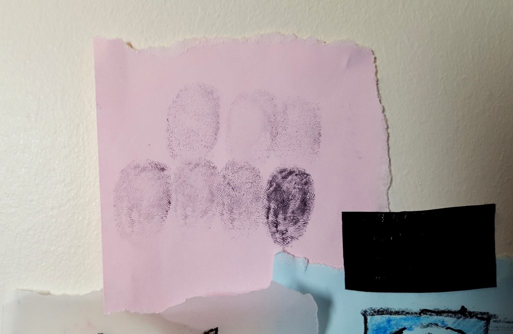
As passports act as a quick from of identification, I displayed all of my images together, slightly overlaying some, so that all information could be seen at the same time. By adding some of my own DNA ā€“ fingerprints and sewn hair ā€“ the passport is more personal to me. I quite like the simplicity of my layout as it is to the point and gets the information across. However, if I continue with the passport I could explore numerical data, locations and other ways of using hair, e.g. writing with it or drawing with it.
20171016_173415

Close-up of fingerprints

20171016_173250

Close-up of Evanescence logo, parts of drawings and sewn hair
Patricia Odysseos-Suther: Task 1

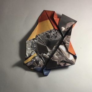
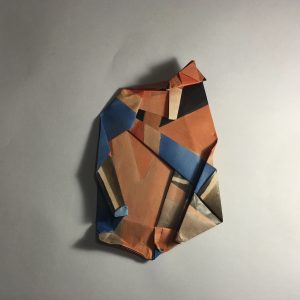
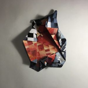
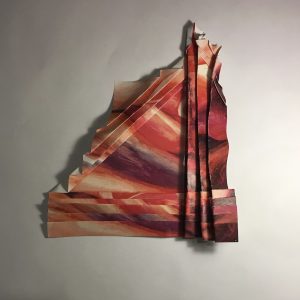
These pieces were part of my A2 exam project; the concept behind them being to play with folding various materials to discover how the processes and outcomes differ from one another. To create these pieces, I drew, weaved, and painted images of folds in various materials such as fabrics, paper, and foil; allowing me to display a variety of geometric and organic folds. The idea of folding the folded images was inspired by Aldo Tolinoā€™s work with the intricate, geometric folding of paper to ā€˜transfoldā€™ images. I experimented with a variety of different folds, some being finer and more accurate to generate different shadows and space; by photographing them with harsh lighting, I created intense shadows to make the folds more prominent. I produced these pieces as a starting point for a composition which combined all the elements I explored for this topic; this included works inspired by Tolino, Umberto Boccioni, and Bridget Riley. They also allowed me to discover a variety of outcomes that could be produced with geometric folding. From here, I proceeded to create my composition with the main element being the physical, geometric folds.

IMG_2994 IMG_2986 IMG_2985 IMG_2984

Kerry Mercer – Research and communication skills / Task 1

Northbrook final piece 2Northbrook final piece

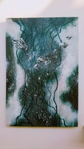
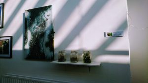
Here I looked at abstract landscape painting. I used acrylic paint, which was placed over natural mud that I stuck to the canvas using PVA glue. I gathered the mud during a walk I went upon in my local woodland area, this took a natural source from my walk directly into my work. The mud and other natural materials I gathered on the walk, are in the jars next to the painting. In this piece I chose to focus on a specific tree I came across, and how the marks in the bark depicted a unique formation. This was shown by running ink down across the canvas, with a green tint to represent its natural occurrence. The background is made up of the formation/colours of the tree’s trunk and its surroundings. This was created on top of the mud in acrylic paint. I chose this medium to work with as it dries quickly, and with that I could form layers of the paint on top of one another. This not only symbolises the layers of the tree but also creates a good blend of colours within the scene. Finally, the 5 larger grey marks stretching across the canvas represent the mould that can be seen on the original tree which inspired me. I chose to represent these going across the ‘tree’ and not along it, to make the painting appear more abstract than realistic. The white speckled marks also represent the smaller markings of mould, as well as showing the background peering through the tree, like the sky pears through the leaves on a typical day.

Through my eyes- Task 1

untitled 2 untitled 3 untitled

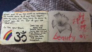
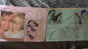
In my first week, we had to create a passport that consisted of aspects about myself. Each page contains something different that either describes me or my interests.

The front page would be the first page people would see. So, it had to make a statement about who I am. I also added my fingerprint and lip outline as well as numerous numbers that are significant to me. Ā­Ā­

The following two pages had my family and friends, this included photos and some drawing which I had drawn. I decided to do the drawing on acetĀ­Ā­Ā­ate as it transparent yet effective because my relationship with my friends and family are open and honest, I share everything with them.

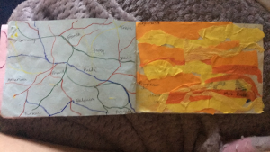
The centre of my book, consisted of images that related more to what I like. On one page I created an atlas using markers and in between the spaces I inscribed all the places I have visited. The final two pages consist of my favourite quotes along with symbols. To me these pictures and quotes summarise me as a person.Ā 

Emily-Jayne Ponting : Fine Art – Research and Communication Skills (task 1)

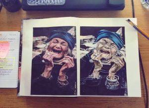
Photograph by: Tan Qi Yong

Photograph by: Tan Qi Yong

The above piece is a primary research development of a 24 hour study. To the left is a photograph taken by Tan Qi Yong, a photographer found on Flickr. I was drawn to this image purely because of the amount of detail I could see and the potential the elderly womanā€™s expression portrayed. I could see that the shading and marks of texture seen in both her skin and her clothes would work well with oil paint; and to get the accuracy of the detail I then used a 30cm ruler to section the printed image (16cm x 24cm) into blocks measuring at (4cm x 4cm) and then the same measurements measured out onto canvas paper. This then made it easier for me to draw the image to the same scale and correct positioning as well as merging in the background to compliment the main focus of the drawing. Once drawn I then mixed similarities into oil paint and progressed with adding basic colour; using alterations due to the fact I wanted to portray a more sombre image as I felt the original piece had connotations of happiness. I intensified the wrinkles to increase the drama and contrast within the piece.

Jordan Warwick – Task 1: Mr Doodle

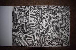
Through constant scrolling on social media I found artists online and Mr. Doodle was one of these. His pieces consist of constant doodling, using a marker pen, on various different surfaces and I adored it. He creates humorous characters, all of which are different from one another, at a pace that I am simply in awe of. I have found myself watching his videos on Instagram, wondering how he can make all of it up right on the spot. I was so intrigued, I decided to give it a try. I found a marker pen, opened my sketchbook and set to work.

As art students we are taught to plan ahead of time, making sure that everything is written out and ready for the deadline. This is the complete opposite, a challenge. From the beginning I decided against creating little characters because I knew I would not be able to conjure them up in so short a time, so I made the conscious decision to experiment with lines and marks. I started slow and eventually sped up until I realised I had become stuck in a repetitive pattern and would have to reprogram the way I was thinking, into a new perspective – opening up my mind for new ideas.

Gradually, the process became easier as I figured out new ways to create interesting patterns of repetition. In addition to this, it was refreshing to try something completely alien to me and actually enjoy the dizzying outcome that my experiment resulted in.


DSC_0525