Category Archives: Fine Art

This Category should be selected if you are a Fine Art student.

Task 4 // Exhibition Review

ROSENG P-5 584

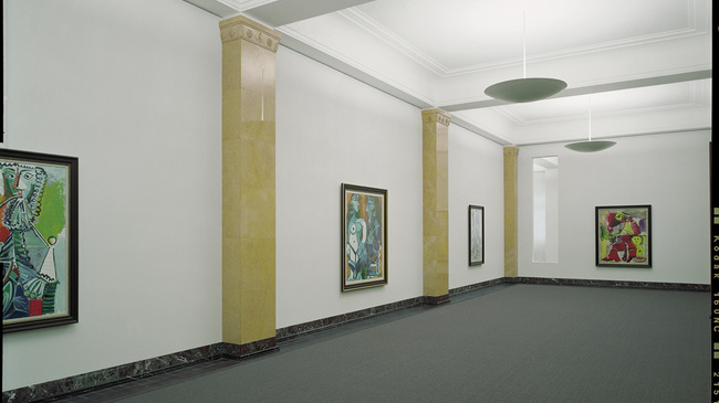
During the summer, I visited the Sammlung Rosengart Collection in Luzern, Switzerland. The collection holds more than 300 works by different artists, it was assembled by a Swiss Art dealer called Siegried Rosengart and his daughter, AngeIa, who followed her father’s business. They have collected majority of Pablo Piccasso’s and Paul Klee’s, which makes the museum’s main strengths. They have 32 of Picasso’s paintings, mainly of his later years and also, up to nearly 100 drawings, watercolour prints and sculptural works. His later work often combines elements of his earlier styles.

It was really inspiring looking at pieces from diverse artists that explored various different styles. There was Kandisky’s  abstract works, Seurat’s pointillism, Matisse’s Fauvism and Post-Impressionism and many more.  Upstairs, there was room filled of photographs of how Picasso was working in the studios. I was able look into the world he works around in.

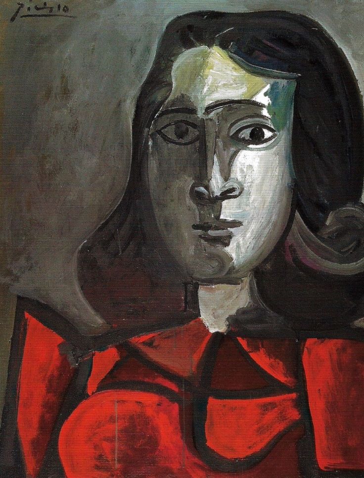
Dora Maar 1943 Picasso

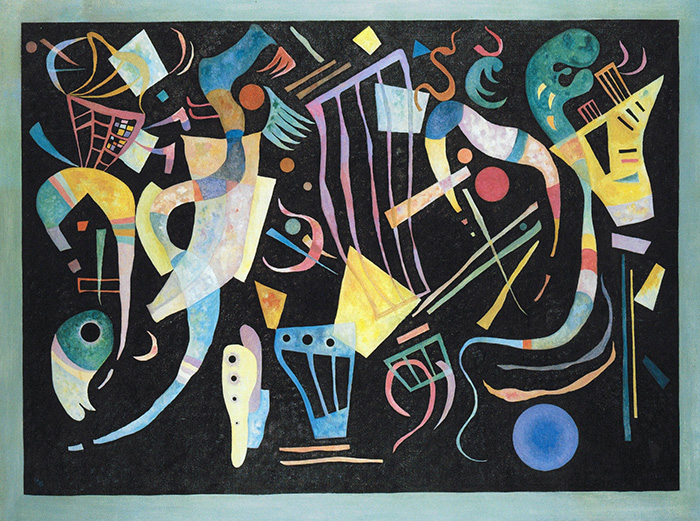
Moody Forms, 1936 Kandinsky


One of my favourite paintings by Piccasso’s was a portrait of Dora Maar, 1943. It reminded me of ‘Weeping Woman’ at the Tate Modern when I visited it a few years ago. Although, the colour schemes are different but the emotion I saw was similar. The sadness in both paintings were thought provoking the feeling towards me. Majority of his paintings were portraits of women, I was so curious on why and found that he was known for his intense personality, he had a complex series of overlapping wives and lovers during his lifetime. He continued to produce art and love women with undiminished force until his death in 1973 at 91. Also, another favourite of mine was Kandinsky’s Moody Forms, 1936, his lines were so playful and floating against the dark background. It reminded of music playing and sound.

After seeing “Weeping Women” in flesh, I was so amused and intrigued on how cubism works. I wanted to see more of his cubist paintings so I was interested to visit the Rosengart. The use of colour is something different, he uses block colours to represent the figures and shapes.  Looking up closely, I noticed he uses various different tones from that one colour and blends it really well. This exhibition left me with wanting paint more and explore different styles of art.

Task 4. Reaction to Visited Exhibition

National Gallery Pre-Raphaelite Exhibition: Reflections
(Date visited: 21/10/17)

The intimacy of the Reflections exhibition is something that made it more exciting and exclusive to walk round. The boxed rooms, you feel contained in and more immersed within as part of the viewing experience. Holding heavy influence in the exhibition is Jan Van Eyck’s ‘Arnolfini Portrait’. Famous for its curved mirror in the background reflecting onlookers whom could be interpreted as the contemporary audience today, the painting hangs on its own private wall emphasising its presence. This is something to note when comparing this space to the paintings previous, relaxed bedroom wall placement.


A room to the right of the entrance door plays a film on loop on the origins Van Eyck’s Netherlandish work. It is welcomed knowledge regarding the roots of the artistic progression and the Pre-Raphaelite Brotherhood itself, before extending person opinions on the works within the exhibition. Classic composition of solitary women, royal groups and unfinished sketches gives an ample insight into how the Brotherhood worked. This disclosed viewing of the artists’ hands is a pleasure to witness.


The vibrancy of Sir John Everett Millais’s ‘Mariana’ for me is the pinnacle of the show. The conscientious, and deliberate nature of the painting is something that is mesmerising and caused me to stand, in awe for the majority of my time in the exhibition.


http://www.themasterpiececards.com/famous-paintings-reviewed/bid/27677/Famous-Paintings-Arnolfini-Portrait

https://www.nationalgallery.org.uk/whats-on/calendar/lunchtime-talk-15-january-2018-1300

http://www.tate.org.uk/art/artworks/millais-mariana-t07553

Task 3. Brief Image Analysis

Family Jules: NNN
Barkley L. Hendricks
(No Naked Niggahs)
1974

This painting struck a cord with me when I saw it placed next to Henri Matisse’s ‘Nu bleu’. With a white female sex slave as the subject matter of Matisse’s painting, it explains and supports Hendricks’ response on wanting to sexualise the black human form. The model in the painting particularly holds the characteristics of a slim conventional black figure: lean limbs and an athletic build. The painting doesn’t include the left lower arm, hand or foot. This gives a sense there may be more yet to come. Such dominance from the model causes a feel of discomfort for the audience. Perhaps this lack of visual conclusion adds to tis discomfort when viewing the painting. The white woman on the scarf gazing at the model could represent the eroticism and arousal that is associated with the naked black form. However, is made more poignant in this example as it is more common for men to be aroused by the female form in paintings, as opposed to white female onlookers.

The wallpaper shows the era in which this painting was meant. A sexual awakening in society in the 1960’s and 1970’s was rife, whereby the topic of sex was more openly talked about. The notion had reached a stage where sex was accepted between couples. However, the divide in society between ethnicities was less forward thinking. Racial prejudices had not been shaken at the same rate.  Below in this painting, exposure to the sexualised black human form was a progressive and modern way of painting in the 1970’s.


https://theartstack.com/artist/barkley-l-hendricks/family-jules-nnn

http://www.tate.org.uk/art/artworks/hendricks-family-jules-nnn-no-naked-niggahs-l02979


Barkley L. Hendricks

Misc. Tyrone [Tyrone Smith], 1976

The painting depicts the slender black male reclining on a white sofa holding a pipe. The backdrop is a brightly coloured patterned wall and a floral rug lies on the floor. His expression shows a casual confidence with his head tilted backward and the positioning of the pipe in his hand. The body language is open with legs partially spread apart and an outstretched arm, making the sexuality of the painting more direct than that of a classical nude like Titan Venus of Urbino, 1538 where the model had crossed legs and placed a hand over her vagina, possibly to indicate shyness and a virgin status which may have been more desirable to the men who viewed her. Although the subject’s homosexuality was not discussed during the sitting, his sexuality confronts the heterosexual male gaze that painted nudes typically served. Interestingly the painting contains a woman on the shirt hung on the sofa. The fact that she is dressed and featured on an item of clothing confronts the need to consistently show a woman nude to objectify her body. In addition, as the woman is a repeated pattern, the artist could be communicating how often the Western culture has painted women and that he is consciously painting a black male to challenge this. This was painted in 1976 following the civil rights era and during the 1970s activism, so a painting of a black male nude, challenges the racial and gender norms of this time. There is a visible tilt between the tiles on the wall and the sofa, possibly showing the artist’s intention to break away from parallels to classical nudes.

Titian

Venus of Urbino, 1538 [oil on canvas]


Bibliography

ARABINDAN-KESSON, A. (2017) The Painting.In Focus: Family Jules: NNN (No Naked Niggahs) 1974 by Barkley L. Hendricks, Tate Research Publication. Availiable from http://www.tate.org.uk/research/publications/in-focus/family-jules/the-painting [Accessed 22 October 2017]

Task 2. Book Summary.

Michael Craig-Martin: On Being An Artist

Michael Craig-Martin’s informative book reads about his own life experience throughout his early schooling, art education, career, and his own inspirations. He offers a subjective tone, with views that some readers will and some readers will not agree with. He is able to elicit a response with his writing. For example, he writes that pieces of work ‘are not mute, waiting for interpretation’ (P12) but express an insight into the artist themselves, as though the artist is therefore open to exposure and intrusion after releasing their work. To me, this vulnerability in an artist is rife. Craig-Martin expresses from the start of the book that his snippets of writing throughout the years have been successfully compiled, and are open pieces of potential advise. If they can offer advise to aspiring artists, that is only a positive. It also has autobiographical elements as he discusses his childhood, university dilemmas, also rejoicing in his successes, and even opens up about his married life.

‘Our job was to create whatever it was that would come next.’ (P63)

The reader gets an insight into Craig-Martin’s modernism approaches. The quotation above explains the mindset of him and his Yale classmates and their endeavors into artist-hood. Having Marcel Duchamp as one of his most poignant Modern Art influences, Craig-Martin’s mindset of pushing current boundaries forward is evident throughout the book.
What I have taken enthusiastically from the book are Craig-Martin’s two pieces of work ‘Knowing’, held at the Tate, and ‘Learning’. I was struck by how he ‘resists the arbitrariness of colour’. The items are common in both acrylic paintings, however the positioning of them varies depending the title of the piece. To the right, ‘Knowing’ shows the accomplishments of man with the globe and metronome catching the eye first. Whereas, in ‘Learning’, the red table, blue chair and blue stepladder are in the foreground of the painting suggesting the stages of education. What is involved in the stages between Learning and Knowing is demonstrated.


Bibliography:

CRAIG-MARTIN,M. (2014) On Being An Artist, United Kingdom.

http://www.tate.org.uk/art/artworks/craig-martin-knowing-t07234

Task 2

Joan Mitchell: leaving America consists of an essay by Helen Molesworth and a catalogue of Mitchell’s paintings exhibited at Hauser and Wirth 2007. Molesworth’s essay gives an insight to the influences of the artist between the years 1958-1964 including Jackson Pollock and William de Kooning. In addition, Molesworth writes this essay with a feminist outlook without explicitly defining Mitchell as a feminist. Mitchell fell between two periods of feminist movements and Molesworth describes how the artist’s struggle to success and the rage seen in her abstract paintings inspired future feminist artists.

I am particularly drawn to Mitchell’s explanation of colour “they don’t mean anything, they simply are, they exist as letters in the alphabet exist” (Mitchell 1992, cited in Molesworth, 2007, p.8) showing that her colour choices are linguistic and used in combination with her application of paint described as “analogous to poetry” Molesworth (2007, p.9). When studying the paintings included I can see the large curving brushstrokes competing with drips and smears of paint. The conversation between the various marks and colours becomes clearer, as well as the artist’s emotions.

Bibliography

UNTERDÖRFER,M.(2007)  Joan Mitchell: leaving America, Germany: Steidl Hauser & Wirth.

Task 1. Parrot’s View

Parrot’s View

I painted Parrot’s View with thoughts on animal welfare at the forefront of my mind. Nature is less regarded in the world, as we continue to build man made structures such as housing, factories and large-scale machinery. Animals are forced to adapt to their new urban habitats, and if they don’t, realistically they won’t survive. Conceptually, these ideas developed from practical and written research, and no first hand influences sparked my thought processes. I later went on to do a project on Alzheimer’s disease, specifically focusing on a care home in Hereford, and it’s residents. Here I found the first hand research far more stimulating, providing a greater insight for me into my own project and body of work. Therefore, the composition, painting techniques or even content of Parrot’s View may have had a different outcome had my first hand research been more thorough.

This painting is oil on canvas and accompanies a series of other work that emulates a similar message to that of Parrot’s View. I screen-printed a range of tools such as wrenches, and tap stop pipes to make the background- my first screen-printing experience. As part of the development of the background, light articulation of the tools with brushed oil paint may portray the message behind the painting with more emphasis (because the subject matter would be visually clearer). This painting was a turning point in my development as a painter as it made me question what is interesting for background materials. This may be a medium other than oil paint, or a technique that disputes the piece.


When given the brief to make a passport and share information about myself I thought about making something to wear like a bracelet due to it’s practicality. However, I felt that wearing personal information would be expose you to other people. That lead me to think about structures that could fold in on itself and  protect private information. Chatterboxes folds into itself three times and I put private information in the middle and layered it over with more open information. As the title was trace I experimented with tracing photos from my phone onto acetate. The transparent nature of acetate meant that I could layer multiple images over each other, further concealing the more private aspects of myself. As the ink wouldn’t dry on the acetate I applied sellotape to stop the smudging, however on reflection I would have let the ink smudge and replace them with new memories, as prominent memories in your mind always shift.  An interesting avenue to develop into would be to present  each fold as a different identity of myself.

Task 12

For the piece I’m talking about I chose one of the pieces I have done in my self-directed study which is painted in acrylic paint. Increasing the size of this piece would help us see the details better. When put in an exhibition it would stand out more because the whole piece is very colourful, therefore catch the eye better. However, due to the impressionist qualities to the piece it would lose the tones created in the piece when bigger, unless it is in a very big space. This would be true in a public space too.

In contrast, making the piece smaller will lose details that a human eye can see and make it hard to tell that it was an apple anymore. If exhibited it would lose the intensity in the piece because such qualities like textures and detail have decreased, due to making the piece smaller. But this means it has made the piece look smoother and could be argued from the point above that it actually looks more like an apple. Furthermore, this depends upon how much the piece has been decreased in size. However, it may engage the audience more, due to need to be closer. I think the piece looks better bigger because compared to making it smaller the process shows the mark makings of the piece better. In this piece I think that showing this quality is important because it shows the process of the making the piece better. If this was smaller this would no longer be obvious. Another factor we need to take into account is if we increase the piece too much we will not maintain the resolution.

If the piece was smaller, I would have repeated it to create a series so it would stand out. If the piece was bigger, I would apply more detail using layers of paint.


Jordan Warwick – Task 12: Exhibition Piece

If I were to change an aspect of a piece of work I would make my exhibition piece for the Manifesto project a lot bigger.


The idea behind my piece was to create something that had elements of mischief and rebelliousness running through it, whilst also showing that a good amount of effort and thought had gone into the creation of the piece – I wanted contradiction.
I believed that creating a proper manifesto was too ‘on the nose’, I wanted to make something that made people think, whilst also being very simple in its format.

The piece had the text;

“MANIFESTO


I, as an artist, am required to provide for you an abundance of words that depict the way I feel about creating art.


Here it is.”

This text was written – in a way that was supposed to resemble a typewriter font – onto a piece of A4 sketchbook paper and ripped out. The intention was for the piece to be a very ‘to the point’ text, written in a very formal font and on a very scrappy looking piece of paper, so that it both stood out and was hidden from the audience. However I feel this was something that really didn’t work. In hindsight, there was enough contradiction within the piece already, and so the size was a step too far. The piece ended up being lost in a sea of other pieces that were of very similar size, and thus didn’t get across the message of contradiction quite so easily and shockingly.

Therefore, if this piece had been bigger, A1 or A0 for example, then it would have brought in a lot more interest and thus made more of an impact.