Category Archives: Fashion & Textile Design

This Category should be selected if you are a Fashion & Textile Design student.

Ethical issues – Duncan Quinn – Task 9&10

ETHICAL ISSUES TASK 9&10

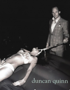
What I first realised about the Duncan Quinn picture was a barely dressed woman at the complete mercy of a fully dressed man. Looking at it, I didn’t understand what he was holding but looking closer, he is holding his tie around her neck as if she is some sort of animal.

If it wasn’t a photoshoot, then the fact that he is looking at the camera means that someone else is there (considering the story they’re trying to get across behind the picture), also suggesting that the whole scenario was premeditated. This man has got her almost completely undressed outside, on the bonnet of a car which is not that discreet. It could only lead to believe she is being made vulnerable and available for public humiliation.

It is worrying to think about what kind of customer this advertisement was supposed to attract. Is it intended to appeal to men that want to have complete and unwavering control over other women? There is no equality in this picture. Only through further research made it clear to me that Duncan Quinn are actually trying to sell the tie.

Looking further, there is a dark liquid coming from the area around this woman’s head. I can only assume that it’s blood. Therefore, there is an implication of a struggle before they got to this stage in the picture and raises so many more questions; is she dead? Did this woman refuse to give him what he asked for and then get attacked so she would have no choice in the matter?

The black and white setting of the picture also helps to conceal a lot of information. We can’t see where they are or if there are anymore people around or if she actually is bleeding from her head. The background and other suggestive details disappear. However, what else we can’t see is the woman’s face. This is the unfortunately common problem in society today about dehumanising our women and objectifying them to the point where they think it’s acceptable.

“The image of the tie in our society generally signifies power and success, two strong desires of a heteronormative male audience.” I believe in this because then it leaves women to believe that they then must have to take on the role of the mistreated woman in the picture as well. Which also leads to women trying to achieve a stereotypical body image and lingerie that the woman in the picture has.

Overall, I think that this advertisement is highly disturbing and unhealthy for anyone that sees it and thinks it’s something they should aspire to. What would happen to all of the young and impressionable children that see this advertisement? Unless they’re taught differently, they are going to grow up believing this is the right way to treat each other or themselves. I do not understand the need to use violence, abuse and sexism to sell ordinary products like clothes or perfume. The greater body of the public look up to high fashion brands only to have their collective views spoilt.

Monique Olowu

Task 7&8

Fashion as Communication is all about finding the definition of the words fashion, dress, clothing and style and whether or not they can be explained individually. This book is also about defining what makes fashion such a controversy; Barnard undergoes defining fashion demand through the use of the social community.
Barnard begins by suggesting that fashion and clothing is a way of being recognised by others in terms of social class as he suggests that it ‘may be the most significant ways in which social relations between people are constructed, experienced and understood. (Barnard, 7). This means that us humans automatically feel comfortable with people of similar fashion sense as ourselves, as if fashion is some sort of conversation starter. Similarly, Fred Davis agrees to an extent with the concept that socially we communicate to one another through similar clothing styles, ‘we know that through clothing people communicate some things about their persons…locating them symbolically in some structured universe of status claims and life-style attachments’ (Davis:4). Additionally, I do agree with both these statements as when I am surrounded by strangers sometimes I think to comment on a piece of clothing that someone is wearing as I find that some people like to inform you of where they bought the item from and the price it costs, then the conversation just ends up flowing really nicely into things like where you shop and what you do for a living.
Barnard begins to break down the meanings of the words fashion, clothing, dress, adornment and style and concludes ‘it is simply not the case that these ideas and concepts can always be easily distinguished or separated from one another’ this shows that these words despite being used to make up different sentences, they cannot be separated in terms of meaning as they all relate to one word if not the other.
In the ‘fashion and anti-fashion’ Barnard mentions the work of Simmel. Barnard refers to Simmel’s account ‘two social tendencies are essential to the establishment of fashion’ (Simmel 1971:301) leading to the ‘need for union’ and the ‘need for isolation’ suggesting to me that although we may consider ourselves to be needy of being categorised into a subgroup, it is always nice when we are unified as it is an uncontrollable instinct to feel welcomed and part of something. On the other hand, it is also our instincts to be apart from others in order to remember to find and know ourselves as individuals outside of a social group.
Additionally, Barnard continues with Simmel’s account of there being a conflict between ‘adaptation to society and individual departure from its demands’ (Simmel 1971:295) further adding to the idea that we want to keep update with the happenings of society, which is where social grouping plays a part, but simultaneously, we want to adapt in our own speed and being away from a group gives us a sense of power to do so. Comparably, Davis states ‘what is worn lends itself easily to a symbolic upholding of class and status boundaries in society.’ (Davis:9) Suggesting to me that what we wear plays a heavy part in the knowledge we have of fashion whilst living or working in a certain area of society.
Through analysing these books, I believe that fashion plays a heavy role in who we know as we all want to hang around with people who are similar to us as it is easier to empower and understand each other’s points of view. Fashion can mean different things to different people in society especially because of the era they may have been brought up in.


Barnard, Malcom Fashion as Communication (2002) psychology press
References:
Davis, Fred Fashion, Culture, And Identity
Simmel, George. 1904. “fashion.” Rpt. In American Journal of sociology 62(May 1957): 541-58

Task 11 & 12 – Final Summary

Throughout this module of research and communication, I have undertaken tasks which have enhanced my basic skills and knowledge when it comes to using a wide variety of resources and approaches towards my own work. I found most of the tasks beneficial however, some felt more challenging than others.

For task one and two, I started off by looking at an advertising poster by the notorious brand, Moschino. From that, I linked it through the pushing of boundaries with an image found on the internet that has recently caught media attention. I found that this related to the exhibition at the met; Iris and b.Gerald Canton. Upon hearing what the first task was, I didn’t expect it to benefit me massively however, it gave me knowledge about current affairs that are happening in today’s fashion industry that I wouldn’t have thought about without doing my own research into it.

Task three and four had me finding three different resources, a book, newspaper and website that all linked together and reference them which I found fairly easy as I have previously used harvard referencing before, however I did struggle with locating my first image that I wanted to explore further. Going into a library full of books should have made it easier for me, nevertheless, I found it harder to narrow down to just one image that I wanted to digress, drawing out the time process in which I completed the task which is something I need to improve on. I found the lecture more interesting, as we are in an already saturated industry, making copyright even harder to enforce.

In task five and six, I started out looking at a collection by Roberta Einer and then used the internet and articles to find out about the inspiration behind her designs. The lecture made me realise how much an artist can be inspired by other peoples work and the sheer amount of work that goes on behind the designing process. This related back to the previous task which emphasised how important it is to reference what and who has inspired your own artwork. I also found creating a visually stimulating mood board very useful and applied similar ways of composition in other mood boards I have had to produce since.

For task seven and eight, we had to read and analyse a text, and then link it to two other texts that related. I found this task more challenging than others due to the heavy, articulate language used in the reading, making me have to read through it multiple times to fully understand it. I also found it harder to find reliable sources that related well, drawing out the process of completing the task. Due to the dread of having to complete this task, it meant that I put it off for as long as I could, procrastinating more than using my time wisely.   

Task nine and ten had me analising a controversial advertising campaign by Duncan Quinn. It allowed me to question societies ideologies regarding advertising to a specific audience, analysing a brand and image, which I enjoyed unpicking. I find this taboo subject to be highly interesting as it has reason for debate, aiding my own morals and beliefs, expanding my own opinions.

After reflecting on these ten tasks, it has made me realise how useful they have been towards my own projects. I have generated a wealth of knowledge about different creative practitioners, the industry and using a variety of resources when finding inspiration. However in the future, I need to work on my time keeping skills when completing these tasks, tackling one a week to keep up.

Task 9 & 10 – Ethical Issues

This photograph was taken from the 2008 advertising campaign for Duncan Quinn, a luxury, high-end suit maker who entices the wealthy through their own ideologies of man. They advertise a swish, wealthy lifestyle that only the elite can afford, through fast cars, fine suits and dominance over women. On the Duncan Quinn website, he is described to “ throw the occasional party, indulge in the odd cheeky lunch, drive too fast and enjoy life just a little too much in the company of his friends”. He takes aspects of his own life and uses it as influences of how he wants his own brand to be represented and who his target audiences is, raising the concern of ethical and social issues within the advertising industry.

The image depicts a bloody, half naked women, lying on the top of a car while the man stands over her looking smug. The fact that he is fully clothed in an expensive suit while she is half-naked with a tie around her neck, embodies animalistic connotations, dehumanising her, making her submissive in comparison. In addition, he is stood over her which implies that he is ‘above’ her in superiority. The use of the neck tie is typically a symbol of power which is taken further here as it is the main weapon that is used by the ‘anti-hero’. This arises the social issue of masculinity. Jason Katz wrote, Advertising and the Construction of Violent White Masculinity where he explores the dominant aspects of being white, heterosexual and middle class within a patriarchal society, for example, “Dealing with economic instability, the increased amount of non-White workers taking jobs, and the women’s movement, men of the time were looking to something that they could use: strength and violence.” This way of understanding, applies to Duncan Quinns ethos and how he represents his own company. He appeals to the white, heterosexual man because that is what his company embodies, it is a projection of Duncans own out-dated views and morals which can be seen to be foreshadowed within this image, through the black and white filter used over the top.

Another ethical issue that has been raised from this advertising campaign is how women’s bodies are exploited to generate male attention. Theorist, Laura Mulvey discussed the male gaze in exccess which can be applied to this image. The fact that a women has been used half naked, stretched over a car, in ‘sexy underwear’ denies her of human identity, which is emphasised by the fact that her face isn’t used in the image, only her body. Laura Mulvey expressed, “In a world ordered by sexual imbalance, pleasure in looking has been split between active male and passive female” which is illustrated within the relationship of the two protagonists in the image.
I personally believe that the progress made by the feminist movement is being contradicted by the ideologies presented by elite brands who embody out-dated, offensive and morbid ideologies showing that there is still a huge divide within the advertising industry and what is socially acceptable within today’s society.


Kratz, J (2011). Advertising and the Construction of Violent White Masculinity. (SECOND EDITION) Thousand Oaks, pp. 261-269.
Mulvey, L (2009). Visual and other pleasure. Basingstoke: Palgrave Macmillan.

Dunca Quinn (2011) Who?. avaliable from: http://duncanquinn.com/about/ [Accessed 27 November 2017].

University of Pittsburgh (2014) Advertising and Dominant Masculinity | Gender, Sexuality, and Women’s Studies. Avaliable from: http://www.wstudies.pitt.edu/blogs/mnf14/advertising-and-dominant-masculinity [Accessed 27 November 2017].


Task 7 & 8 – Reflective writing

Sanda Millers, ‘Fashion Media: Past and Present’, evaluated the concept of taste during the eighteenth century, also known as the enlightenment period. The first fashion magazine, Le Mercure Galant was regarded as the first form of modern publicity, emerged and introduced a wider audience of ‘intellectuals’ to a subject worthy of intellectual pursuit and was ultimately progressed by the likes of Denis Diderot. Le Mercure Galant was however, short lived as it was seen to be ahead of its time and was later reintroduced as Mercure de France during the ‘age of reason’ amongst the French revolution. This is argued to have changed societies ideologies of the constrictions of beauty and taste. Miller contemplates the philosophical aesthetics of the concept of taste and discusses whether it is deliberated through personal judgement or a more meaningful, thought-out critique.

The french encyclopaedist, Denis Diderot was aware of moral messages behind a piece of artwork and believed that it should be evaluated on a more irrational basis as there is no common denominator in our own personal likes and dislikes when critiquing. Diderot argues that art is a ‘delicacy of the imagination’ (Barlett, Cole & Rocamora 2013) suggesting that the way we interpret art is based on personal opinion and how we see them is different to how another observer would perceive it. I personally agree with this statement as everyone is brought up differently, shaping our own ideas and opinions through cultural experiences, environmental and political differences and also by the people surrounding us. This lends itself hand in hand to the famous expression, ‘beauty is in the eye of the beholder’.

A critic who opposed Didorts enlightened efforts was Jonathan Richardson, who thought art criticism should be on an objective basis only. One of Richardson’s work was, An Essay on the Whole Art of Criticism(1719), in which he laid out seven categories that he perceived as being integral to the success of the artwork in which he was critiquing and assigned them a score between zero and eighteen. The categories being composition, drawing, invention and colouring. I personally think that this is also contradictory, as giving a piece of art a score would still have underlying personal opinion behind it. I also struggle to understand where you would draw the line between what ‘score’ you would assign them with. Whats sets an ‘sixteen’ and a ‘eighteen’ a part. He also claimed that, “One man may be as good a judge as another if he applies himself to it.” Thus showing that his beliefs about his own critiquing haven’t progressed alongside the enlightenment period like other critics.
In addition, Henry James, who was an American author had similar opinions to Diderot and wrote, “We must grant the artist his subject, his idea, his donnĂ©: our criticism is applied only to what he makes of it.” (James 1888) This suggests that he saw that the freedom of art allowed for a freedom of criticism much like Diderot expressed. He allows himself to see the piece of art in the way that the creator sees it, looking for more meaning and showing understanding towards it in contrast to a score sheet.

To conclude, I believe that taste within critiquing is something that has progressed massively and has a huge part to play within modern fashion and how we view art as a whole. The Enlightenment period paved the way for modern fashion to correspond to the concept of taste which aided the efforts in getting observers to have their own opinions, rather than a universal one that is constricted by tradition.  


Barlett, Cole & Rocamora (e.d) 2013, Fashion Media: Past and Present, London: Bloomsbury

James, H 1888, The Art of Fiction, ‘Partial Portraits, Macmillan and Co, London.

Richardson, J 1792. The works of Jonathan Richardson, Strawberry-hill, London.


Task 5/6 – Visual Research


Monsoonartcollection.com. (2017). BRIDGET RILEY: STREAK 2, 1979 | MONSOON ART COLLECTION. [online] Available at: http://monsoonartcollection.com/bridget-riley/streak-2/ [Accessed 25 Nov. 2017].

Bridget Riley uses colour and shape to create an illusion that makes a flat two dimensional image look 3D. The gradual change in the line is the base of the image making it have a bumpy texture that when layered with the other aspects allows the image to have movement and depth. By using a two-tone colours scheme, red and blue, it allows there to consist of separate parts which in effect adds a foreground and a background creating the depth previously mentioned. The colour red is the first to be seen by the eye which allows the ‘foreground’ to be seen initially and ahead of the ‘background’ which creates this dimensional illusion. When you step back and look at the design as a whole even more shapes are created such as zig zag pattern – this could be perceive differently making it a conversational piece. The simplicity of the design also allows the focus to stay on the illusion effect instead of being taken away by other contributing factors. Having the piece landscape also enables the eye to travel across the piece, again linking in ith this common theme of movement. Her work has key points and features that relate to those of the ocean such as the rhythm seen in the waves. Getting the aspect of movement across in a two dimensional image is something I would want to try and achieve in my on work whether that be print, weave or knit. This idea of texture and shape is also seen a lot in Issey Miyake’s work but instead of illusions he manipulates the look of pleats. In this recent collection this idea is seen throughout linking it to the elements such as water like Bridget Riley.

Task 5 & 6 – Visual Research

This mood board covers the influences in Roberta Einers Spring/Summer ‘16 collection.
Her collection was inspired by American pop art during the 50s, 60s and 70s. East coast meets west coast. The American girl. Bubble-gum colours as well as colour blocking from Andy Warhol. Her use of detailed embroidery can be seen to be influenced highly from Balmain.

I have chosen to look further into this image by the notorious Andy Warhol. This was made as a exhibition poster that presents the portrait of actress, Elizabeth Taylor. Personally, I really like how simplistic this image is in shape and colour but also in practical process. He created it by using a simple screen printing method which really allows the colour to take center stage. To me, Warhol’s work epitomises colour blocking which is something that Roberta Einer has taken from his work and something that I could potentially look at in the future if I desired such inspiration within my own designs. On further research, I found out that Warhol had a fascination with the ‘celebrity death’ culture that began with his painting of Marilyn Monroe upon her tragic death in 1962. I think that this makes the image even more interesting to look at as an observer, as the image is hauntingly flat, yet so vibrant and full of life. Warhol could’ve wanted to celebrate their life through art, much like their own ‘art’ over the years. Now I know this, I can start to see something quite cold and chilling about his work, someone that once was at their peak of their careers, reduced, lifeless, without any emotion, much like the flat blocks of colour that he uses, which I think connotes the mark that is left behind them.

Tate, ‘Liz’, Andy Warhol, 1965. Avaliable from: http://www.tate.org.uk/art/artworks/warhol-liz-ar00320 [Accessed 14 November].

Task 3/4 – Academic Integrity and Plagiarism

I started off by finding a book in the library which focused on the theme of life and death in Picasso’s work. I chose this book in particular because it showed some correlation to the work I am currently producing as well as the style of work I usually admire which could help give me some background knowledge for future project when conducting this piece of research. The book consists of 133 illustrations which fit under the umbrella of life and death. From this I then decided to search and discover if anybody else had looked into this idea of life and death in Picasso’s work and came across an article by Aidan Meller. In the article he talks about one specific piece by Picasso and how it could symbolize Life, Death and Nudity. For the last source, the news article, I found another piece of writing that explores similar themes in yet another part of Picasso’s work. This time it was on ‘Picasso: Minotaurs and Matadors review – sex and death in the bullring’. Like in the first source the writer explored a few samples of work from Picasso and related back to the theme of sex and death.


Green, C. (2009). Life and death in Picasso. London: Thames et Hudson.

Aidan Meller. (2017). Life, Death and Nudity Explored by Picasso — Aidan Meller. Available at: http://aidanmeller.com/life-death-and-nudity-explored-by-picasso [Accessed 2 Nov. 2017].

Searle, A (2017) Picasso: Minotaurs and Matadors review – sex and death in the bullring. The Guardian, 28 April.

Task 3 & 4 – Academic Integrity and Plagiarism

I started off by looking going into the library and finding the book, ‘Missoni, Art Colour’, which I found to be visually pleasing as well as interesting. One reason being due to the fact that I’m currently on my knitwear module which has involved me experimenting with bolder colour choices, something that I haven’t properly experimented with before. I usually stick to more muted and effortless tones, thus making me want to look into colour more which could help me with my understanding of colour combinations. To link with this, I found the article, ‘How colour affects our mood’, which I found to be eye opening. It talks about how colour influences an observers emotions, which in design, is very important when conveying the meaning and ideas behind what you create. One quote which emphasises this is, “when you look at red, it does increase your heart rate. It is a stimulating color”. This implements the idea that colour plays a bigger part in our day to day life,subconsciously. I then found a website which follows the ‘it’ colours, which in high-end fashion this season, being red. It also explores pinks, oranges and blues which all connote different meanings. I found this website useful in finding designers that relate to certain colours, but also in pairing a variety of different colour combinations together, inspiring my own work further.


Zanella, E 2016, Missoni Art Colour, Rizzoli International Publications, New York, United States.

Grumman-Bender, R. (2013) How colour affects our mood. Huffington Post, 27 November.

Francois, N. Sleek The most iconic colours in Fashion. Avaliable from: http://www.sleek-mag.com/2017/02/17/colours-in-fashion/ [Accessed 30 November 2017].

Task 1/2 – Online Resources

Dormer, P. (1986). The New Ceramics. London: Thames and Hudson.

I started this task looking into different pottery designs focusing on a book, by Peter Dormer, that explores new trends as well as traditions under the umbrella of ceramics. Two pieces that particularly caught my eye were by the artist Matteo Thun labelled ‘Cocktail glass’ and ‘Flower vase’ – both of which were produced in Italy around the time of 1982. The reason these ceramics caught my eye in particular was because they seemed to break up my stereotypical view and thoughts on pottery being circular, round and smooth in appearance but instead these designs consisted of much more abstract and harsh shapes that were fixed together at a central point. The lack of colour in these pieces allowed the more daring shapes to be the focal point and permitted shadows to be easily seen which added to the various dimensions of these designs. The subtle addition of slight texture meant that the sections of the designs could be broken up showing the different shapes that were used to create the final resulting design.

Merrill Lyons. (2017). Nathalie Du Pasquier. [online] Available at: http://merrilllyons.com/nubert-says/2014/2/1/nathalie-du-pascalier [Accessed 5 Nov. 2017].

Following my previous research I decided to look into designers that shared Matteo Thun’s use of abstract and bold shapes which led me to the artist Nathalie du Pasquier. In her work she uses a wide use of texture, colour and unique shapes to produce captivating designs that usually turn out to be statement interior pieces. Nathalie liked to oppose the conventional norm challenging what most perceived as good taste to try and break most people’s perception of what art and pattern for interiors should look like – she once stated “Form didn’t have to follow function, a telephone could have the shape of a banana”. Due to my current rotation being print I would like to get across this idea of bold shapes in my own work, deconstructing the outlined shapes of the ceramics to make them into interesting printed designs.

Design Museum. (2017). Memphis. [online] Available at: https://designmuseum.org/memphis [Accessed 5 Nov. 2017].

With further research I discovered that Nathalie du Pasquier was part of the Memphis art movement that occurred in the 80’s. The Memphis ground was founded in Milan by Ettore Sottsass in 1981 and their focus was to design and create designs ranging from postmodern furniture to ceramics that conflicted the usual designs at the time from 1981 to 1987. There was an exhibition at the Design Museum, 13 April – 13 July 2014, that showcased this work and has influenced designers work since and therefore is still a big part of the design world today. For example in 2011 Christian Dior showcased aspects of this movement in the fall collection with features such as bold prints with overlaying embroidery topped off with statement geographical shapes used for the headpieces.