Category Archives: Fashion & Textile Design

This Category should be selected if you are a Fashion & Textile Design student.

Task 1/2: Dali and Schiaparelli’s Lobster Infatuation.

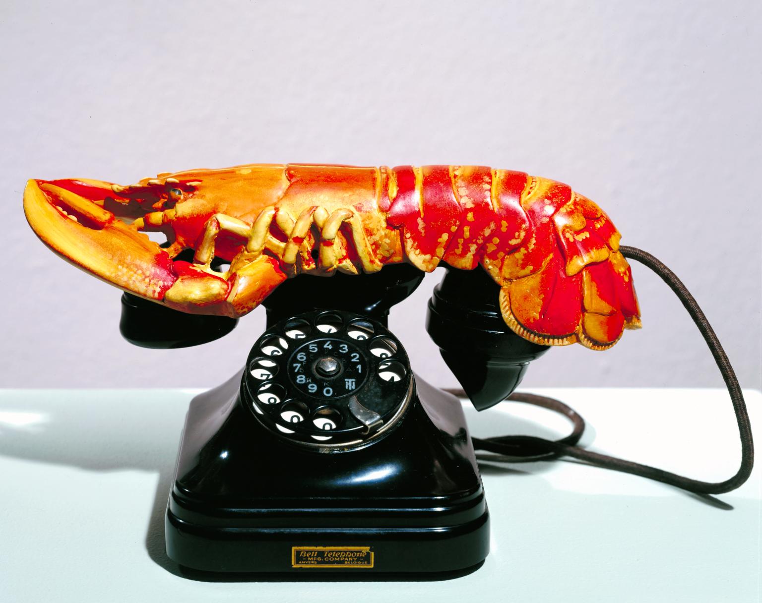
Salvador Dali’s Lobster Telephone 1938 (Tate)
The Lobster Telephone is one of my all time favourite sculptures; Dali had this unique ability to make madness seem normal. I’ve always been fascinated by his creative process, and the fact that I’ve never questioned the absurdity of most of his work. With this piece I loved the use of the traditional rotary dial telephone and the pastel colour palette set off by this bizarre, vibrant shell fish. Its unexpected and original, the way that the tail echoes the curve of the phone create such harmony that it almost seems normal.

The Lobster phone was a collaboration between Dali and Edward James. Pairing the two unrelated objects was an attempt to reveal the secret desires of the unconscious, as well as having strong sexual connotations. On this particular piece Dali placed the tail (where the sexual organs are located) directly over the mouth piece of the telephone. He also created a multi media piece called “The Dream of Venus”, where he covered live models genitals with lobsters. In the same year Dali submitted a drawing of the same telephone with a lobster receiver but this time surrounded by flies, titled: ‘TÉLÉPHONE APHRODISIAQUE’. A similar drawing is printed in his book, captioned “I do not understand why, when I ask for a grilled lobster in a restaurant, I am never served a cooked telephone; I do not understand why champagne is always chilled and why on the other hand telephones, which are habitually so frightfully warm and disagreeably sticky to the touch, are not also put in silver buckets with crushed ice around them.”. Both lobsters and phones featured in a large portion of his work, but this particular piece was said to have saved the Surrealist movement. It resurrected an ageing art form and added excitement and energy

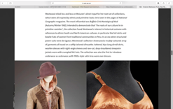
Elsa Schiaparelli’s Lobster Dress 1937 (Philadelphia Museum of Art)
Close friends Elsa Schiaparelli and Dali collaborated on many occasions, but their most famous piece was the Lobster dress. Schiaparelli asked Dali to paint one of his heavily featured lobsters on her dress, said to symbolise sexuality. Alongside the Lobster were sprigs of parsley, Dali apparently requested to slather real mayonnaise on the dress but undertsandably Schiaparelli would not allow it. Dali once said “Like lobsters, young girls have a delightful exterior. Like lobsters, they turn red when you get them ready to eat”. The white, silk dress symbolising virginity and innocence in contrast with the ginormous vivid red lobster created this dichotomy between classicism and exhilarating excitement. The fact that the lobster is painted right between the woman’s thighs makes one question the intention and meaning behind it.

The combination creates a sensual, fun garment that challenged their time. I love that Schiaparelli was one of the first to combine art and fashion, jumping straight into the surrealist movement. Unfortunately, while the dress became the pinnacle of Schiaparelli’s career, the erotic tension Dali aimed to create destroyed the purpose of Cecil Beaton’ shoot with Wallis Warfield Simpson. The dress was deemed too provocative and the photographs weren’t approved for public viewing.

Lobster Telephone 1936 Salvador Dal? 1904-1989 Purchased 1981 http://www.tate.org.uk/art/work/T03257

Tate (2017) Salvador Dali Lobster Telephone 1938. Available from: www.tate.org.uk/art/artworks/dali-lobster-telephone/

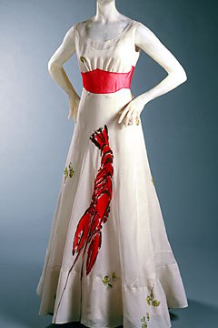
Rogers, L.W.R (2009) Elsa Schiaparelli: Shocking-Pink. Available from: www.lisawallerrogers.com/tag/schiaparelli-and-the-lobster-dress/


Task 1/2-Online Resources

Task 1/2

How to use online resources?

Photograph of Grace Jones in 1980, book chapter ‘Outsider’, photographer unknown Blackman, Cally (2012) 100 Years of Fashion, London

Photograph of Grace Jones in 1980, book chapter ‘Outsider’, photographer unknown
Blackman, Cally (2012) 100 Years of Fashion, London


Bustier, 1980, original artefact, Philadelphia Museum of Art, Philadelphia https://theredlist.com/wiki-2-23-1249-1258-view-1970s-profile-issey-miyake-3.html

Bustier, 1980, original artefact, Philadelphia Museum of Art, Philadelphia
https://theredlist.com/wiki-2-23-1249-1258-view-1970s-profile-issey-miyake-3.html

I initially chose to focus my research on a photograph of Grace Jones found in my own book ‘100 years of Fashion’ by Cally Blackman. In the photo her androgyny and strong silhouette create a striking image, this is why I chose it. For this reason I originally assumed I would base my research on the sexuality and gender identity of Grace Jones however after spending more time looking at the photograph I found more interest in her androgyny being emphasised by the contrast of her muscular arms and shoulders with the feminine silhouette of the bustier. For this reason I decided to focus my research on the bustier and its designer; Issey Miyake. Using the designers name and keyword ‘bustier’ I quickly found a website named ‘The Red List’ on which there was a range of images of Miyakes work- including a red bustier, similar to that in the original secondary source. While this website did not have any written information it did inform me of an archive in which more knowledge on the bustier could be gathered; the Philadelphia Museum of Art.

 https://theredlist.com/wiki-2-23-1249-1258-view-1970s-profile-issey-miyake-3.html


https://theredlist.com/wiki-2-23-1249-1258-view-1970s-profile-issey-miyake-3.html

https://www.philamuseum.org/collections/permanent/87018.html?mulR=599653818|1

https://www.philamuseum.org/collections/permanent/87018.html?mulR=599653818|1

The Philadelphia Museum of Art archives were very useful in giving information on Issey Miyake as well as the bustier itself and the concept behind it. 

Issey Miyake is a Japanese designer yet received western training . Despite this his designs are described as ‘neither Eastern nor Western’ and instead are said to combine the traditional Japanese emphasis of use of materials with modern technology. His ‘Women’s Bustier’ is an example of this as it was made in collaboration with a mannequin manufacturer (use of technology) and out of plastic (unique material choice). 

The bustier was a centrepiece of Miyake’s ‘Bodyworks’ exhibitions that toured in the early 1980’s. In this exhibition Miyake’s study of the body form and garment linking straight back the body. The bustier is playing with the idea that a garments purpose is not to  cover the body but to ‘expose a second skin’, allowing more of the wearers personality through rather than disguise it through a clothing barrier. Instead it exposes the wearer more than ever, drawing attention to their real natural body shape, I think this is a metaphor for the exposure of their raw soul. 

Another factor I find particularly interesting with his concept and bustier piece is that it seems to be celebratory of the natural voluptuousness of the female body yet this is very uncommon in high fashion (particularly during the 1980’s).

If I were to research this topic further there is valuable information in the digital archives of The Kyoto Costume Insititute and an essay named ‘Miyake, Kawakubo and Yamamoto: Japanese Fashion in the 20th Century’ on The Metropolitan Museum of Art website. 

Bibliography:

Blackman, C. (2012). 100 years of menswear. London: Laurence King.

Theredlist.com. (2017). Issey Miyake : Fashion, History. [online] Available at: https://theredlist.com/wiki-2-23-1249-1258-view-1970s-profile-issey-miyake-3.html [Accessed 18 Oct. 2017].

https://www.philamuseum.org/collections/permanent/87018.html?mulR=599653818|1 [Accessed 18 Oct. 2017].

Task 1&2: How to use online resources

Image of Westwood’s ‘Nostalgia of Mud’ collection March 1982 Photograph by François Lamy Taken from book ‘Vivienne Westwood’ By Gene Krell, as part of the ‘Fashion Memoir’ series.

Image of Westwood’s ‘Nostalgia of Mud’ collection March 1982
Photograph by François Lamy
Taken from book ‘Vivienne Westwood’ By Gene Krell, as part of the ‘Fashion Memoir’ series.

Vivienne Westwood is a designer I’ve always admired; herself a powerful woman, a political advocate and environmental campaigner. She expresses her views and opinions through her collections- for example her fall 2017 mens wear collection featured androgynous models and outfits. Vivienne designer the collection to inspired inner exploration, with many elements derived from past collections, recycling ideas for both genders. The mixed gender models also an element ‘recycled’- used by Vivienne in her early collections, such as ‘Pirates’. The image above is from Westwood’s ‘Nostalgia of Mud’ collection of 1982. Despite having studied Westwood before and her early collections such as ‘Punkature’, I had not previously seen this collection. I selected this image over others within the book ‘Vivienne Westwood’ as I loved the composition of the shoot; itself a reflection of the textured and layered clothing being modelled.

http://worldsendshop.co.uk/nostalgia-of-mud/ Original photograph of store front at St Christopher’s Place owned by Vivienne Westwood and Malcolm McLaren taken in 1982, photographer unknown.

http://worldsendshop.co.uk/nostalgia-of-mud/
Original photograph of store front at St Christopher’s Place owned by Vivienne Westwood and Malcolm McLaren taken in 1982, photographer unknown.

Further research regarding this collection lead me to the ‘Worlds End’ website- Westwood’s Flagship store. The post reflects upon the collection, but mainly the store that was created to market it in. Westwood created a shop to reflect the collection, itself a piece of art:

“The shop front was covered by a 3D relief of the map of the world made out of plaster & coloured a mud brown. The interior featured the cave like look of an archaeological dig. Scaffolding surrounded the walls, brown tarpaulin was stretched across the ceiling & a central pillar/stalagmite rose out of a pool of oily green liquid which bubbled primitively away.”

Ben Westwood, ‘Nostalgia of Mud’ 2014
http://worldsendshop.co.uk/nostalgia-of-mud/

https://www.vam.ac.uk/articles/vivienne-westwood-punk-new-romantic-and-beyond Article discussing the progression of Westwood’s work over the decades.

https://www.vam.ac.uk/articles/vivienne-westwood-punk-new-romantic-and-beyond
Article discussing the progression of Westwood’s work over the decades.

The information provide by the Website furthered my understanding of Westwood’s ideas, the shop acting as a further exploration of her concept.

The website however did not provide a explanation of Westwood’s ideas behind the collection. To further understand this I found an article produced by the V&A which mapped Westwood’s collections over the decades.

The article explained Westwood’s intention: ‘to demonstrate that the roots of our culture lie in primitive societies’ with garments within the collection reference traditional garments of different cultures.

This allowed me to further understand the composition of the garments and the reasons for the design of the store in which the garments were sold.

https://www.vam.ac.uk/articles/vivienne-westwood-punk-new-romantic-and-beyond Article discussing the progression of Westwood’s work over the decades.

https://www.vam.ac.uk/articles/vivienne-westwood-punk-new-romantic-and-beyond
Article discussing the progression of Westwood’s work over the decades.

Beginning research directed by a book, rather than an online source provided me with a more open starting point. If I had approached this research without having to use a book as my first resource I would have just relied upon previous knowledge of Westwood’s work, resulting in a restricted project. Working initially from a book prompted a different direction of research, using the internet to then further this initial research only. The use of the V&A’s archive of Westwood’s work provide me with a clear and reliable reflection upon the collection and its initial concepts, furthering my understanding of the work and the message it was designed to convey.

Task 1&2 – How to Use Online Resources?

For my first project based on the theme of line, I initially wanted to research colour. I wanted to investigate how coloured shapes intercept and overlap each other, forming patterns in an array of colour.

I wanted to find information based on the American artist Jasper Johns, as he produced vibrant colourful paintings based on various themes. I found a book in the library, “Jasper Johns: A Retrospective” by Kirk Varnedoe, which illustrated his painting, “Map”, created in 1961 (figure 1). The bright painting however, is limited in colour, as only the primary colours of red, yellow and blue are used, as well as introducing small amounts of white and black paint over certain areas.
I furthered my knowledge on the “Map” painting by searching the internet for information. I found the Museum of Modern Art website, where I watched an interview based on the history of the piece (figure 2). The interview implies that Jasper John’s “Map” was painted to illustrate the idea of chaos, as it created was during an uncertain time in America. In 1961, John F. Kennedy became America’s 35th president and the civil rights movement was just beginning, causing a clear distinction of segregation between the states. The concept of chaos is further supported, by the way Jasper Johns’ has painted different states and boundaries. For example, some boundaries were unclear, messy and some, were even missed. The way the paint had been applied also indicates Jasper Johns’ feelings towards the country at this time. It is clear that both sources indicate how the painting illustrates the new and changing country.
Following my initial research, I used the internet to search for brightly coloured fashion in the 60s. I discovered images of vivid mini dresses based on the primary colours of red, yellow and blue (figure 3). During the 60’s fashion, the Pop art era was introducing bold, vivid colours which later turned into polka dots and patterns.

To expand my knowledge of the 60’s colour palette and fashion, I used the internet to search for exhibitions based on my research. I found that the V&A Gallery have an exhibition based on 60s fashion, however, it limited my knowledge as it had little information and photographs (figure 4).

Overall, I have found the internet to be the best area to find information about Jasper Johns and 60’s colour and fashion. The internet was a quick resource and had vast amounts of information from different galleries, articles and imagery. However, to gain a deeper knowledge and understanding of art i.e. the “Map” painting and 60’s fashion, like exhibited in the V&A museum, I would like to visit the exhibitions to see the work in person and develop my own understanding of the pieces.

Figure 1: Page 203, Jasper Johns: A Retrospective. By Kirk Varnedoe.

Figure 1

2

Figure 2

Figure 3: Image taken from: https://vintagedancer.com/1960s/1960s-fashion-womens/

Figure 3

Figure 4: Screen shot taken from: https://www.vam.ac.uk/collections/1960s-fashion

Figure 4


Bibliography

  • Figure 1: Varnedoe, K. (2006). Jasper Johns: A Retrospective. New York: The Museum of Modern Art, New York.
  • Figure 2: 1960s Fashion. (n.d.). Retrieved October 18, 2017, from Victoria & Albert Museum: https://www.vam.ac.uk/collections/1960s-fashion
  • Figure 3: 1960s Fashion: What Did Women Wear? (n.d.). Retrieved December 18, 2017, from www.vintagedancer.com: https://vintagedancer.com/1960s/1960s-fashion-womens/
  • Figure 4: Art, T. M. (2013, December 30). www.youtube.com. Retrieved October 18, 2017, from Screen shot of Youtube clip taken from MoMA: Screen shot of Youtube clip taken from MoMA. https://www.youtube.com/watch?v=wer4F-2qd-Y


Task 1/2: How to Use Online Resources?

When set this particular task, I started off by scoping the WSA library (after the lecture given) for an interesting topic of research in which I came across the book ‘Techno Textiles: Revolutionary Fabrics for Fashion and Design’ which once read through slightly I could see multiple images which enticed me further. Furthermore, I found in particular an image which shows a women model wearing a ‘Shirt and Unisex trousers in ‘Milk Microfibre’’ taken by an unknown photographer on July 1996. I chose this image as it contained multiple subjects of choice in which would lead me into different paths and avenues to find more in-depth research on. For example, one subject choice I could possibly research into would be the start of the ‘Unisex revolution’ upon which only started within the 20th Century and societies are less conformed and structured now and lean more towards the gender-neutral/androgynous aesthetic due to becoming more open and acceptable in people’s views and ideas – the main designers who carried this movement forward were the likes of ‘Ann Demeulemeester’ and ‘Gareth Pugh’ who dubbed terms such as ‘gender-neutral’ and ‘Agender’. As well as this, this image also intrigues me to focus more on the fabric itself researching more in-depth into the ‘Milk Microfibre’ as that is the main focus of the books objective (as it looks into the specific techno textiles used within the garments themselves).

I decided to look on the internet for another image in which relates to the image which I got from the book from the library so I chose to look down the Unisex Revolution route and came across this particular image which came from searching on ‘Pinterest’ and is from ‘KTZ’s Fall 2017 Menswear Fashion Show’ which I found intriguing just purely for the fact I can clearly see development from the first image I chose which was taken in 1996 and this current image taken this year. I feel that this proves that societies are more open-minded and have less bias views on these particular subjects as barriers are crossed within fashion based upon gender clearly seen in both photos.

Furthermore, the next task specifies looking into museum exhibitions and archives to broaden our understanding of the image itself so I took it upon myself to look onto ‘Google’ and search for a museum exhibition/archive. Therefore, I came across this particular website which explained about a designer’s collection being shown in an exhibition which was based upon uniformity and neutrality which I found linked successfully with my images as they all convey the same message of conformity and gender-neutralism (expressing designs which fall within ‘unisex fashion’).

‘Shirt and Unisex trousers in ‘Milk Microfibre July 1996’:

‘Shirt and Unisex trousers in ‘Milk Microfibre July 1996’:

'KTZ Menswear Fall/Winter Fashion Show 2017':

‘KTZ Menswear Fall/Winter Fashion Show 2017’:


References:

  1. Techno Textiles: Revolutionary Fabrics for Fashion and Design – A book sourced from the ‘WSA Library’.
  2. https://www.pinterest.co.uk/pin/847521223597479541/ – An image taken from a search within the website ‘Pinterest’.
  3. https://www.radhourani.com/blogs/projects/15589821-5-yrs-of-unisex-phi-exhibit – A website in which gave me a deeper in-sight into ‘Unisex Fashion’ purely due to the fact the specific designer created a whole entire collection purely based upon the idea of gender-neutralism.

RCS Task 1&2 – Greek mythology


IMG_3690

The marriage of Zeus and Hera, The birth of Greek Mythology, photographer unknown, sculptor unknown.

Zeus and Hera are most commonly portrayed as the couple that rules Olympus and everything on earth beneath it. However, that is not the case. Zeus had had many wives before Hera.

When Zeus and his brothers, Poseidon and Hades, defeated Kronos, it left the three of them to rule separate parts of the world. Zeus, the god of the sky and land, Poseidon the god of the sea and Hades the god of the underworld. Zeus was so powerful that he was ruler over Olympus and naturally all of the other gods too.

Therefore, it left him to seduce every being as he pleased and no one or thing could resist him.

I looked into other Greek gods and goddesses that had their own love stories and problems and found many that are still being retold today as different things.

IMG_3689

Beauty and the Beast 2017, photo courtesy of Disney, fashionista.com, costumes by Jacqueline Durran.

The story of Beauty and the Beast is in fact a retold version of the story of Cupid and Psyche.

Their story however follows a similar story line to the original storyline of Beauty and the Beast. Both women are sent or ‘exiled’ to a far away place, in Belle’s case it was the castle and for Psyche it was the mountain top. They both went up there because of their fathers, Belle went because her father was trapped and Psyche was dragged up by her father because he was told to do so by the gods, Aphrodite was jealous of Psyche’s beauty.

Psyche was told she was to be in love with a serpent-like man and then was taken to a house where she was to live with him in the dark without being allowed to see what he looks like. Belle was also left to live with the Beast, who she didn’t know had a true man living within. Despite the fact that both women didn’t know what their lovers truly looked like, they fell in love with them.

However this is when the two women differ a little. Belle had to break the spell she didn’t know about in order to live happily with the Beast but Psyche didn’t know what her lover looked like at all and, when she fell pregnant, she became curious as to what he looked like. When she found it was Cupid, it destroyed their chances of being together.

Psyche was determined and Aphrodite gave her a set of three impossible tasks to complete, which she completed up until the third task. She was too curious and fell into a sleep from one of the tasks. Cupid rescued her and persuaded his mother, Aphrodite, to change her mind about Psyche and the gods transformed her into an immortal.

The Uffizi museum in Florence has the famous statues of quite a few of the Greek gods and their children, including Cupid and Psyche, Perseus killing Medusa and Zeus in the woods with children.

By Monique Olowu

Task 1 and 2 – Marcel Duchamp and The Armory Show


Marcel Duchamp in Hollywood. Photography captured by Beatrice Wood Book called Marcel Duchamp: The Bachelor Stripped Bare: A biography Published by MFA Publications, a division of the Museum of Fine Arts, Boston, ©2002. Chapter: A Fond Memoir, Page 313.

Marcel Duchamp in Hollywood.
Photography captured by Beatrice Wood
Book called Marcel Duchamp: The Bachelor Stripped Bare: A biography
Published by MFA Publications, a division of the Museum of Fine Arts, Boston, ©2002.
Chapter: A Fond Memoir, Page 313.

After the lecture I made my way to the library and randomly took out the book Marcel Duchamp: The Bachelor Stripped Bare: The Biography. When flipping through the pages I came across a black and white picture of Marcel Duchamp in Hollywood. It was quite an intense photo, almost a portrait of the artist taken by a friend of his: Beatrice Wood.

The Armory Show (also called The International Exhibition of Modern Art) in February 17, 1913 Opened at the 69th Regiment Armory on Lexington Avenue in New York. Smithsonian Institution Archives of American Art Photographer: unknown

The Armory Show (also called The International Exhibition of Modern Art) in February 17, 1913
Opened at the 69th Regiment Armory on Lexington Avenue in New York.
Smithsonian Institution Archives of American Art
Photographer: unknown

It was a surprising factor to find a French artist in the cosmopolitan American city, so I decided to look for “Marcel Duchamp in America”. An article in The New Yorker magazine caught my attention. There it explained how he became popular in this region and the purpose of his stay. Apparently, Duchamp’s “Nude descending the staircase”, a painting with cubist influence, was presented in one of the most significant shows ever held in the States: The Armory Show of 1913. Thanks to the enormous attention that his piece caught during this exhibition, Duchamp became well renowned.

The New-York Historical Society, a museum and library, explicitly created a website based solely on the Armory Show and its 100 year anniversary. Through this reliable source I gathered a considerable amount of data related to it and the impact it supposed on the society of the times and the development of future art practices. In fact, I found out thanks to a review in the New York Times that in 2013 the exhibition: The Armory Show at 100: Modern Art and Revolution was held. This show had historical purposes and brought back together some of the pieces that were originally displayed in 1913.

The Armory Show at 100. Website created by the New Work Historical Society, Museum and Library Website Available at: http://armory.nyhistory.org/about/ Accessed on the 18th of October of 2017

The Armory Show at 100.
Website created by the New York Historical Society, Museum and Library
Website Available at: http://armory.nyhistory.org/about/
Accessed on the 18th of October of 2017

 Marcel Duchamp, as previously mentioned, was a participant of the show, however, I yet hadn’t had the opportunity to discover more about him. Through the website of Tate Modern, I found further information not only of his life and artworks, but also of his personal vocabulary when expressing and talking about his pieces (for example: readymades).

Apart from artists like the French, I came across others like Picasso and his Blue Nude painting in some press releases of the NY historical society. It was impressive being able to read the reactions of people of those times: “You know, she’s a nude. You can tell she’s a nude, but she’s in all of those colours you never imagined you would see on a woman before, she looks very primitive, almost childlike” (viewer talking about “Blue Nude”).

Quotes like this made me perceive the realness of these events and somehow made them more human and interesting. I deepened myself into history websites to see if there were any historic events that could explain the need of this radical change in art aesthetic, and there clearly was. By reading the online Encyclopaedia Britannica I realised that between 1914 and 1918 World War One took place. Such a conflict gave rise to a moment of great tension and chaos. This breaking of art had now more of an origin, and it made sense that Dadaism, the art movement that all these different artists belonged to had emerged in a neutral country such as Switzerland.


Bibliography (Books and Websites).

Marquis, A., 2002. Marcel Duchamp: The Bachelor Stripped Bare: A Bibliography. 1st ed. Boston: MFA Publications, a division of the Museum of Fine Arts, Boston.

The New Yorker. 2017. DUCHAMP AND NEW YORK | The New Yorker. [ONLINE] Available at: https://www.newyorker.com/magazine/1996/11/25/duchamp-and-new-york [Accessed 12 October 2017].

Keats, J for Forbes Website. 2017. The Naughtiest Picture of 1913 ‘Nude Descending a Staircase’ Returns To New York City. [ONLINE] Available at: https://www.forbes.com/sites/jonathonkeats/2013/11/05/the-naughtiest-picture-of-1913-nude-descending-a-staircase-returns-to-new-york-city/#525497556c45 [Accessed 12 October 2017].

Continue reading

Exhibition Review: ‘Rei Kawakubo/Comme des Garcons: Art of the In-Between’:

The specific exhibition I decided to research into was the ‘Rei Kawakubo/Comme des Garcons: Art of the In-Between’ exhibition due to the fact that it was a current and recent up-to-date exhibition in which has been seen profusely by others. The exhibition was open on May 4th, 2017 to September 4th, 2017 at ‘The MET Museum, Iris and B.Gerald Canton Exhibition Hall, New York, USA’ previewing the works of Rei Kawakubo’s earliest collections, dating back to 1981, to her latest collections today – showcasing 140 examples (following nine dominant and recurring aesthetic expressions) in which created quite a thematic style exhibition as its shown in a more uncongenial way through taking the viewers through the designers development stages over a period of time rather than a more conformed and traditional array of exhibitions. The exhibition is all about her unsettling aesthetic brought on by expressing themes of:

  • ‘ABSCENE’ and ‘PRESCENE’,
  • ‘FASHION’ and ‘ANTI-FASHION’,
  • ‘MODEL’ and ‘MULTIPLE’,
  • ‘HIGH’ and ‘LOW’,
  • ‘SELF’ and ‘OTHER’,
  • ‘OBJECT’ and ‘SUBJECT’,
  • ‘CLOTHES’ and ‘NON-CLOTHES’.

All of which creates an intense and invigorating atmosphere just purely due to the fact its presented in quite an interstitial artistic manner. This basically implies that the exhibition itself is an art form which falls between the familiar boundaries of common genres/media, therefore making the work more difficult to categorize and comprehend in a way where it will fit within a singular artistic discipline. By having such an unconventional layout and previewing such avant-garde and conceptual design ideas/concepts it gives me an in-sight into another designers varied-style of working in terms of fashion design (i.e. Rei Kawakubo’s adaptations of the uses of avant-garde couture and conceptualism). I like the fact that the exhibition has such a wide and broad variety of themes, ideas and concepts as it allows you to see her, the designer (Rei Kawakubo), development through the stages of her career (which in itself gives me inspiration through the design development and design process). As well as this, I feel that the exhibition once seen and taken all of it in it will leave you broadening your own potential of creativity allowing you to have no limits and break the boundaries of conformity. I felt whilst looking at this particular exhibition it was quite intuitive and contained a vast amount of intellectual design in contrast to other exhibitions I could rarely see therefore in my opinion I feel if I was to have attended this exhibition I would have thoroughly enthused myself into it and gain a lot of knowledge, creativity and experience from going.

https://www.vogue.com/slideshow/rei-kawakubo-comme-des-garcons-art-of-the-in-between 

Main Entrance to the 'Rei Kawakubo/ Comme des Garçons' Exhibition:

Main Entrance to the ‘Rei Kawakubo/ Comme des Garçons’ Exhibition:

Inside the 'Rei Kawakubo/ Comme des Garçons' Exhibition:

Inside the ‘Rei Kawakubo/ Comme des Garçons’ Exhibition:

References

Information:

  1. https://fashionunited.uk/news/culture/the-10-must-see-fashion-exhibtions-of-2017/2017010322981 – Due to the fact that I had not been to any exhibitions recently I decided to research online and see what kind of exhibitions happened recently this year, in which led me to this specific website in which I found the exhibition (with a little description of what the exhibition is about and when it took place).
  2. https://www.metmuseum.org/press/exhibitions/2016/rei-kawakubo – When looking on the first website I researched, I found that it was very vague and did not leave me with enough information about the exhibition so I searched and found this website which led me to more in-depth and analytical information on the exhibition – allowing me to focus more and known more about the exhibition itself.
  • Video: ‘Rei Kawakubo, Comme des Garcons: Art of the In-Between – Gallery Views.’ – On the website stated above, I came across this video in which spoke about the different key themes the exhibition has to offer and how each one is portray in juxtaposition of each other (as they all contained opposites of some form).
  1. https://en.wikipedia.org/wiki/Interstitial_art – Researching more about the exhibition itself, I came across this phrasing in which I did not truly understand so I looked up the definition and researched into the basis of the idea more – therefore allowing me to understand and connect more with the exhibition and what it is truly based upon (and to gain a better understanding of the word).
  2. https://en.wikipedia.org/wiki/Ambiguity – Researching more about the exhibition itself, I came across this phrasing in which I did not truly understand so I looked up the definition and researched into the basis of the idea more – therefore allowing me to understand and connect more with the exhibition and what it is truly based upon (and to gain a better understanding of the word).
  3. https://en.wikipedia.org/wiki/Retrospective – Researching more about the exhibition itself, I came across this phrasing in which I did not truly understand so I looked up the definition and researched into the basis of the idea more – therefore allowing me to understand and connect more with the exhibition and what it is truly based upon (and to gain a better understanding of the word).

Images:

  1. https://www.vogue.com/slideshow/rei-kawakubo-comme-des-garcons-art-of-the-in-between – took some images from a slideshow on the ‘Vogue’ website so I could see what the exhibition could look like and how it was displayed visually and aesthetically.


Task 1/2 – Online Resources

For this task, I started in the library looking at all the different sections, deciding what to choose as my primary source. I came across a book on Cubism, which contained photos and information all about the different artists who use cubism in their work. “Cubism is an early 20th-century style and movement in art, especially painting, in which perspective with a single viewpoint was abandoned and use was made of simple geometric shapes.”[1] I came across this painting called ‘In The Hold’ by David Bomberg, which is a very colourful geometric framework of multiple cubes and triangles, divided into sections, to create one whole image. When reading the description, it is said that you are able to see little images, such as person in a hat, however I am not able to find this myself. This picture caught my eye because of all the different colours and shapes that were used; I get a sort of pop art feel from this image. The multi coloured squares really draw your attention to the whole piece rather than just one area of the piece. The image looks better as a whole rather than separate sections of colour. The style of cubism breaking down a specific view point was extremely influential is many artists. It is a very popular way of art used by many artists in pieces such as Les Demoiselles d’Avignon by Pablo Picasso.

Going on the internet to search for my secondary source, I came across many incredible fashion garments which were inspired by cubism. The one that I chose was my favourite out of all of them; made by an upcoming fashion designer from Japan called Wynn Zyou. He created a cardboard fashion inspired cubism piece; which caught my attention because of how animated it looks. When you look at the garment, you would think that it was edited of Photoshop or is a cartoon, however the thought of it being an actual garment surprises me because of this sort of optical illusion. This reminds me of JumpFromPaper’s optical illusion bags, because of this unreal, cartoon like design. The way that the design stands out, like the In The Hold painting, really draws your attention to all of the garment, especially the skirt part of the dress, rather drawing your attention to one area of the piece. This due to the large range of colour and shapes throughout the whole piece instead of it being dull in some areas and colourful in other. You are able to tell exactly where his inspiration came from, even without knowing beforehand or being told. The garment is extremely fun and colourful, like the Bombergs’ painting, which is what I believe really brings these two pieces together.

I did really enjoy looking at all the fun garments people have made, which are inspired by cubism because there is such a huge range of ideas from fun and colourful to extremely elegant pieces. With this, it would make a perfect idea to use as a project brief.

In The HoldCubism Inspired

[1]  http://www.tate.org.uk/art/art-terms/c/cubism – CUBISM

1960s


I chose the 1960s because it is an interesting and bold age. It interests me to see the beginning of change socially and in fashion, using PVC and more other man made materials in garments. The library is a great resource available to me so I looked for and found a book on the nineteen-sixties, it inspired me because it relates to my current project and my past in fashion and textile design – at college I looked into the sixties and thoroughly enjoyed it. The first image that I chose was from ‘A fresh look at the Decade if Change by Francis Wheen The Sixties’. It shows a normal high street from the time, with various aspects of the decade showing including advertising, fashion and motorcars. I came to my decision on the PVC dress on the basis that there are bold shapes in the original photograph, which are replicated in this image of a garment made in the 1960s. The style of this dress and its manufacture was inspired by the ‘space age’ a popular movement of the time. Furthermore, women and men adopted the ‘wet look’ mainly garments and accessories made from plastic, man-made fabrics and materials. Women in the sixties looked up to celebrities’ style such as Doris Day, Marilyn Monroe and Audrey Hepburn in the media which was very influential to everyday fashion.

I feel the first image displays the many changes that happened in the sixties, women had more freedom, and different laws were introduced to give people more control of their own bodies, in turn, this was mirrored in fashion with influential characters like Mary Quant who introduced the mini skirt fitting in perfectly with society at this time. PVC seems to be held together with zips that may be a metaphor for how the different components of society fit together in different ways and how it can easily be unraveled at the pull of a string/ zip. Women’s fashion was mainly influenced throughout this time but men also had changes such as ties getting wider and collars longer. Men’s general look was more relaxed because of their long hair influenced by The Beatles. Some men stuck with suits similar to those worn in the fifties, which was older men. There was a major European influence in the sixties for men’s fashion, including tassels, and the hippie movement. Overall, I think my choices in photograph and garment go together well as I can clearly see the connection between the two.

IMG_2500

Unkown photographer, The Sixties by Francis Wheen

320

PVC optical shift dress, Stephen Willats, 1965, UK. Museum no. T.19-1991. Victoria and Albert Museum, London