Category Archives: Fashion & Textile Design

This Category should be selected if you are a Fashion & Textile Design student.

Task 5/6 Visual Research

Matty Bovan: Fall 2017 Collection

the_black_horns_by_allagar-d99fw5kfd81ce478c326abac8f076d3a089251atumblr_mm11aacATk1rtjmi5o1_1280imagesimages-1

7da216aeef6e38d8b3b747a272924d09--title-page-martin-game-of-thrones

v1.bTsxMTE2NjkzODtqOzE3NTA3OzIwNDg7ODAwOzEyMDA

98be34913227ed111f3efe6663bfc6c8

Matty Bovans Fall Collection 2017

Blade Runner Film: 1982 Fantasy/Science Fiction Film

In Matty Bovan’s Fall collection of 2017 he has many inspirations and referencing which have been used in order to come up with a visually appealing and a successful knitwear collection. One of his inspirations is the film made in 1982; Blade Runner, staring Harrison Ford. This film is a science fiction/ fantasy film. It is about eliminating four escaped Replicants from colonies who have returned to earth. Being an alien based film, it has many interesting features to it which have rubbed off on Matty Bovan’s designs. I believe that in his collection he has been inspired by Blade Runner in many ways. One of which could be with the shapes and colour he has chosen to use throughout his collection. But not only this, in some of his designs, you can see how he has taken inspiration from the costumes used in the film. He has included in his garments many alien/ sci fi elements by using metallic thread and sequins.

The theme of the film; about eliminating replicants coul have rubbed off onto Bovan’s collection; as some of his garments are seen in a very similar style and with somewhat constant theme, yet they all differ in many ways, such as colour, shape, pattern and the techniques used. This could link to the topic of the film; about not being able to replicate humans, you will always be able to tell whether its a human or something else. So therefore, I believe the Matty Bovan could be suggesting and wanting to translate a message in his collection, by saying that he is unique and you can’t replicate his designs, as you will always be able to tell whether it is his design or someone else’s; i believe he is putting a stamp on all of his garments.

Bibliography:

  • Fall 2017 ready-to-weat, Fashion East: vogue.com
  • Brooke Bobb, B.B, February 18, 2017, How Rising London fashion Week Star Matty Bovan Crafts his Crazy Cool Clothes www.vogue.com/article/fashion-runway-london-fashion-week


Task 5/6- Visual Research

Screen Shot 2017-11-02 at 14.56.39

Jackie Nickerson- Gift, 2013

Jackie Nickerson Gift, 2013

I came across Gareth Pugh and his AW14 Paris Collection and was immediately drawn to the materials and shapes he had used like the plastic, calico and creamy beige tones that aren’t usually used on the catwalk. When researching for his influences I came across an article [1] that cited a photograph (Gift, 2013) taken by Jackie Nickerson as one of his influences. The photo was taken from her ‘Terrain’ series which was based on southern and eastern African farms and focuses on the ‘materiality of labour’ as mentioned on her website [2]. The particular image was of a woman who was obstructed by plastic sheeting standing in the middle of a farm, and it was this context that I think inspired Pugh. Nickerson did this to describe the relationship between the farmworker and their environment, which to me could suggest she was trying to convey that for many workers, their work is entirely consuming and their identity as a human outside of the farm is very unknown. I feel Pugh picked up on this and portrayed this using those materials as he stated in an interview with Lou Stoppard that “It was a bit like hitting the reset button this season” [3] almost like he wanted to re-identify with how he worked so that it was more raw and untouched and showed a different side to his design process, which can be seen through the use of very similar materials in this collection. Also in the image the plastic is offset by the natural farm surroundings and gives a stark contrast. Plastic being a man-made product, links exactly to what she was trying to convey and I feel it works perfectly in the image to show how much the materials these people are making, have an impact on the environment but also themselves. Pugh then translated this onto the body, a very natural being, for fashion design and shows how much she inspired his work.


Bibliography

1) Brandes, B (July 2014) Gareth Pugh’s Labyrinth  http://www.dazeddigital.com/fashion/article/20252/1/gareth-pugh-s-labyrinth  Accessed: 1st November 2017

2) O’Toole, P. Moving between Land and Subject                  http://www.jackienickerson.com/work.php?pid=1&mode=3   Accessed: 1st November 2017

3) Paris Women’s Wear A/W 2014 Gareth Pugh http://showstudio.com/collection/gareth_pugh_paris_womenswear_a_w_2014     Accessed: 1st November 2017

Task 5/6 – Visual Research

gucci1 gucci2 gucci4 gucci3 gucci5 gucci6 gucci7 gucci8 gucci9 gucci10

gucci5

Whatson, M (2015) Butterfly, Rome [Accessed 30th October 2017] Photographed by Blasetti, A

My chosen designer is Gucci. The image I chose is of a piece of artwork by Martin Whatson. It is a painting of a butterfly with colourful graffiti wings inside of a wooden frame which is hung on a wall of a derelict building. I liked this image as I liked the way the painting, which is of something natural, was placed on something manmade. I also like how the butterfly and the frame around it is in perfect condition, where as the building is a contrast with peeling paint and rust.

The artist used acrylic paint and spray paint to complete this piece. His background was a large canvas measuring at 80cm x 101cm. Whatson used spray paint to create the graffiti style patterns within the wings as well as the thicker black areas of the butterfly, shown by the small specks around it which gives the effect of shadowing. Behind the butterfly, is a light wash of colour with faint white lines painted over the top to create texture and to make it realistic like the butterfly has landed on something. The photographer, Alberto Blasetti, has shot the image at eye level with the art work slightly off centre. He has created a sense of depth in the photograph by including the walls of different rooms in the building. The use of the wide angle gets the viewer to look at the whole image instead of just focusing in on the art, which has become embedded in the photograph. From looking at Blasetti’s other images in his ‘Art’ collection, I have noticed a similarity in the angles of which the photographs were taken. The majority of the shots have been taken at eye level however, the images of art work taken in a gallery have been taken at a side angle to include the shape of the room. I have also noticed that all the other photos have a white background so the eye focuses on the art however, with the outside butterfly image, the photographer has purposely used it as part of the whole composition.

Task 3/4 – Academic Integrity

IMG_1411IMG_1401

Buxbaum, G (2005) Icons of Fashion: The 20th Century.
London: Prestel.

I decided to base this research task around fashion in the 1960s as I am interested in the different styles created throughout the decade. I started off by going to the library and flicking through various books until I found an image that caught my eye. The book I chose was ‘Icons of Fashion: The 20th Century’ by Gerda Buxbaum, which included information about 1960s fashion that I wanted to explore further. I also chose this book because I noticed one of the contributors was Christopher Breward who is the head of research at the Victoria and Albert museum, so I know all the information would be correct. I selected an image which shows a few minidresses designed by Pierre Cardin as I liked the colours and 3D patterns created within the garments.

pierre

V&A Museum (2016) Pierre Cardin. Available from:
http://www.vam.ac.uk/content/articles/p/pierre-cardin/ [Accessed 21st October 2017]

I then wanted to find out more about the designer of the dresses so decided to find a website for more information. I found a page on the V&A’s website which gave details about the designer, how he set up his own business and his inspirations behind the designs. I chose the V&A because I know it is a reliable source and the information on the website would be correct.

telegraph
The Telegraph (2011) Pierre Cardin: a history. The Telegraph, 21st October

I then went and found a newspaper article about the designer. I came across an article called ‘Pierre Cardin: a history’ which included a timeline of events that happened in his life from 1922 up until 2010. I chose this newspaper because the layout was easy to read and the addition of the years gave me a better understanding, even though the information wasn’t that detailed.

Task 1/2 – Online Resources

IMG_1385

Photograph of Vivienne Westwood in 1977, book chapter ‘Outsider’, photographer unknown Blackman, Cally (2012) 100 Years of Fashion, London

The book I started off with was ‘100 Years of Fashion’ by Cally Blackman. I liked the look of this book because it went through a lot of the different styles in the various decades and included iconic photographs from them. I flicked through the pages and came across a photograph of Vivienne Westwood from 1977 which caught my eye. I was intrigued by the style of the clothes and wanted to find out more about the main influences at the time as well as the designers inspiration. After some further research, I found out that the ‘Bondage Suits’ were part of Vivienne Westwood’s Spring/Summer 1976 collection and comprised of a matching trouser and jacket set. Westwood was inspired by elements of combat and fetish wear but mainly influenced by Punk which was popular with musicians at the time.

suit

‘Bondage Suit’ S/S 1976 By Vivienne Westwood and Malcolm McLaren https://collections.vam.ac.uk/item/O72586/bondage-suit-vivienne-westwood/

As the book had little information on the collection, I then started to search the internet for more information on the garments. I decided to look at the V&A collections as I knew it was a trustworthy source and came across a suit similar to the one worn in the original image. It was featured in an exhibition called ‘Vivienne Westwood: Punk, New Romantic and beyond’ which centred around Vivienne Westwood and her involvement in the Punk era where she created her trademark look. After reading further, I found out that she created garments that she and McLaren sold to young people who were brave enough to wear the edgy style. The use of imagery on the garments were often seen as controversial as they show unclothed parts of the body as well as images that were classed as pornographic. Also the use of a photograph of the Queen with a safety pin through her mouth and a quote saying ‘she ain’t no human being’ was seen as a rebellion against the Royal Family.

https://www.vam.ac.uk/articles/vivienne-westwood-punk-new-romantic-and-beyond


Task 3 Visual

Reference moodboard 

ć±ćč•ćż«ç…§ 2017-11-01 例捈9.46.14

Fashion Designer :Rick Owens

rick-owens-cover-1_0

Portrait of Rick Owens by Danielle Levitt.

I am inspired by the American fashion designer Rick Owens he is also the founder of Rick Owens      .

Actually, I have two favorite designers, Yohji Yamamoto and Rick Owens, the style of these designers are similar, but also have different features. Rick Owens is the designer who most inspired me. In the traditional fashion way, the design of this brand could not meet the public aesthetic culture and not destined to be popular or hard to become popular, but it also inspired me a lot. The Gothic style, the dark style and high street style is the symbol of this brand. Black, grey and off-white is the main color which is not exaggerated and low-key. It seems to me that black is the coolest color. So I chose to deeply understand Rick Owens 2017 SS fashion show and collection. Here are some pictures of him during the spring and summer of 2016.ć±ćč•ćż«ç…§ 2017-11-01 例捈10.47.40Rick Owens 2017 SS Collection “walrus”

Image analysis


ć±ćč•ćż«ç…§ 2017-11-01 例捈9.44.34

Rick Owens 2017 SS Collection / Styling & Photo by MilK

I love this picture from the bottom to the camera angle, jumping and the photographer just perfect models capture. Different clothing parts of the body around the model, together with the loose body contour, the walrus theme became apparent. The texture of the ancient Greek folds, like the walrus’s sebum texture, is deliberately huge, like the tail of a walrus. Some people would say that this season clothes like unfinished things. But this is the reason why Rick Owens attracts me, because the design is sui generis.


Reference List:


Available from:https://www.vogue.com/fashion-shows/spring-2017-menswear/rick-owens/[Accessed 1 Nov. 2017].

Available from: https://www.flickr.com/photos/andy999/6133900707/lightbox/ [Accessed 1 Nov. 2017].

Available from: https://i.pinimg.com/originals/50/32/b2/5032b22664b221ed68b496c70c715332.jpg[Accessed 1 Nov. 2017].

Available from: https://500px.com/photo/92469069/like-a-model-by-rob-jann%C3%A9 [Accessed 1 Nov. 2017].

Available from: https://rovingpsyche.wordpress.com/2014/10/25/fashion-in-ancient-greek/[Accessed 1 Nov. 2017].

Marble, R. (2006) Colossal statue if Antinous as Dionysos-Osiris Available from: https://en.wikipedia.org/wiki/Antinous#/media/File:Antinous_Pio-Clementino_Inv256_n3.jpg  [Accessed 1 Nov. 2017].

https://en.wikipedia.org/wiki/Antinous#/media/File:Antinous_Pio-Clementino_Inv256_n3.jpg  [Accessed 1 Nov. 2017].

Michael,M.(2005) Headcovering customs of the ancient world  Available from: http://www.bible-researcher.com/headcoverings3.html [Accessed 1 Nov. 2017].

Numéro. (XXXX) Exclusive interview with fascinating fashion designer Rick Owens. Available from: http://www.numero.com/en/fashion/exclusive-interview-rick-owens

Task 5/6 – Visual Research

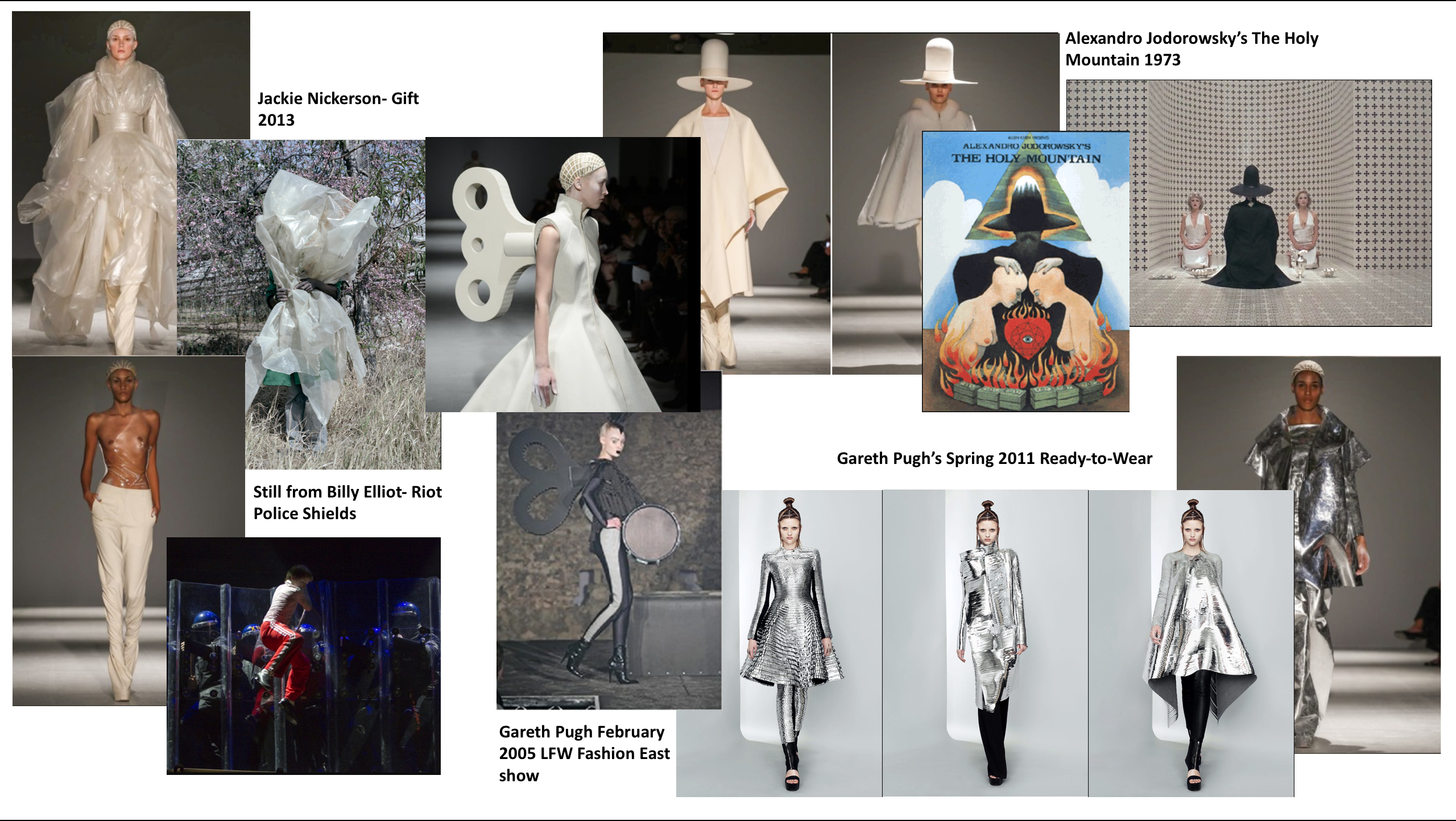
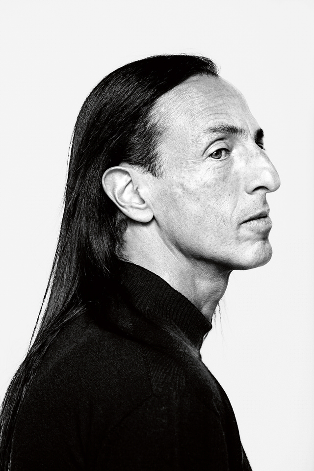
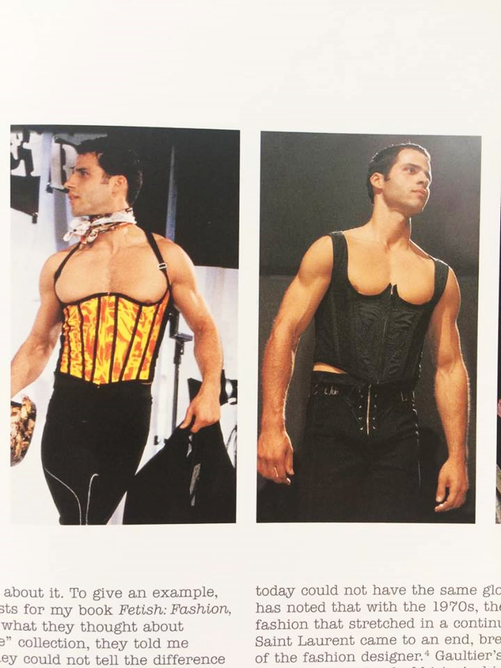
Fashion Designer – Gareth Pugh

gp1 gp2 
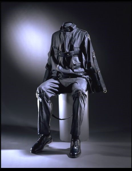
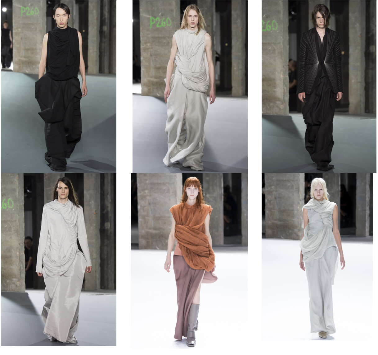
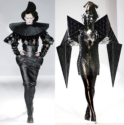
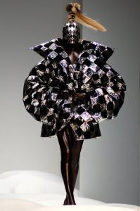
Examples of his workgp3 gp4

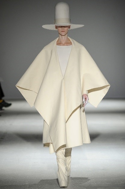
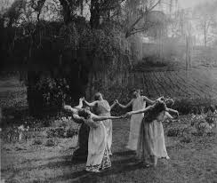
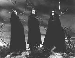
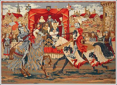
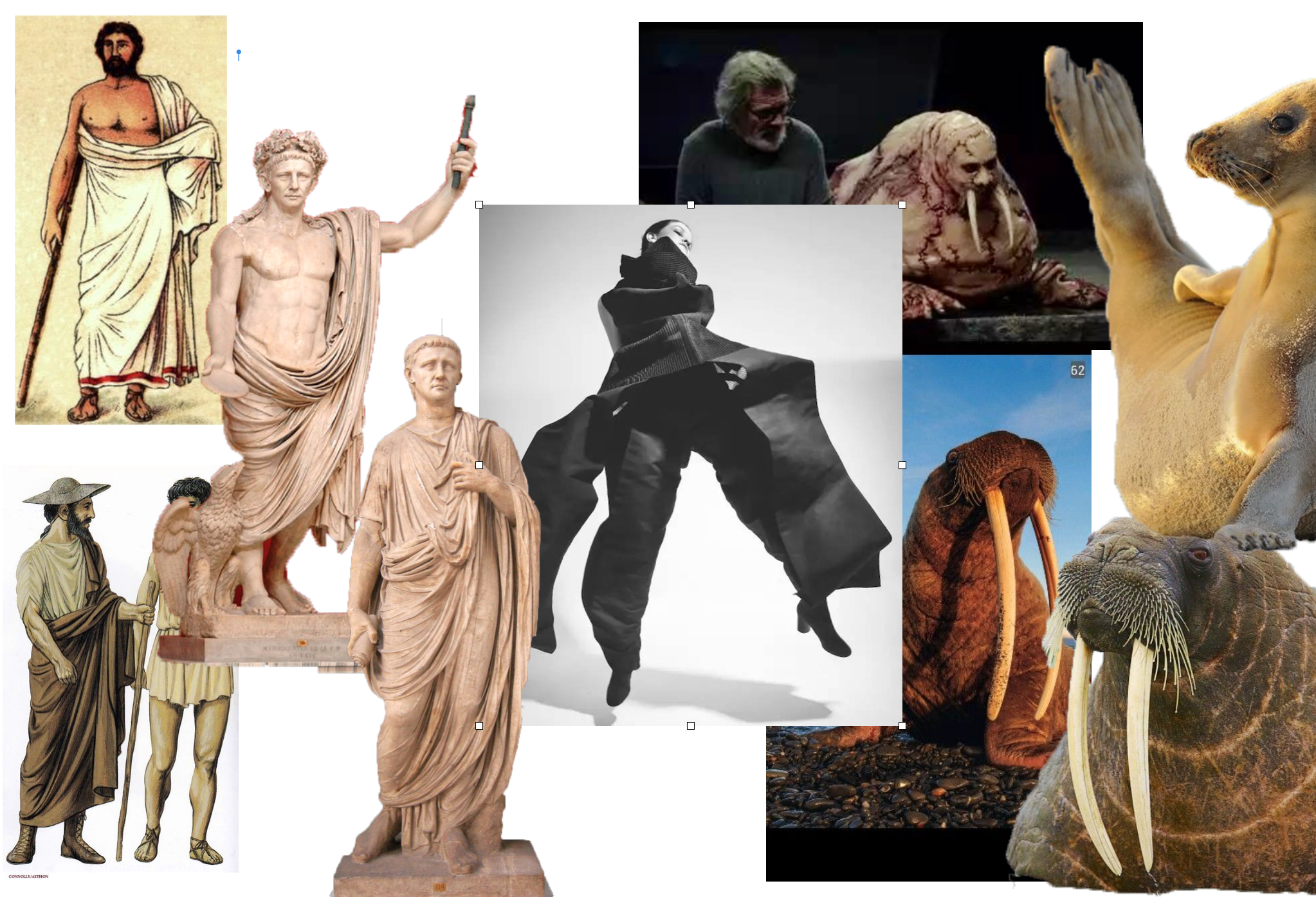
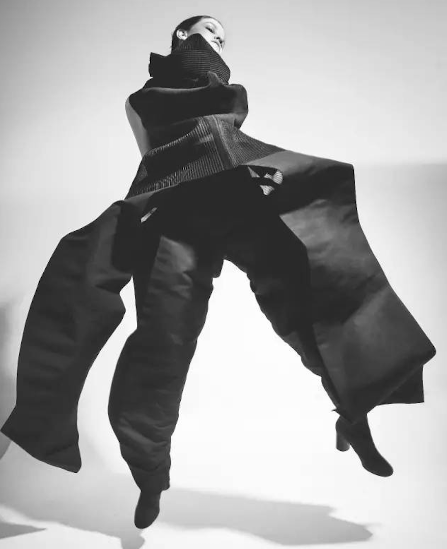
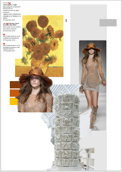
Reference Mood Board
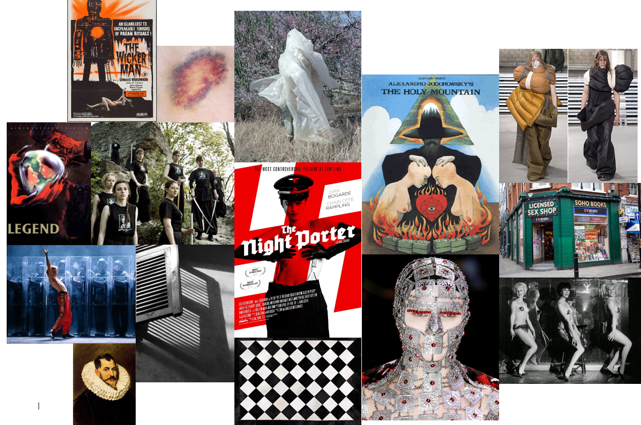
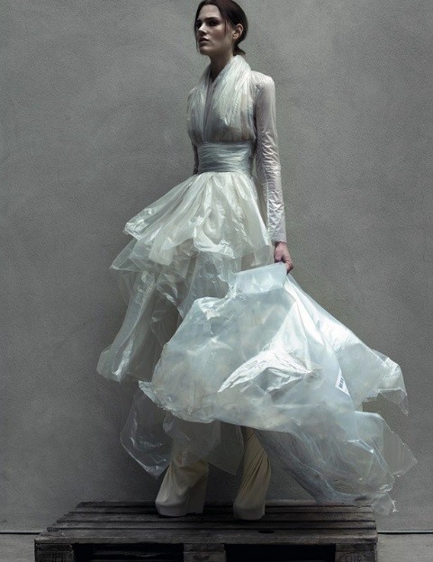
mood


Image analysis

gp5

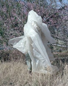
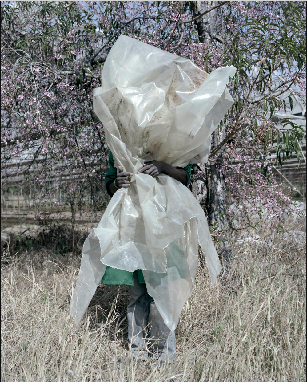
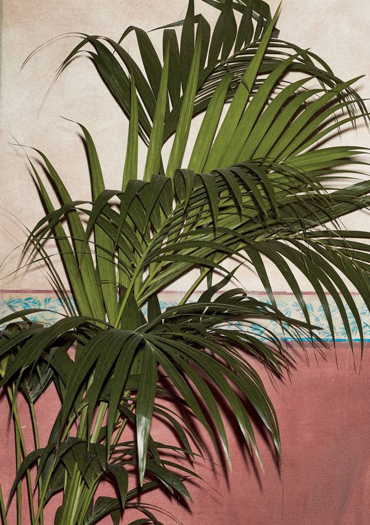
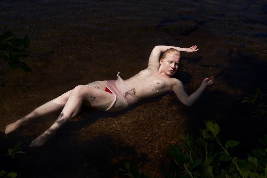
“Gift 2013” from the collection “Terrain”

Photographer: Jackie Nickerson

Shoot location: Southern Africa

The subject of the shoot is a local farmer from Southern Africa who has been immersed in a piece of plastic sheeting to obscure their face and body. The portrait image is a head on shot of the subject which gives it a more intense contrast between the harshness of the plastic and the softness of the natural landscape behind the subject. By having the image in full focus, the viewer can see the harsh folds and lines of the plastic more clearly which gives the image more definition and sense of 3D form. The image has been taken with most likely a DLSR camera and has been probably slightly cropped to allow a stronger point of focus on the subject to make them the focal point of the image more successfully. Nickerson has used the rule of thirds as well to immerse the viewer in the subject of the photo by positioning them in the full 3 centre segments with small pieces of plastic sheeting spreading out to then allow the viewer to observe the natural landscape surrounding the subject. The style of the image is more of an artistic portrait of the subject with them only suggested through the basic form whilst the rest is hidden through the plastic sheeting, however this in itself instigates narrative. Nickerson tends to work with the normal people of Southern Africa such as farmers and workers as the subjects of her images. The tones tend to be faded slightly and there is a common trend of obscuring the subjects face or body in some way to conceal identity. The shoots also normally take place in the landscapes these people work in.

When comparing this image to Nickerson’s other work it is clear to see that they all follow a common trend of obscurity of identity and a focus on the landscapes the subjects work and live in. After reading a review of Nickerson’s work by Jack Shianman I have been able to broaden my understanding of the work, he writes “TERRAIN is about us in the landscape, how we change the world we inhabit at every moment of our being human, and how, for better and for worse, the world that we make, in turn, changes who we are.”. This statement involves a deeper understanding of how we as humans adapt into our environments and effect it both positively and negatively in the process. Nickerson illustrates this concept within what she clads her subjects in – palm leaves, crates, plastic and tangled wood – all of which create their own contrasts and atmospheres when placed within the natural landscapes around the subjects, for example the contrast between the plastic and nature within this image is slightly strange to view and I feel like that represents the current balance between humanity and nature in that its unbalanced and not synced with one another with the plastic being harsher against the softness of the plants behind it. I decided to compare Nickerson’s work to that of Steve McCurry who does a lot of travel portraits of the local people in the places he visits, by comparing the two an interesting contrast surrounding colour was seen as McCurry’s photography was a lot more vibrant and portrayed a more colour side to life and humanity by expressing a variation of culture and what humanity is. This is different to Nickerson whose work is more faded in tone and instead of expressing the subjects face (which McCurry uses to express the life of the subject and connect with the viewer) she instead uses objects to hide them and allow the viewer to develop deeper meaning on the relationships of the elements of the image and how they compare to humanity’s relationship with the surrounding world. McCurry’s imagery also commonly uses a shallow depth of field to focus more on the subject rather than the landscape around them whereas Nickerson uses a wider depth of field to express a balance in her work and relationship in the elements.

In conclusion Nickerson’s work demonstrates a sense of opposite and an unbalanced nature which allows me to see why Pugh was influenced by it for his AW14 collection which features more stripped-down materials and materials similar to the plastic sheeting in the photographed draped onto the model’s body. Through my research into Pugh’s references I found opposites to be a key element which is most likely why he became interested in this image by Nickerson, due to its strange relationship between the subject and the landscape as there was something slightly off about it but it’s hard to describe which I feel is a common element of Pugh’s collective works.

Bibliography

http://www.dazeddigital.com/fashion/article/11272/1/20-qas-gareth-pugh

http://www.dazeddigital.com/fashion/article/23560/1/gareth-pugh-a-visual-history

http://www.dazeddigital.com/fashion/article/20252/1/gareth-pugh-s-labyrinth

http://garethpugh.blogspot.co.uk/p/collections.html

http://www.jackshainman.com/artists/jackie-nickerson/

http://stevemccurry.com/galleries

http://www.jackienickerson.com/work.php?pid=1&mode=4

Task 5/6 – Valentino

To find an inspirational designer to me wasn’t hard, Valentino has always been a favourite of mine. Through the simple lines and the detailing which is very advanced for the Fashion industry I knew this was something I’d want to look into. To find a collection which I could get the designers inspiration from I didn’t have to look hard. I looked at Vogue and noticed that Valentino’s Fall 2016 Couture collection has plenty of information on where the designers got their inspiration from.

This Couture collection has used William Shakespeare as a main subject for the garments created; by using his famous storylines. Valentino has also looked at the Elizabethan era with its architecture, portraiture and the Italian catholic renaissance.

Portraits of  Women of Italian Renaissance. Agnolo Bronzino

To focus on one image, I’ve chosen this original Elizabethan portrait, I think it sums up the collection easily. The first thing I notice by comparing it to the Valentino garment is how alike they are, I could easily understand the Valentino garment being the original Elizabethan costume.

One thing that Valentino has taken from the Elizabethan era is the bodices, the puffed sleeves, the necklines, the brocade and the shape of the silhouette. I immediately notice the Elizabethan ruff around the neck which was a popular trend from that time period; it doesn’t show in this portrait, but however it shows how they covered their necks with detailing.

Valentino Fall 2016 Couture Red

With both the images I’ve noticed how they decorate their garments as well with the detailing and the jewellery which shows power and money – what social class they are. The rich textures of the fabric also bring them both together, this was another popular trend for that era as everyone followed the queen to show their wealth and status.

Valentino mood board

Click on link


I feel that the Valentino collection really connects with the Italian and Elizabethan renaissance era as you can see what key parts they have taken to create the Couture collection.

http://www.italymagazine.com/featured-story/renaissance-part-5-art

http://elderbradengriffiths.com/mantova-italy-gem-of-the-renaissance/

https://www.rsc.org.uk/shakespeares-life-and-times

http://www.artistsandart.org/2009/12/portraits-of-women-in-italian.html

https://www.pinterest.co.uk/catholic4all/popes-of-the-catholic-church/

https://www.vogue.com/fashion-shows/fall-2016-couture/valentino

https://www.pinterest.co.uk/explore/sacred-heart-cathedral/

http://www.philippagregory.com/family-tree/queen-elizabeth-i

https://www.rsc.org.uk/the-merchant-of-venice/about-the-play/dates-and-sources

https://www.citelighter.com/film-media/fashion/knowledgecards/womens-fashions-of-the-elizabethan-era

Task 3/4 – Academic Integrity


(Book)

The Fashion World of Jean Paul Gaultier: from the sidewalk to the catwalk 

jpjp2jp3

(Webpages – Fashion Photographers)

Terry Richardson                                        Drui and Tiago

jp6      jp4

Jason Kibbler

jp5

(Article from i-D magazine)    Sofia Hattingh

jp8 Photograph by Frances Carterjp7

I started with the Jean Paul Gaultier book as it had a large collection of his work which allowed me to draw some themes from this to take forward in the rest of my research. The main pieces displayed in the book that I focused on were the ones that involved eroticism and heightened sexuality as I wanted to explore how designers incorporated eroticism and fetish within their works as I found this to be a key feature of Gaultier’s work. I selected a few images from the book to illustrate this point such as the male corsets and the structured female piece which was more of a deconstructed corset which is a piece that embodies both the themes I wanted to explore.

I researched into eroticism and fetishism with fashion design however I couldn’t find that much that had a whole website or webpage for it so I decided to research into fashion photographers who explored sexuality within their work as this was a more fruitful research option. I found my 3 photographers by looking at sites which had collections of fashion photographers who were currently working and very successful. Terry Richardson was one of the main photographers I wanted to look into as he was involved in the scandalous Tom Ford campaign which was banned in multiple countries due to it over sexualising the female body to advertise the cologne. After looking into the more extreme end of the sexual fashion photography I looked at slightly softer examples such as Drui and Tiago and Jason Kibbler both whose work explores a more dignified expression of the female body. Whilst both photographers explore nudity and suggestive sexuality it doesn’t hold the same intensity and atmosphere as Richardson’s work which feels more expletive and intrusive which is more intimidating to the viewer.

For the newspaper article section of my contextual research I found an article in i-D magazine which had an interview with Sophia Hattingh who in 2015 made glasses which had pubic hair put in them. This magazine article related very well to my other research as it involved fetishism within fashion which was more controversial and made a statement about how society reacts to sexuality displayed in the media. Through researching into this article I was able to see how Hattingh wanted to push the boundaries of fashion materials and societies acceptance of sexuality by putting more controversial materials into her work.


Reference bibliography

Editorial Portfolio- Drui and Tiago (2017) Editorial Portfolio – Druiandtiago. Available from http://driuandtiago.com/Editorial-Portfolio [Accessed 25 October 2017]

Terry Richardson Official Website (2017) Terry Richardson Official Website. Available from http://www.terryrichardson.com/archive/#/vintage/39/3 [Accessed 25 October 2017]

Jason Kibbler (2017) Jason Kibbler. Available from http://jasonkibbler.com [Accessed 25 October 2017]

Sarah Gooding (2015) reframing gender, identity, and sexuality in fashion with sophia hattingh. i-D Magazine, 16 January, https://i-d.vice.com/en_au/article/mbvp73/reframing-gender-identity-and-sexuality-in-fashion-with-sophia-hattingh

Menkes, S (2011) The Fashion World of Jean Paul Gaultier: from the sidewalk to the catwalk. Unknown: The Montreal Museum of Fine Arts in association with Abrams

Visual Research

Visual Research Moodboard

Through creating the moodboard, I have found the oil painting ‘SUNFLOWERS, (1888)’ painted by the renowned artist Vincent-Van-Gough an element that I wanted to explore further; through its captivating use of colours and simplicity of composition.

Within the artwork, texture is a true feature that really emphasises the way that the material has been manipulated. Van-Gough uses oil within his work, which was a popular material.

I have had the privilege of seeing this artwork in person. I always thought that the artwork was overworked by the public; their projection of how ‘brilliant’ it is which rapidly made the artwork tedious. However, prints of the work does not do it justice, or project its brilliance. First-hand observation helps you to understand the work in terms of texture and how the material has been manipulated. Including how incredible the application of the work is. Understanding the movement of the brush to inform texture and create something which is much more visually 3D.

The use of colours within this piece also helps create a sense of depth, including the direction of the sunflowers heads; the combination of colour and texture help create something timeless. Researching into the meaning and symbolism of sunflowers was a way that Van-Gough may be trying to communicate an emotion, a story? The magnificent flowers are particularly known for platonic love, faithfulness and loyalty, particularly towards a family member or close friend. Which when reviewing Van-Gough’s lifespan this ‘platonic’ love is profound; particularly the dedication that both his brother and his brother’s wife gave to him. The sunflowers are not only beautiful, but have the possible symbolic gesture towards the couple and Van-Gough’s life.Â