Author Archives: Vanika Santos

task 4/5

Alexander McQueen 2001 collection: Gothic Masquerade and The Macabre

Alexander McQueen is in no doubt the most inspirational person who ever lived. His innovative designs have swept both the world of fashion and fine Art. he has never failed to surprise his audience with his incredible canvas of collections. McQueen mostly gets his inspiration through nature, most of his later work was inspired nature and its beauty.

Using his imagination, he translates each detail into a new creative design. he quotes “I’m about what goes through people’s mind, the stuff that people don’t want to admit or face up to. The shows are about what’s buried in people’s Psyches” [1]. the themes that Alexander works from are designs inspired by his own personal life; the emotions that he cannot express through words he uses to portray through his designs. the collection he produced are very exquisite and bold; from the colours to the design of garments and even tackling on nudity to display his thought about women.


Portrait of Alexander McQueen, 1997 photographed by Marc Hom.

(http://www.vam.ac.uk/content/exhibitions/exhibition-alexander

-mcqueen-savage-beauty/about-the-exhibition/)

[1]http://savagebeauty.alexandermcqueen.com/gothic.html

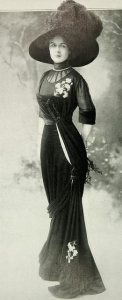
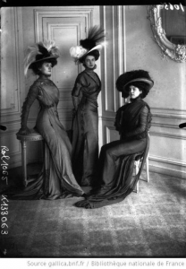
McQueen’s inspiration:  Late Victorian mourning wear

Robe d’apres-midi

Images reference: https://www.pinterest.co.uk/pin/183029172329099714/?lp=true

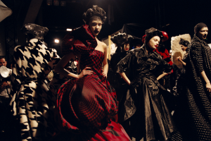
Backstage, Horn of Plenty, Autumn/Winter 2009

Photograph by ANNE DENIAU
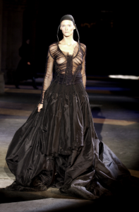


Horn of Plenty, Autumn/Winter 2009 Photograph by CHRIS MOORE

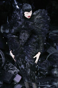
Supercali, Autumn/Winter 2002

Photograph by CHRIS MOORE

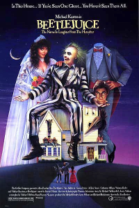
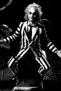
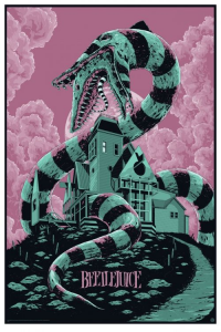
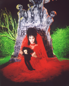
Expanding his inspiration for his 2001 spring/summer collection: Tim Burton’s ‘Beetlejuice’.

http://timburon.wikia.com/wiki/Beetlejuice


scene from movie beetlejuice: http://www.imdb.com/title/tt0094721/mediaviewer/rm2978438656


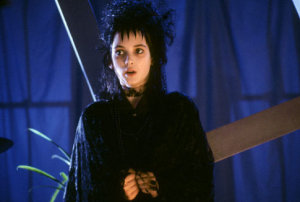
image from scene of movie Beetlejuice: http://www.imdb.com/title/tt0094721/mediaviewer/rm2978438656

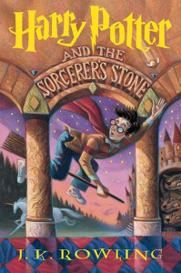
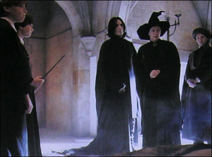
Second Inspiration of Gothic: Harry Potter


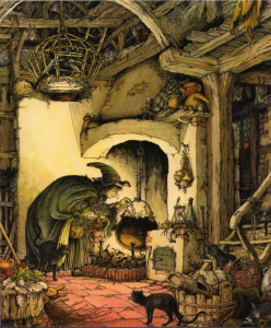
Illustrated by Mary GrandPrehttp: //www.imdb.com/list/ls000671664/

written by J.k Rowling:

https://www.pinterest.co.uk/pin/520728775647816005/

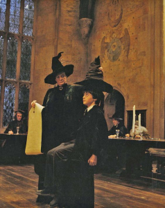
Harry Potter film scene, posted by Pinterest.

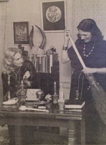
20th Century Witches

Image Witches Doreen Valiente and Patricia Crowther

Posted by https://www.pinterest.co.uk/pin/393150242462108246/

Alexander McQueen collection that launched in 2001 for his spring and summer collection was inspired by death and romance. McQueen’s designs were influenced by movies and history. His first inspiration of death came from a period during the Late Victorian era mourning clothes, influenced by the design of the long gown and exaggerated flat hats. his respect for history and all its superstition of death and the afterlife gave his aesthetic ideas that was later translated into designs.

Beetlejuice was a film produced during 1988 which was written a Famous director and script writer Tim Burton, this movie was in relation to death and supernatural activity. the log black dresses that can be seen in his design was inspired one of the character in the film called Winona Ryder with her black long gown similar with the mourning clothes, Beetlejuice was a horror/thriller genre the movie encouraged him to portray death in a more explicit design. He collaborated with the filmmaker to create a mise-en-scene performance for his catwalk presentation.

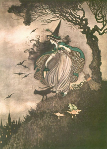
Witches and wizards was another of his influences with their theorised tall black hats and wands encouraged him to travel more into a fiction dream of dark powers and magic.  He explored more into the topic and encountered the book/movie written by J.K Rowling. ‘Harry potter’ was counted as one of his main inspiration because the moving/ book was based on wizard and witches which exists in both fantasy and reality.

Alexander’s mind set was different from other designers because of his positive view in life. He was able to turn death into a positive outcome and used it to hi advantage, he crated a transformative medium using fashion; and as was quoted in response the show “a fairy-tale told in Fabric” (savage beauty article, Alexander McQueen, Gothic collection, published 2001). Over all the designs and performance that he displayed was unique and innovative, to be able to balance death and romance as one emotion is a true talent. He quotes “It is important to look at death because it is a part of life. It is a sad thing, melancholic but romantic at the same time. It is the end of a cycle – everything has to end. The cycle of life is positive because it gives room for new things.”

Quotes from: http://savagebeauty.alexandermcqueen.com/gothic.html

Article, Savage Beauty. quote from Lee Alexander McQueen, 2001.


task 9/10

Ethics: Duncan Quinn

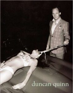
The photograph of the Duncan Quinn image portrays sexual assault and rape to the woman which appears to be lying dead on top of a luxurious classic car wearing nothing but only her lingerie. The body language of the woman tells me that she in unguarding herself with both her hands helplessly beside her displays surrender and defeat. The man dressed in his expensive looking suit reflects wealth and authority; in the image it shows the man’s tie around the woman’s neck as he carelessly tugs her across the car. the tie represents a sense of ownership as likened to a dog with the leash, or a collar, which leads to the theory of men buying or seducing women as she become an animal in the site of men. This image was photographed at night to ironically portray the sense of darkness with in the image. The man’s fascial expression shows that he is does not care about the woman and her situation but instead he stares bluntly at the camera with no emotion in in his face; this shows that the man treats the woman as an item of ownership and not as person.

Over all I think that Duncan Quinn want this image to represent sexual violence against women and how the wealthy takes advantage of the lesser to participate into sexual activities to earn a living. The image also displays the objectification of human which leaves us with the theory of the man murdering the woman and enjoying it afterwards, as shown through his facial expression, advertising propaganda of male dominance. Another speculation of this photograph is suicide, looking at the image the woman is shown with a tie around her neck and this can also express a form of foreshadow of the woman committing suicide by hanging herself leading to the topic of many young women committing suicide due to rape and sexual harassment. The image also shows many signs of sexist behaviour, starting off with the man in his suit, the photo shows the properly dressed for the occasion while the woman is half naked, this symbolises women as weak and useless following up its stereotype about woman.

Dealing with the ethical issue of this subject is not an easy solution, I believe that at an early age children should be taught to respect and give equal rights to each gender. Men should not see women as weak and vulnerable nor seek them for their physical appearance but instead they should accept the opposing gender and acknowledge their decisions. Although most of society that are sexually abused are women we should also not forget the existence of male rape and abuse. In conclusion we should not allow stereotypes and gender roles to control how to live, for example, men and women should be allowed to take any job at their desire without any label attached and by opening a window such as this will enhance the image of each gender and will prevent many violence and traumatic incidence involving sexual abuse.

task 11/12

Summary

During this entry course for ‘Research and communication skills’ over the past week I have been learning many different techniques and useful sources that I will be able to use each time I write and an evaluation. The program extended my knowledge on online searching and many more critical skills that I need. There have been sometimes when the lectures were hard to follow and I have also found it difficult to balance my project with the task given each week, but I have only treated it as a stepping stone to push my self to my best ability.

At the beginning of task 1 I was not able to understand the value of the lesson but as I searched more into the task I found myself noticing errors or habits that I have been making while doing my online research. During this study I was able to extend my research to another level, collecting primary and secondary source as well as aimlessly the surfing the internet for a good quote or image. This session has taught me to use the library more often because there are many more information’s found in books that cannot be discovered just by using google. The general skills I have learnt in this session has benefited me to write a descriptive research evaluation.

During task 2 I was taught the importance referencing the source that I have taken from the internet, books, article etc. having learnt Plagiarism in my collage years I was able to further my knowledge of referencing in the right way.  What I have found difficult in this task was finding the information about a certain source that was posted anonymously, it was quite frustrating to put into a Harvard reference without data about the writer or artist.

Task 3 and 4 of visual research and reflective writing was a difficult subject, the hardest part of the subject was finding the right topic to talk about. With the help of my previous sessions I was able to produce a review of the topic given. After a while of writing I was getting the pattern of writing the effectively, this part og the project was a stressful because of my project deadlines mixing in with my RCS work. But I was able to find my way around it and my solution was to relate the researches I was writing to my project.

The last task of this module about Ethics was a different type of writing from the other projects. I have this module easy because of the multiple skills I learnt from the past week. the only difficult part of this task was constructing the paragraphs for the analysis to be understandable, as I took my time I was hopefully able to write at the right technique. Overall as I overview all of the previews six tasks I think I was able to learn multiple new skills not only in writing but also in research, the only thing that I would have worked on was my time management for all the subjects because there were times where I was busier than the other and the quality of my work was not as consistent throughout the project. In the positive site this module has introduced me to new techniques that I will be able to use for any future evaluations, essays or even personal statements

Academic Integrity & Plagiarism

Autobiography.


Oskar Schlemmer born in 1888, Stuttgart Germany is a German painter, sculptor, designer and choreographer.  Growing up he had been part of futuristic era. At a young age participated as an apprentice in a marquetry workshop taking classes at the Kunstegerbeschule, translated to the ‘School of Applied Art’, in Stuttgart where he graduated with a scholarship that allowed him to broaden his knowledge as a young artist. Having spent his time in berlin, familiarising himself with the trends as a futurist artist, gaining inspiration from the Der Strum gallery where they exhibited writing, drawings and prints. In 1912 he because a master student of abstract artist Adolf Hölzel.


1916 Schlemmer participated in the First World War, he was wounded in action which was the cause of his discharge from the army. During 1919 he was inspired to help the spear head a movement to upgrade the curriculum at the Stuttgart academy of fine art and brought the modern art exhibition to the faculty showing his art works of simplicity and geometry.

During the period of his marriage to Helena Tutein In 1920 Schlemmer was at the same time invited to the great territory of Walter Gropious in the Bauhaus school in Weimar to teach.  He contributed with the project of geometrical performance with in the school. His time in the campus was a building block for him to go over his limit of modernising art. He participated with plenty of classes such as sculpture, mural painting, metal work and life drawing. The guardian reported with the article that stated that “with the rise of the Nazi in the early 30’s, schlemmer was edged out of a teaching post in berlin. His work was included in the infamous exhibition of the ‘degenerate art’ in 1937. He then worked in the secret in a factory in Wuppertal until his death”. Focusing on space, time and movement he had master the aesthetic art of futurism. He recorded movements and stationary functions, sitting, lying, walking, standing as they are universally valid; he once said of his work. TheyIn the month of April 1943 Oskar Schlemmer sadly passed away but truly made his mark in the sight of the industry.

  • source 1: Author Ferry, E. and Blumberg, N. (2017) Oskar Schlemmer German Artist. Britannica. page 1

Work: ballet of geometry (das triadische ballet).  

He had created some of his best work while working with in the partnership of Bauhaus. One of his master piece, as known to many, was the “Das Triadische ballet” in 1922. This performance was a unique blend of futurism and ballet. He had created and crafted the garment which was used during the performance, overall there was 12 choreographies across three parts and using three dancers (one male and two female dancers) and 18 costumes. The ballet was based on the modern vision of Oskar, the geometrical patterns and shapes was one of his inspirations. He had also used a lot of vibrant colours and dark to create an attracting cinematic image to promote futurism. The garments of the dancers were much exaggerated with their costumes and makeup which portrayed a very animated feel to the audience. The background was created with multiple bright colour such as yellow and pink and this added a very modern feel throughout the performance. In one of his performances he had used a black background with a hint of white floor, the exemption of this was to create a mature and expression to the routine. The first act with the yellow-hue was to represent the plot-free work shifts from playful dances. The second act was the ceremonial movement in the pink-hue background, and lastly the multiple mystical dances against the black backdrops in the third act.


Futurism

SPR_B63_W2117101614050

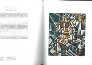
Futurist painting “Figure + Art +space” oil canvas, 125 x 107cm

Date: 1910-1913

Artist/painter: Liubov Popova

I chose this painting of Liubov Popova called Figure + air + space. This painting was produced in Russia, St Petersburg during the movement called futurism. The artwork was supposed to portray a nude painting of a woman in a futuristic state. What influenced him the most was the movement of technology; vehicles and big motor machines such as cars, trains and weaponry were very popular throughout the era which effected most of the artists’ work.

As shown he had chosen an unusual colour palette for a nude portrait. In the painting he had selected cold dark metallic pigment of brown and bluish and purpling grey which symbolizes the weight of the machinery produced by its powerful volumetry. In the centre displays the woman’s body parts merging with the surroundings, which stands out because of the colouring of the flesh.

Futurist back then was a revolution of people who supported the violence and war for they believed that it is a sign of brotherhood between men and moving forward with new inventions to the future. With this they advertised war through their work.

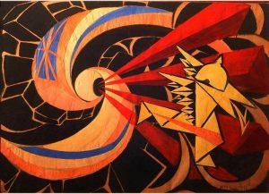
This relates to the artist and sculptor Giacomo Balla. As part of a futurist Balla has created his work in the similar style as Luibov, although instead of using dark colour to symbolise the moving revolution he used the complete opposite. The painting shows vibrant primary colours that speaks in as violent image; it shows a soldier (who is translated into shapes) shooting of to the distance and a flag is spiralling into the bullet. This signifies conflict between countries which he attempted to portray to the public.

yheshyaeyhe

Artist: Giacomo Balla

Painting title: light, movement and speed

From Italy

Image from: https://theartstack.com/artist/giacomo-balla/war-1916

4c5f9-radu-stern-against-fashion-clothing-as-art-1850-1930-600x443

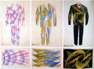
The ‘Anti-Neutral Suit’

Artist: Giacome Balla

Image from: https://www.pinterest.co.uk/pin/492722015455999567/

By looking more into this artist I later on Balla created a design of the Anti-neutral suit in 1914. The suit was a juxtaposing the suit’s materiality against that of some present day anti neutral outfits. The suit represented not, in fact, definitively peaceable or classless but rather violent expansionist.

His work has really interested me into looking more into the First World War and how the futurist came to be and how his intricate paintings of war actually inspired people to become futurist.


Article, written by: H Social Sciences K Law

Date: 07 Sep 2017

Source: https://kar.kent.ac.uk/id/eprint/62620


Although despite the purpose of his work, I think that his paintings were very live and vibrant. He was able to translate his expression into his work. He did not use any material for work with but instead he used his aesthetic imagination to express the revolution of the nation through speed, time and space.  As a fashion student I think that the patterns that he produced were abstract and different from what the used to have during that time. The suit he designed interest me with millions of question on why he decided to translate his paintings and patterns into a garment.