Author Archives: Saskia Norris

Task 11&12: Final Summary

Overall I have enjoyed this module of research and communication, it has taught me the key skills I need to carry out successful research at university level. The course has worked alongside my practical work, improving my research with each project.

Task 1&2 forced me to begin research from a book, rather than online, which is my usual starting point. I found starting research from a book more engaging and arguably easier as it was more of a visual process. This task coincided with the beginning of my first practical project, utilising research skills from this first task defiantly benefitted the research I conducted during the project, providing me with a wider range of starting points, taking my practical project in a different direction than I had perhaps initially thought.

I did not find the second task as engaging as the first. I enjoyed the lecture on plagiarism, but found the task quite similar to the first. However I do understand that learning how to correctly reference books, newspaper articles and webpages is very important, and found this skill crucial to completing the majority of the other tasks within this module. I am used to footnoting, so initially the Harvard referencing system seemed complicated, yet I found when put into often it became much simpler.

I really enjoyed task 5&6, exploring the inspirations behind designers collections proved very interesting, I don’t think I really understood the volume of research involved in created a collection or the wide range of sources utilised by designers before completing the task. This again made me reconsider my own research, the designer I looked at pulled inspirations from a variety of sources, some related, some contrasting, where as I had just been carrying out more straightforward research. It made me consider using a greater range of sources in my research when starting a project, and to not be afraid to throw together completely contrasting concepts to create a unique project.

The reflective writing task was the task I found most difficult. This was mainly due to the academic texts; I found them difficult to read, which lead to a certain level of procrastination. However, once I had read and understood my chosen text I found it easy to form a response as there were many points within the text that could be argued. I liked being able to offer my own opinion upon the text, and exploring a counter argument to a point allowed me to research various different sources and statistics. If I were to complete this task again I would work harder on my time management, as putting the task off only created personal stress, yet when I completed the task I found it really not that difficult.

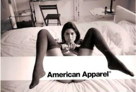
The task regarding ethics within fashion advertisements was extremely interesting; the level of ethical issues within current advertisements was actually quite shocking. I chose to look at the American Apparel advert, it was interesting to analyse the composition of the image and further research other American Apparel advertising campaigns and read other responses to these. It definitely made me reconsider artistic license and whether there should be greater regulation within the advertising industry to stop the continued sexualisation of women and girls.

I’ve found this module interesting and engaging. I understand the importance of completing all the tasks to allow us to have the skills we need to write at an improved level. I feel like I’m now able to carry out thorough research from a variety of different sources compared to past studies.

Task 9&10: Ethical Issues

Ethical Issues

This controversial advertisement for the clothing brand American Apparel raises issues regarding the ethics of fashion. American Apparel is a brand commonly associated with controversy; from the series of pornographic advertisements, to the founder Dov Cherney being fired from his position due to his own controversial actions. With this advert especially it seems American Apparel is playing into the concept that ‘sex sells’- an arguably dated and degrading concept. However the rise of American Apparel’s popularity coincided with the increase of visual social media. Visual media platforms such as ‘Tumblr’ or ‘Instagram’ allowed for an increase of sharing in all aspects, from artwork to political and social opinions and views. These platforms share the common feature of a sense of freedom of expression. This is was the target consumer of American Apparel, therefore the advert may been seen than more than what it initially seems.

The advert may be perhaps viewed as an expression of female sexuality. Marketing for male products, especially cologne, use female sexuality to ‘entice’ the buyer. These adverts are arguably degrading to women, objectifying and implying their sexuality is something that can be bought or controlled. This advert however does create a sense of female control over sexuality. The bright background implying the image was taken in daylight, therefore no sense of shame or anything hide. The woman herself is the focal point of the image, with no male presence, she is seen as in control of her actions, therefore her sexuality. Her clothing is also not overtly sexual, she is not wearing lingerie, but plain socks- making the image seem quite basic, implying a sense of normality and equality.

However there is no denying that the advert is reminiscent of a pornographic image, and despite its attempt to reclaim capture female control of female sexuality, it is in fact still sexualising and objectifying the model. Therefore continuing the media and marketing abuse and use of female sexuality. The use of stockings similar to that of the classic school sock is also an ethical issue. The sexualisation of young or underage girls is an issue that American Apparel have been criticised about before. The brands 2014 ‘Back to School’ campaign pictured a school girl in a traditional school pleated skirt leaning over, allowing for a view up her skirt. This advertisement was banned by the UK Advertising Standards Authority for ‘sexualising school girls’.

This is not the only advertisement of the brand that has been banned in the UK, the ASA banned a series of adverts, calling them ‘vulnerable, gratuitous and voyeuristic’ [Independent, 2014]. The nature of these advertisements could arguably be seen as an ethical issue due to the impact and influence they may have on their impressionable, young target audience/ consumer. Young girls who may be influences by the world wide brand should not be exposed to these kind of images, thinking this way of presenting ones self is something they must also do to be considered ‘fashionable’, to be an American Apparel girl.


[1] Independant, Linda Sharkley. 2014. Revealed: American Apparels most controversial moments following a ban on back to school ad. http://www.independent.co.uk/life-style/fashion/features/american-apparel-s-most-controversial-moments-following-ban-on-back-to-school-ad-9712735.html. [Accessed 27 November 2017].

Task 7&8: Reflective Writing

‘FASHION IS TRIVAL AND RIDICULOUS AND SERIOUS MINDS NEED NOT BE DETAINED BY IT’

In his book ‘Fashion as Communication’, Malcolm Barnard explores the definition and purpose of fashion. Within the book, Barnard discusses the belief in the triviality of fashion:

‘The idea that fashion and clothing are trial pursuits is just one popular prejudice. Writing in the Guardian in 1992, Wilson notes how, ‘every so often, a letter appears in The Guardian’s Woman’s Page. The writer of the letter is always different but, she says, the letter is always the same and it always argues that fashion is ‘irrelevant to serious- minded persons’ [Malcolm Barnard 2002:17]

To me, it seems Wilson is using this example to disagree with the point being made. By stating the ‘writer is always different’ but ‘the letter is always the same’ [Wilson 1992:34]. If this was a really comment made by ‘serious- minded persons’ would it really be a just a constant repetition of the same view? Wilson also uses the repetition of the word ‘always’, this elongates her statement, creating a sense of boredom towards these letters.
Like Wilson, I would argue that fashion is anything but trivial. In 2016 the UK’s creative contributed £90 billion to net GDP, accounting for one in eleven jobs, with the fastest growing employment rate than other aspects of the economy. I believe fashion is a way to express personality, it can be manipulated to communicate a certain message, an indicator of social group or class. Fashion, ‘in spite of its seemingly trivial nature
expresses the individuality of the wearer, and conveys to those around them so much about who they are. It can introduce like-minded individuals, project a personal image and values, and enable mutual understanding. It communicates, and it connects.’ [Drost 2017].

I would also argue that the idea that fashion is ‘irrelevant’ to serious or powerful people is incorrect. Many people use fashion to ‘power dress’, wearing garments of a certain style to create confidence or to portray a certain message. Power dressing evolved in ‘the late 1970s and early 80’s, business-minded woman began dressing- if not for power, then simply to fit in.. and if they wanted to be taken seriously’ [Nelson 2017]. Nelson argues that power dressing now is ‘wide-ranging and refreshingly individualistic’ far from that of the 1970s, yet is still used on a daily basis by the majority of the most powerful people within society. Political leaders are perhaps a good example of this. During political campaigns this way of dressing is particularly prevalent, potential leaders can be seen to dress themselves to portray certain messages or highlight personality. The current Prime minister, Theresa May, utilises power dressing when she is within the public eye:

‘It’s a winning formula that she relied upon for David Cameron’s last cabinet meeting, where she stepped out in a navy blue trouser suit with origami lapel’ paired with a ‘bold statement necklace’ [Pentelow and O’Connor 2017]

The navy trouser suit reminiscent of 70’s power dressing, a more masculine dress to assert power and seriousness, yet the use of a statement necklace adds a sense of personality and femininity to the outfit. This outfit works to create a certain image May wishes to portray, that of seriousness, yet a personality, to be relatable.

To argue fashion is trivial is naive; not only is the industry one of the biggest, and greatest employers within the UK, you cannot escape fashion. The way we dress on a daily bases, whether we favour current trends or past styles, we are portraying a message, a visual communication. How we dress and embrace fashion can often say a lot about the individual, it may be we’re dressing for power, or to communicate a message, but I believe it is crucial that we are able to dress to embrace individuality. I understand that fashion could be seen as trivial due to its ever changing nature or perhaps increased materialism, yet I think you cannot underestimate the power of dress upon the individual.

[1] Barnard, M (2002) Fashion as Communication, London: Routledge.

[2] Wilson, E (2003) Adorned in Dreams, London: I B Tauris

[3] Drost C (2017) Why is Fashion Important in Society? One Lucid, August 12th, https://www.onelucid.com/home-1/2017/8/12/why-is-fashion-important-in-society

[4] Nelson, K (2017) How is Fashion Updating Power Dressing for 2017. W Magazine, February 21st, https://www.wmagazine.com/story/power-dressing-for-2017-celine-prada-balenciaga

[5] Pentelow, O and O’Connor T (2017) Theresa May: A Political Life in Pictures. Vogue UK, June 22nd. https://www.vogue.co.uk/gallery/theresa-may-political-life-in-pictures


Task 5&6: Visual Research

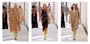
Maison Margiela Couture Fall 17
Designer: John Galliano

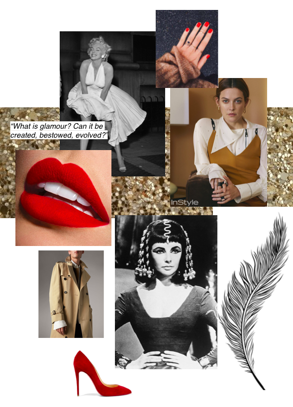
For the Maison Margiela AW17 Couture collection, designer John Galliano cites his main inspiration as ‘Everyday Glamour’. Galliano looked at the meaning of Glamour and what he would identify as ‘Glamourous’- such as a red lip, high heel and sequins. Galliano also turned to images of iconic ‘glamourous’ stars, Marilyn Monroe and Elizabeth Taylor being his main inspirations. Galliano, however, wanted the collection to also reflect everyday wear, hence the introduction and deconstruction of the classic trench coat, and reference of modern muses like Riley Keough- who epitomises this natural kind of glamour that carries through to the everyday.


Elizabeth Taylor in Cleopatra (1963) Courtesy of Twentieth Century Fox, photographer unnamed.


’Iconic Images’ of Elizabeth Taylor were one of John Galliano’s named inspirations for the AW17 collection. Taylor epitomises the glamour within Hollywood during the 1950s and 60s. The image above is taken from the 1963 film ‘Cleopatra’ in which Taylor starred. The image shows the immense detail with which all the costumes were created. Costume designer Renie Conley had a budget of £123,000 just for the wardrobe. Conley won the 1963 Academy award for Best Costume Design for her incredible creations showcased in the film. The costume of the film was extremely influential, reviving a trend for Egyptian style accessories, the geometric bob and especially the Cleopatra eye.

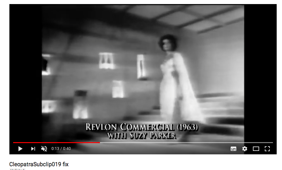
Below is an advert from 1963, advertising the makeup brand Revlon and their eyeliner to create Cleopatra inspired eye makeup. This derives directly from the popularity of the film starring Taylor.


Task 3 & 4: Academic Integrity and Plagiarism

Screen Shot 2017-10-20 at 14.27.30

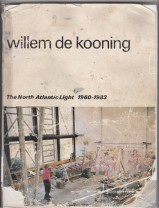
Wilde, E.D, (1983) Willem De Kooning: The North Atlantic Light 1960-1983. Amsterdam: Stedelijk Museum.

I looked at Willem De Kooning’s work as part of my current print project. Kooning was an abstract expressionist artist, I love his use of colour and bold brush strokes. Kooning breaks down what he sees into basic lines and textures, allowing him to create not only a visual, but emotional response to the subject. This book is a wonderful visual catalogue of Kooning’s work, created by Stedelijk Museum. Screen Shot 2017-10-26 at 20.32.07Screen Shot 2017-10-26 at 20.32.31

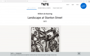
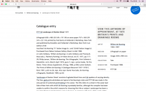
Tate Gallery (2017) Willem de Kooning: Landscape at Stanton. Available from:
Street 1971 http://www.tate.org.uk/art/artworks/kooning-landscape-at-stanton-street-p77158 [Accessed 23rd October 2017]

This print by Kooning is one of my favourites; I love the texture present in the image and the different shades within the monochrome palette. This image (Landscape at Stanton Street) captures Kooning’s emotional response to the landscape, rather than a direct copy of the view in front of him. The Tate website provided detailed information on the process of how Kooning created the image.

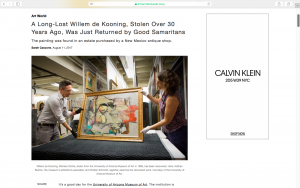
Screen Shot 2017-10-26 at 20.33.36Cascone ,S. (2017) A Long- Lost Willem de Kooning, Stolen Over 30 Years Ago, Was Just Returned by Good Samaritans. Artnet News, 11th August.

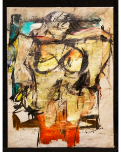
Below- the stolen image, ‘Woman- Ochre’ by Willem de Kooning.
Researching into Kooning’s paintings further, I found this story about one of Kooning’s paintings being stolen then returned. The worth of Kooning’s work is highlighted, allowing understanding for this aspect of the art industry and the impact of theft from an educational perspective.Screen Shot 2017-10-26 at 20.33.46


Task 1&2: How to use online resources

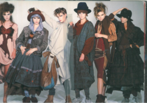
Image of Westwood’s ‘Nostalgia of Mud’ collection March 1982 Photograph by François Lamy Taken from book ‘Vivienne Westwood’ By Gene Krell, as part of the ‘Fashion Memoir’ series.

Image of Westwood’s ‘Nostalgia of Mud’ collection March 1982
Photograph by François Lamy
Taken from book ‘Vivienne Westwood’ By Gene Krell, as part of the ‘Fashion Memoir’ series.

Vivienne Westwood is a designer I’ve always admired; herself a powerful woman, a political advocate and environmental campaigner. She expresses her views and opinions through her collections- for example her fall 2017 mens wear collection featured androgynous models and outfits. Vivienne designer the collection to inspired inner exploration, with many elements derived from past collections, recycling ideas for both genders. The mixed gender models also an element ‘recycled’- used by Vivienne in her early collections, such as ‘Pirates’. The image above is from Westwood’s ‘Nostalgia of Mud’ collection of 1982. Despite having studied Westwood before and her early collections such as ‘Punkature’, I had not previously seen this collection. I selected this image over others within the book ‘Vivienne Westwood’ as I loved the composition of the shoot; itself a reflection of the textured and layered clothing being modelled.

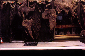
http://worldsendshop.co.uk/nostalgia-of-mud/ Original photograph of store front at St Christopher’s Place owned by Vivienne Westwood and Malcolm McLaren taken in 1982, photographer unknown.

http://worldsendshop.co.uk/nostalgia-of-mud/
Original photograph of store front at St Christopher’s Place owned by Vivienne Westwood and Malcolm McLaren taken in 1982, photographer unknown.

Further research regarding this collection lead me to the ‘Worlds End’ website- Westwood’s Flagship store. The post reflects upon the collection, but mainly the store that was created to market it in. Westwood created a shop to reflect the collection, itself a piece of art:

“The shop front was covered by a 3D relief of the map of the world made out of plaster & coloured a mud brown. The interior featured the cave like look of an archaeological dig. Scaffolding surrounded the walls, brown tarpaulin was stretched across the ceiling & a central pillar/stalagmite rose out of a pool of oily green liquid which bubbled primitively away.”

Ben Westwood, ‘Nostalgia of Mud’ 2014
http://worldsendshop.co.uk/nostalgia-of-mud/

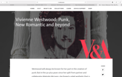
https://www.vam.ac.uk/articles/vivienne-westwood-punk-new-romantic-and-beyond Article discussing the progression of Westwood’s work over the decades.

https://www.vam.ac.uk/articles/vivienne-westwood-punk-new-romantic-and-beyond
Article discussing the progression of Westwood’s work over the decades.

The information provide by the Website furthered my understanding of Westwood’s ideas, the shop acting as a further exploration of her concept.

The website however did not provide a explanation of Westwood’s ideas behind the collection. To further understand this I found an article produced by the V&A which mapped Westwood’s collections over the decades.

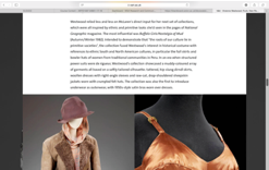
The article explained Westwood’s intention: ‘to demonstrate that the roots of our culture lie in primitive societies’ with garments within the collection reference traditional garments of different cultures.

This allowed me to further understand the composition of the garments and the reasons for the design of the store in which the garments were sold.

https://www.vam.ac.uk/articles/vivienne-westwood-punk-new-romantic-and-beyond Article discussing the progression of Westwood’s work over the decades.

https://www.vam.ac.uk/articles/vivienne-westwood-punk-new-romantic-and-beyond
Article discussing the progression of Westwood’s work over the decades.

Beginning research directed by a book, rather than an online source provided me with a more open starting point. If I had approached this research without having to use a book as my first resource I would have just relied upon previous knowledge of Westwood’s work, resulting in a restricted project. Working initially from a book prompted a different direction of research, using the internet to then further this initial research only. The use of the V&A’s archive of Westwood’s work provide me with a clear and reliable reflection upon the collection and its initial concepts, furthering my understanding of the work and the message it was designed to convey.