Author Archives: Poppy Ash

Task 2, Consume a Book

ROSENTHALL, S. (2011) Pipilotti Rist: Eyeball Massage, UK: St Ives Westerham Press, Hayward Publishing

Eyeball Massage explores work by video-installation artist, Pipilotti Rist, and acts as an accompaniment to Ristā€™s exhibition at the Hayward Gallery in London (September 2011-January 2012), but also includes earlier works. It contains essays that explore different aspects of Ristā€™s art, for example how the viewer is involved in the art through the use of video projections, the relationship between the body and camera, and the use of three-dimensional forms and viewing areas.

The book combines an introduction by two gallery directors, followed by five essays from authors (including the exhibition curator). Ristā€™s techniques are examined and comparisons to artists with similar visual or conceptual ideas are suggested.

As the Gallery where Pipilloti Ristā€™s Exhibition took place produced the book, the viewer can understand why the writersā€™ viewpoints are entirely positive, as the book acts to promote Ristā€™s work and explain her relevance in the contemporary art scene.

The design of the book first engaged me through its choice of holographic-style cover and the vibrant, pixelated glitches seen on opening the book. The editing of the colours in the video work is pleasing to the eye, as intended by the artist (suggested through the title Eyeball Massage). This design acts as an indication of the type of artwork that Rist produces. Recurring motifs are included in Ristā€™s work, such as those of fairytales, the body, nature and water, which through her art take on a dreamlike, luscious, futuristic appearance. I love the idea of installation art and the intense experience created which the viewer can engage with. Ristā€™s bold, psychedelic, often intimate videos frequently question the ā€˜politics of the female bodyā€™. Through her art, Rist demonstrates her ā€˜desire for erotic, emotional and social freedomā€™ (Iles, C. page 111) and through the strong, visually interesting video-art and installation, the art avoids the objectification of the female body that is often prevalent in media and cinema.

Task 1, Passport

Passport

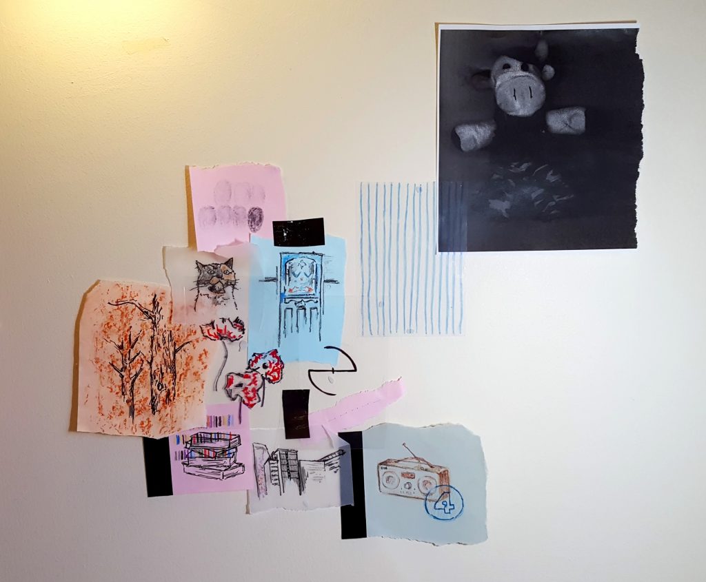
The first project that we were set on our Fine Art course was to create a ā€˜passportā€™. This project made me consider what constitutes a ā€˜passportā€™ and what can be seen to shape oneā€™s identity. I immediately hadĀ several ideas and possible routes to explore ā€“ is the layout and format of a passport important or can it be changed to reveal information in a different way? What information about myself should I add that isnā€™t usually included on a passport? Should I use images or numbers or a mixture of both to describe myself? Of course there are many ways in which I could go about this idea, and it is difficult to know where to start or which materials to use, etc.

Despite being a seemingly straight forward task (a way to get to know the other fine artists in the room and provide information about yourself) it is complex in that there is no clear end point; you can make as much or as little of the project as you wish.

Personally, the idea of sharing personal information to others makes me feel nervous, and I chose to instead provide only the main information about myself to form the starting point of my passport, tracing or drawing things of relevance on different pieces of paper. These drawings included my front door, pets, toy cow, local area, favourite band, hair colour, etc. I then experimented with photocopying things (e.g. Cowie) and took a tree rubbing over my tree drawing as I have always loved the texture of trees.

Other ideas that I considered include providing only a list of important dates and/or numbers in a way of simplifying my existence into statistical means. I also considered overlapping acetate, placing more obvious details on top thus making them easier to see, with lesser known information causing the viewer to take more time to decipher (similar to getting to know someone in real life). A further idea which I had involved representing myself only by the stereotypes of my local area ā€“ coming from an area which is often given a bad name (Croydon, South London) and having lived there all my life, it is an area which people sometimes try to avoid mentioning, even if it isnā€™t as bad as it is made out to be. The area in which you live in and your social environment is definitely something which can be seen to shape you as a person, thus giving you your identity and makingĀ places visited your ā€˜passportā€™.

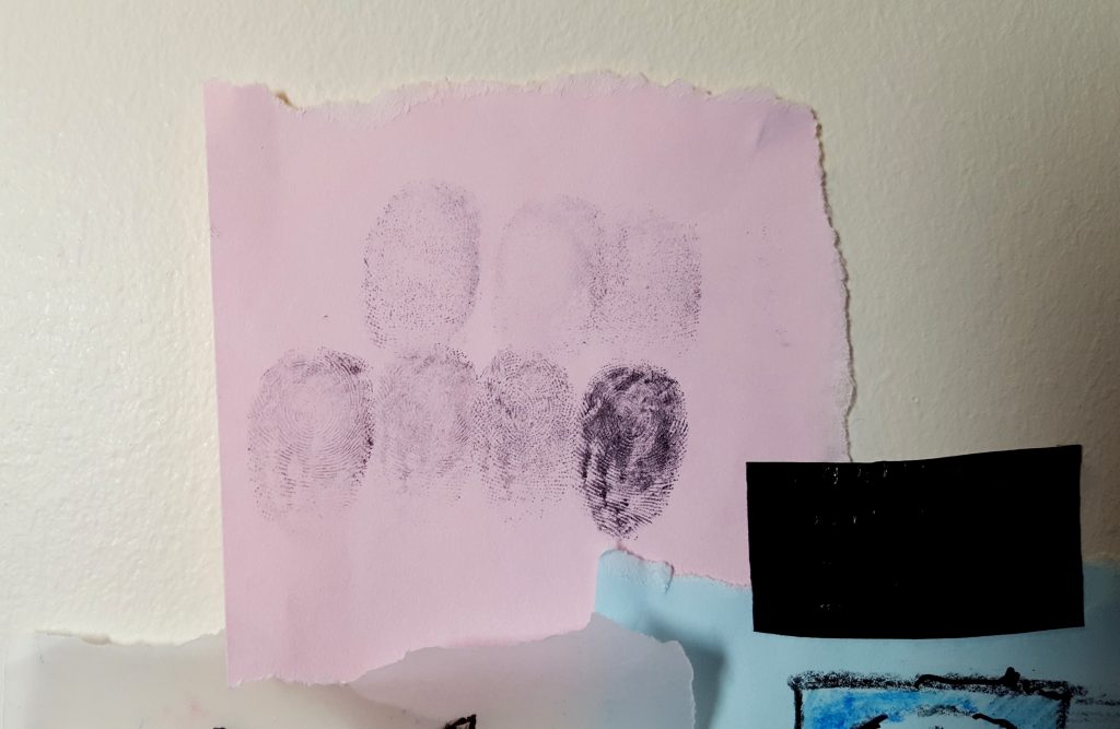
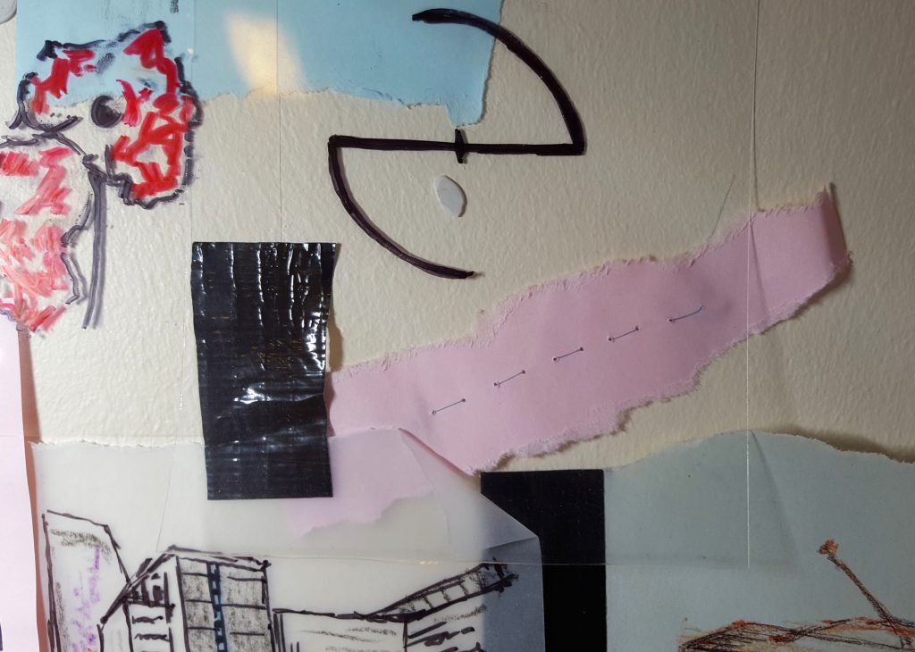
As passports act as a quick from of identification, I displayed all of my images together, slightly overlaying some, so that all information could be seen at the same time. By adding some of my own DNA ā€“ fingerprints and sewn hair ā€“ the passport is more personal to me. I quite like the simplicity of my layout as it is to the point and gets the information across. However, if I continue with the passport I could explore numerical data, locations and other ways of using hair, e.g. writing with it or drawing with it.

20171016_173415

Close-up of fingerprints

20171016_173250

Close-up of Evanescence logo, parts of drawings and sewn hair