Author Archives: Nafisa Fadie

summary


In this module I have developed my research skills, extended my understanding of art history and pushed myself to analyse further details in my work.

Through out my research I have discovered how valuable researching art movements and not just individual artists is. This has allowed me to discover new artists with ease, reading about artists and then about artists involved in similar work at that time. Researching art movements has also allowed me to discover artists across a variety of mediums that all work to the same ideals and themes. This means that I have been broadening my field of research across different time periods, medium and values, giving me a wider variety of references to call upon in my practical work.

In my opinion, the authenticity task was one of favourite, because I found it highly interesting researching a variety of opinions towards the matter of artwork being truly authentic. This has allowed me to think about my own work and what and where I draw inspiration from, as well as looking at other practitioners work and how they have found their inspiration. Tasks where we had to analyse three images and relate them back to our own work I also found highly interesting as I thought it helped me make more connections between my work and other artists’, as well as improving my knowledge of other artists and how I evaluate their work. I also thoroughly enjoyed researching into how technology has impacted art, I liked forming an opinion towards the matter and voicing it in way that included research to help back up points made.

However, the Publish or perish! Task was one my least favourite. I have missed the lecture on that day due to my appointment. I have vised the blackboard to catch-up with work and to complete my task but I did not understand as much. I felt this was due to fewer detail about the artist in the PowerPoint. In this module I have developed my research skills, extended my understanding of art history and pushed myself to analyse further details in my work.

In conclusion, I have enjoyed the last ten weeks of research and coummunications, it has allowed me expended my knowledge and opened my mind to different artistic movements, I realized that artist work has a great impact on the society and in our day to day life. This blog has inspirited me to do further research on artiste work and always use referencing to show my researching skills, this has improved my analysing skills,

publish or perish

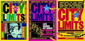
These poster was created by David King. He was a British designer, writer and historian of graphic design who. From this collection, he created a series of revelatory books unfolding the history of the Russian Revelatory, and its associated art and propaganda. He developed a special interest in Leaon Trostsky and the Subsequent doctoring of revolutionary photos and record.

for the past three decades David King has moved deftly between roles as designer, photographer, editor, researcher and author. His graphic style – an easily recognisable mix of explosive sans serif typography, solid planes of vivid colour and emphatic rules – reworked for the New Left in Britain the graphic language of the Russian Constructivists.

King was born in 1943, and studied at the London School of Printing and Graphic Arts (now London College of Printing) under Robin Fior, who describes King’s approach as ‘compare and contrast as a political stance’.


Cuber poster is the popular art form in Cuba following the Cuban Revolution, when the government sponsored some 10,000 public posters on a fascinating range of cultural, social, and political themes.

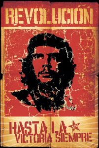
Alberto Korda was the official photographer of Fidel Castro. His photographs are known for their endurance. His most recognizable image of Che Guevara, titled “Guerillero Heroico”, became a worldwide emblem of revolution and rebellion. After Che’s death as martyr, this photograph was used in T-shirts and album covers and advertisers started using this image of Che to draw the attention of youth. But Alberto never made a penny from this renowned photograph. As a photographer, he always preferred to take photos in natural light. He, for the first time, used Cuban models to show off Cuban clothes. Earlier, he was more interested towards fashion photography. On account of the Cuban Revolution, the condition of the people living in poverty made him to change the subject of his photography. His photo “La Nina” represents the stories of the poor. Korda’s photographs served as the documentary of the entire Cuban revolution under the reign of Fidel Castro.

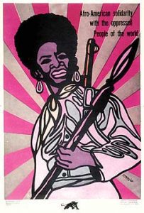
Emory Douglas was an integral part of the Black Panther Party, joining as minister of culture in 1967 and designing artwork that became potent symbols of the movement. Although the party ceased to function from 1980, its legacy goes on, as does Douglas’s work in an exhibition at Urbis, Manchester.

Reference 

https://en.wikipedia.org/wiki/David_King_(graphic_designer)


http://www.eyemagazine.com/feature/article/repuations-david-king


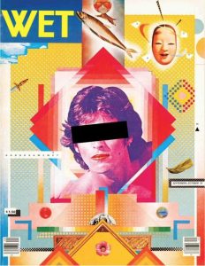
http://gilburtandpaul.co.uk/index.php/2016/05/12/spoilt-for-choice-londons-listings-mags-in-the-early-1980s/


postmodernism condition


Postmodernism was a movement that was born as a response to modernism. Modernism was a movement that was born as a response to industrialisation. Modernism let to great achievements but world war one happened as well as the invention of the nuclear bomb and all of this led to realisation that those same institutions we trusted would progress us into the future are lust as likely to destroy us.Postmodernism is direct response to modernism, its does not replace modernism but it does question everything from the concepts of truth, logic, and were adopted the enlightenment era.


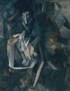
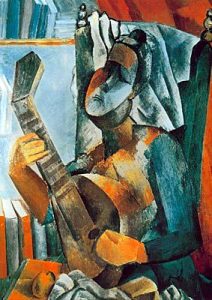
Modernism had failed or at least that’s what the postmodernists believed. Modernists had spent much of the 20th century trying to forge a better world inspirited by the science and universal truths. To them less was more. The postmodernists less were a bore. They believed we needed as many references as possible to demine our own individual subjective conclusion. Picasso created one off masterpieces based upon predetermined principals of art. His creation rocked the art world, but postmodernist wasn’t impressed. They believed in more than one method or style. Collage, chance, anarchy, repetition. These were infinitely more interesting. Postmodernists wanted to challenge audiences and force them to ask questions. Postmodern buildings rallied against the blandness that had gone before.

postmodernism had its critics, objecting to unnecessary ornamentation. An obsessive tendency to recycle the past to make something new and often just plain silliness. The rise of mass media really helped postmodernism take off. The world was interconnected like never before. For many postmodernism was liberating giving creative expression a dynamic, often unsettling vice. Postmodernist cinema still confuses, surprise and delights us. Postmodernist performers still bemuse us and we just can’t seem to get enough quirky postmodern art. Politically, philosophically, creatively- the postmodern movement has proven itself a force to be reckoned with. Like a giant social cattle prod compelling society to question why things are the way the are, and why they aren’t.

Reference

https://en.wikipedia.org/wiki/Postmodernism

postmodernism collage


counterculture


The counterculture emerged in early 1960s in USA and in UK, then spilled over into other western countries. The counterculture name suggest this is a culture that is against something but against what? In 1960s the cold war cold reached a climax with the Cuban Missile crisis with the world on verge of nuclear war. The newest generation come of age during this time and began to question the norms and values of their dominate culture. The different groups such as African Americans, woman’s, gays and lesbians began to demand their rights. Civil right and freedom of speech become central to creating a society that was more inclusive revolution and many of the protests began. So in principle the counterculture of the 1960s and early 1970s was thus a mixture of people, ideas, events, circumstances, and technological developments. These developments made exceptionally rapid change.  The new generation become rebellious by welcome sex, drugs and pop music.


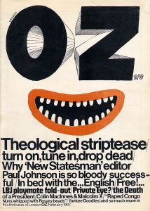
OZ magazine was an underground alternative magazine. OZ pushed the boundaries during a time of cultural and political upheaval. As times were changing and new generation were becoming more to new views.

This magazine is simplistic, relying heavily on typography. The most prominent feature is the cartoonish face in the middle, using the hand-rendered “OZ” as the eyes- thought simplistic in design and colour, this illustration works effectively in showing the tongue in cheek spirit of this underground publication. The rest of the poster is composed of typographic work, using only 2 typefaces decreasing in size. This heavy amount of information, conveyed mainly in Helvetica, contrasting with the illustration portrays the ideals and meaning behind Oz magazine – the combination of the crude culture of underground press and its hardline activist journalism.

Reference 

https://en.wikipedia.org/wiki/Counterculture_of_the_1960s

http://counterculturellp.com

https://www.theguardian.com/media/gallery/2017/sep/23/covering-the-counterculture-the-60s-underground-press-in-pictures

https://theconversation.com/oz-magazine-goes-digital-and-the-party-continues-29766

Authenticity

What does authenticity mean? The dictionary describes it as “of undisputed origin and not a copy; genuine”. Meaning being real and true.

To be authentic in todays creative industry is is harder then before; the development of social media has influence more artist to create amazing art/ design. Now day finding and sharing an art work has become earlier. The positive side is more people are being inspired through social media, and it has influences people to create they own creative medium. Internet has allowed us to share our creative skill meaning most of your work is inspired by someone or something. Therefore, in my opinion to be truly authentic in today’s world can be challenging but not impossible.

During the early development of the Modernism movement Paul Strand was one of the greatest and most influential photographers of the the 20th century whose images have captures abstract viewpoints also defined the way fine art and documentary photography is understood and practised today. Edward Hopper was influenced by this style and produced paintings with a similar effect.

This is relevant today because modernism as a principle strips away old convention to the bare bones of simple style in pursuit of making new, this still holds value in modern practice, we see these principles in our everyday lives with the use of abstraction and sans serif design.

The argument to Hoppers authenticity could be the differences in subject matter and media. He was influenced by an artists work but interpreted with his own style and ideas to create an original concept.

I think it is impossible to be truly authentic; we learn from history with even new ideas and styles can be related to another even subconsciously in some way.

reference 

http://www.jobdig.com/articles/1778/What_Does_it_Mean_to_be_Authentic%3F.html

”technology is the mortal enemy of art”

As human beings we have always been afraid of changes because our brains have evolved to fear uncertainly, fear of being unable to adapt, whether it is interacting with people, or change in environment, it freaks us out. We have to recognize that change can be good for us. Changes often force us to adapt in ways we have never experienced, which can be a major driver of personal, growth and development.

When photography was born over 175 years ago, some of us saw it as the mortal enemy of art. However, in reality, the creation of photography greatly influenced art over the coming years and provided growth to numerous art form in 20th century.

Todays technology’s like computer, gadgets and cell phones has strong bonded with art, it has become inseparable. With the help internet, people are more have knowledge, everyone have access to artists from whole round the world. this has helped help to share they artist work and inspire/ influenced them to create their own artwork. from today’s social media its clear to see technology has huge positive influence on modern artist

But there also some negative aspects in arts relationship with technology. Artist work being online has made people stay at home and view the artwork instead of going out to visit a gallery in person.

However, I disagree with the “technology is the mortal enemy of art” because there are more positive aspects then negative. Technology has given birth to a whole new genre of art and the internet has become a medium for artist to communicate their ideas.

Reference

https://www.theguardian.com/education/mortarboard/2012/may/09/students-procrastinating-exams

https://www.goldensquared.com/blog/59/

http://www.bbc.co.uk/news/entertainment-arts-19576763

View at Medium.com

comparing two images


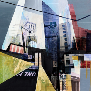
Jon Measures developed his own approach to making mixed media artwork. This involved combining multiple views of Los Angeles and other urban areas through cutting and chopping different characteristic of the city’s rich fabric together. The images are digitally edited photographs. The Paint is used to stylize as well as emphasize certain aspects of the photographic materials, to add texture, layering and colour. This is known as hybrid between painting, photography, digital art and collage and echoes the layering of history that takes place in cities.

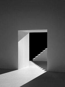
Stephen left school with a photographic career already certain in his mind. Following college, he started assisting ‘up North’ before moving to London in 1998. Lenthall specialises in studio-based still life photography. This means he attracts a variety of clients from editorial to commercial as well as advertising. Enjoying the pace and choreography of still photography, Lenthall is able to bring simple, graphically observed object to life in an imaginative way.

Examining Lenthall’s and Measures work, a visual difference can be noted. He uses different shades of black creates a deeper personality of a building composed of basic shape structure. Using layering to construct a building, it allows you to focus on different infrastructures that create surrounding environment.

Although both images differ, they portray similar perspective on buildings. From analysing the art work it is possible to tell that the artists are keen on exploring the aspects of environment that focus on structure, infrastructures as well as scars of human development.

Reference

https://www.artslant.com/global/artists/show/10641-jon-measures?tab=PROFILE

http://www.theniceniche.com/this-week/jon-measures-mixed-media-artist

http://www.lenthall.co.uk/about

https://www.itsnicethat.com/articles/748-stephen-lenthall


Terminal bar

Terminal Bar is an award winning American documentary short film directed and photographed by Stefan Nadelman. Relying on a variety of animation such as live action and black and white photography to illustrate an image of the by-gone era of New York. Terminal Bar premiers the work of bartender through a photo-driven documentary. This short film was produced with the hope of rescuing the craft from obscurity as well as show Stefan Nadelman’s skills as a filmmaker.

Although pictures taken featured people different backgrounds, the film mainly depict life of gay customers who lived on the edge of society in one way or another.

Terminal Bar was once a regular bar but, over time there was an increase in number of gay customers attending the bar. This resulted in the Bar becoming an attraction site for gay customers across America.

The terminal bar was a unique bar because it was like a community, rather then semi successful bar.

Examining this documentary, what caught my eye was the flow of black and white portraits throughout the film. It was an interesting concept that can be used to interpret emotions and feelings through pictures. In my opinion the use of black and white photographs captures the unique corner of the world in all its complex glory.

Through the different use of imagery intermingled with narration about the bar’s history, makes for a compelling and engaging short film. Raw and evocative, the photos keep a part of the bar alive – and a history that shouldn’t be forgotten.