Author Archives: Madeleine Phillips

Task 2

“Taste is a tender subject. What really fascinates me about the topic of aesthetic taste is that people really care.”

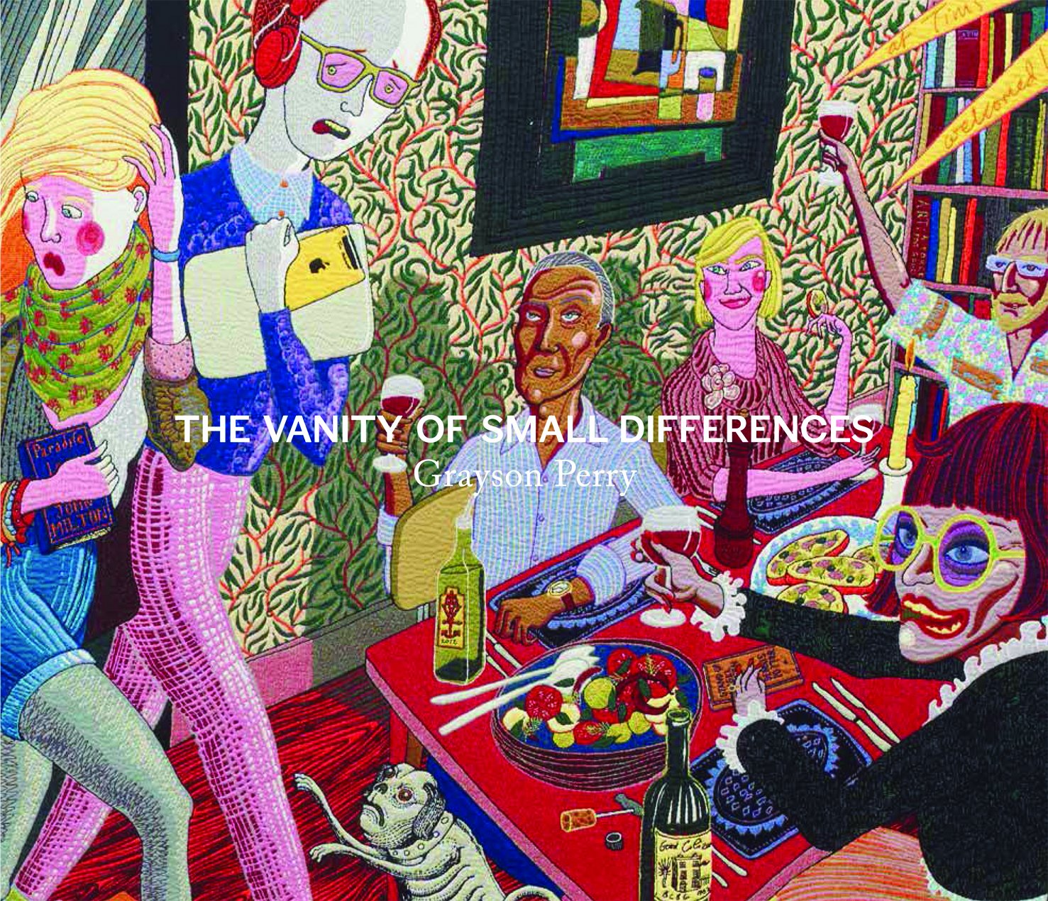
For this task, I’ve chosen “The Vanity of Small Differences” by the artist Grayson Perry. This book is about Grayson Perry’s series of tapestries which encapsulate British class culture and the meaning of taste.

The book starts off with a foreword about the context of the book and a bit about the artist himself. He describes his background and how his work is a social commentary about British culture. And then since the book is about some tapestry pieces he created he then proceeds to give a history and context about them and how he personally feels about them. He also describes his inspirations.

Then there’s a section by Suzanne Moore – she gives her thoughts about the subjects’ meanings from her personal point of view, recounting experiences.

The next couple of sections are snippets of information about the artist’s research and sketchbook work. After that is pictures of the final pieces themselves.

The final part of the book gives more information about how the tapestries were made and the process of it.

Task 1


For this entry, I will be reflecting upon the task we were given for the induction week which was to create a passport. I decided to take it fairly literally and actually create something on the more realistic side. I wanted to do it in my own style and went about it in a fairly relaxed way. The main things I did were layering of various coloured paper. One of the things which sticks out to me is the layered paper rose I did for the front cover. I was unsure what to put on the front as I wanted it to have some sort of focal point. I decided to go with a rose since it was a fairly easy thing for me to do and I often paint and draw a lot of roses/flowers in my art. Without realizing it at the time I made the outside of the passport quite regal with the rose and the colours. I think I did this partly because I tend to gravitate towards rich colours for my work. Also looking back, I was perhaps influenced by the overly flowery “shojo” style anime/manga used in the late 20th century as I had watched a show very recently called “Revolutionary Girl Utena” which uses an excessive number of roses throughout the show as is actually a plot point. I attended an exhibition last year in London at the House of Illustration called the “Shojo Manga: The World of Japanese Comics” which displayed the art style which I am describing. It’s very flowery and romantic. I would like to maybe in the future dwell upon these themes more in future projects or work. I also wish to try out layering paper more as I really enjoyed the process.

In the inside of the passport I used very messy squiggly lines and rough crayon colouring to mimic how passports tend to have pastel maps or other imagery in the background. I felt this was very effective as I tend to be quite meticulous and this relaxed technique was refreshing for me. I have been by a few people that I am in the borderline between illustration and fine art and I feel learning to be more relaxed and use messy techniques will help me get away from the illustration side of things.

I do not think I would try making a passport again but it encouraged me to try something new and got me to reflect on my style especially when seeing my peers’ passports too and how many people thought outside of the box. I need to challenge myself to think more outside the box too so I can grow as an artist!