Author Archives: Mia-Laine Layzell

Task 11&12 – Summary

This semester’s Research and Communication Skills module has been extremely interesting, allowing me to explore topics and areas I haven’t previously considered, and while it has, at times, been challenging, I have definitely learnt a number of valuable skills.  The first problem I encountered was not in terms of writing, but in terms of actually finding the materials to work from in the first place. There was a specific photo-shoot in a specific issue of ‘The Face’ magazine that I spent an entire week trying to find, with no luck. This slowed my work down and meant I had to think of another direction to take my task in. This taught me to keep my options open and not to just rely on one piece of research to inform a task as it may not always be available.

The tasks have also helped me to understand the importance of referencing and citing any work that is not my own, I now embrace referencing as I now understand how it shows I have looked into the wider context surrounding a task and I am using that research to justify and inform my writing.

An important learning outcome for myself from this module has been to be able to look at an artist’s or designer’s work and with just a little research be able to identify a vast range of sources that have informed their work. Not only does this help when analysing and interpreting their work, but it has also taught me that there is no limit to where I can gather inspiration and research from in regards to my own studio practice.

I found the reflective writing task slightly challenging because although I understood the texts we were given and enjoyed finding other academic texts that related to the points made, I found it difficult to add a substantial amount of my own thoughts and views as I agreed with everything I had written. This has shown me that sometimes it is easier to write about and reflect upon something that you might not necessarily agree with, as you can much more easily come up with opposing viewpoints.

I really enjoyed the lectures on plagiarism and ethics in advertising as it sparked debate amongst the group and it gave me an opportunity to write about topics that I was extremely interested in and passionate about. Not only do I think it is important to have these conversations in an academic environment, but it also gives you time to think and reflect on these topics in your own time outside of university.

Overall, I think the most important thing I have learnt throughout this module has been to be able to research much more efficiently. No longer am I trusting the internet to find unreliable sources that do not add much depth to my writing, but instead, I am finding pleasure in discovering appropriate academic texts and sources, using the fantastic library available to us, and applying what I find to the tasks in order to produce a higher standard of work.

Task 9&10 – Ethics

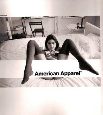
As a young woman and a feminist I am very torn by this image advertising American Apparel. The image depicts Sasha Grey, who can be no more than 20 years old (as I cannot find what year the image was taken I am unsure of her age at the time) lying on a bed, topless and having just pulled her tights and underwear, if she was indeed wearing any, down to her knees. Initially, I am taken aback by the photograph in disbelief that this was an advert for a clothes shop and not a soft-core pornographic film, however, once you start to analyse the photo and American Apparel’s advertising history, the feelings only worsen.

The photograph is taken from above the model, looking down on her, which suggests a position of power and dominance, in turn making her pose seem much more forced and subservient, like she is doing what she is told. This is an example of female objectification that we are all too familiar with in advertising, although not normally this blatant or explicit. These types of images only strengthen the false notion that women belong to men, are the submissive sex and their bodies are only objects to be used for men’s sexual gratification, while “creating a climate in which the marketing of women’s bodies – the sexual sell and dismemberment… is seen as acceptable.” (Kilbourne, 2011)

This is also extremely confusing for me, as from personal experience I can estimate that the average age of the customer for American Apparel is between 14 and 18. When I was around this age it was extremely fashionable to wear American Apparel and now, at age 20, I do not know a single person (either personally or on social media) who is my age and still shops there. This troubles me greatly as either American Apparel do not know who their customers actually are, or they are consciously advertising to young girls and boys in this way, and I do not know which is worse. Kilbourne states that:

“Adolescents are particularly vulnerable because they are new and inexperienced
consumers and are the prime targets of many advertisements. They are in the process of
learning their values and roles and developing their self-concepts. Most teenagers are
sensitive to peer pressure and find it difficult to resist or even question the dominant
cultural messages perpetuated and reinforced by the media. Mass communication has
made possible a kind of national peer pressure that erodes private and individual values
and standards. But what do people, especially teenagers, learn from the advertising messages? On the most obvious level they learn the stereotypes.” (Kilbourne, 2011)

The reason I am torn by this image, is that I believe there is nothing inherently sexual about the female body. There is nothing inherently sexual about breasts, whose sole purpose is to feed our young, with buttocks, whose purpose is to aid with sitting and walking, or with the female genitals for that matter. Yes, they are involved in sexual intercourse, but there is no essence to an amalgamation of skin, nerves and cells that is inherently sexual. So why is it that men can share a “kind of casual togetherness” (Steinem, 1982: 4) in terms of nudity where women rarely, if ever, can? When we see this image of a mostly naked young woman, we should not be shocked or outraged, because it is simply a body.

I understand that the majority of the general public do not share this view, however, I am yet to meet anybody who does not agree with me at least on a theoretical level. I also understand that by advertising in this way, brands are furthering the sexualisation of the female body as they are fully intending for the image to come across as sexual, rather than just as a scientific depiction of the human anatomy.

While I have these conflicting thoughts regarding this image, I ultimately do understand that regardless of how I view the female body, and regardless of whether or not Sasha Grey chose to be photographed in that way or not, the use of this kind of image in advertising, especially when the actual market for the brand may be much younger than they intended, can be extremely harmful to young people everywhere. Not only does it reinforce ancient sexist and misogynistic views that my generation are so desperate to get rid of, but it is also teaching these views to a fresh set of eyes every time they bring out a new advert or a young person hears of the brand for the first time.


Bibliography

Kilbourne, J. (2011). Beauty… and the Beast of Advertising. Centre of Media Literature, pp. Accessed via: http://medialit.org/reading-room/beautyand-beast-advertising.

Steinem, G. (1982). In Praise of Women’s Bodies. Page 4, e-book


Task 7&8 – Reflective Writing

In the chapter ‘Etymologies and definitions of fashion and clothing’ of Malcolm Barnard’s Fashion as Communication, the idea of fashion and anti-fashion is raised. This idea circulates around the concept that in order for there to be fashion, people within any given society must have a desire to be both part of a larger social group and be an individual at the same time. Barnard poses that it is in more complex societies with “a number of clearly defined and segregated groups” that the desire for individuation is greater than the desire to adapt to society, and this is what brings about fashion. Societies in which one of the feelings is not present, or the desire to be part of the larger group is stronger than the need to be different, there can only be little, if any fashion. I agree with this theory as I know from personal experience the feeling of trying to be like and present myself like my peers, while still trying to communicate some form of individuality.

“The paradox of fashion is that everyone is trying at the same time to be like, and to be
unlike, his fellow men – to be like them in so far as he regards them as superiors, to
be unlike them (in the sense of being more ‘fashionable’) so far as he thinks they are
below him.” (Flugel 1950)

While these circumstances may facilitate fashion, I believe that it is the intention of the wearer that communicates whether something is fashion or not. If someone is using their clothing to signal that they wish for change and movement, then this is seen as fashion. However, if what someone is wearing communicates their wish for things to stay the same, then this is anti-fashion. Barnard shares the view, and gives the example of Prince Charles and Princess Diana to demonstrate this idea. Prince Charles would be said to wear anti-fashion as he wears pretty much the same thing as he has since he was a young man, and being part of the wealthy aristocracy, he probably doesn’t want much about society, for him, to change at all. Princess Diana on the other hand, would have been said to wear fashion, as she was always pushing for change, be it through her humanitarian and charity work, or simply by challenging the pre-conceived ideas of how a princess should act or dress.

As I stated before, I totally agree with this theory, and I especially agree that richer upper-class members rarely change the way they dress as a reflection of how they are perfectly comfortable in their lives and wish for nothing to change. However, I do not believe that this is the only way fashion is brought about.

Flugel makes an interesting observation in The Psychology of Clothes: he points out that as it is human nature to imitate that which is envied and admired, and so it is expected that the lower classes will start to imitate what the upper classes wear. However, those is the upper classes risk losing what makes them ‘higher’ and ‘different’, and so because they cannot enforce laws to stop the wrong class dressing like them (it has been tried, and failed), they change what they wear and create a new uniform for the upper classes. This creates a double movement and what appears to be a never-ending cycle of fashion. So, it seems that it is not only Barnard’s distinction that creates fashion, just as not all rich, upper class members wear anti-fashion like Prince Charles, but some do help to create fashion through the fear that they will be associated with a lower class.


Bibliography

Barnard, M. (2002). Fashion as Communication. New York: Routledge, 2nd edition.

Flugel, J. C. (1950). The Psychology of Clothes. London: Hogarth Press.

Kawamura, Y. (2005). Fashion-ology: An Introduction to Fashion Studies. Oxford & New York: Berg.


Task 5&6 – Visual Research

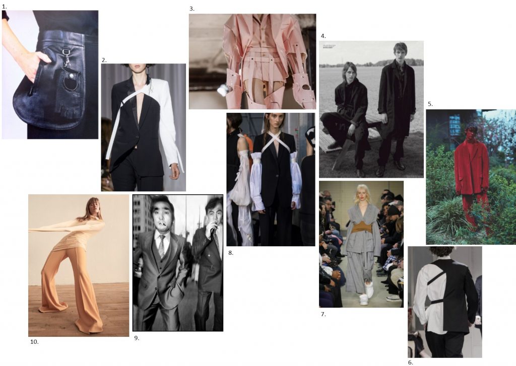
Sheila Casando // Fall 2017


1. Margiela for Hermés
2. Ann Demeulemeester Spring 17
3. Comme des Garçons AW16
4. ‘The Outsiders’, editorial by Benjamin Alexander for VMAN Magazine, Fall 15
5. Photography by Alice Rosati for Rollacoaster Magazine – VĂȘtements special, June 15
6. Yohji Yamamoto
7. Défilé Public School, Ready to Wear AW 17/18
8. Ann Demeulemeester Men’s Spring 17
9. Bruce Gilden Photography
10. Klara Kristin wears Naomi Itkes, photography by Hasse Nielsen for Mixte Magazine AW 16/17


Chosen image:

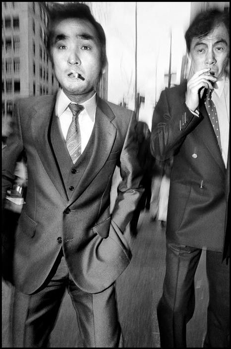
USA. New York City. 1988.

This photograph from a series by Bruce Gilden shot around New York City over the 1980s and 1990s features two men in business suits smoking cigarettes. The man in the foreground occupies around 2 thirds of the frame and neither of the men are fully in the shot. The angle of the shot is around torso height, as Gilden tends to bend slightly for a lower angle when photographing. This makes the viewer feel as if they are participating, as if they are part of the action of the city. The edges and background of the photograph are out of focus, reflecting the fast-paced nature of the city and how fearless Gilden is when given an opportunity for a shot even with very little time. During this series, Gilden used all black and white film and all of his photos utilise a flashgun which helps him to visualise the feelings of the city; the energy, the stress and the anxiety.

Gilden is a street photographer, however his style of photography and his photography methods are unlike any other I have seen. Gilden’s subjects very rarely know they are being photographed. He gets so close to his subjects that they often think he is photographing behind them. He jumps in front of his subjects and within a second, he has his shot and the two have parted ways. It is a very aggressive method of photographing and I am surprised that Gilden doesn’t receive just as aggressive responses from his subjects. However this style produces an extremely unique and emotive result. Gilden wants to show how lost in thought the people walking around the city are, that they’re not paying attention.

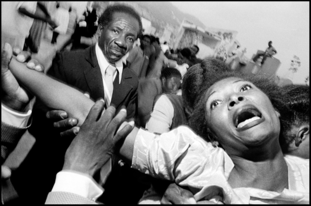
Cemetery Port-au-Prince, Haiti, 1988

Gilden’s other works, such as a series he shot in Haiti in the 1980s, shows how he can apply his unique style regardless of the subject. The violence and poverty he captured when visiting Haiti are clearly visible and are a stark contrast to his shots around NYC, however his style of photography is just as provocative and immersive.

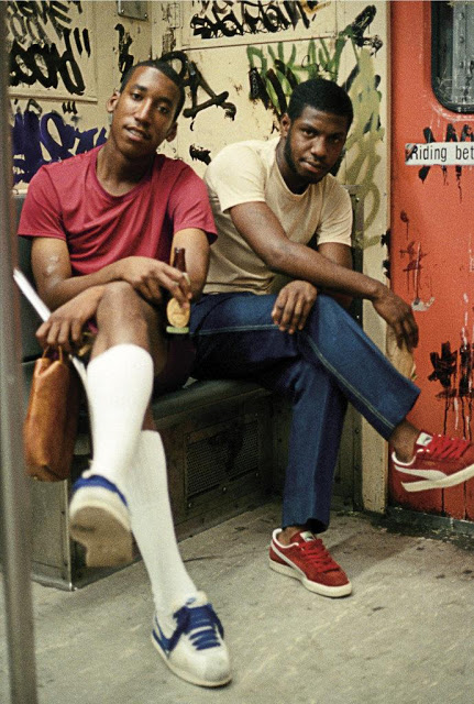
Another documentary/street photographer of 1980s NYC, more specifically Brooklyn, is Jamel Shabazz. Despite shooting around the same time and locations, Shabazz and Gilden’s work feel very different. One of the most obvious differences is that Gilden’s work was in black and white while Shabazz’s is in full colour, but the first difference that struck me was that Shabazz’s subjects are aware they are being photographed and have had time to prepare themselves for it. In fact, Shabazz would approach his subjects, introduce himself and tell them about his photography; completely contrasting Gilden’s aggressive split second shots. The two photographers’ goals also seem to be different. While Gilden searches for characters he is drawn to and wants to convey the feeling of that single moment, Shabazz was more concerned with making a statement about the world he lived in and about making his subjects smile and feel good about themselves.

While Bruce Gilden’s influence on Sheila Casado’s Fall 17 collection may have been small or could easily go unrecognised, I think there is more to take from Gilden’s attitude and appreciation for what would normally be ‘ordinary’ than what is seen in his photos.


Bibliography:

Not Just a Label (2017) Sheila Casado Available from: https://www.notjustalabel.com/designer/sheila-casado [Accessed 26 October 2017]

Gilden, Bruce (2005) A Beautiful Catastrophe, New York, Powerhouse Books

Gilden, Bruce (2017) Bruce Gilden, NYC Available from: http://www.brucegilden.com/a-beautiful-catastrophe/ [Accessed 28 October 2017]

Walker, Benjamen & Silenzi, Andrea (Producers). (2008) WNYC Street Shots: Bruce Gilden Available from: https://www.youtube.com/watch?v=DnBeh9tUPRU [Accessed 28 October 2017]

Gilden Bruce (1999) Haiti, Stockport, England, Dewi-Lewis Publishing

Gilden, Bruce (2017) Bruce Gilden, Haiti Available from: http://www.brucegilden.com/haiti/ [Accessed 28 October 2017]

Magnum Photos (Year Unkown) Religion, Haiti, Bruce Gilden Available from: https://www.magnumphotos.com/newsroom/religion/bruce-gilden-haiti/ [Accessed 28 October 2017]

Shabazz, Jamel (2011) Back in the Days, New York, PowerHouse

Jay (2012) The Reel Foto – Jamel Shabazz: Old School Street Photography Available from: http://reelfoto.blogspot.co.uk/2012/08/jamel-shabazz-old-school-street.html [Accessed 28 October 2017]

Task 3&4 – Academic Integrity

Cohen, Ari Seth (2016) Advanced Style: Older and Wiser, New York: Powerhouse Books

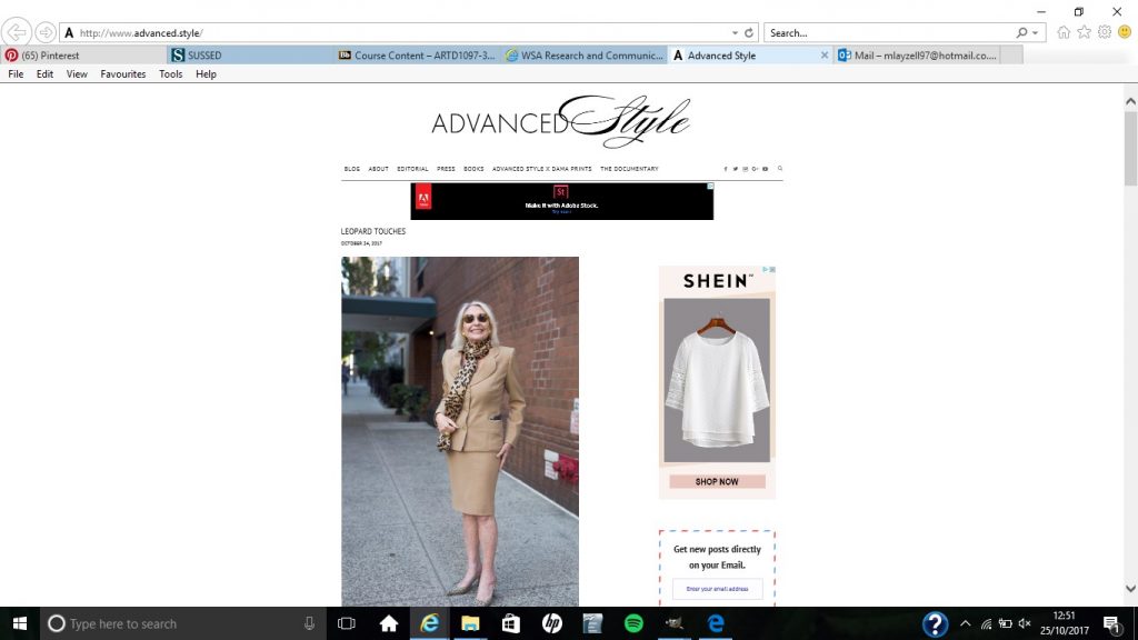
Cohen, Ari Seth (2017) Advanced Style, Available from: http://www.advanced.style/ (25/10/2017)


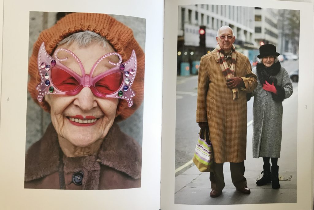
I have always been fascinated by older women who still embrace fashion and creativity and the reasons behind them ignoring the social ‘norms’ that come with ageing, which is why I decided to look into the work of Ari Seth Cohen. Cohen photographs inspiring older men and women on the streets of New York City and publishes them both on his blog Advanced Style, and in books of the same name. What started as a personal project to help cope with the loss of his grandmother, has become an international phenomenon that has helped to re-shape the way we see ageing.


Dacre, Karen (2017) Rocha looks back to granny to bring down curtain on fashion week, Evening Standard, 19/02/2013, p8

From this, I wanted to research into designers that have used older people as inspiration for their designs, which led me to the article in the Evening Standard about Simone Rocha’s London Fashion Week show in 2013. She had used her own grandmother as inspiration for the designs, which heavily featured faux fur, netted head pieces and thick rimmed glasses. Rocha’s designs however, still seemed to be aimed at a younger audience and so if I was to research into this subject further, I would find designers whose target market is older people, with designs that are still fresh and exciting.


Task 1&2 – Online Resources

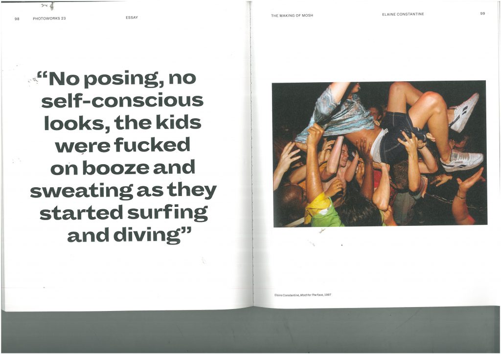
Figure 1: Photograph of a group of teenagers in 1997, taken as part of a fashion editorial called ‘Mosh’ by Elaine Constantine for ‘The Face’ magazine. Pages 92-99. Various contributors, (2016), Photoworks Annual – Issue 23: Self Styled

I first came across this image while reading an issue of Photoworks. I was drawn to the raw nature of the photography and assumed the piece must be about 1990’s teen culture, music or drinking. I was right to an extent, as this is exactly what the photograph is depicting, however I did not expect to find out that the set of images were actually a fashion shoot for The Face magazine. The photographer, Elaine Constantine, explained how in the summer of 1997 she and stylist Greg Faye gathered over 70 teenagers in London, provided designer clothes, alcohol and music and just started photographing. The authenticity of the photos was unlike anything I had ever seen before in a fashion context. Normal teenagers, no styling and even less direction; a complete contrast to the hand-picked models, staged poses and expertly styled outfits we usually see, even when I have seen other photographers adopt a ‘documentary’ style.

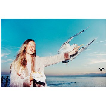
Figure 2: ‘Sarf Coastin’ 1997, original photograph, fashion photography for The Face magazine, Elaine Constantine. Found on V&A collections website.

It was this that lead me to looking further into Constantine and her style of fashion photography, when I came across Constantine’s most famous image. ‘Sarf Coasting’ was another fashion editorial Constantine shot for The Face and it featured a group of girls simply having a fun day out in Brighton. The iconic image of the seagull diving for the girl’s chips, came from Constantine’s own experiences of weekends at the pier, feeding the seagulls with her boyfriend. To Constantine, she was just giving something different a go, when in reality, it was this shoot that kicked off her career, landing her regular jobs with magazines such as US Vogue, Italian Vogue and campaigns with Jigsaw and Hunter.

It is clear that Constantine was tired of seeing the grunge fashion and ‘heroin-chic’ trends that were everywhere in fashion photography in the 1990s, and so wanted to introduce something new, something different. Her vibrant, energetic images were a shock to the industry, a shock that it very well needed.

‘Heroin-chic’ was a trend of the 90s that adopted imagery of heroin addicts and their environments into fashion photography – characterised by underweight figures, dark circles around the eyes and pale skin. It was originally due to the rise in popularity of the drug with the middle-class and wealthy, as well as a reaction to the ‘healthy’ look of models such as Cindy Crawford at the time, however it turned into so much more. It glamorised the drug, depicting it as ‘cool’ and desirable in fashion ad campaigns. It was eventually condemned and fell out of style by the end of the 1990s, showing that capturing real people in real scenarios was clearly what the public and the consumer wanted, and we can see this by Constantine’s continued success. Her work has now been exhibited around the world, and held in collections in the National Portrait Gallery and the V&A.